7 Signs Your Website Looks Outdated
Your website looks outdated for reasons that are usually easy to spot once you know what to look for, and hard to notice when you've been staring at the same site for years.
Visitors don't give you the benefit of the doubt the way you might give yourself. A dated-looking site quietly signals that the business behind it might be dated too, whether or not that's actually true.
What it costs you to get this wrong
An outdated site doesn't announce itself with an error message. It just loses you a share of visitors who quietly assume a more current-looking competitor is the safer choice, without ever telling you why they left.
Table of contents
Update fonts and colors that feel stuck in the past
Replace generic stock photos with real ones
Simplify a cluttered navigation menu
Speed up a slow-loading homepage
Remove outdated design gimmicks like sliders and autoplay video
Refresh content that hasn't been touched in years
Make sure your site actually works well on phones
FAQ
Before we get into the signs
If you want an honest, free opinion on where your own site actually stands, we do a small number of free redesigns each month.
1. Update fonts and colors that feel stuck in the past
Certain fonts and color choices are tied to a specific era of web design, the same way certain clothes instantly read as a particular decade.
This matters because typography and color are some of the first things a visitor notices, often before they've consciously registered anything else on the page. Dated choices here color everything that follows, even if the content itself is solid.
Swap in a simple, modern font pairing and a color palette that feels intentional rather than accidental. This alone can make an otherwise fine site feel noticeably more current.
2. Replace generic stock photos with real ones
Certain stock photos have been reused so often across so many websites that visitors recognize them, consciously or not, as filler rather than anything specific to your business.
This matters because generic stock photography does the opposite of what a photo is supposed to do. Instead of building trust, it signals that not much thought went into the site.
Swap in real photos of your team, your work, or your space wherever possible. Even a simple photo taken on a phone, with decent lighting, tends to read as more current and more trustworthy than a polished but generic stock image.
3. Simplify a cluttered navigation menu
A menu with ten or more items, several of which barely differ from each other, is a common leftover from an older approach to web design that tried to list everything at once.
This matters because a cluttered menu makes visitors work harder to find what they actually came for, and modern, well-converting sites tend to favor a small number of clear, purposeful options instead.
Cut your menu down to the handful of pages that matter most, and fold anything less essential into those pages instead of giving it its own menu slot.
4. Speed up a slow-loading homepage
A site that takes several seconds to load, often due to large uncompressed images or outdated technical setup, feels dated the moment a visitor has to wait for it.
This matters because visitors today expect a page to load almost instantly, and a slow site reads as neglected even if the design itself is otherwise fine.
Compress your images, remove anything loading that visitors never actually see or use, and test your site's speed on an actual phone connection rather than fast office wifi.
5. Remove outdated design gimmicks like sliders and autoplay video
Rotating image sliders on a homepage, autoplaying background video, and heavy parallax scrolling effects were popular design trends that have mostly fallen out of favor for good reason.
This matters because these effects tend to slow the page down, distract from the actual message, and instantly date a site to whichever era they were popular in.
Replace a rotating slider with one strong, clear image and message instead of cycling through several competing ones. Simpler, in this case, reads as more current, not less.
6. Refresh content that hasn't been touched in years
An outdated copyright year in the footer, a blog with no posts since several years ago, or testimonials referencing outdated details are small details that quietly signal neglect.
This matters because visitors notice these details even when they're not actively looking for them, and they raise a quiet question about whether the business itself is still active and paying attention.
Update your footer year, remove or refresh any clearly stale content, and add recent testimonials or examples of current work wherever you can.
7. Make sure your site actually works well on phones
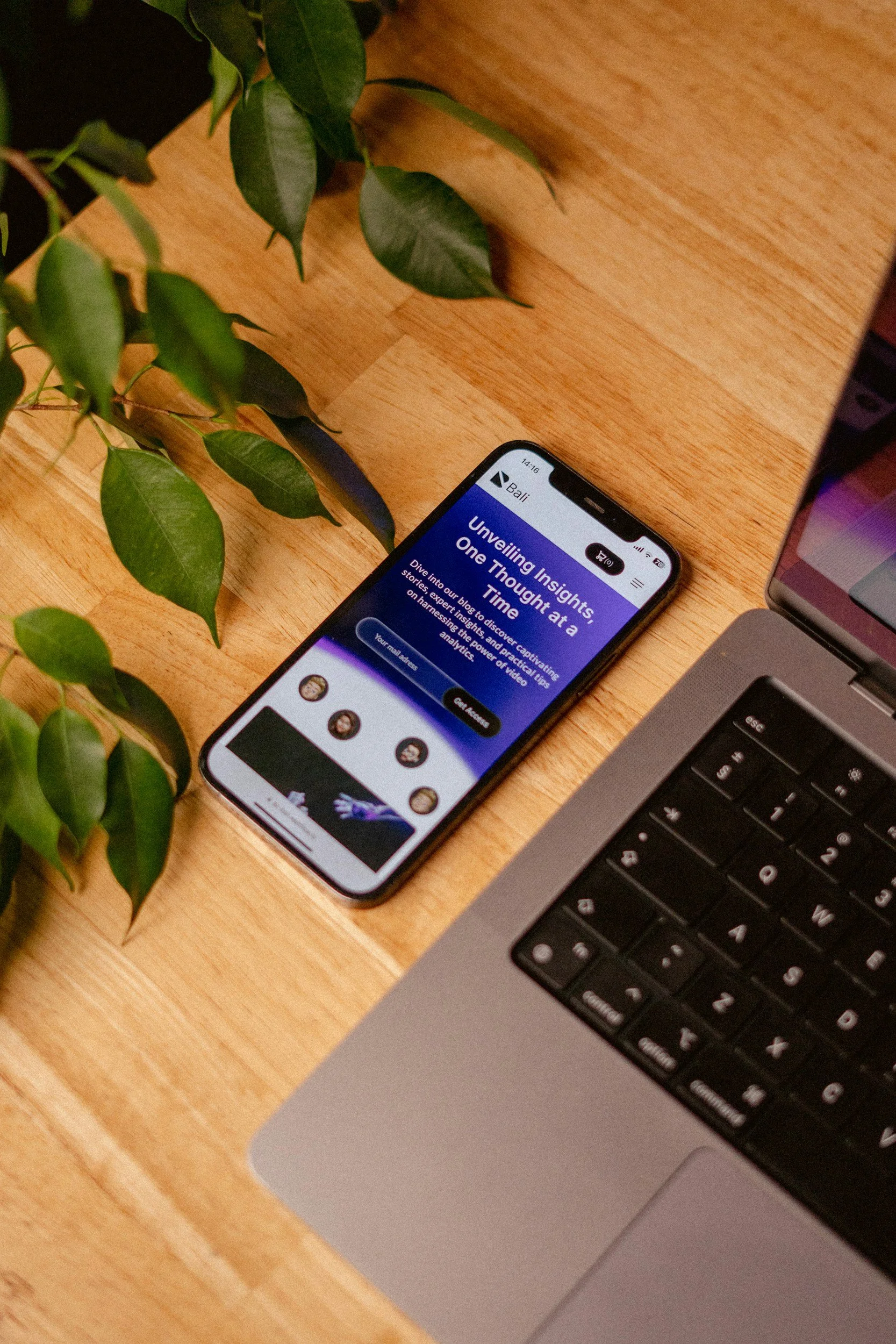
A site that was clearly designed for a desktop screen and only grudgingly resized for mobile is one of the fastest ways to feel outdated to the large share of visitors browsing on their phones.
This matters because a growing majority of visits to small business sites now happen on mobile, and a cramped, hard-to-tap mobile experience reads as an afterthought rather than a priority.
Open your own site on your phone and check whether text is readable, buttons are easy to tap, and the layout feels intentional rather than squeezed to fit.
FAQ
How often should I redesign my website?
Most businesses benefit from a meaningful refresh every two to three years, even if it's not a full rebuild each time. Small updates in between, like new photos or a footer date fix, help keep things current without a major project every year.
Does an outdated website hurt my SEO?
Indirectly, yes. Outdated sites are often slower and less mobile-friendly, both of which affect search rankings, even though "looking dated" isn't itself a direct ranking factor.
What design trends are considered outdated in 2026?
Rotating homepage sliders, autoplay background video, heavy drop shadows and bevels, and generic corporate stock photography are among the most common signs a site hasn't been touched in a while.
Can I update parts of my website without a full redesign?
Yes, often. Swapping outdated photos, simplifying your navigation, and refreshing stale content can meaningfully improve how current your site feels without rebuilding it from scratch.
Does an outdated website affect customer trust?
It can. Visitors form an impression within seconds of landing on a page, and a dated-looking site can quietly raise doubts about whether the business itself is still active and attentive.
How do I know if my website needs a redesign or just small updates?
If the core structure and message still work but individual elements feel dated, small updates are often enough. If the whole site feels disorganized or fails on mobile, a full redesign is usually the better investment.
You can spot the signs now. Fixing them all takes real time.
At this point you probably have a decent sense of whether your own site shows any of these signs. Actually fixing fonts, photos, navigation, speed, and content, all while running the business the site supports, is a bigger job than it looks on paper.
There's a faster way to see exactly where your site stands, without tackling all seven fixes yourself first.
Get a free homepage redesign.
Each month we take on a small number of free homepage redesigns for real businesses. If you're wondering how long it would take to build a website that actually looks like it belongs to your business, this is the easiest way to find out.
Here's exactly what you get: we'll take your current homepage and build a real visual mockup of what a redesign could look like, along with a short Loom video walking you through what we'd change and why. It's yours to keep either way, whether or not we ever work together.
There's no cost, no pressure, and no generic template. We review every submission personally, and we only take a handful each month so each one gets proper attention.
If you'd rather talk it through first
You can also book a call and we'll look at your site together.
Written by
Mikkel Calmann
More web design insights