10 Minimalist Luxury Websites for Design Inspiration
Scroll through the best luxury sites on the internet and you'll notice what's missing before you notice what's there. That absence is the point. We pulled together ten of the sharpest examples of minimalist luxury web design working today, not as templates to copy, but as proof of how far restraint can carry a brand when it's executed with real precision.
Table of contents
Why minimalist luxury websites matter right now
The top 10 minimalist luxury websites that nail the art of editorial elegance
Why minimalist luxury web design works for high-end brands
Visual storytelling: The DNA behind every luxury minimalist website
How minimalism elevates perceived value
What these websites tell us, and where minimalist luxury is heading
FAQ
1. Why minimalist luxury websites matter right now
In the world of high-end digital branding, where refinement is currency and attention is a luxury, these ten minimalist luxury websites stand out as benchmarks for modern elegance. These aren't simply clean layouts, they are disciplined compositions, intentional breathing room, and visual restraint executed with taste and authority.
Luxury buyers are fatigued by noise, clutter, and over-explained storytelling. They want clarity. They want atmosphere. They want a website that telegraphs confidence before a single line of copy is read.
Minimalism, when elevated to its luxury expression, is not about simplicity. It's about precision. It's about editorial quietness that lets the brand's essence speak.
For premium founders, boutique labels, and high-ticket service brands, the problem is clear: most websites are visually loud and strategically insecure. They try too hard to impress and end up diluting their perceived value. The following curated selection showcases ten minimalist luxury websites that master visual restraint and brand-led sophistication, giving prospective clients the instant "I want that" moment before they ever scroll.
It's worth noting what these sites have in common structurally, not just aesthetically. Almost none of them use a traditional navigation bar crammed with links. Most collapse to a single menu icon, because the brands trust visitors to explore rather than needing to be steered at every turn. That single choice, removing the visual weight of a full navigation bar, does more for a premium first impression than almost any other decision on the page.
2. The top 10 minimalist luxury websites that nail the art of editorial elegance
Each site below demonstrates a unique interplay of white space, typography, art direction, and refined movement. These examples are not templates to copy, they are case studies in how luxury brands command presence without excess.
1. The row, the blueprint of understated authority
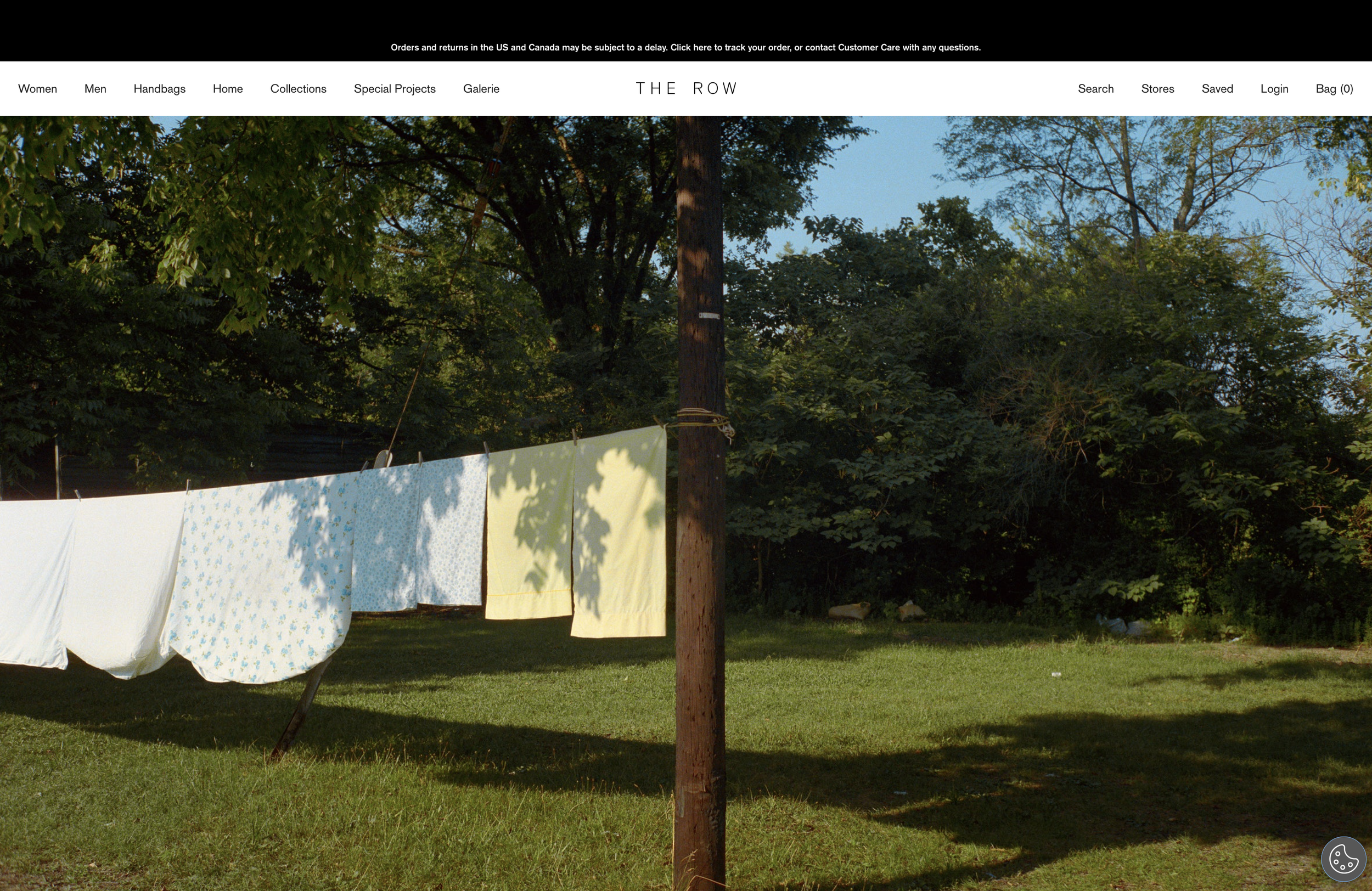
No loud banners. No promotional noise. Just editorial spaciousness, restrained color, and art-house photography. Content breathes and nothing competes for attention. Typography is not decorative, it's architectural. The site feels like a gallery, not a store, instantly elevating product value. Takeaway: minimalism becomes luxury when every pixel is intentional.
2. Aesop, ritualized minimalism in digital form
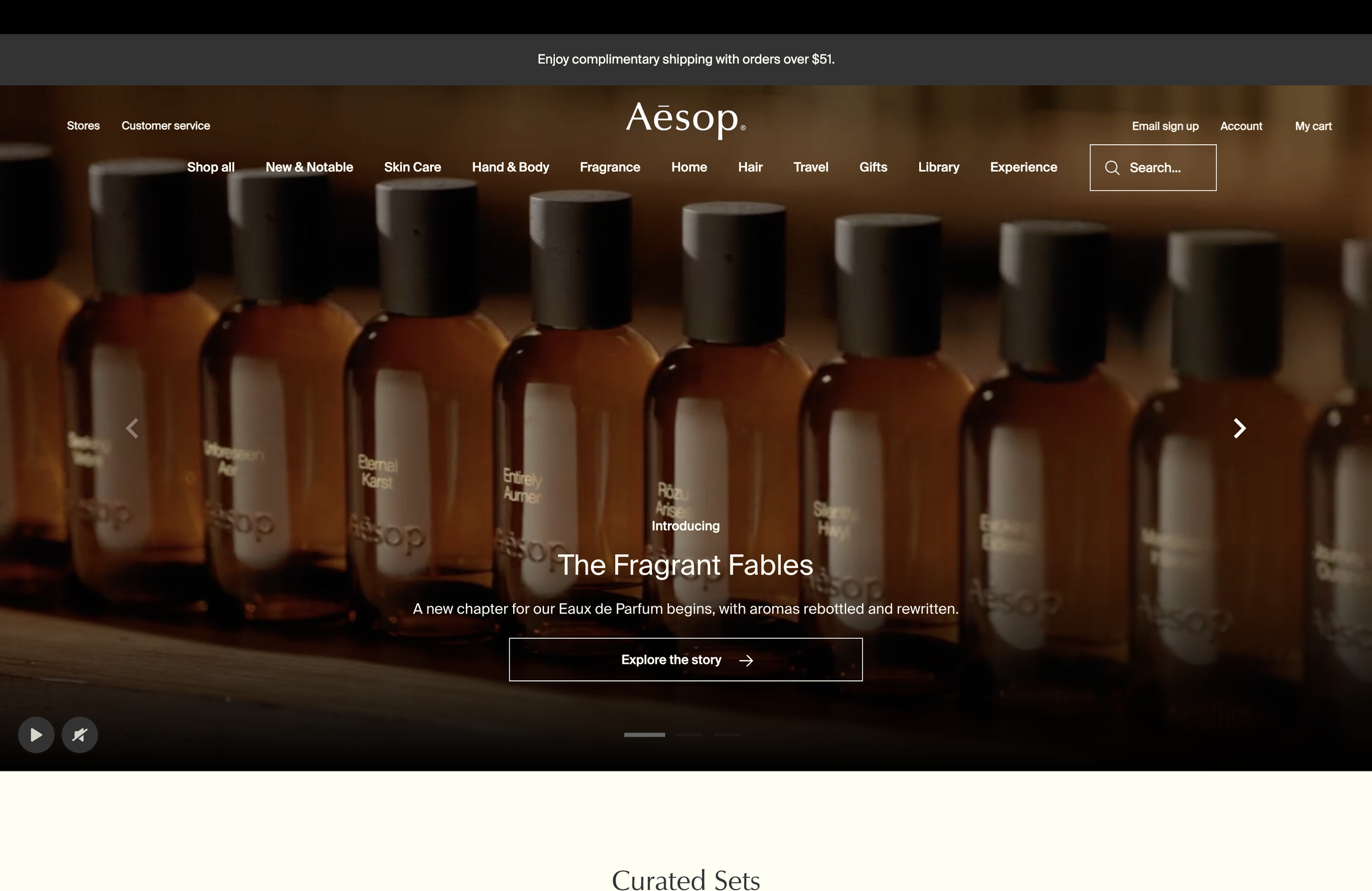
Aesop's digital universe balances quiet minimalism with cultural storytelling. Layouts shift gently, giving every product space to feel iconic. The neutral, earthy palette mirrors the brand's sensorial identity, and product photography is displayed like sculpture. Copy is poetic but simple, never shouting. When visual minimalism meets narrative richness, premium resonance happens.
3. Céline (Old Hedi Slimane Era), purity and precision
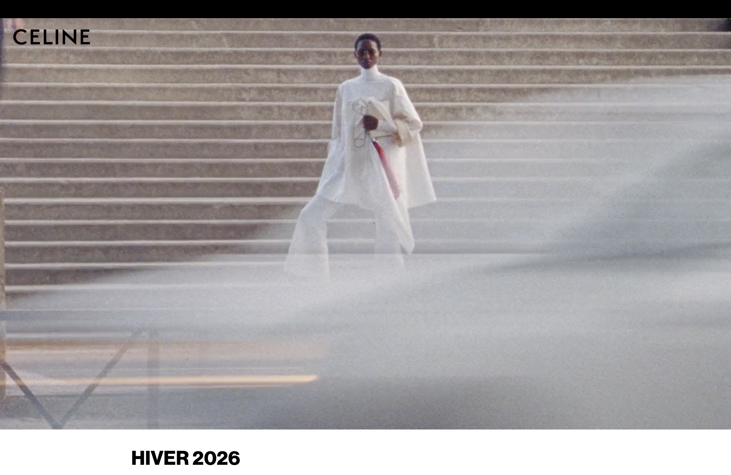
The Céline site under Phoebe Philo's era became the holy grail of minimalist web design. Ultra-thin sans-serif typography made luxury feel almost medicinal, and large-scale images dominated the layout, crafting a magazine-like aesthetic. Zero friction, zero clutter, total focus. Minimalism becomes a brand language, not a style, when it influences how products, photography, and content coexist.
4. Rimowa, industrial minimalism meets German precision
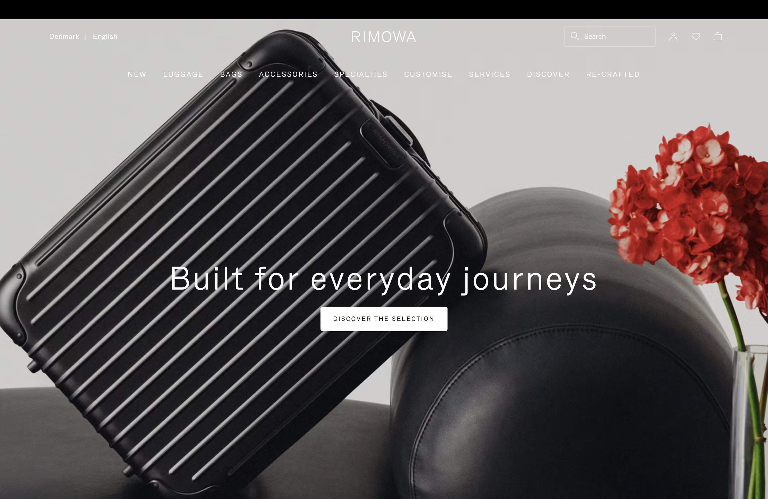
Rimowa's website feels engineered. Precise grid alignment creates visual trust, a chrome-inspired color palette reflects the product, and cinematic videos highlight motion, not noise. This is minimalism with structure, minimalism with posture.
5. Apple, the archetype of luxury minimalism
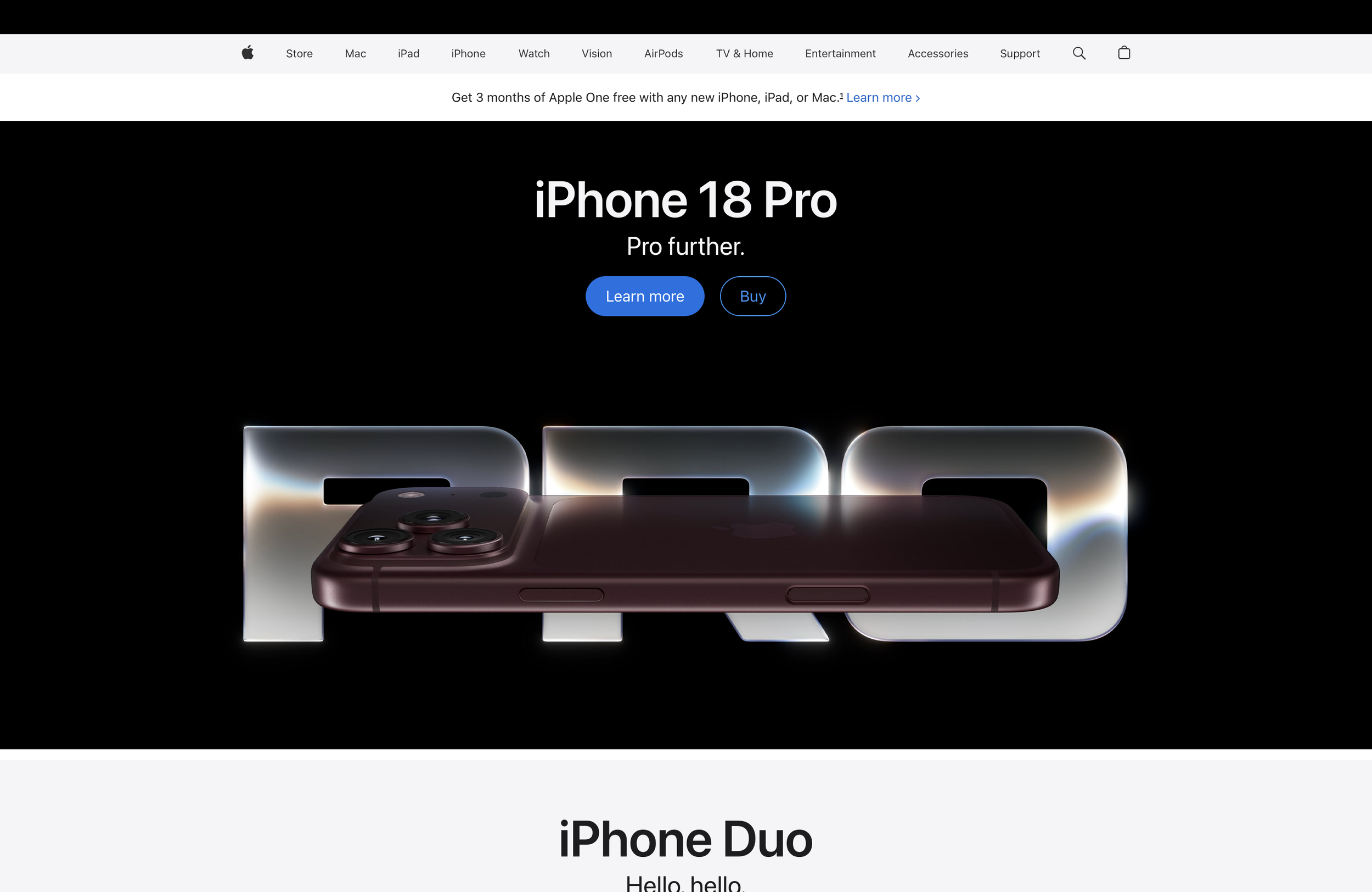
Apple's design philosophy has become the blueprint for digital minimalism: clarity, geometry, and disciplined restraint. Hyper-clean product shots sit against vast white space, typography carries just enough weight to convey confidence, and slow, elegant micro-interactions feel expensive. Luxury is not about adding, it's about removing until only excellence remains.
6. Hermès, art-forward minimalism
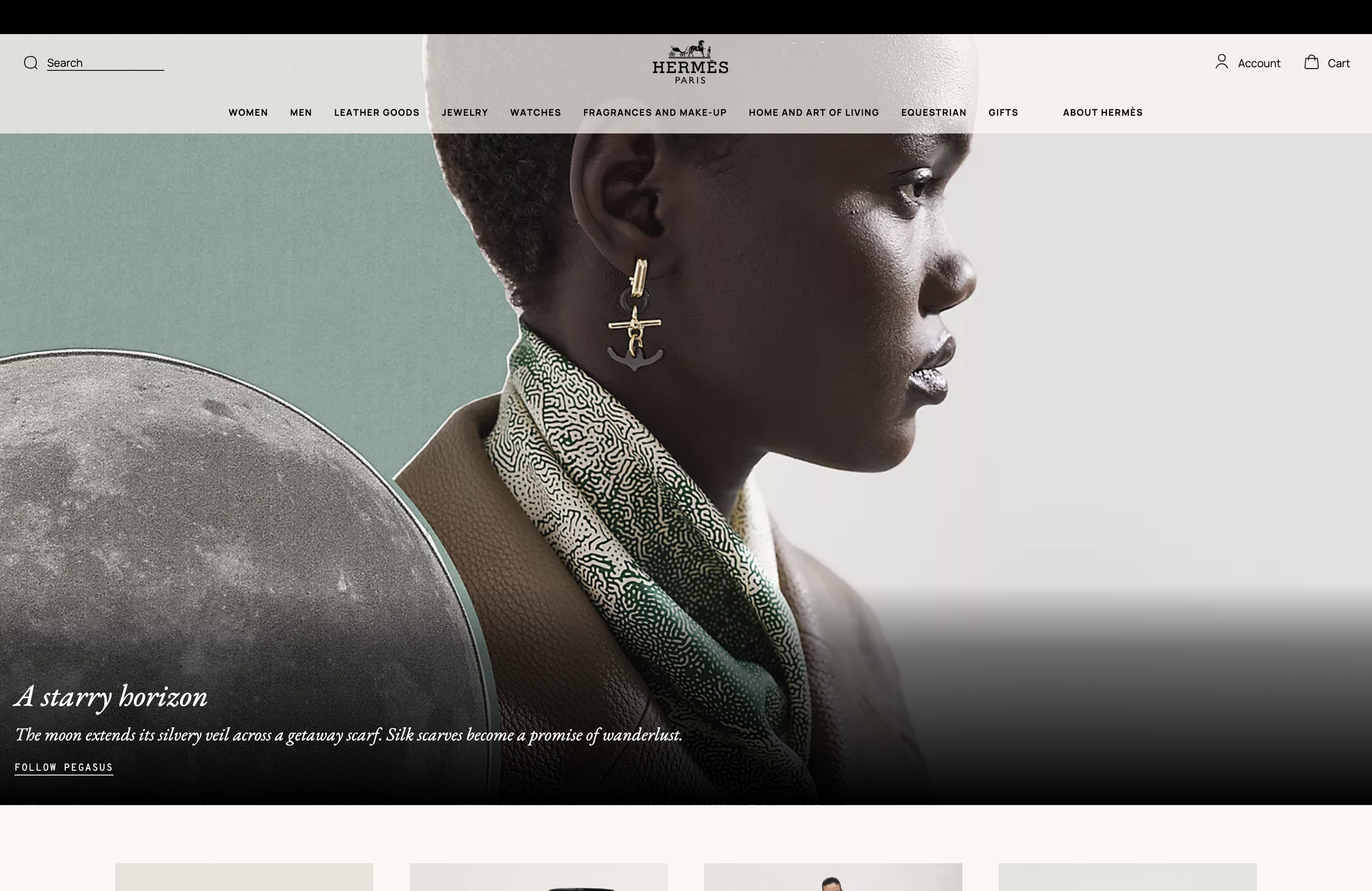
While not strictly minimalist in every area, Hermès' digital editorial pages remain deeply influential for luxury-brand web design. Whitespace is paired with bold, unexpected color blocks, photography feels editorial rather than e-commerce, and clean layouts guide the eye with graceful rhythm. Luxury minimalism can include color, when the palette is curated with sophistication.
7. Toteme, Scandinavian editorial minimalism
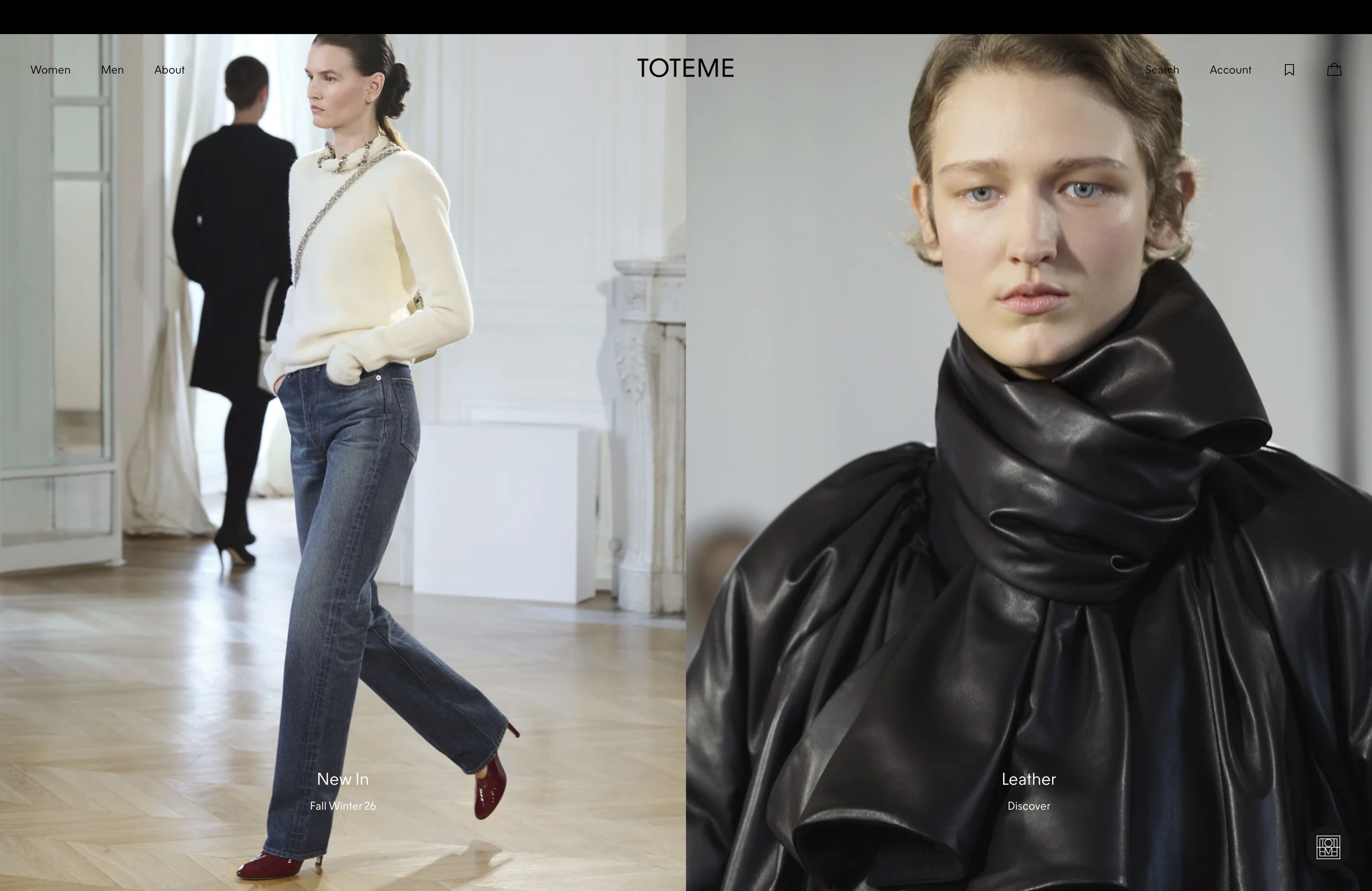
Toteme nails the intersection of fashion minimalism and architectural editorial design. Harmonious grids echo print magazines, a soft monochromatic palette feels tactile, and the slow, confident scroll pace conveys presence rather than rush. Minimalist luxury thrives when design mimics a physical experience.
8. Aman Resorts, minimalism as serenity
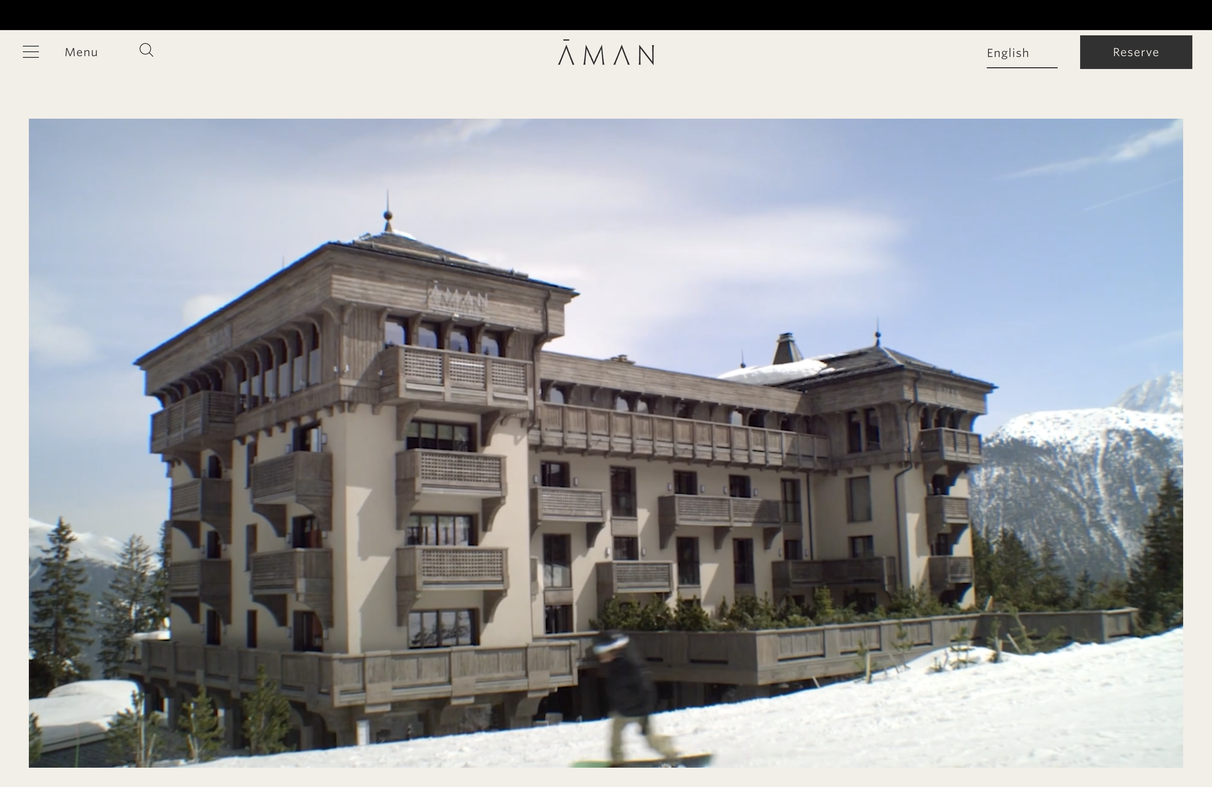
Aman has built an empire on the art of silence, and its website captures that philosophy perfectly. Immersive, full-bleed photography carries no cluttered overlays, typography is reduced to a whisper, and every interaction feels slow and intentional, like the resort experience itself. When a website feels calm, the brand feels priceless.
9. Jacquemus, playful minimalist luxury
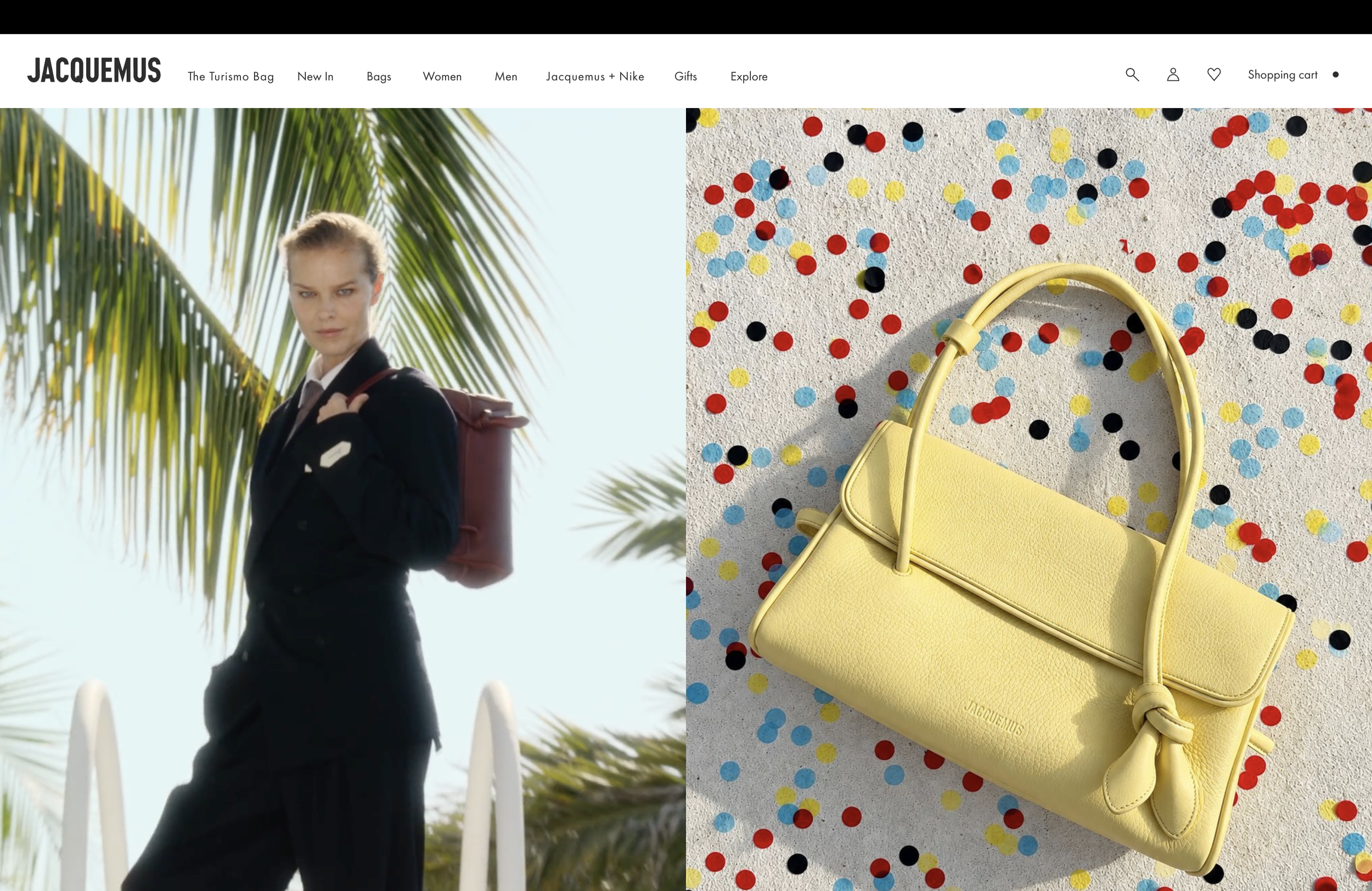
Jacquemus offers minimalist design with a youthful, sun-soaked twist. Unexpected compositions still feel clean, bold editorial photography sits against minimal layouts, and confident use of whitespace elevates the quirky brand voice. Minimalism doesn't equal seriousness, it can feel warm and human while staying premium.
10. Saint Laurent, dark minimalism with edge
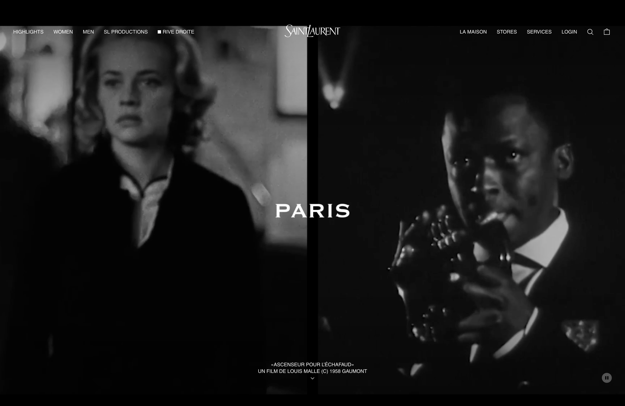
Saint Laurent's digital aesthetic uses negative space and bold typography to command presence. A high-contrast black-and-white palette, dramatic editorial photography, and minimal design carry maximum attitude. Minimalism can be sensual, cinematic, and powerful, when executed with confidence.
3. Why minimalist luxury web design works for high-end brands
Minimalist luxury web design is not a trend, it's a strategic posture. It signals confidence, because brands that don't over-explain feel more expensive. It signals editorial taste, because luxury audiences trust brands that visually curate their world. It creates focus, because whitespace lets core messages breathe and creates emotional clarity. It creates immersion, transforming websites from transactional spaces into premium experiences. And it drives brand elevation, because when visuals are refined, everything else, products, services, pricing, feels elevated too.
There's also a competitive angle worth naming directly. In categories where every brand is chasing the same aesthetic trend, whether that's maximalist color or busy animated interfaces, a genuinely restrained site reads as a deliberate departure rather than a missed memo. Standing apart from a crowded visual trend often does more for brand recall than following it more skillfully than everyone else.
4. Visual storytelling: The DNA behind every luxury minimalist website
Minimalist luxury websites succeed because they operate like modern editorials. Photographic hierarchy treats images like artwork, large, emotional, and intentional. Typography functions as design rather than decoration, and is treated as architecture. Whitespace is treated as luxury, something only a confident brand allows itself this much of. Visual rhythm means every scroll feels choreographed, and micro-interactions are curated rather than gimmicky. Palette precision, limiting a scheme to two or three tones, feels expensive on its own. Minimalism is not emptiness. It's controlled expression.
One detail that separates the amateur attempt from the professional one is restraint under pressure. Almost every founder, midway through a redesign, wants to add one more section, one more proof point, one more feature callout. The sites above resist that instinct consistently, and that discipline compounds across dozens of small decisions into a site that feels considered from the first pixel to the last.
5. How minimalism elevates perceived value
Below is a realistic transformation showing what minimalism can achieve for a premium client. Before, a high-ticket interior design firm had an overloaded homepage, a busy color palette, mixed fonts, twenty-plus competing images, and services buried beneath visuals.
In a minimalist luxury redesign, the site gained editorial photography paired with clean grids, one serif and one sans-serif for elevated typography, a soft monochromatic palette inspired by their interiors, whitespace doubling visual clarity, and a hero section with a single line: "Spaces designed for quiet confidence."
The result: session duration up 48 percent, significantly higher lead quality, fewer unqualified inquiries, and a client pricing increase justified through elevated perception. Minimalism didn't just improve aesthetics, it transformed the brand's perceived authority. It also changed how the sales team operated, because prospects arriving from the site had already absorbed the brand's positioning before the first call, shortening the sales cycle and removing much of the early education that used to eat up the first meeting.
6. What these websites tell us, and where minimalist luxury is heading
Brands investing in minimalist luxury design understand one thing clearly: luxury is a feeling, not a feature set. The founder who wants this aesthetic is signaling that they value creative excellence, editorial direction, intentional storytelling, and brand elevation over budget solutions. They invest, respect the process, and want a long-term digital asset, not a cheap website. If a client says, "I want my website to look like this," you already know they're design mature.
These ten sites represent more than inspiration, they are signals of where premium digital branding is going. Refinement is replacing noise. Editorial presence is replacing clutter. Confidence is replacing complexity. Luxury clients don't want more, they want meaningful less. The brands that embrace this aesthetic rise above the market, not by shouting, but by shaping silence into something unforgettable.
The bottom line
What these ten sites share isn't an absence of design — it's controlled expression: photographic hierarchy, architectural type, and whitespace deployed as a status symbol rather than a gap to fill. Brands that adopt this posture aren't just chasing a look; they're pre-qualifying the kind of client who recognizes restraint as confidence. As premium digital branding matures, refinement is replacing noise as the real competitive advantage — and these examples are the blueprint for getting there.
FAQ
What makes a website "minimalist luxury" rather than just plain?
Minimalist luxury uses deliberate restraint — controlled typography, generous white space, and curated imagery — to project confidence and exclusivity, whereas a plain site simply lacks design intention altogether.
Why do brands like Aesop, Hermes, and The Row use so little on their homepages?
Because in luxury branding, less visual competition means each element carries more weight; restraint signals that the brand doesn't need to shout to be taken seriously.
Can a smaller brand pull off minimalist luxury without a big-name budget?
Yes — the effect comes from typography discipline, photographic quality, and spacing choices, not from budget size. Strategic restraint is available to any brand willing to edit ruthlessly.
Does minimalist design hurt conversion by removing sales copy?
Not when done correctly — minimalist luxury sites still guide visitors clearly toward action; they just do it through hierarchy and pacing rather than dense persuasive copy.
What's the biggest mistake brands make when trying to copy this style?
Removing content without adding intention — true minimalist luxury requires more design discipline, not less effort, to make every remaining element count.
More insights