A Quick Fix That Instantly Improves Your Website
Most website problems don't need a redesign, they need twenty minutes and a clear eye. We've watched businesses spend thousands chasing a "full rebrand" when the real issue was a CTA nobody could find or a broken link in the footer. Before you touch your budget, walk through the fixes below. They're the same checks we run on every site audit, and they usually surface exactly what's costing you conversions.
Table of contents
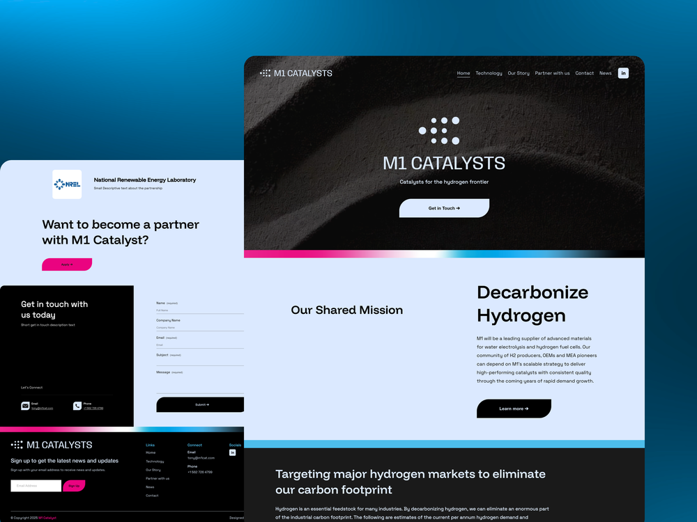
Make sure your CTAs stand out
Declutter your layout
Check your mobile experience
Fix broken links
Tighten your page titles and meta descriptions
Simplify your forms and check your contrast
How to find these issues on your own site in 20 minutes
FAQ
1. Make sure your CTAs stand out
Call-to-action buttons are usually the single most important element on a page, since they're the bridge between someone reading your content and someone becoming a lead or a customer. If a visitor has to hunt for the button, they won't click it, they'll just leave. Your CTA should use a color that contrasts clearly with the rest of the page, sit in a spot visitors naturally scroll to, and use text that says exactly what happens next, not a vague "Learn More." Test it by squinting at your homepage from across the room. If the button doesn't jump out even then, it's not doing its job.
Repetition helps too. Most visitors don't read a page top to bottom, they scan it, so a single CTA buried at the very bottom rarely gets seen by anyone who didn't already scroll that far. Repeat your primary CTA after your hero section, again after any proof or pricing section, and once more at the very end of the page. Keep the wording consistent across each instance so visitors always recognize it as the same action, rather than three different offers competing for attention. And be careful with secondary buttons nearby: a "Learn More" link next to your main CTA is fine, but two buttons of equal visual weight on the same screen forces a decision your visitor didn't come to make.
2. Declutter your layout
A page that's trying to say everything at once ends up saying nothing. When every section is fighting for attention, with banners, sidebars, extra widgets, and stacked promotions, visitors don't know where to look, so they disengage. A clean layout does the opposite: it guides the eye deliberately from headline to proof to action. Go through your top pages and ask, for each element, whether it's helping someone take the next step or just filling space. Anything in the second category should be cut, not shrunk.
Whitespace is doing more work than most business owners give it credit for. Cramming sections tightly together to avoid scrolling actually makes a page feel busier and harder to parse, even when the total amount of content hasn't changed. Give each section room to breathe, and use consistent spacing between blocks so the page reads as one coherent flow instead of a stack of unrelated pieces bolted together. If you're not sure where to start cutting, look first at anything that was added "just in case" a while ago: an announcement bar nobody updates, a widget from a tool you stopped using, or a testimonial carousel duplicating content that already lives on your case studies page.
3. Check your mobile experience
More than half of all web traffic arrives on a phone, which means your "desktop-first" design decisions are actually being judged on a screen a fraction of that size. Test your site on an actual phone, not just a browser preview. Look for text that's too small to read without zooming, buttons that sit too close together to tap accurately, and images that crop awkwardly or slow the page down. A site that feels effortless on mobile keeps visitors engaged; one that requires pinching and zooming loses them within seconds.
Pay particular attention to anything built for desktop first and shrunk down afterward, multi-column layouts, side-by-side comparison tables, and wide embedded forms are the most common offenders. On Squarespace, use the mobile preview toggle in the editor for every page, not just the homepage, since service and pricing pages are often where mobile layout breaks down first. Check that tap targets, buttons, links, menu items, sit at least the width of a thumb apart, and that your navigation menu opens and closes cleanly without any lag or visual jump. If a visitor has to zoom in even once to read your headline, that's a fix worth making before anything else on this list.
4. Fix broken links
A broken link or a stray 404 page tells a visitor, in a split second, that nobody is minding the store. It's a small thing, but it erodes trust fast, especially if it happens on a page they reached from an ad or a search result. Click through your main navigation, your footer, and any prominent in-content links at least once a quarter. It takes a few minutes and it's one of the easiest ways to protect the credibility your design has already earned.
Broken links tend to accumulate quietly after a redesign, a rebrand, or simply deleting an old page without updating what pointed to it. Check external links too, not just internal ones: a link to a partner site, a press mention, or a tool you recommend can break the moment that other business changes its own URL structure, and you'd never know unless you tested it yourself. If you do find a page that no longer exists, set up a proper redirect rather than leaving a dead end, so visitors and search engines land somewhere useful instead of a generic error page.
5. Tighten your page titles and meta descriptions
This one doesn't show up visually on the page itself, but it shapes the very first impression a visitor forms, often before they've clicked anything. A vague page title like "Home" or a meta description that's been left blank means search engines generate their own summary, usually by pulling a random sentence out of your page, which rarely represents your offer well. Rewrite each top page's title and description to state clearly what the page is about and who it's for. This small fix improves click-through rates from search results and sets the right expectation before a visitor even lands on your site.
6. Simplify your forms and check your contrast
Every extra field on a contact or booking form is another small reason for a visitor to abandon it halfway through. We regularly see forms asking for a phone number, a company size, a referral source, and a project budget before someone has even decided whether they want to talk to you. Strip your primary form down to what you genuinely need to have a first conversation, usually name, email, and a short message field, and push everything else into a follow-up email or a discovery call. Fewer fields consistently mean more completed submissions, and the qualifying questions can wait until someone has already raised their hand.
While you're in there, check your color contrast too. Low-contrast text, light gray on white, pale color on a similarly pale background, looks stylish in a mockup and becomes genuinely hard to read in daylight on a phone screen. This isn't just an aesthetic preference, it's an accessibility issue that quietly excludes visitors with any degree of visual impairment, and it affects a larger share of your audience than most business owners assume. Run your body text and your headline colors through a free contrast checker, and adjust anything that fails, before assuming a redesign is the only way to make a page feel more legible.
7. How to find these issues on your own site in 20 minutes
You don't need special tools to run a quick self-audit. Open your homepage on a phone and ask whether the primary CTA is the first thing you notice, before you even start scrolling. Then scroll through your top three pages and count how many competing buttons, banners, or pop-ups are visible at once; anything beyond one or two is clutter worth cutting. Click every link in your main navigation and footer to catch anything broken, and note how long the homepage takes to actually load on mobile data rather than office wifi. Glance at your page titles as they appear in a browser tab or a Google search result and rewrite any that are vague or generic. Fill out your own contact form on your phone, timing yourself, and notice at what point you'd be tempted to give up if you were a stranger with three other tabs open. That single twenty-minute pass usually surfaces most of the issues covered here, and gives you a short, specific list to fix instead of a vague sense that "something's off."
None of these fixes require a developer, a new template, or a meeting to approve them. They're the kind of changes you can make between calls on a slow afternoon, and unlike a full redesign, you'll usually see the effect within days, in the form of a lower bounce rate, a longer average session, or simply more messages landing in your inbox. Treat this list as a recurring quarterly habit rather than a one-time fix. Sites drift: a new team member adds a banner, a marketing tool inserts its own pop-up, an old promotion never gets removed. Running through these checks every few months keeps the small stuff from quietly piling back up into the exact problems you just solved.
The bottom line
None of this requires a redesign or a developer — just twenty honest minutes with your own website. Check your CTAs, clear the clutter, test the mobile experience, and hunt down broken links, and you'll have fixed the four issues most likely to be quietly costing you customers right now. Big redesigns take months to pay off; these fixes start paying off the moment you make them. Start this afternoon.
FAQ
What's the fastest way to improve my website without a full redesign?
Focus on four things: make your CTA visually obvious, remove clutter competing for attention, verify your mobile experience works, and fix any broken links. All four can be done in about twenty minutes without touching code or hiring a developer.
How do I know if my call-to-action is actually working?
If you have to search the page to find your main button, your visitors will too. It should stand out through color contrast, size, and placement, and use action-driven copy rather than a generic label like "Learn More."
Why does decluttering a layout improve conversions?
Every extra element on a page competes with your main message for attention. Removing unnecessary sections, redundant images, or busy backgrounds gives visitors a clearer path to the one action you actually want them to take.
How can I check my website's mobile experience quickly?
Open your site on an actual phone, not just a browser's resize tool, and try to complete the same action a customer would — reading key info, tapping a button, filling a form. If anything feels slow, cramped, or broken, that's exactly what mobile visitors are experiencing.
How often should I check my site for broken links?
Run a quick check at least once a quarter, and immediately after any redesign, page reorganization, or third-party tool change, since those are the most common causes of links quietly breaking.
More insights