How to Stand Out When Every Website Looks the Same
Trying to stand out when every website looks the same in your industry starts by understanding why that sameness happens in the first place. It's rarely a coincidence.
Most businesses in a given industry end up copying each other without meaning to, using the same templates, the same stock phrases, and the same generic photos, because it feels safer than doing something different.
What it costs you to get this wrong
A website that looks like everyone else's forces a visitor to decide between you and a competitor on price alone, since nothing on the page gives them another reason to choose you. That's a hard place to compete from, especially if you're not the cheapest option.
Table of contents
Why every website in your industry ends up looking the same
Say exactly who you help, not everyone
Replace generic industry phrases with your actual words
Show proof that's actually yours
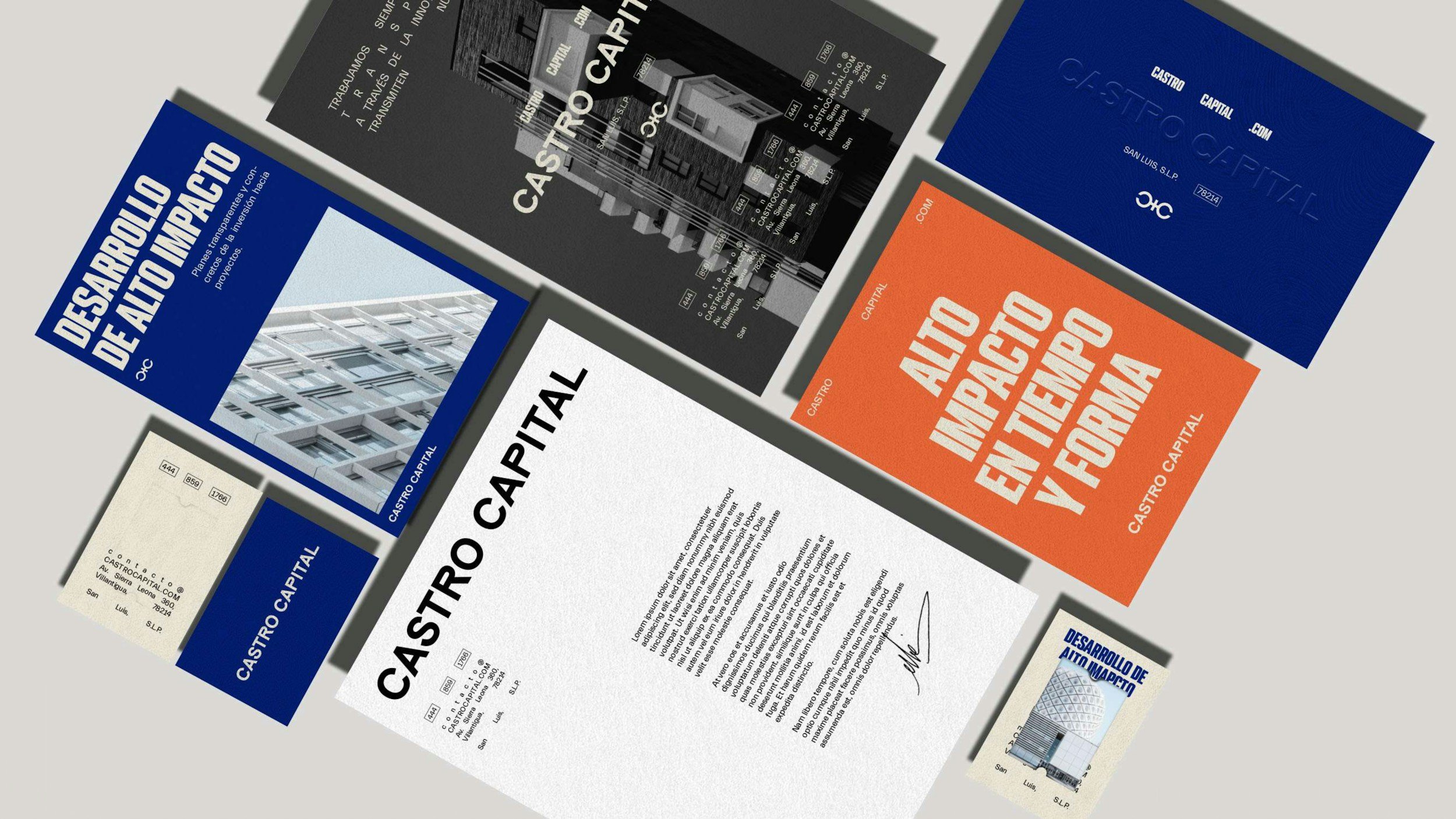
Make one visual choice that's distinctly yours
Let your actual voice come through in the writing
Common mistakes to avoid
FAQ
Before we get into how to actually differentiate
If you'd like a fresh perspective on your own homepage specifically, we do a small number of free redesigns each month.
Why every website in your industry ends up looking the same
Most businesses look at competitors before building their own site, which is reasonable research. The problem is when that research turns into quiet copying, the same layout, the same section order, the same photos of people shaking hands.
This happens because standing out feels risky. Sticking close to what everyone else in the industry does feels safe, even though it guarantees you'll be judged next to them on the one thing you didn't differentiate: price.
Recognizing that this sameness is a choice, not an inevitability, is the first step toward doing something different.
Say exactly who you help, not everyone
Most same-looking websites describe their audience the same vague way: "serving businesses of all sizes" or "helping everyone with their needs."
This matters because trying to speak to everyone usually means speaking clearly to no one. A visitor scanning quickly needs to see themselves reflected specifically, not folded into a broad, generic audience.
Name your actual ideal customer specifically, by industry, size, or situation, even if it means you're technically excluding some visitors who don't fit that description. Specificity reads as confidence, not narrowness.
Replace generic industry phrases with your actual words
Certain phrases show up on nearly every website in certain industries: "committed to excellence," "we treat you like family," "quality service since" whatever year. These phrases have been repeated so often they've stopped meaning anything.
This matters because a visitor who's seen the same phrase on three competitor sites already skips right past it on yours. It's invisible, not persuasive.
Replace those stock phrases with the actual words you'd use talking to a customer across a table. If you wouldn't say it out loud to a person's face, it probably doesn't belong on your homepage either.
Show proof that's actually yours
Every competitor with a generic template probably has the same kind of proof: a five-star badge, a vague "trusted by hundreds" line, or a stock testimonial that could belong to any business.
This matters because generic proof doesn't actually prove anything specific about you. Specific proof, a real number, a real result, a real name, does the opposite.
Use whatever specific detail you actually have: a real client outcome, a number that's true for your business, or a testimonial that mentions something concrete rather than generic praise.
Make one visual choice that's distinctly yours
You don't need an entirely unique visual system to stand out. You need one deliberate choice that most competitors in your industry aren't making.
This matters because a single distinctive element, an unusual but tasteful color choice, a specific photography style, an unexpected layout for one section, gives visitors something to actually remember your site by.
Pick one thing and commit to it fully rather than making several small, timid changes. A confident, single choice reads better than a handful of half-measures.
Let your actual voice come through in the writing
Most websites in the same industry sound almost identical because they're all written in the same neutral, corporate tone, careful not to offend anyone and careful not to say anything memorable either.
This matters because tone of voice is one of the easiest ways to differentiate without touching the visual design at all. A website that sounds like an actual person, direct, warm, specific, stands out simply by not sounding like a form letter.
Write the way you'd actually talk to a customer, with your own phrasing and your own priorities, rather than defaulting to whatever sounds safely professional.
Common mistakes to avoid
A few patterns quietly undo the effort of trying to stand out.
Copying a competitor's site structure directly.
Using their layout as a loose reference is fine. Rebuilding it section for section just makes you the second version of them.
Reaching for the same stock phrases everyone else uses.
If a sentence could appear word for word on a competitor's site, it's not doing any work for you.
Hiding behind generic language out of fear of alienating someone.
Specific messaging always excludes someone, and that's exactly what makes it work for the people it's meant for.
Chasing every trend at once instead of picking one differentiator.
Trying to be different in five small ways at once usually reads as chaotic rather than committed.
FAQ
Is it risky to make my website look different from competitors?
Less risky than staying identical to them. A website that looks the same as everyone else's forces visitors to choose based on price alone, which is a harder position to compete from than being memorably different.
How do I find out what makes my business actually different?
Look at what you do differently in practice, not just what you'd claim in a sentence. Specific processes, specific results, or a specific type of customer you serve particularly well are usually the real answer.
Should I copy what my competitors are doing well?
Learning from what works is reasonable, but copying it directly just makes you a slightly later version of them. Take the underlying idea and express it in your own way instead.
Does website design alone help me stand out, or does it need more?
Design helps, but the words on the page usually matter just as much. A distinctive layout paired with generic, interchangeable copy still blends in once a visitor starts reading.
What if my industry has very strict expectations for how websites should look?
Some industries do require certain conventions for trust or compliance reasons. Even then, there's usually room to differentiate through your specific messaging and proof, even if the visual structure has to stay fairly standard.
How long does it take to differentiate an existing website?
It depends on how deep the changes go. Rewriting your messaging and swapping generic proof for specific proof can happen relatively quickly. A deeper visual differentiation usually takes a proper redesign.
You know why the sameness happens now. Fixing it on your own site is the harder part.
At this point you understand why so many websites in your industry blur together, and what actually breaks that pattern. Applying it to your own site, in your own words, with your own visual choices, is a different challenge though, especially while you're running the business the site is meant to support.
There's a low-risk way to see what a more distinctive version of your homepage could actually look like.
Get a free homepage redesign.
Each month we take on a small number of free homepage redesigns for real businesses. If you're wondering how long it would take to build a website that actually looks like it belongs to your business, this is the easiest way to find out.
Here's exactly what you get: we'll take your current homepage and build a real visual mockup of what a redesign could look like, along with a short Loom video walking you through what we'd change and why. It's yours to keep either way, whether or not we ever work together.
There's no cost, no pressure, and no generic template. We review every submission personally, and we only take a handful each month so each one gets proper attention.
If you'd rather talk it through first
You can also book a call and we'll look at your site together.
Written by
Mikkel Calmann
More web design insights