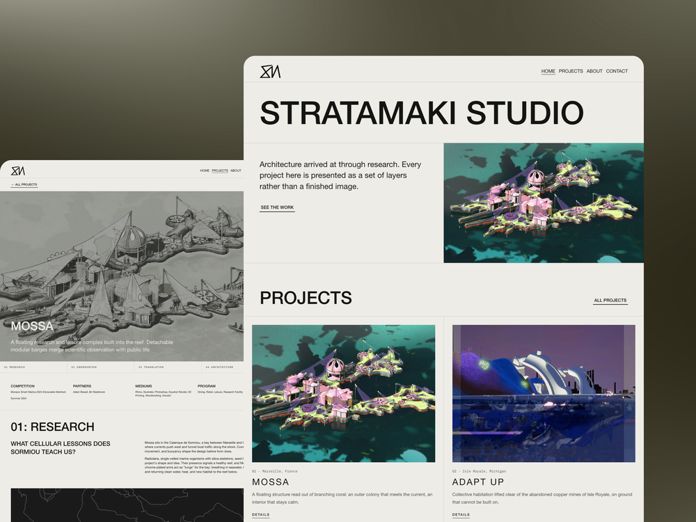
Stratamaki Studio, the practice of architect Michael Kats, had a website that showed finished renders, a name, and a contact link, and nothing else. The site skipped the site analysis and drawings behind every project, so anyone reviewing the work, a hiring panel, a collaborator, a prospective client, saw the final image and had no way to judge the thinking that produced it. We rebuilt the site in three weeks to fix exactly that gap.
Table of contents
The problem with a renders-only portfolio
What the rebuild actually changed
The layered project structure we built
The resume problem most architects ignore
What launched, and what it looks like now
What this case says about portfolio sites generally
FAQ
1. The problem with a renders-only portfolio
Michael Kats works between research and making, which means a huge part of what makes his projects strong happens before the final image exists: site analysis, early drawings, the reasoning behind a form. The previous version of his site never showed any of that. It presented a grid of polished final renders with nothing behind them, which meant visitors, including the hiring practices and panels reviewing his work, were judging taste rather than thinking, because taste was the only thing the site gave them to judge.
This is a common failure mode for architecture portfolios generally, and it's one we've written about separately in how to write an architecture portfolio that wins clients. A portfolio that shows only outcomes, no matter how beautiful, asks the viewer to trust that good thinking happened somewhere offscreen. A portfolio that shows the layers gives them the proof directly.
2. What the rebuild actually changed
The brief was specific: show each project as a set of layers, site, research, drawing, form, instead of one finished image standing in for the whole process. We scoped the project as a full design, build, and SEO engagement on Squarespace, and delivered it in three weeks, which reflects how a focused scope with a clear brief moves fast, something we cover more generally in why Squarespace works well for architecture firms.
Visually, we built a drawing-set aesthetic rather than a conventional glossy portfolio look: paper tones, hairline rules, and monospace metadata that reads like annotation on a drawing set rather than marketing copy. Each project got a numbered, located heading, treating the work the way a drawing index would, 01, Marseille, 02, Isle Royale, and so on, which reinforces the sense that this is a working body of research rather than a highlight reel.
3. The layered project structure we built
Every project page on the new site moves through the same sequence: site context first, then research, then drawing, then the resulting form. This structure does the work the old renders-only grid couldn't, because it gives a viewer the actual argument behind each project instead of asking them to infer it from a single finished image.
Five projects launched in this structure: Mossa, Adapt UP, Arid Logics, Outposts of Autonomy, and Synaptic. Each one reads as a complete case for the thinking behind it, not just a gallery entry. That consistency across all five projects is what makes the site function as what the brief called for: a portfolio that reads as a body of work, not a loose collection of final images.
4. The resume problem most architects ignore
Architecture portfolios routinely bury or skip a resume entirely, treating experience and credentials as separate from the project work, when in reality a hiring panel or collaborator reviewing a portfolio almost always wants both in the same place. We built Michael's experience, skills, education, and honours into the site directly, structured as an accordion so it stays accessible without competing with the project work for attention, and we added the full CV as a downloadable PDF for anyone who wants the complete record.
This detail matters more for an architect positioning for teaching, collaboration, and research-driven practice work than it would for a firm chasing only residential commissions, and the site states his availability for practice, collaboration, and teaching on every page, which keeps that positioning visible no matter which page a visitor lands on first.
5. What launched, and what it looks like now
The finished site gives Michael a single structure that holds every project consistently, with the CV built directly into the page instead of living in a separate file nobody downloads, and it's set up so he can add new projects himself without needing a developer for every update. That last point matters for the same reason it matters for any architecture practice: a portfolio that's easy to update is a portfolio that actually stays current.
Michael's own description of the result captures what changed: "Mikkel truly went above and beyond in creating a great website for me. Will definitely recommend to others in the future." You can see the finished portfolio itself at the Stratamaki Studio portfolio, including all five projects in the layered structure described above.
6. What this case says about portfolio sites generally
The specific fix here, showing research and drawings alongside final renders, won't apply identically to every architecture firm, because not every practice is built around the same research-forward process Michael's is. But the underlying lesson generalizes: a portfolio built around final images alone is always going to undersell the work behind them, whether that work is deep research, difficult site conditions, or complex client coordination. The fix is always some version of the same thing, showing the layer that's currently invisible.
For firms wondering whether their own portfolio has this same gap, the test is simple. Pick your three strongest projects and ask whether a stranger looking at the page would understand why the project turned out the way it did, or just that it turned out looking good. If it's the second, the fix Stratamaki Studio needed is probably the fix you need too.
The bottom line
A portfolio that only shows outcomes is making the viewer do work the website should be doing for them, which is connecting the dots between a problem and a design response. Stratamaki Studio's rebuild didn't make the work better, it just stopped hiding it.
FAQ
What type of architecture practice is Stratamaki Studio?
It's architect Michael Kats's practice, working between research and making, with a focus on showing the analytical process behind each project rather than only the finished design.
How long did the Stratamaki Studio website rebuild take?
Three weeks, covering design, build, and SEO as a single scoped engagement.
What platform was the new site built on?
Squarespace, which supported the drawing-set aesthetic, layered project structure, and self-editable CMS the project needed without custom development.
How many projects launched on the new site?
Five: Mossa, Adapt UP, Arid Logics, Outposts of Autonomy, and Synaptic, each shown in the full site-research-drawing-form structure.
Can Michael update the site himself now?
Yes. The site was built so new projects can be added directly without needing a developer, which keeps the portfolio current as new work completes.
More insights for architects