Website color psychology and how it influences perception and decisions
Color is not decoration. It is a silent language that shapes trust, emotion, and authority before a single word is read.
In this article:
Why website color psychology determines how your site is judged instantly
Website color psychology as a positioning tool rather than a trend
How color hierarchy guides attention without persuasion
Emotional pacing through website color psychology
Color psychology and perceived value
Cultural awareness in website color psychology
Conclusion

Start your project
Start your project with a free discovery call and see how we can bring your vision to life.
Why website color psychology determines how your site is judged instantly
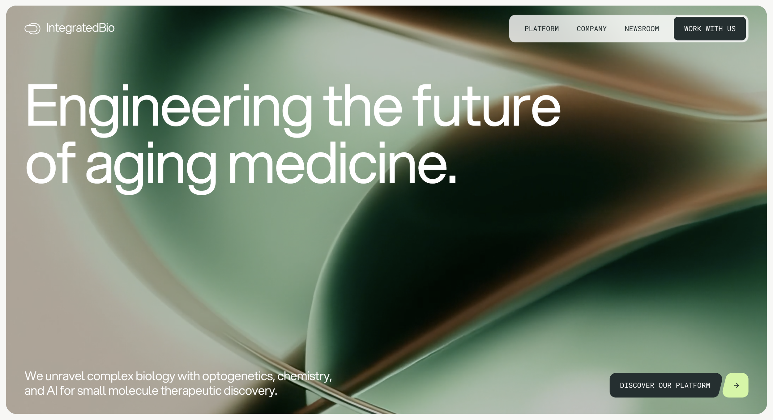
Website color psychology is one of the fastest acting forces in digital perception. Within milliseconds of landing on a page, visitors form an emotional judgment about credibility, relevance, and intent. This judgment happens before logic. It happens before copy. It even happens before layout is fully processed.
Most websites underestimate this moment. They treat color as a branding exercise rather than a positioning decision. The result is a site that may look attractive but fails to feel convincing.
Color choices communicate tone. They signal maturity or playfulness, restraint or urgency, clarity or chaos. When these signals are misaligned with the audience, no amount of explanation will fully recover trust.
Understanding website color psychology is not about choosing popular palettes. It is about shaping perception deliberately.
Website color psychology as a positioning tool rather than a trend
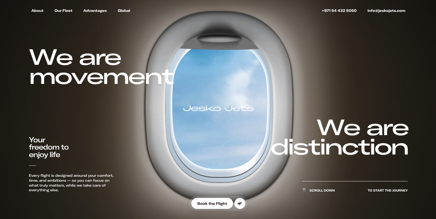
Color trends change quickly. Authority does not. This is why effective website color psychology is grounded in positioning rather than fashion.
Positioning driven color systems are designed to reflect how a business wants to be perceived in the mind of its audience. Calm palettes signal confidence. Controlled contrast signals clarity. Over stimulation often signals insecurity.
This is where many sites lose authority. They adopt vibrant colors to appear modern or energetic without considering whether that energy aligns with their message. The site becomes visually loud but strategically quiet.
Intentional color psychology prioritizes emotional alignment over attention grabbing. It understands that the most effective websites do not try to excite everyone. They resonate deeply with the right audience.
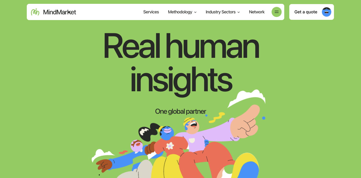
How color hierarchy guides attention without persuasion
Color hierarchy is one of the most powerful applications of website color psychology. It determines where attention flows and where it rests.
When hierarchy is clear, the eye moves effortlessly. Primary elements stand out. Supporting elements recede. Nothing competes unnecessarily. This visual calm is perceived as professionalism.
When hierarchy is unclear, users feel unsettled even if they cannot explain why. Too many competing colors create friction. The site feels harder to read, harder to understand, and harder to trust.
Effective color hierarchy uses restraint. It relies on repetition and consistency rather than novelty. Accent colors are earned through contrast, not saturation.
This approach allows calls to action to feel natural rather than forced. Attention is guided, not demanded.
Emotional pacing through website color psychology
Emotion is not static across a website. It should evolve as the user moves deeper. Website color psychology supports this pacing.
Initial sections often benefit from neutral or controlled tones that establish trust. As engagement increases, subtle shifts in color can introduce warmth, depth, or emphasis.
This progression mirrors human interaction. We do not lead with intensity. We build toward it.
Websites that use the same emotional intensity everywhere feel flat or overwhelming. Websites that shift tone thoughtfully feel considered and human.
Color transitions do not need to be dramatic. Often, the most effective shifts are barely noticeable yet deeply felt.
Color psychology and perceived value
Perceived value is closely tied to visual restraint. In website color psychology, less often communicates more.
Muted palettes, limited color counts, and intentional contrast signal focus. They imply that nothing is accidental. This perception increases trust and willingness to engage.
Conversely, excessive color variety often reduces perceived value. It suggests indecision or a lack of hierarchy. Even high quality content can feel diluted when surrounded by visual noise.
High value websites feel calm. Their color systems support reading, reflection, and clarity. They invite users to slow down rather than rush.
This sense of calm is increasingly rare and increasingly valuable.
Cultural awareness in website color psychology
Color meaning is not universal. Context matters. Website color psychology requires cultural awareness and audience understanding.
Certain colors carry different emotional associations depending on industry, geography, and expectation. Ignoring this context can unintentionally create friction.
However, cultural awareness does not mean defaulting to safe choices. It means making informed decisions. Sometimes breaking expectations intentionally can be powerful, but only when done with precision.
Authority is built when choices feel intentional rather than accidental.
Conclusion
Website color psychology is not about aesthetics alone. It is about perception, trust, and emotional alignment.
When color is treated as a strategic tool, it guides attention, establishes credibility, and reinforces positioning without explanation. It works quietly but relentlessly.
The most effective websites do not rely on color to impress. They rely on color to clarify. They understand that authority is felt long before it is understood.
In a digital landscape saturated with noise, intentional color psychology becomes a competitive advantage that cannot be replicated by templates or trends.
Start your project
Start your project with a free discovery call and see how we can bring your vision to life.
Don’t miss these