Top 10 best typography combinations 2026
The top 10 best typography combinations 2026 reveal how leading websites use type to create trust, shape perception, and signal design maturity from the first scroll.
In this article:
Why typography now determines whether a website feels elevated or forgettable
The top 10 list
What these typography combinations reveal about modern web design
Why typography choices influence alignment and trust
Conclusion

Start your project
Start your project with a free discovery call and see how we can bring your vision to life.
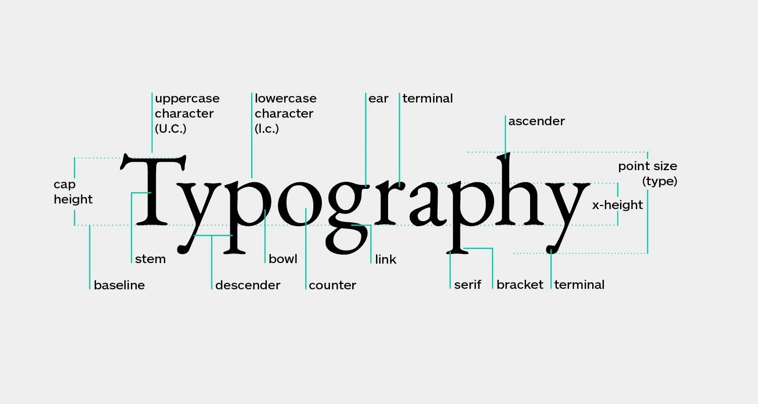
Why typography now determines whether a website feels elevated or forgettable
Typography has quietly become the most decisive element in modern web design. As layouts become cleaner and visual noise fades, type is no longer competing for attention. It is the attention. This is why the top 10 best typography combinations 2026 matter. They show how the most visually confident websites communicate identity, authority, and clarity without relying on excess graphics or complex layouts.
Users today are fluent in design language. They recognize default fonts immediately. They sense when typography feels templated rather than authored. In contrast, when type combinations feel intentional, the entire website feels considered. This feeling directly affects trust. It affects how long users stay. It affects whether they believe the brand knows what it is doing.
The examples below are not theoretical pairings. They are real, live websites that demonstrate how typography choices influence perception at the highest level of modern digital design.
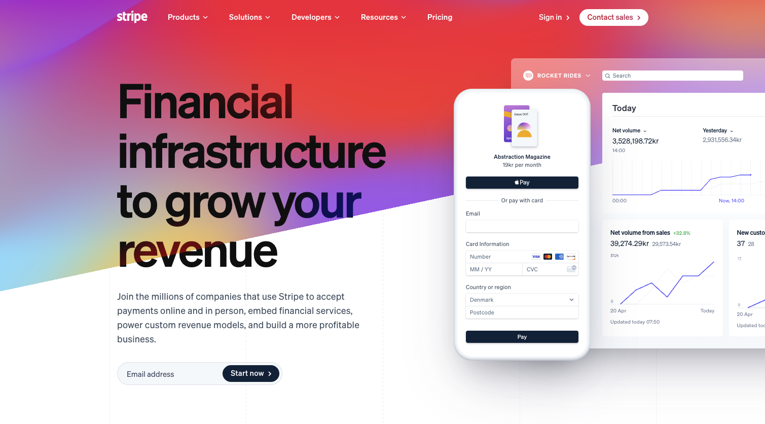
10. Stripe using Inter and custom display refinements
Stripe continues to set the standard for modern product driven websites, and its typography system remains one of the most studied. The combination is built primarily around Inter, a highly legible sans serif, paired with subtle custom refinements for larger headings.
What makes this pairing stand out in 2026 is not novelty but execution. Inter is everywhere, yet Stripe’s use of scale, spacing, and weight variation gives it a proprietary feel. Headlines are confident without being aggressive. Body text feels effortless and readable. The typography disappears into the experience, which is exactly the point.
This combination works because it supports clarity at scale. Complex ideas feel approachable. Dense information feels structured. The site feels calm even when presenting technical content.
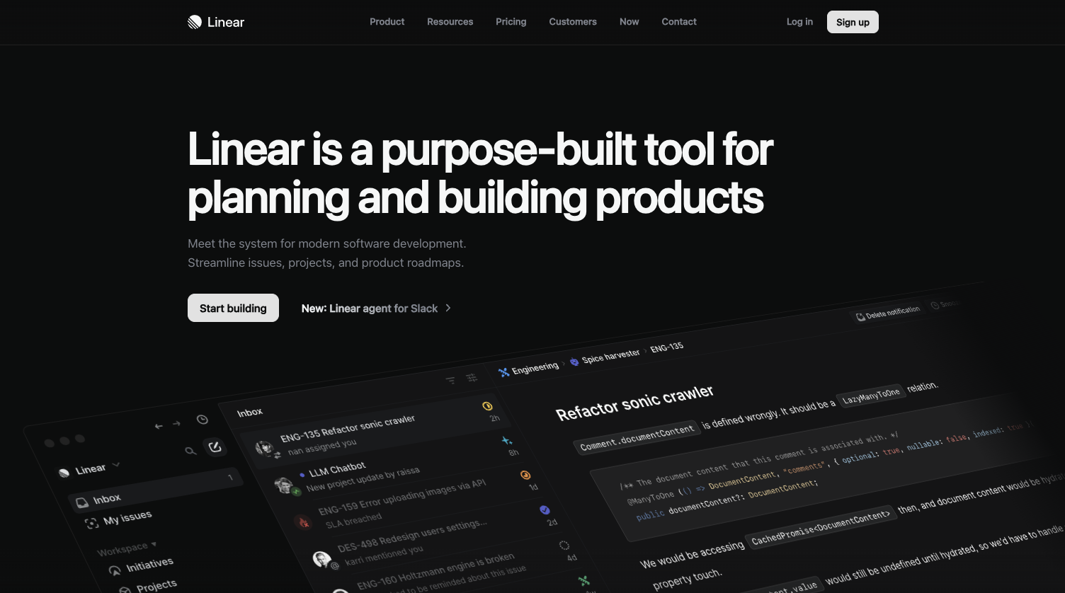
9. Linear using SF Pro inspired system with refined hierarchy
Linear’s website exemplifies modern restraint. Its typography relies on a system inspired by SF Pro, combined with precise hierarchy and generous spacing. The result is a layout that feels calm, efficient, and deeply intentional.
The pairing here is less about contrasting fonts and more about mastering a single family across multiple roles. Headings feel strong due to scale rather than weight. Body text is spaced for long reading sessions. Microcopy remains crisp and unobtrusive.
This approach reflects a growing trend in the top 10 best typography combinations 2026 where confidence is shown through limitation rather than variety.
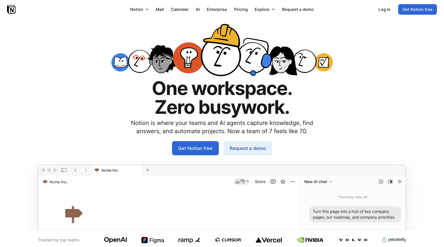
8. Notion using a softened sans serif system with expressive sizing
Notion’s typography has evolved into one of the most recognizable systems on the web. The site uses a friendly, neutral sans serif paired with expressive sizing and spacing to create warmth without sacrificing structure.
Headlines are large and welcoming. Body text feels conversational yet precise. The typography supports Notion’s positioning as both powerful and human. There is no tension between usability and personality.
This combination succeeds because it feels approachable while remaining disciplined. It invites exploration rather than intimidation.
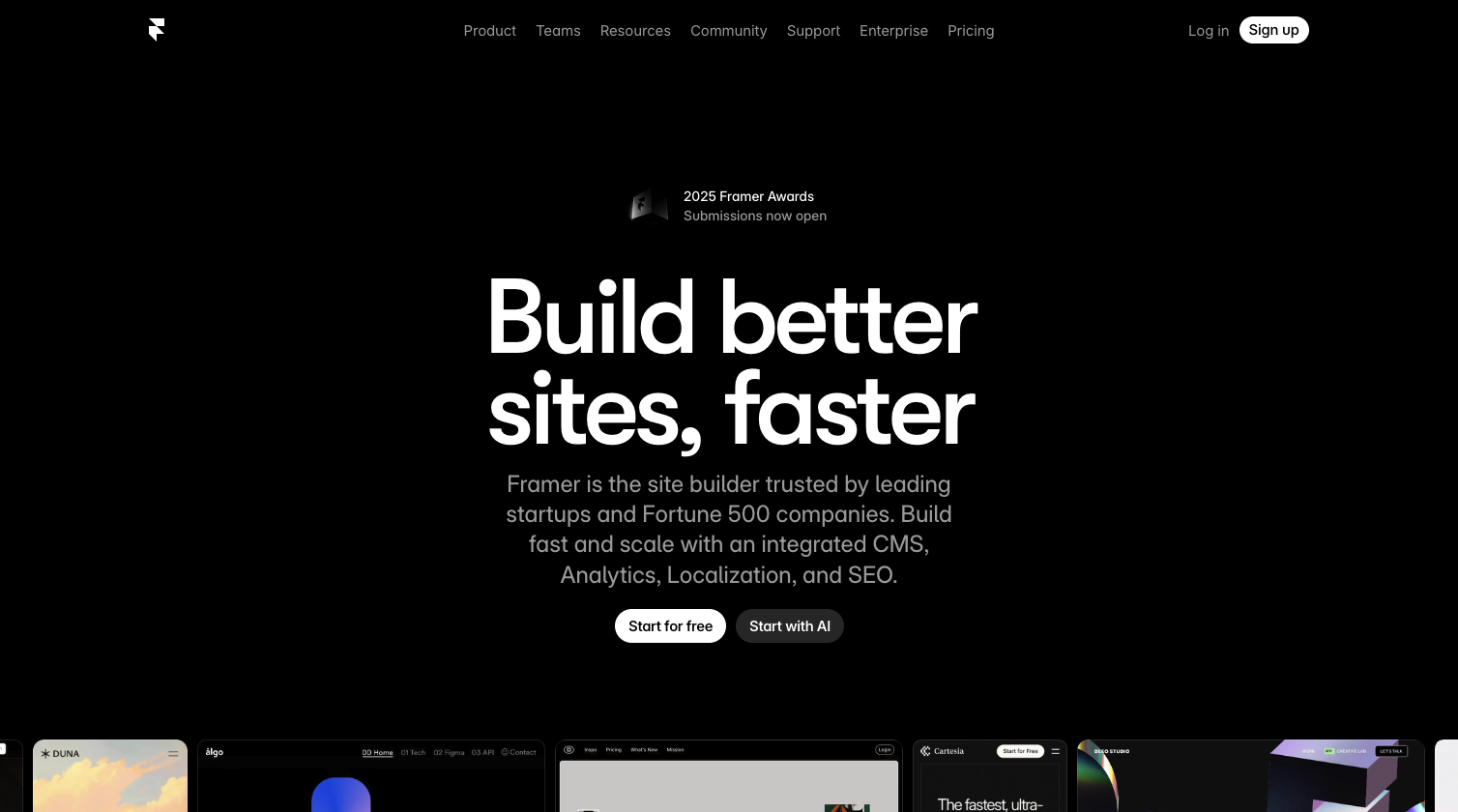
7. Framer using modern grotesk with bold editorial scale
Framer’s website uses a contemporary grotesk style font paired with dramatic scale shifts. Headlines are oversized and assertive. Supporting text is minimal and tightly controlled.
This typography combination feels editorial and confident. It assumes the visitor understands modern design language. There is very little explanation. The type does the talking.
In the context of the top 10 best typography combinations 2026, Framer stands out for how it uses scale rather than decoration to create impact.
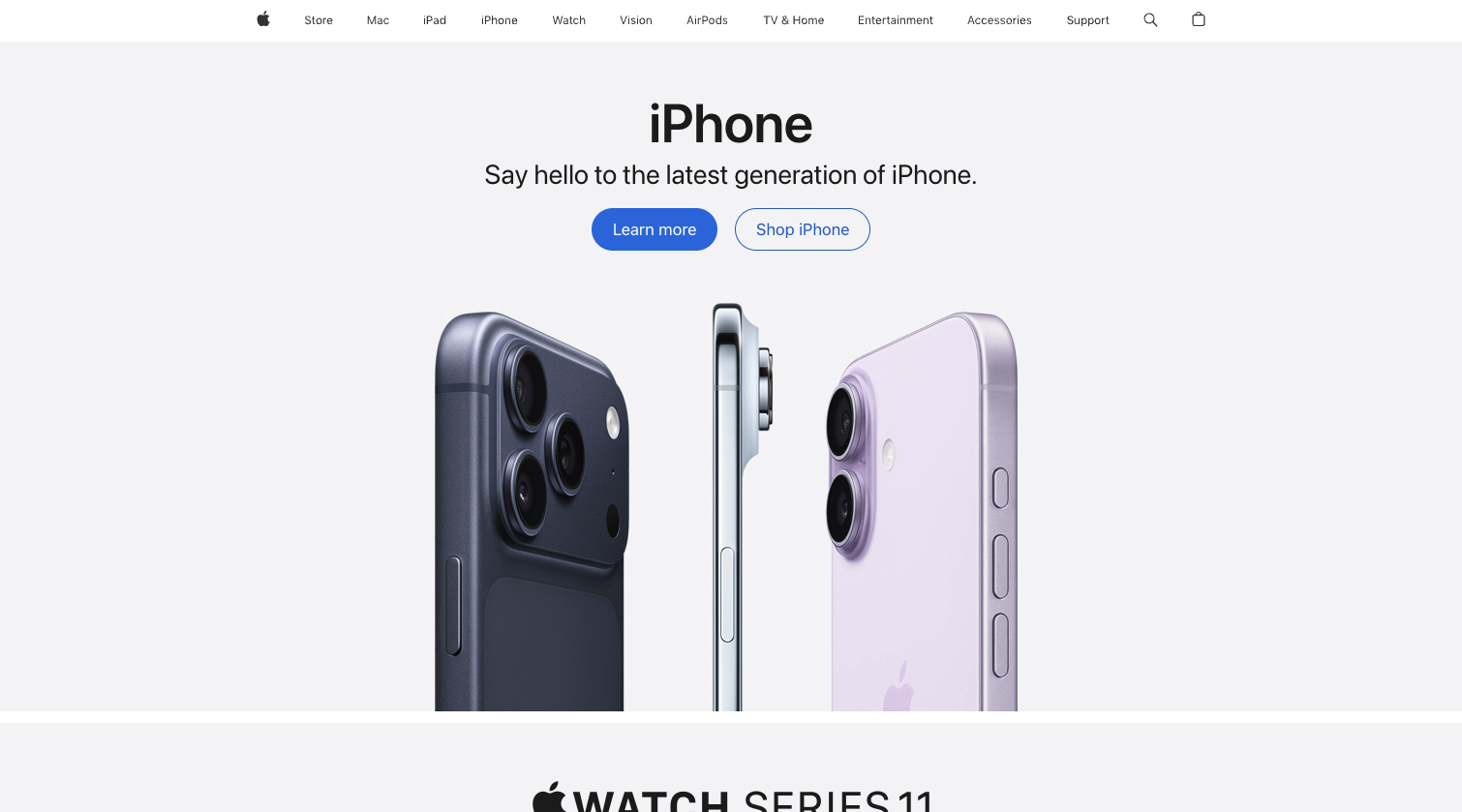
6. Apple using San Francisco with extreme typographic discipline
Apple remains a masterclass in typographic restraint. Its use of San Francisco across marketing pages demonstrates how hierarchy and spacing can create sophistication without experimentation.
Headlines feel precise. Body copy feels balanced. There is no unnecessary variation. The typography feels invisible, yet unmistakably Apple.
What keeps this system relevant in 2026 is consistency. The typography never competes with the product. It frames it. This level of discipline is difficult to achieve and easy to underestimate.
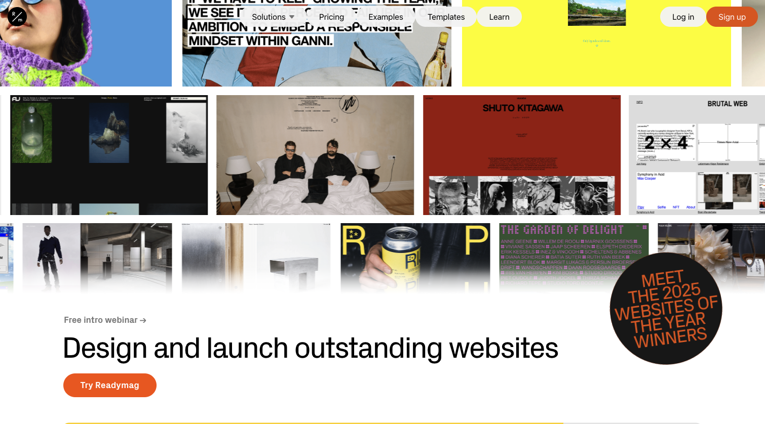
5. Readymag using expressive serif and sans serif contrast
Readymag’s website embraces a more expressive approach by pairing a character driven serif with a neutral sans serif. The contrast feels intentional and editorial.
The serif headlines add personality and depth. The sans serif body text maintains readability. Together, they create a narrative driven experience that feels crafted rather than constructed.
This pairing reflects a growing desire for warmth in digital typography. It shows how contrast can be emotional rather than aggressive.
4. Awwwards using modern serif headlines with clean body typography
Awwwards uses typography as a design statement. Large serif headlines paired with a clean sans serif body create an editorial, almost print like experience.
The serif adds authority and cultural weight. The sans serif ensures clarity. The spacing between elements allows each typographic choice to breathe.
This combination reinforces Awwwards’ role as a tastemaker. The typography feels confident and curated.
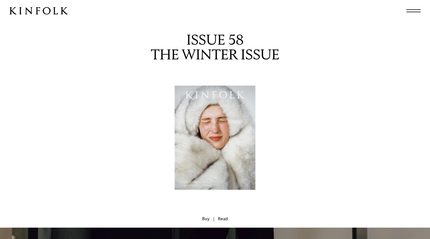
3. Kinfolk using refined serif led typography
Kinfolk’s digital presence mirrors its print legacy. The site uses elegant serif typography for headlines paired with understated supporting text.
The typography feels slow, intentional, and composed. It invites reading rather than scanning. The experience feels more like a publication than a website.
In the context of the top 10 best typography combinations 2026, Kinfolk demonstrates how typography can define tempo and mood.

2. Medium using evolved serif and sans pairing for long form clarity
Medium’s typography system has matured into one of the most readable on the web. A refined serif for article content paired with a clean sans serif for interface elements creates a clear distinction between reading and navigation.
This pairing prioritizes comfort. Long form content feels effortless. The interface fades into the background.
Medium proves that typography is not about visual dominance but about supporting human behavior.
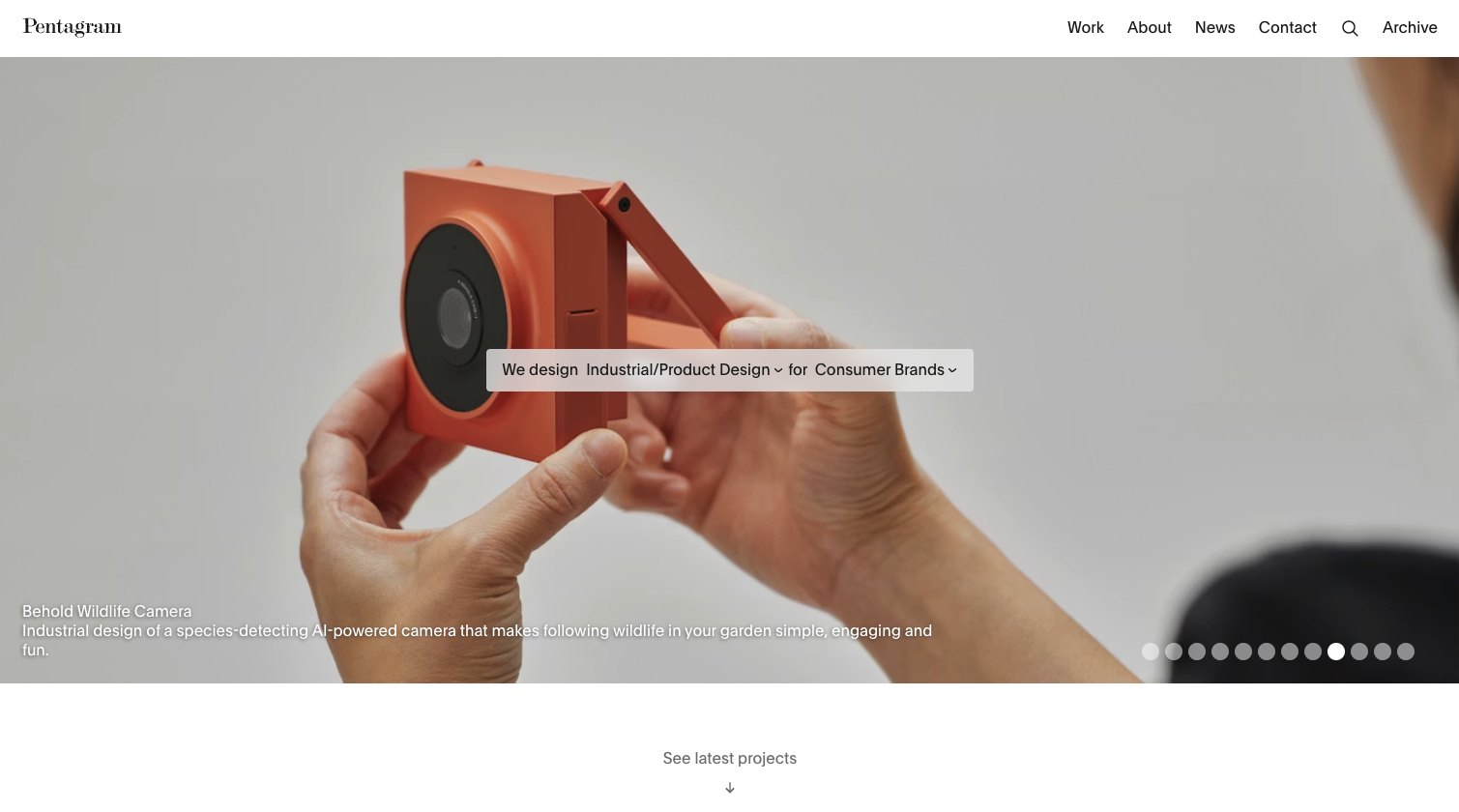
1. Pentagram using disciplined typographic authorship across digital experiences
Pentagram takes the top position in the top 10 best typography combinations 2026 because its digital presence reflects something most websites never achieve: typographic authorship. Rather than relying on a single formula, Pentagram’s site uses a highly disciplined pairing of a refined serif with a modern grotesk sans serif, executed with absolute restraint.
The serif headlines feel intellectual and composed, carrying the weight of cultural credibility. The sans serif supporting text is precise, neutral, and intentionally quiet. Together, they create a rhythm that feels editorial, architectural, and deeply considered. There is no excess scale, no decorative flair, no performative contrast. The confidence lies in proportion and spacing.
What sets Pentagram apart is how typography controls pacing. Headings introduce ideas without urgency. Body text invites slow reading. Negative space reinforces hierarchy rather than filling silence. The typography never asks for attention. It assumes it.
This combination defines the direction typography is moving in 2026. Away from trend chasing and toward authored systems that feel permanent. Pentagram demonstrates that when typography is treated as a design language rather than a visual layer, it becomes the foundation of trust, authority, and long term relevance.
What these typography combinations reveal about modern web design
Across all ten examples, a clear pattern emerges. The most effective typography systems are not about novelty. They are about intention. They rely on hierarchy, spacing, and proportion rather than excessive font variation.
The top 10 best typography combinations 2026 demonstrate that clarity is the new sophistication. Websites that master typography feel authored. They feel calm. They feel confident.
These examples also show that typography choices act as a filter. They attract users who appreciate thoughtfulness and restraint. They quietly communicate values without explanation.
Why typography choices influence alignment and trust
Typography is one of the first signals users interpret. Before reading content, they feel the type. They sense whether it aligns with their expectations. This is why typography decisions influence trust so deeply.
When type feels intentional, users assume the same care applies to the rest of the experience. When type feels generic, doubt enters immediately.
These examples show how typography becomes part of positioning rather than decoration.
Conclusion
The top 10 best typography combinations 2026 highlight how real websites use type to create clarity, authority, and emotional resonance. These examples prove that typography is no longer a secondary design choice. It is a primary driver of perception and trust.
Each site demonstrates a different approach, yet all share a commitment to restraint, hierarchy, and intention. They show that the strongest typography systems do not demand attention. They earn it.
As digital experiences continue to simplify visually, typography will carry even more responsibility. The brands that understand this will continue to stand apart through quiet confidence and unmistakable clarity.
Start your project
Start your project with a free discovery call and see how we can bring your vision to life.
Don’t miss these