How to design a landing page that attracts the right clients
A considered approach to design a landing page that turns attention into intent by aligning visual structure, narrative flow, and brand authority.
In this article:
Why most landing pages fail before the message lands
Designing a landing page as a controlled visual narrative
Visual hierarchy and layout decisions that signal authority
Using imagery and typography to reinforce positioning
Designing a landing page that qualifies as much as it converts
Conclusion

Start your project
Start your project with a free discovery call and see how we can bring your vision to life.
Why most landing pages fail before the message lands
To design a landing page well is not about assembling sections or following patterns copied from competitors. Most landing pages underperform because they are built to explain rather than to position. They focus on saying everything instead of revealing the right thing at the right moment.
Visitors arrive with skepticism. They scan before they read. They assess credibility before they consider conversion. If the page feels generic, crowded, or overly eager, trust erodes instantly. This is not a copy problem or a traffic problem. It is a design problem rooted in hierarchy, restraint, and narrative clarity.
The most effective landing pages feel composed. They give the impression that nothing is accidental. Each section earns its place. Each visual decision reinforces the brand behind the offer. This is the difference between a landing page that asks for attention and one that commands it.
Designing a landing page as a controlled visual narrative
When you design a landing page through an editorial lens, you stop thinking in sections and start thinking in sequences. The page becomes a guided experience rather than a container for information.
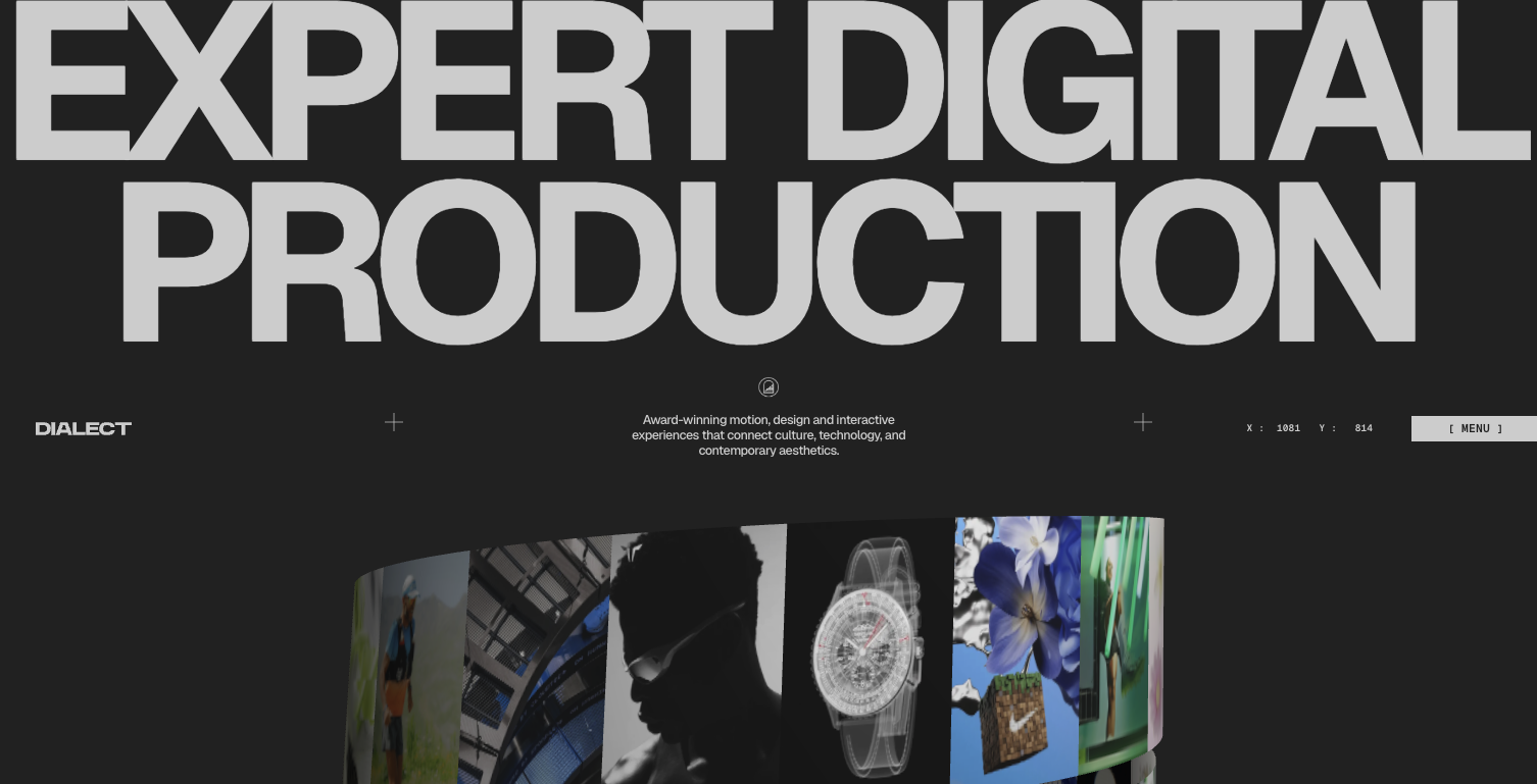
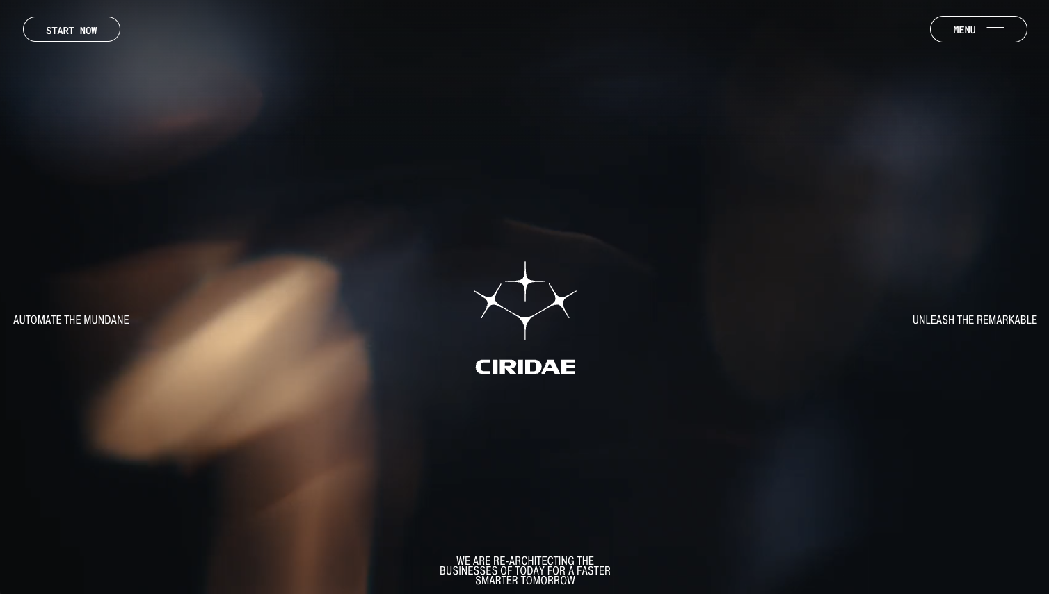
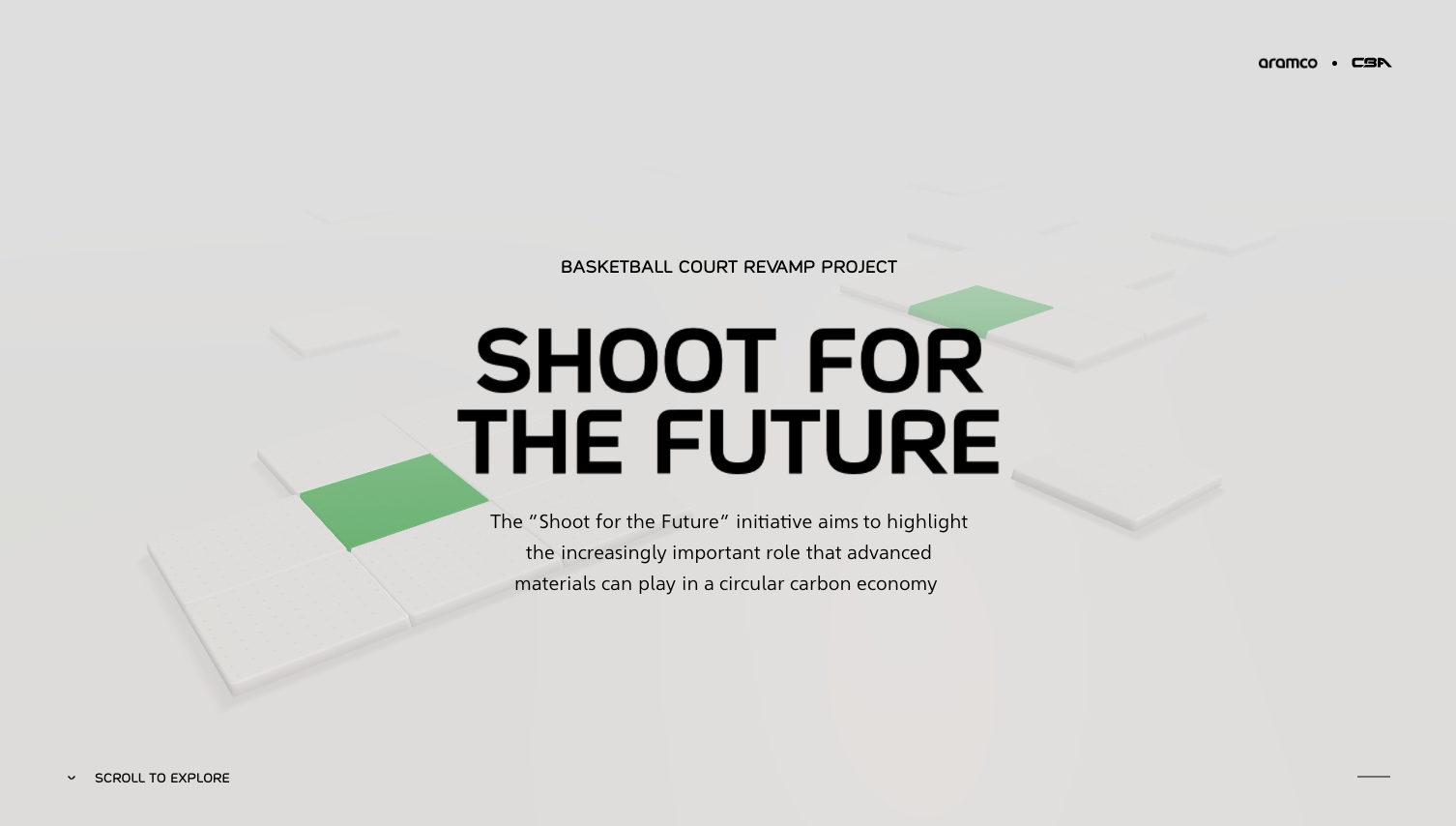
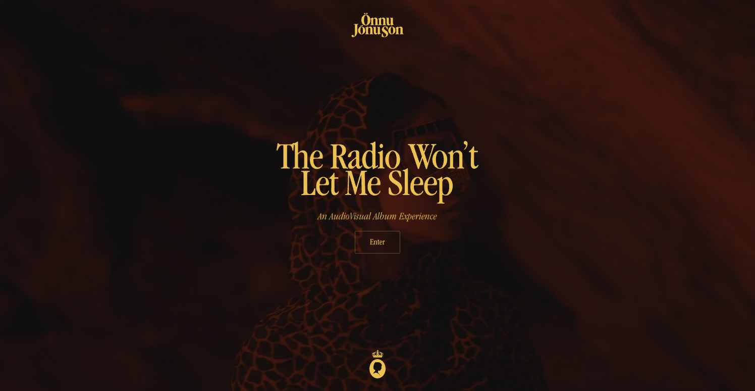
The opening frame sets emotional context. This is where tone is established visually, long before the copy is processed. Layout width, spacing, imagery style, and typography weight all communicate signals about confidence, clarity, and intent. A composed hero area does not rush to convince. It introduces presence.
As the page unfolds, rhythm becomes critical. Alternating density and openness keeps the reader engaged. White space allows ideas to land. Structured grids guide the eye naturally downward. The best landing pages feel effortless to scroll because the design anticipates how attention moves.
This narrative approach means every visual element supports the story. Imagery is not decorative. It reinforces the promise. Typography is not expressive for its own sake. It establishes hierarchy and pace. Color is used to emphasize decisions, not to entertain.
Visual hierarchy and layout decisions that signal authority
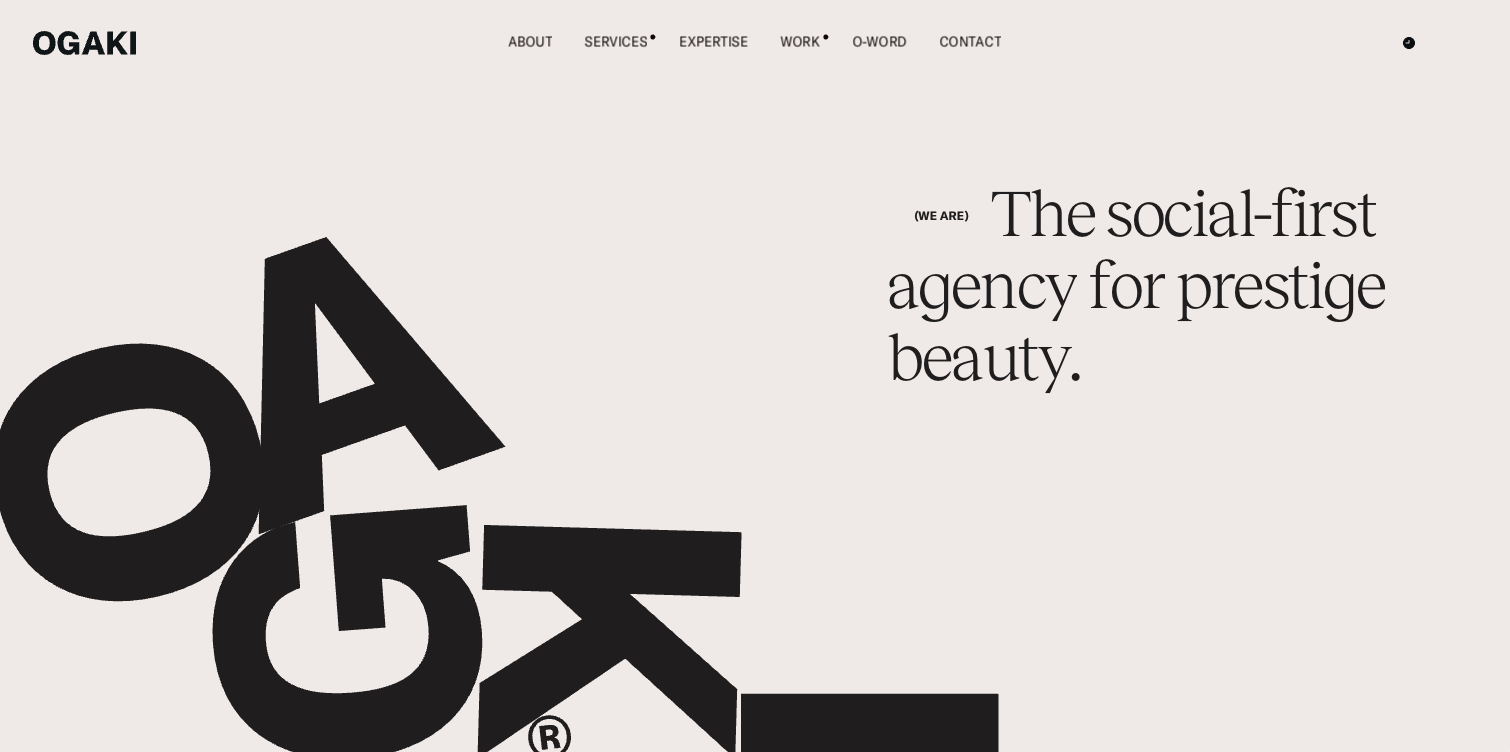
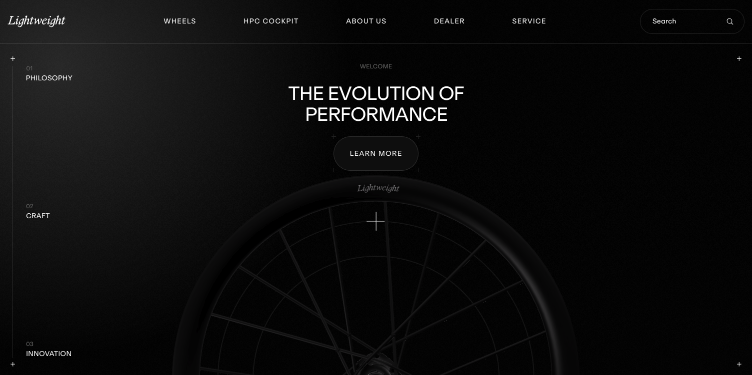
To design a landing page that attracts discerning clients, hierarchy must be unmistakable. Visitors should never wonder what matters most. This clarity does not come from size alone. It comes from contrast, alignment, and intentional restraint.
Primary messages need space to exist without competition. Secondary content should support without distracting. When everything is emphasized, nothing is trusted. Authority is communicated through what is left out as much as what is included.
Consider how spacing functions psychologically. Generous margins signal confidence. Tight clusters signal urgency. Both can be effective when used intentionally, but mixing them without purpose creates confusion. A strong layout establishes a consistent spatial language that the visitor subconsciously learns as they scroll.
Alignment also plays a role in perceived quality. Clean vertical and horizontal relationships create calm. Misalignment creates friction. High end landing pages feel quiet because the layout does not fight for attention. It guides it.
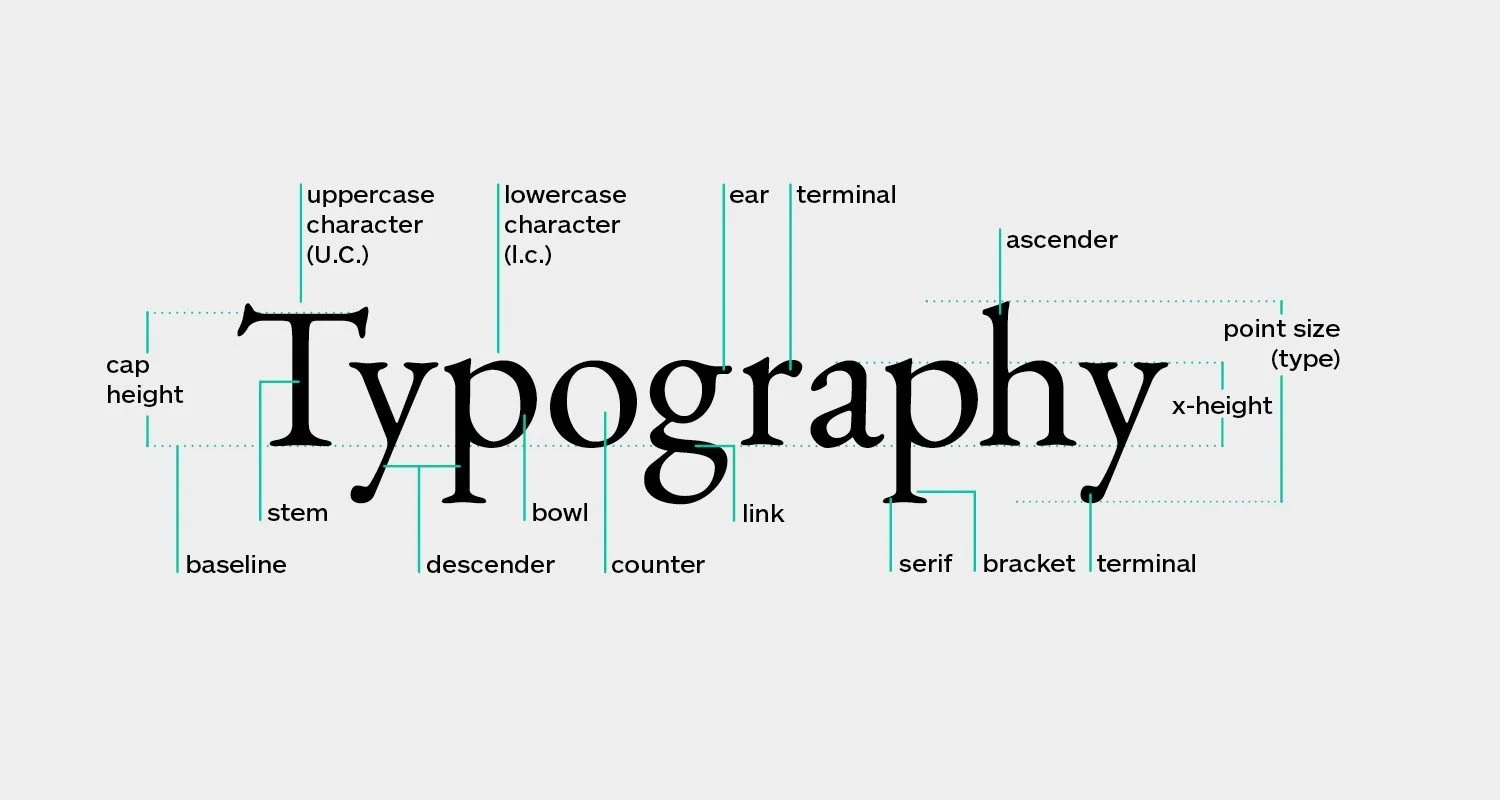
Using imagery and typography to reinforce positioning
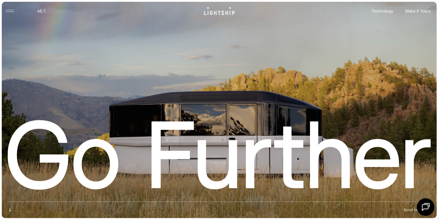
Imagery is often where landing pages lose credibility. Stock visuals, overly literal illustrations, or mismatched photography styles dilute the message instantly. When you design a landing page with positioning in mind, imagery becomes a narrative device rather than a filler.
Strong imagery suggests context without explanation. It creates mood and expectation. It implies outcomes rather than spelling them out. This subtlety is what separates aspirational pages from transactional ones.
Typography carries similar weight. Type choices communicate era, intent, and confidence. A restrained typographic system with clear hierarchy feels intentional. Overly complex systems feel performative. The goal is not to impress designers but to create a reading experience that feels considered and trustworthy.
When typography and imagery are aligned, the page gains cohesion. The brand feels singular rather than assembled. This cohesion is what makes visitors linger and explore instead of bounce.
Designing a landing page that qualifies as much as it converts
Not every visitor should convert, and a well designed landing page understands this. Design choices naturally filter audiences by taste, expectations, and values.
A composed, editorial layout attracts visitors who appreciate clarity and intention. These visitors are more likely to engage deeply and consider long term value. A page built on restraint signals that the brand is selective, not desperate.
This qualification happens visually. It happens through pacing, through the confidence to slow the scroll, and through the absence of unnecessary persuasion. When the page feels grounded, visitors project competence onto the brand behind it.
The result is not higher volume but higher quality engagement. The page becomes a conversation starter rather than a pitch deck.
Conclusion
To design a landing page at a high level is to understand that conversion is a byproduct of trust, not pressure. The most effective landing pages are visually calm, narratively clear, and strategically restrained. They do not chase attention. They organize it.
When design decisions are made with intention, the page communicates authority before it communicates features. It attracts the right audience by being unapologetically composed. This is what transforms a landing page from a marketing asset into a brand experience.
In a crowded digital landscape, this level of design discipline is what makes a landing page memorable, credible, and quietly persuasive.
Start your project
Start your project with a free discovery call and see how we can bring your vision to life.
Don’t miss these