Website layout guide 2026 for effective design and lead generation
Website layout guide 2026 outlines the principles, patterns, and strategies needed to design websites that attract high-value leads and communicate brand authority.
In this article:
Why website layout matters for positioning
Core principles of website layout 2026
Patterns that enhance usability and engagement
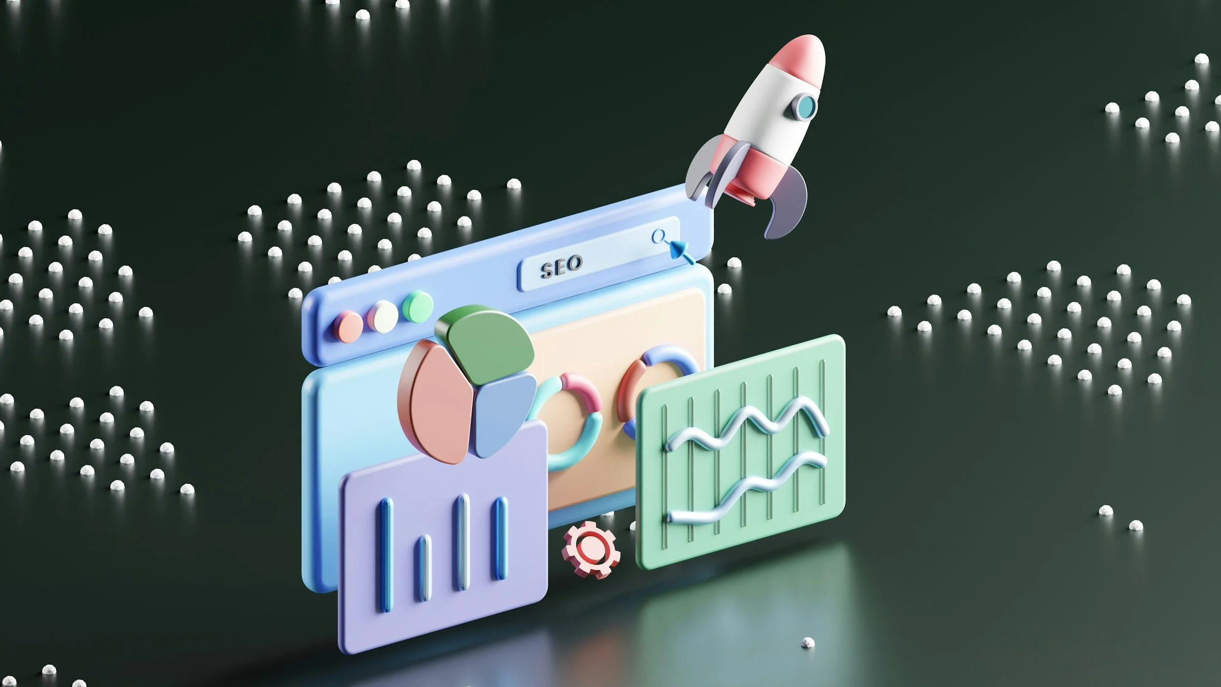
Visual storytelling through layout
Optimizing layout for lead generation
Common mistakes to avoid in 2026
Testing and refining your layout
Conclusion

Start your project
Start your project with a free discovery call and see how we can bring your vision to life.
Why website layout matters for positioning
The layout of a website does more than organize content; it communicates your agency’s perspective and approach. In 2026, users expect websites to guide them intuitively, highlight priorities, and reflect the quality of the brand behind the page.
A strong layout impacts both perception and action. Visitors form judgments about a company within seconds, often based on visual hierarchy, spacing, and clarity of information. Poor layout can undermine credibility and reduce engagement, even if your services are exceptional.
Strategic layout positions your agency as thoughtful and deliberate. Every section, image, and headline should serve a purpose: guiding users, reinforcing brand narrative, and attracting clients who are aligned with your standards.
By structuring information hierarchically, the page communicates which content is most important and which decisions are expected from visitors. High-value clients are drawn to layouts that are confident, clear, and easy to navigate. This pre-qualifies leads naturally without overt persuasion.
In 2026, effective layouts will continue to combine functional design with storytelling. Visual patterns, whitespace, and typography are not just aesthetic, they become signals of authority and refinement. Layout is the silent guide that turns casual visitors into engaged prospects.
Core principles of website layout 2026
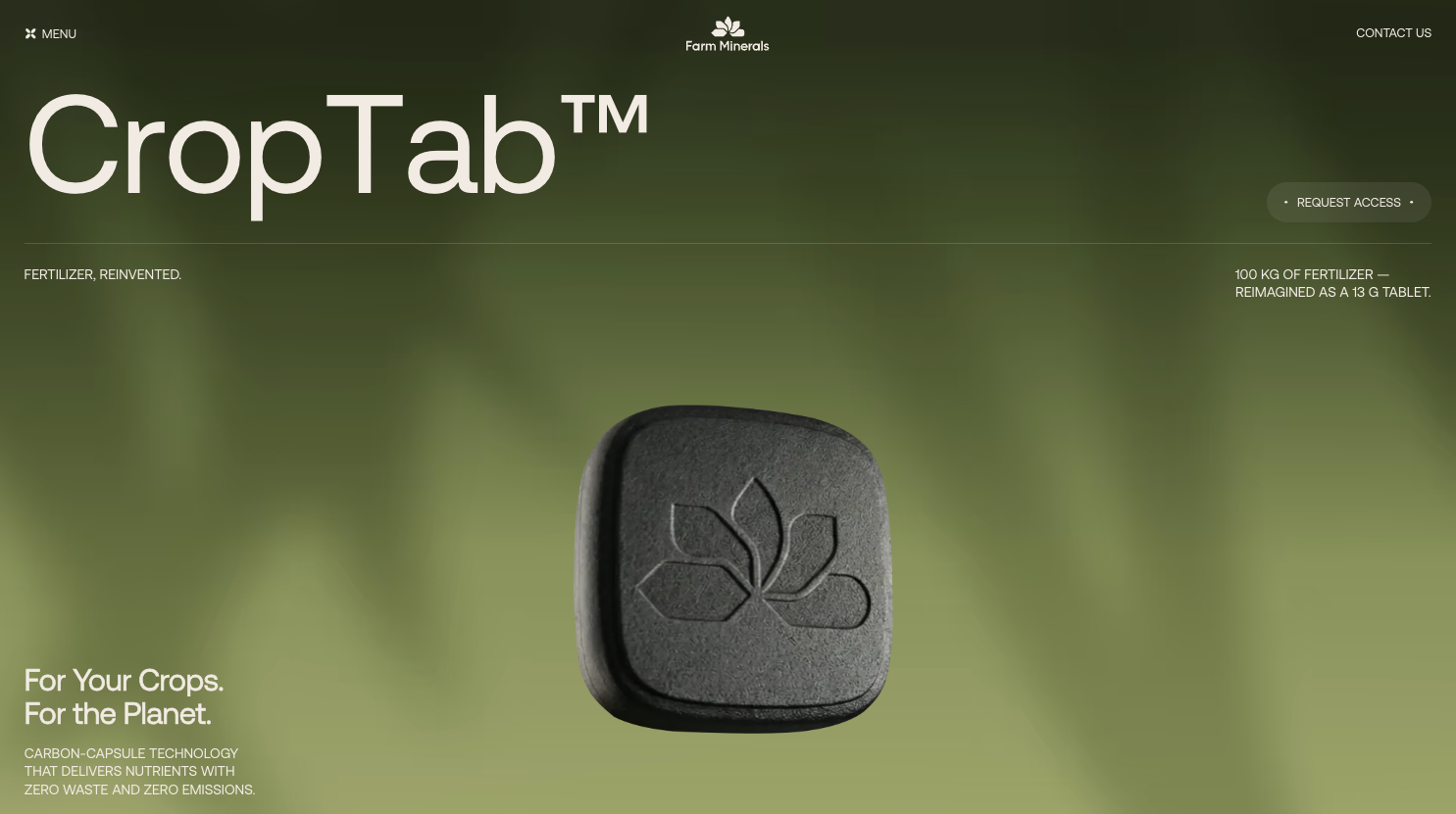
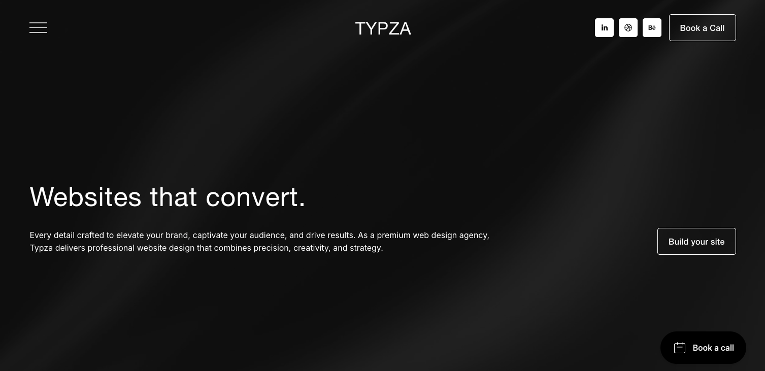
The first principle of effective website layout is clarity. A visitor should know what to focus on immediately and understand how to navigate the content. This is achieved through consistent spacing, hierarchy, and clear sectioning. Headlines and subheadings direct attention, while visual cues like imagery or lines subtly guide the eye.
Second, layouts must reinforce narrative. Pages are not simply containers for content, they are storytelling tools. Visual flow communicates logic and sequence. A visitor should be able to follow the page from problem to solution, feeling confident about the expertise behind every section.
Third, responsive and adaptive design is non-negotiable. In 2026, users will access sites from multiple devices with varying screen sizes. Layouts must adapt seamlessly, ensuring that hierarchy, visuals, and key messaging remain clear at any scale.
Finally, intentionality drives effectiveness. Every element, from button placement to whitespace, should be purposeful. This ensures that the layout communicates standards, creates visual focus, and emphasizes outcomes, guiding visitors toward meaningful action without aggressive prompts.
These principles collectively ensure that a website layout positions your brand, communicates expertise, and attracts high-value clients who recognize quality when they see it.
Patterns that enhance usability and engagement
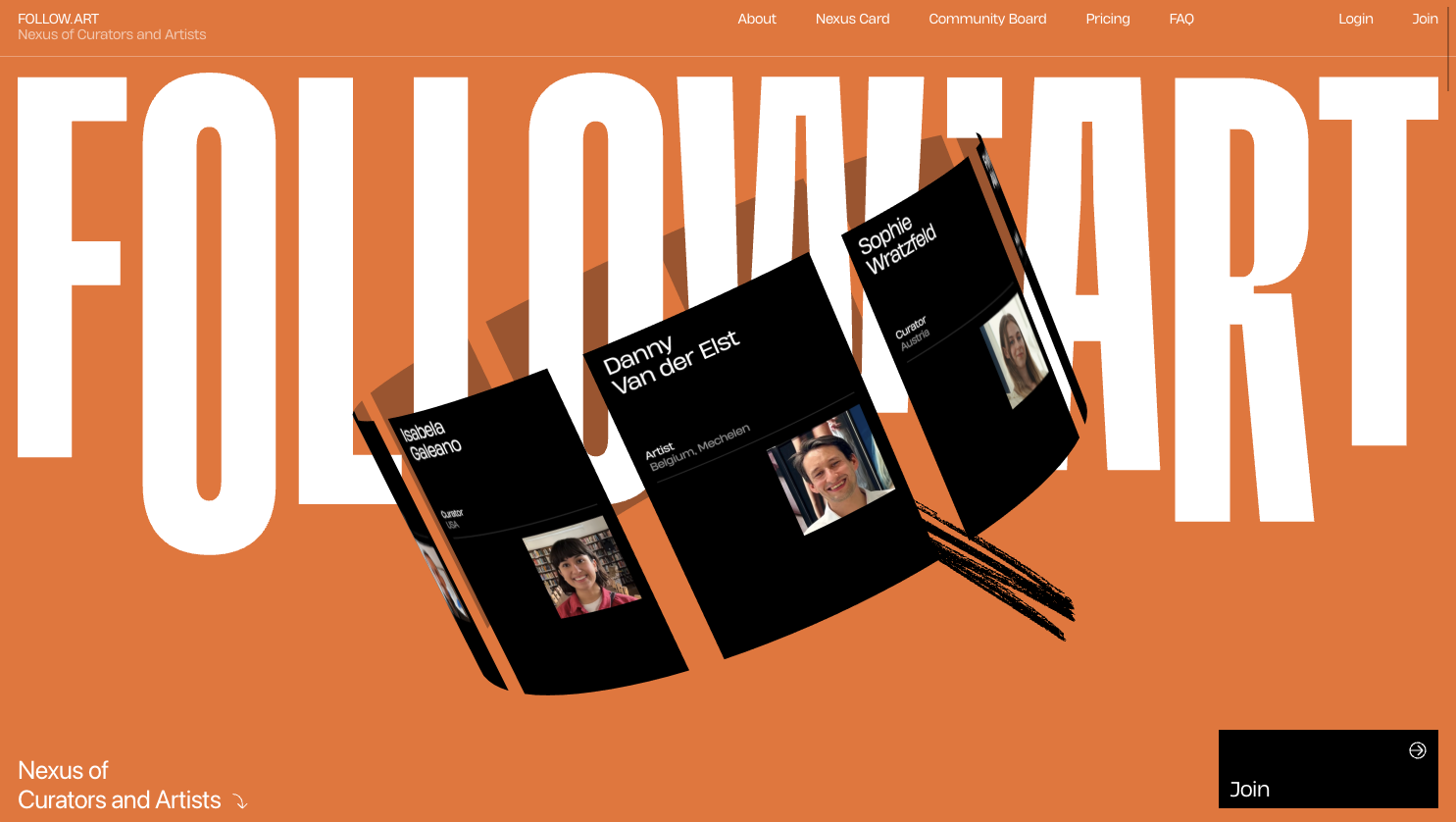
Successful layouts in 2026 are built on recognizable patterns that improve usability while supporting brand storytelling. Hero sections with clear value statements, visual hierarchy that separates key messaging from supporting content, and strategically placed calls to action are essential.
Grid-based layouts remain highly effective for organizing complex content without overwhelming visitors. Grids allow flexibility while maintaining balance, letting designers highlight priority sections and sequence secondary information. Cards and modular blocks provide clarity and offer opportunities for visual storytelling, such as demonstrating process steps or client outcomes.
Whitespace is more than a design choice, it signals confidence and helps users focus on important elements. By leaving space around content, designers create breathing room that enhances comprehension, makes the page feel intentional, and increases perceived value.
Interactive elements such as hover states, animated transitions, or progressive disclosure help guide engagement without forcing users. Subtle micro-interactions confirm choices, reinforce hierarchy, and demonstrate attention to detail.
A well-chosen combination of these patterns ensures that layouts remain usable, engaging, and strategically aligned with positioning goals. They provide the structure to guide visitors from awareness to consideration, preparing them for conversion.
Visual storytelling through layout
Layouts in 2026 are expected to communicate story as much as information. Strategic use of visuals can illustrate process, clarify complex concepts, and emphasize outcomes.
Illustrations, diagrams, or workflow visuals allow visitors to understand service delivery at a glance. For example, a three-step process displayed visually communicates efficiency, rigor, and clarity. Photography or high-quality imagery communicates context and sets the tone for brand standards.
Typography and spacing play a role in visual storytelling. Headings indicate sequence and importance, body text provides clarity, and spacing ensures readers can process information comfortably. Color choices, contrast, and alignment reinforce hierarchy and highlight essential messages.
Visual storytelling also guides pacing. Large visuals or full-width imagery can pause attention, emphasize key sections, and create focus on narrative peaks. Combined with supporting text, these layouts help visitors follow the story without feeling overwhelmed.
Every visual choice contributes to perception, signaling professionalism, clarity, and intentionality. For high-value clients, these cues pre-qualify the visitor as someone aligned with your standards.
Optimizing layout for lead generation
Lead generation is built into every effective layout. Placement of forms, calls to action, and interactive elements must align with user flow. The layout should create natural opportunities for engagement rather than forcing it prematurely.
Effective layouts guide visitors through a journey: establishing context, highlighting problems, showcasing solutions, and inviting action. The flow should feel intuitive, reinforcing understanding while maintaining interest.
Placement of key conversion elements is intentional. Forms or inquiry prompts appear at logical points where visitors have gained enough context to act. Secondary CTAs support engagement without distracting from the primary goal.
Layout also communicates value to high-end clients. Sections that demonstrate process, outcomes, and expertise subtly indicate standards and pricing expectations, ensuring that inquiries are pre-qualified. Visitors feel informed and confident, ready to engage in high-level discussions rather than low-value negotiations.
Common mistakes to avoid in 2026
Despite evolving standards, some layout mistakes persist. Overcrowded pages, inconsistent spacing, unclear hierarchy, or excessive features can confuse visitors and reduce trust.
Ignoring mobile optimization is another critical error. Layouts must adapt to various devices, ensuring the narrative, hierarchy, and visual storytelling remain intact.
Generic layouts without purpose fail to guide action. Every section must have intentionality. Visitors should understand the problem, solution, and next steps without being told explicitly.
Overuse of animation or unnecessary elements can distract from storytelling and hierarchy. Minimalist design with clear intention ensures clarity while maintaining engagement.
Avoiding these mistakes ensures that a layout positions your brand effectively, communicates process clearly, and attracts the right visitors for meaningful engagement.
Testing and refining your layout
Layouts are rarely perfect on the first attempt. Testing allows you to understand how visitors interact with content and where adjustments are needed.
A/B testing different layouts, sequence of content, visual emphasis, or placement of conversion elements reveals insights about behavior and engagement. Heatmaps and user session tracking provide data about where attention is drawn and where friction occurs.
Refinement is not about increasing features but optimizing clarity and flow. Adjustments to hierarchy, spacing, or visual storytelling can significantly improve comprehension and conversion.
Regular evaluation ensures that your layout remains effective as expectations, devices, and trends evolve. In 2026, continual refinement is key to maintaining positioning and lead quality.
Conclusion
Website layout guide 2026 emphasizes clarity, hierarchy, narrative, and visual storytelling. Layout is not just functional, it communicates perspective, builds trust, and guides visitors toward meaningful engagement.
Strategic layouts attract high-value leads, pre-qualify clients through design, and reflect standards without needing overt explanation. Visual storytelling, intentional spacing, and purposeful hierarchy help visitors understand process and outcomes quickly.
A strong layout balances usability, aesthetic, and messaging to position your agency effectively. By following these principles, your website communicates competence, professionalism, and intentionality, making the right clients confident and ready to engage.
Start your project
Start your project with a free discovery call and see how we can bring your vision to life.
Don’t miss these