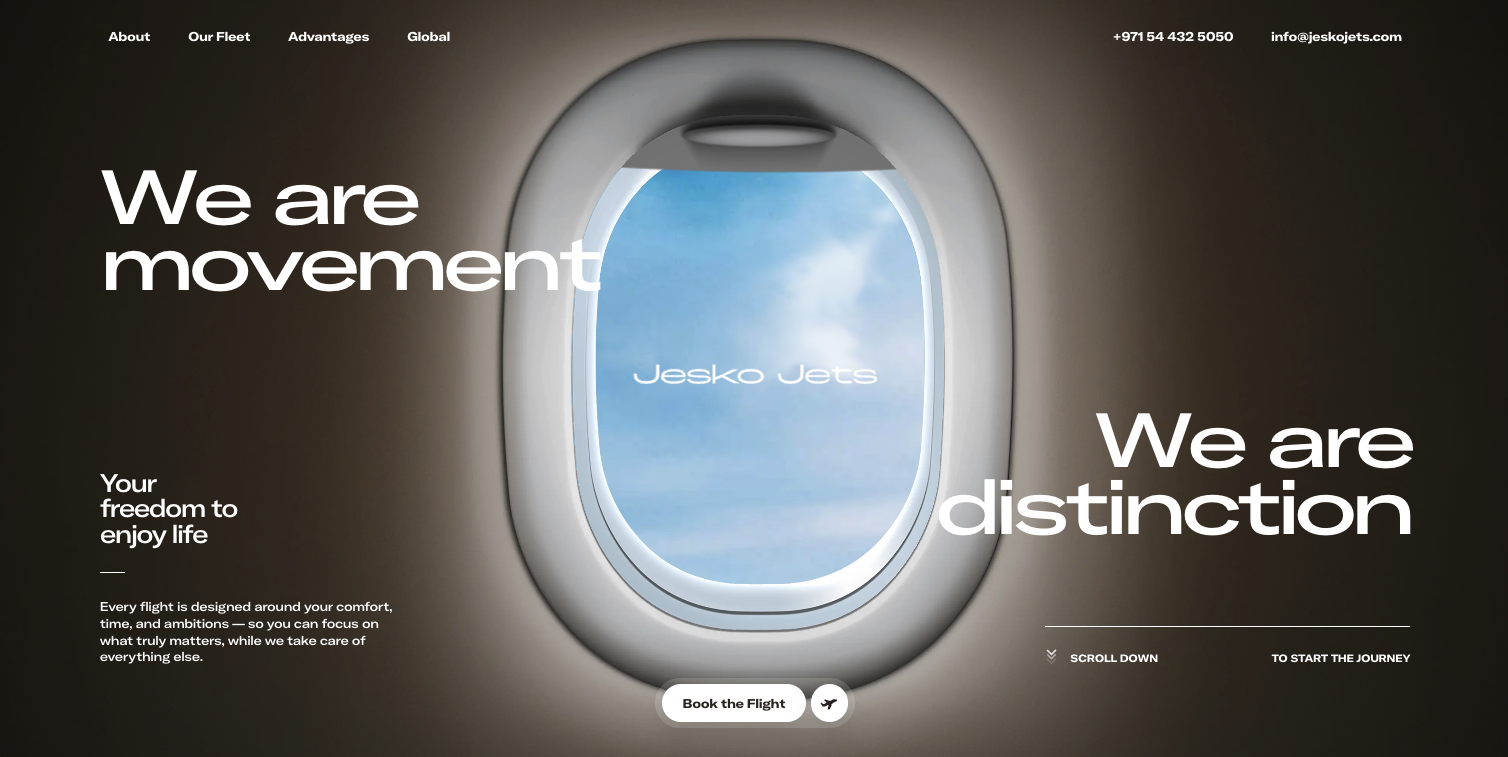
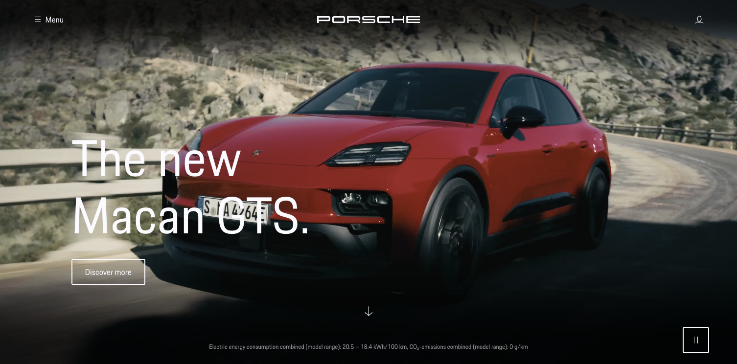
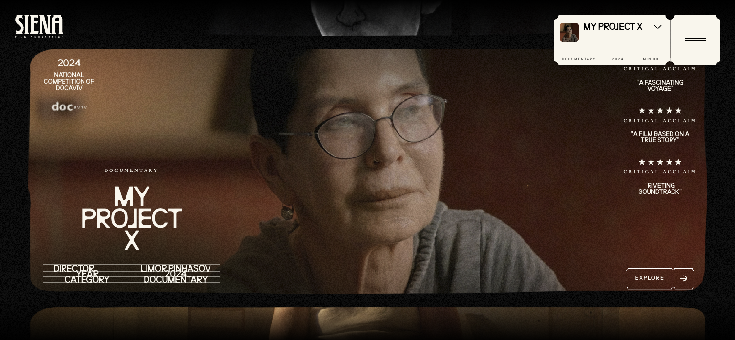
How to use icons in web design to create clarity and authority
A refined approach to icons in web design transforms interfaces from functional layouts into composed visual systems that feel intuitive, intentional, and trustworthy.
In this article:
Why icons in web design often undermine credibility instead of improving it
The role of icons in web design as visual language
How icon style influences brand perception
Using icons in web design to guide attention and flow
Icons as part of a composed design system
Conclusion

Start your project
Start your project with a free discovery call and see how we can bring your vision to life.
Why icons in web design often undermine credibility instead of improving it
Icons in web design are frequently treated as minor decorative elements, added late in the process to fill space or replace words. This misunderstanding leads to cluttered interfaces, inconsistent visual language, and diluted brand perception. Instead of guiding users, poorly considered icons create hesitation. Visitors pause to interpret meaning rather than move forward with confidence.
When icons feel generic, mismatched, or excessive, they signal a lack of restraint. They suggest that the design is trying to compensate for unclear messaging or weak hierarchy. High level web design does not rely on icons to explain everything. It uses them selectively to reinforce structure, rhythm, and comprehension.
The most effective icons feel inevitable. They appear exactly where expected, communicate instantly, and disappear into the experience rather than drawing attention to themselves. This level of precision is not accidental. It is the result of intentional design thinking.
The role of icons in web design as visual language
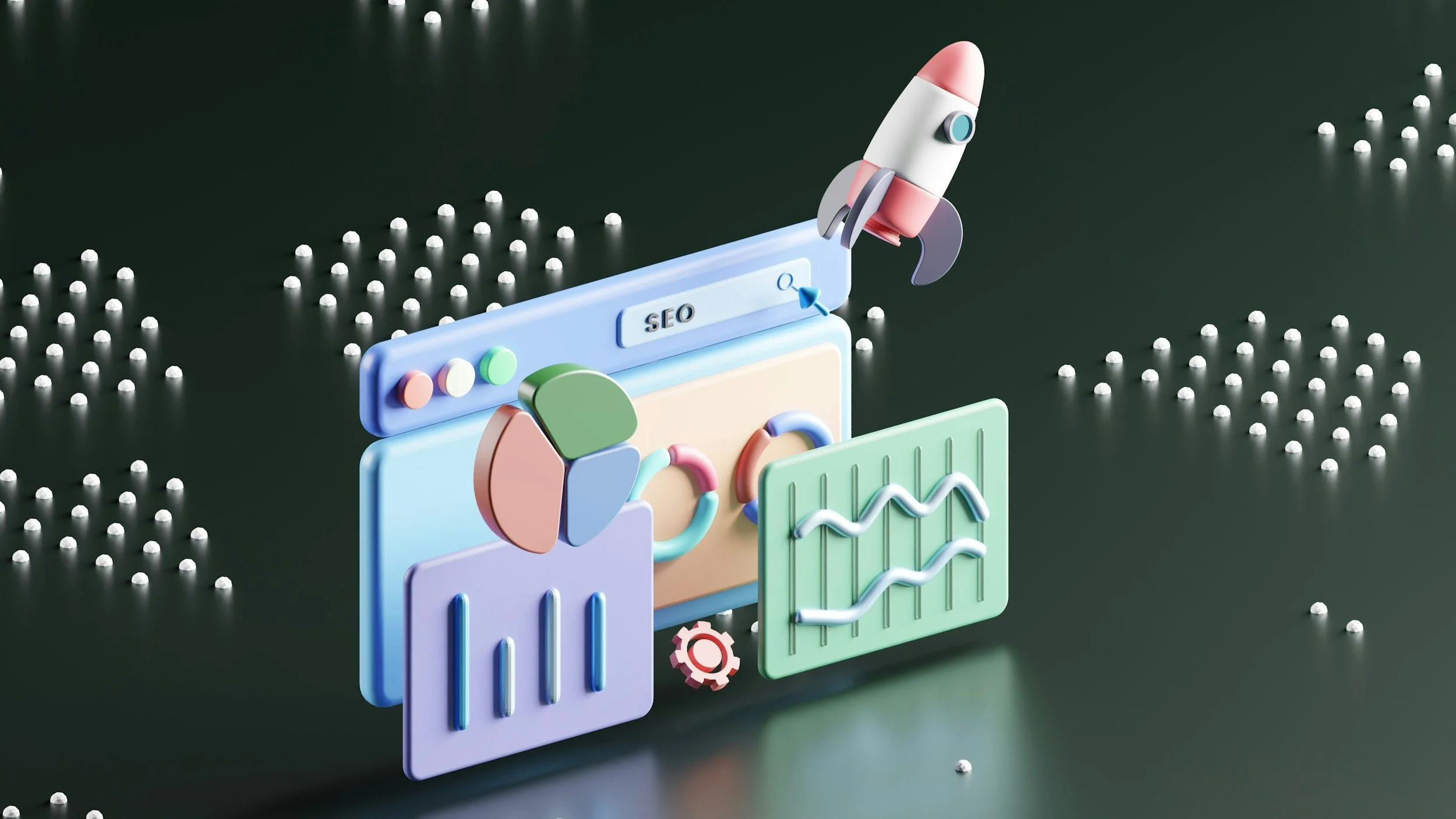
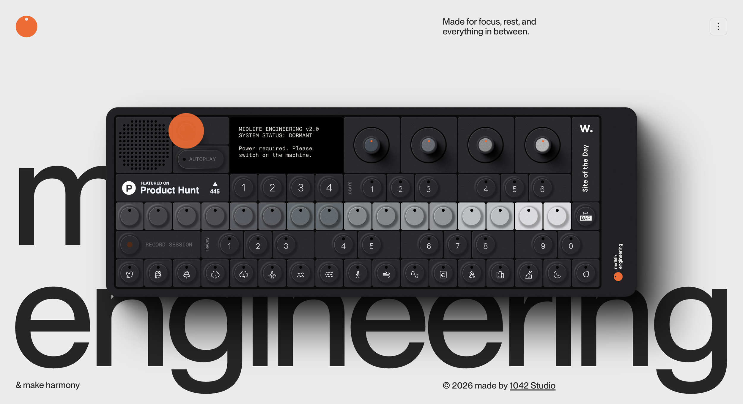
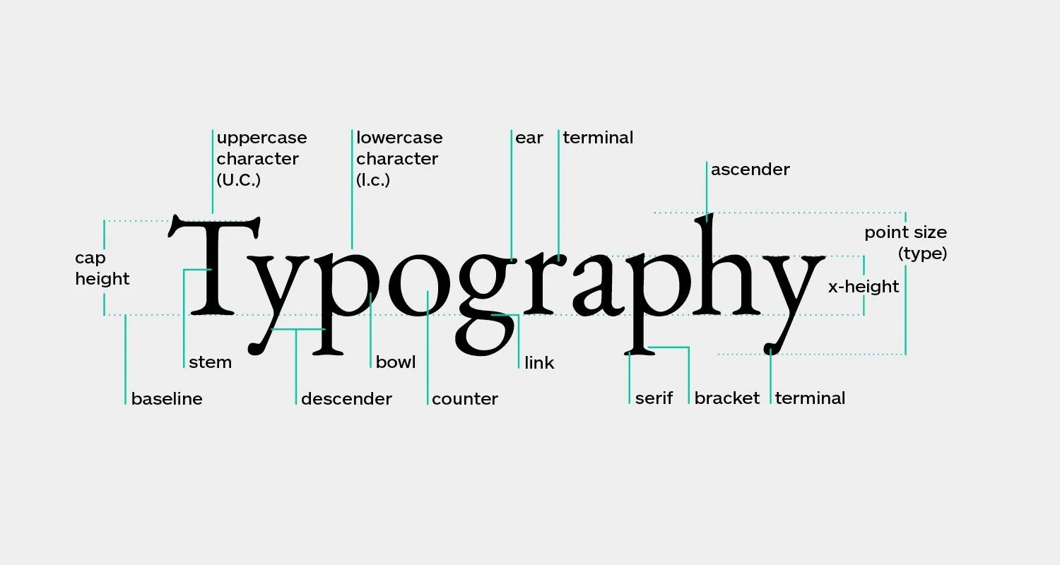
Icons function as a visual shorthand. They compress meaning into form. When used correctly, they reduce cognitive load and accelerate understanding. When used without intention, they become noise.
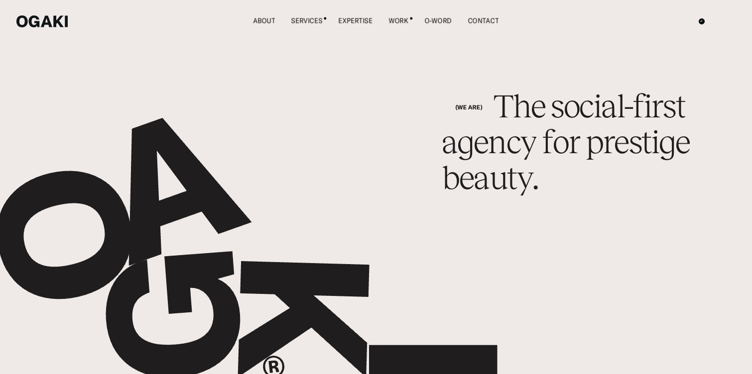
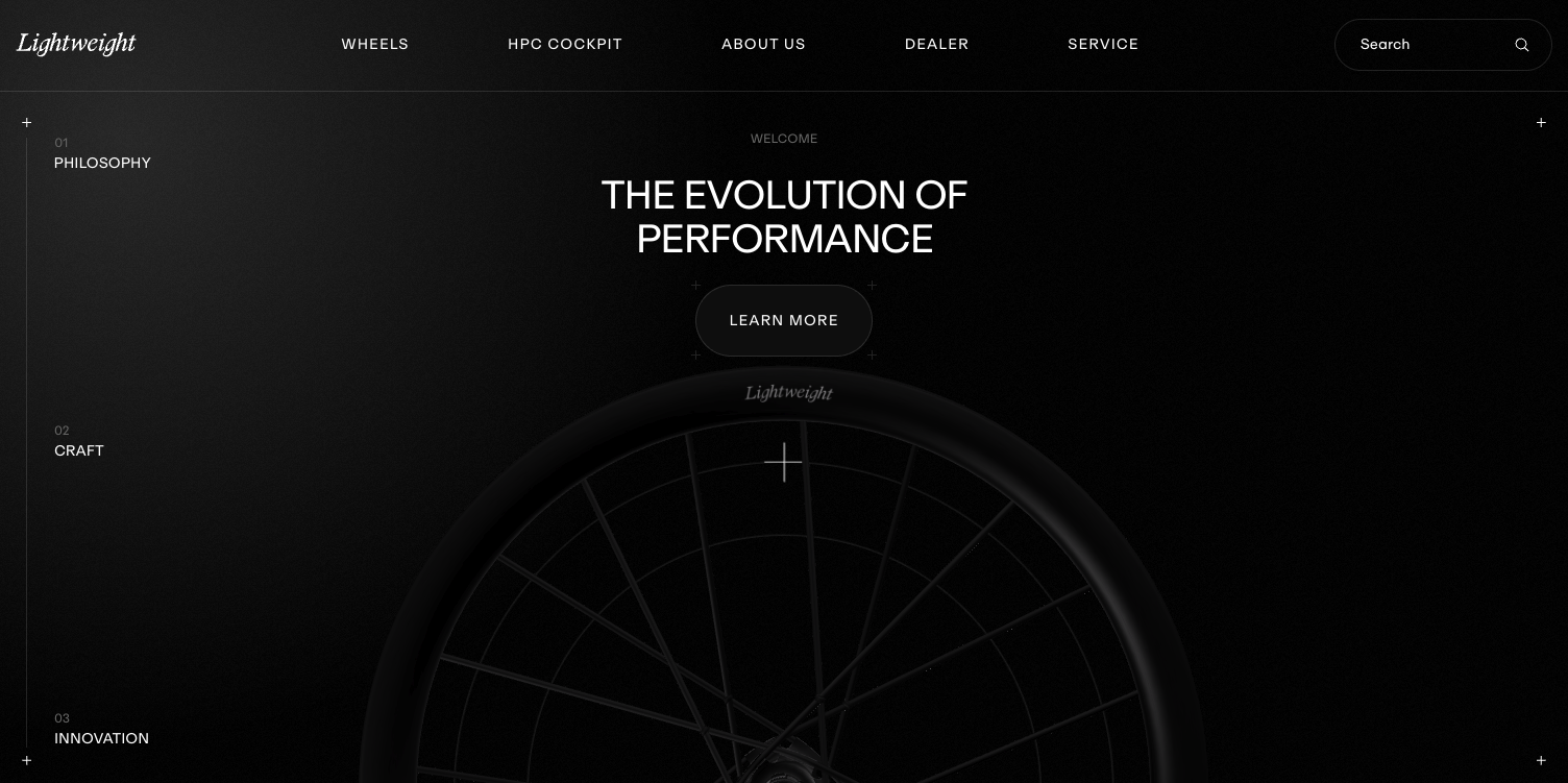
In refined interfaces, icons belong to a system. Line weight, corner radius, scale, and spacing are consistent across the experience. This consistency creates trust because the interface feels coherent. Users subconsciously recognize patterns and move through the site with ease.
Icons should support the primary message, not compete with it. Their purpose is to clarify actions, group related content, or signal function. They are not meant to decorate headings or replace strong typography. When icons are asked to carry meaning that should be handled by layout or copy, the interface becomes fragile.
A disciplined approach to icons in web design treats them as part of the brand’s visual voice. They align with typography, color, and spacing choices to create a unified aesthetic.
How icon style influences brand perception
Every icon style communicates something about the brand behind it. Sharp geometric icons suggest precision and structure. Rounded icons feel approachable and fluid. Highly detailed icons can feel expressive but risk visual noise if not controlled.
Choosing an icon style is a positioning decision. It signals how the brand thinks, operates, and communicates. When icon style clashes with the rest of the design system, the disconnect is immediately felt, even if users cannot articulate why.
Scale is equally important. Oversized icons can feel childish or overly illustrative. Undersized icons can feel hesitant or unfinished. Balanced scale ensures icons feel integrated rather than pasted on.
Color usage also matters. Icons that borrow accent colors can guide attention subtly. Icons that introduce new colors fragment the palette and weaken hierarchy. Restraint keeps the interface calm and confident.
Using icons in web design to guide attention and flow
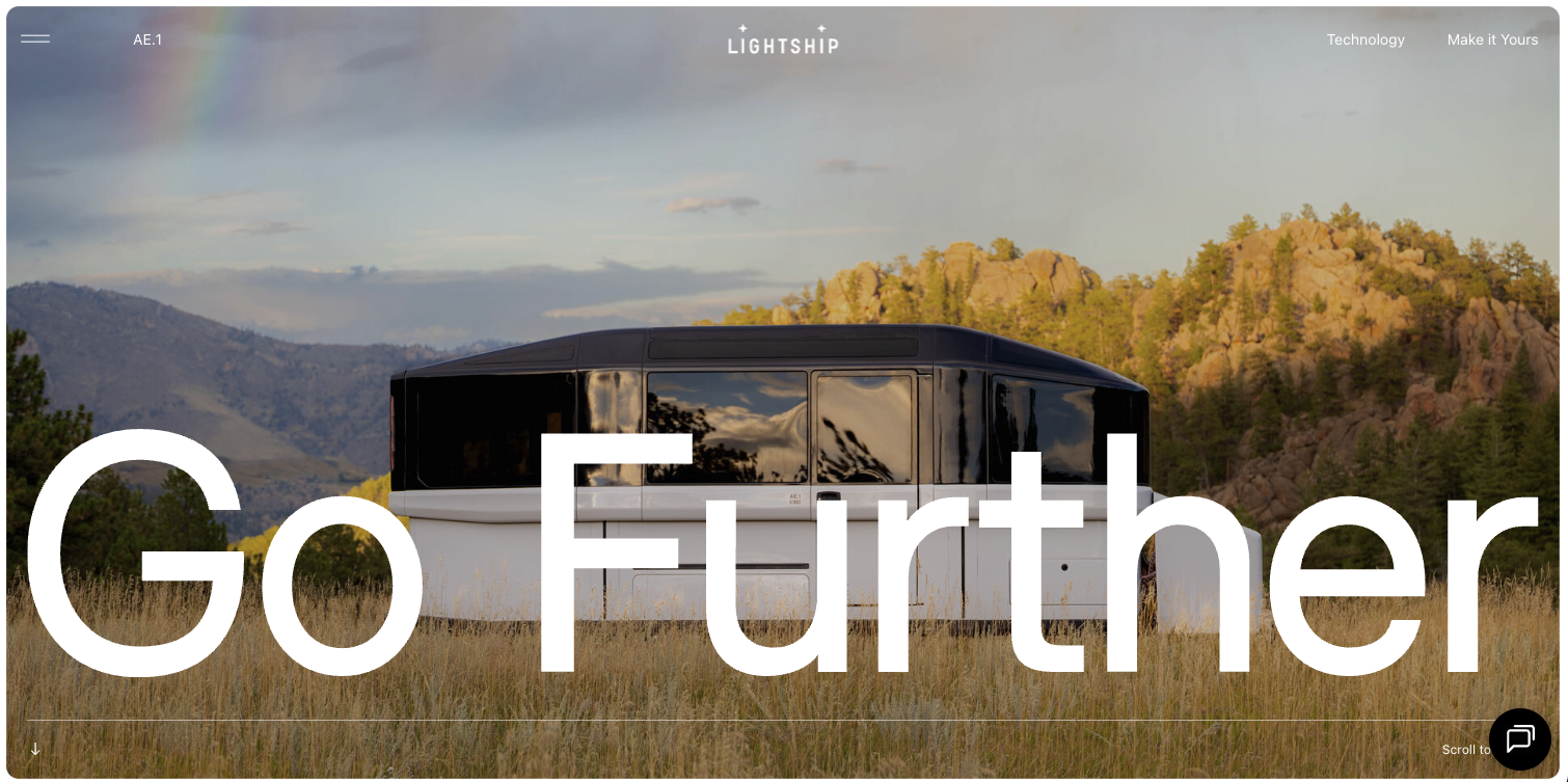
One of the most valuable roles of icons in web design is directional. Icons can guide the eye through a page, reinforcing the intended reading order. When paired with strong layout decisions, icons help establish rhythm and pace.
For example, a simple icon used consistently alongside section labels creates a visual anchor that helps users scan without losing context. Similarly, icons placed near calls to action can reinforce intent without shouting.
The key is predictability. When users learn how icons behave on a page, they trust the interface more. Random or inconsistent placement breaks that trust and forces users to reorient themselves repeatedly.
Icons should never be the only indicator of meaning. They work best when paired with text or supported by layout cues. This redundancy creates confidence rather than confusion.
Icons as part of a composed design system
High performing websites treat icons as components, not assets. They are designed or selected as part of a larger system that includes typography, grid, spacing, and interaction states.
This systemic approach ensures icons scale across devices and contexts without losing clarity. Stroke thickness remains legible at small sizes. Spacing remains consistent in dense layouts. Hover and active states feel natural rather than forced.
When icons are introduced late or sourced inconsistently, they break the system. When they are considered from the beginning, they strengthen it.
A composed icon system also allows for evolution. As the site grows, new icons can be added without disrupting the visual language. This scalability is essential for brands that expect their digital presence to evolve over time.
Conclusion
Icons in web design are not decorative afterthoughts. They are part of the interface’s language and should be treated with the same care as typography and layout. When used intentionally, icons reduce friction, guide attention, and reinforce brand perception without demanding focus.
The most effective icons feel quiet yet precise. They support the experience rather than define it. This restraint signals confidence and clarity, qualities that resonate with audiences who value thoughtful design.
In a landscape where many websites rely on excess to compensate for lack of direction, a disciplined approach to icons becomes a differentiator. It communicates that every detail has been considered, and that the brand behind the interface understands the power of visual clarity.
Start your project
Start your project with a free discovery call and see how we can bring your vision to life.
Don’t miss these