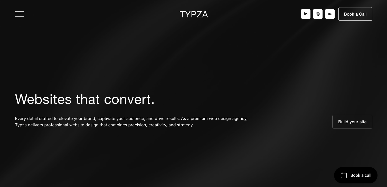
How to design a converting landing page
A converting landing page is built to turn focused traffic into real inquiries by guiding serious visitors toward one clear decision.
In this article:
Why most landing pages fail to convert serious buyers
Define one clear outcome for your converting landing page
Structure the page to guide the eye and the decision
Reinforce positioning through language and proof
Reduce risk by answering silent objections
Design the call to action for clarity and confidence
Connect the landing page to a larger growth strategy
Conclusion

Start your project
Start your project with a free discovery call and see how we can bring your vision to life.
Why most landing pages fail to convert serious buyers
A converting landing page is often treated as a quick campaign tool. Many businesses design one page, add a headline, a short pitch, and a form, then expect results. When conversions stay low, they assume the offer is weak or the traffic is wrong. In many cases, the real problem is structure and positioning.
Buyers who land on this page are not always casual visitors. Some are actively planning. They have budget. They are comparing providers. They are looking for clarity before they act. If your page feels rushed, vague, or overly promotional, they hesitate.
A weak landing page tries to impress everyone. A converting landing page speaks directly to one audience with one problem and one clear next step.
Think about the mindset of a serious buyer. They are asking silent questions. Does this company understand my situation? Is the process structured? Will this investment create real impact?
If your page does not answer those questions quickly, trust drops. Even small signs of confusion can create doubt.
A converting landing page is not about adding more sections or louder headlines. It is about aligning message, structure, and design so that the right buyer feels understood and ready to act.
When done well, this page becomes a focused decision tool, not just a marketing asset.
Define one clear outcome for your converting landing page
Every converting landing page must revolve around one outcome. Not two. Not five. One.
If you are offering a strategy session, the goal is to book that session. If you are promoting a specific service, the goal is to start a conversation about that service.
Clarity at this stage shapes the entire page. The headline should reflect the main result. The supporting text should reinforce that result. The call to action should point to the same next step.
For example, imagine you are targeting founders who want a strategic website redesign. Your page should speak directly to that goal. It should explain how the redesign improves positioning, attracts qualified leads, and supports growth.
A converting landing page does not try to educate visitors on everything you do. It narrows the focus. This focus builds strength.
When buyers see a page that is clearly built for their exact need, they feel recognized. They feel less overwhelmed.
Serious clients often value simplicity. They do not want to search for the next step. They want it to be clear.
By defining one outcome and building the entire page around it, you reduce friction and increase confidence.
Structure the page to guide the eye and the decision
Design is not decoration. It shapes behavior. A converting landing page should guide visitors from top to bottom in a natural flow.
Start with a strong headline that states the result. Follow with a short paragraph that expands on the value. Keep it direct. Keep it clear.
Then move into the core problem. Describe what the visitor may be experiencing right now. For example, they may have traffic but low inquiries. They may feel their messaging is unclear. They may struggle to explain their value.
When they see their problem described in simple language, they feel understood.
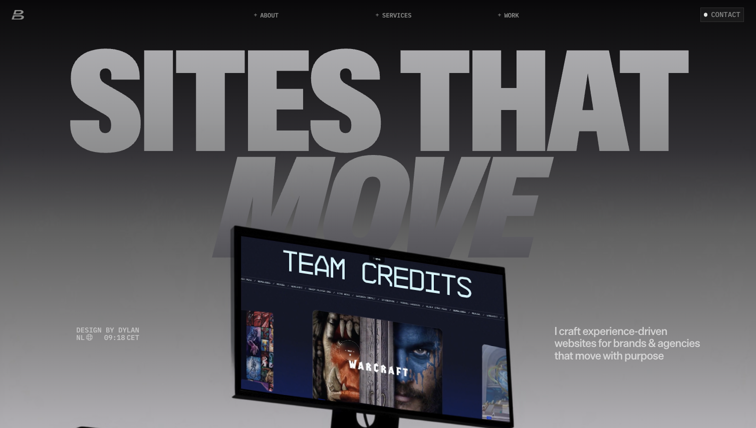
After the problem, present your solution. Explain your approach in a structured way. This is where visual storytelling can help. You might describe a three step process that moves from strategy to design to launch. Paint a clear picture of how the journey unfolds.
Each section should build on the last. Problem, solution, proof, action.
White space, clean typography, and clear headings make the page easier to scan. A converting landing page should feel calm and focused, not busy.
When structure is strong, visitors do not feel lost. They move forward with clarity.
Reinforce positioning through language and proof
A converting landing page is also a positioning tool. It communicates who you are for and who you are not for.
If you work with growth focused companies, say so. If your projects are strategy driven and long term, make that clear.
Avoid generic phrases. Be specific about the type of client and the type of project you handle. This naturally filters visitors.
Proof is essential at this stage. Include short testimonials or outcome driven statements. Focus on transformation and results.
For example, a client might explain that after launching their new site, inquiries became more qualified and sales calls became easier. That statement supports your positioning as a strategic partner, not just a designer.
A converting landing page should make serious buyers feel safe. They should see signs of experience, structure, and results.
When language and proof align with your positioning, you attract better inquiries. Visitors who are not aligned will often step back. That is a positive outcome. It protects your time and strengthens your conversion quality.
Reduce risk by answering silent objections
Even when interest is high, risk is present. A converting landing page must reduce that risk.
Buyers may wonder about timelines, communication, or investment level. You do not need to share every detail, but you can address common concerns.
Explain how you manage projects. Mention that you start with strategy. Clarify that you focus on measurable outcomes.
You can also describe what happens after they submit the form. Will they receive a confirmation email? Will there be a discovery call? How soon will you respond?
This transparency builds trust.
Imagine a founder ready to invest in a new landing page for a campaign. They land on your page and see a clear process and next steps. They feel relief. The unknown becomes known.
A converting landing page does not rely on pressure tactics. It relies on clarity. When risk feels lower, action feels easier.
Design the call to action for clarity and confidence
The call to action is the turning point. On a converting landing page, it should be visible and repeated where natural.
Use simple language. Start your strategy session. Request your proposal. Book your consultation.
Avoid vague labels like Submit or Click here. Specific language reinforces purpose.
Placement also matters. Include a call to action after the main value section and again near the bottom of the page. Do not overwhelm the visitor with too many buttons, but make the next step clear.
The form itself should be simple. Ask only for the information you truly need. Long and complex forms increase friction.
Design the button with strong contrast, but keep it aligned with your brand. It should feel confident, not aggressive.
A converting landing page supports action through clarity. When the visitor reaches the end, they should not wonder what to do next. The path should feel obvious and aligned with their goal.
Connect the landing page to a larger growth strategy
A converting landing page works best when it is part of a broader strategy. It should not exist in isolation.
Traffic may come from paid ads, email campaigns, or direct outreach. Each source shapes the visitor’s expectations. Make sure the messaging on the page matches the promise made in the ad or email.
Consistency builds trust. If a visitor clicks on a message about strategic website growth and lands on a generic page, trust drops.
Also consider what happens after conversion. The experience should feel seamless. Confirmation messages, follow up emails, and onboarding steps should reflect the same tone and clarity as the page.
When every touchpoint feels aligned, your brand feels strong.
A converting landing page is not just a single asset. It is part of a system that guides serious buyers from first click to signed project.
High value clients often notice alignment. They look for signs that a company thinks in systems, not shortcuts. When your landing page reflects that mindset, it builds deeper confidence.
Conclusion
A converting landing page is built with intention. It focuses on one outcome, guides the visitor with clear structure, reinforces positioning, reduces risk, and makes the next step simple.
It is not about flashy design or clever copy. It is about clarity and alignment.
When serious buyers land on your page, they are looking for reassurance and direction. If your message speaks to their goal, your structure feels organized, and your call to action is clear, they move forward.
A well designed converting landing page turns active interest into real conversations. It attracts clients who value strategy and are ready to invest in meaningful growth.
Start your project
Start your project with a free discovery call and see how we can bring your vision to life.
Don’t miss these