Client acquisition website design that attracts, qualifies, and converts
Client acquisition website design is not about generating more traffic. It is about shaping perception, building confidence, and attracting the right clients before a conversation ever begins.
In this article:
Why most websites fail at client acquisition
What client acquisition website design actually means
How structure and flow drive client acquisition
Visual restraint as a client acquisition signal
Positioning through design rather than persuasion
How client acquisition website design improves lead quality
Conclusion

Start your project
Start your project with a free discovery call and see how we can bring your vision to life.
Why most websites fail at client acquisition
Many websites are built to exist, not to acquire clients. They look polished on the surface but lack strategic depth. They explain services without positioning them. They present information without guiding decisions. As a result, they attract curiosity rather than commitment.
The problem is not aesthetics alone. It is intent. A website designed without acquisition in mind becomes passive. It waits for the right visitor instead of actively shaping who engages.
Client acquisition website design starts with the understanding that visitors are not neutral. They arrive with questions, skepticism, and limited attention. If the website does not immediately establish clarity and authority, those visitors leave or convert at a level that undervalues the business.
Effective acquisition begins long before a form submission. It begins with perception.
What client acquisition website design actually means
Client acquisition website design is the deliberate structuring of visual hierarchy, messaging, and experience to attract, qualify, and convert aligned clients.
This approach recognizes that not all traffic is valuable. The goal is not volume. It is alignment. A well designed acquisition focused website communicates who the business is for just as clearly as who it is not for.
Design decisions become strategic signals. Layout communicates confidence. Spacing communicates restraint. Typography communicates tone. Structure communicates competence. Every choice either strengthens or weakens the acquisition process.
Rather than trying to appeal to everyone, client acquisition website design narrows focus. It creates an experience that resonates deeply with the intended audience and feels irrelevant to the rest.
How structure and flow drive client acquisition
Structure is the backbone of acquisition. It determines how information is revealed and in what order trust is built.
A strong acquisition focused website does not lead with exhaustive detail. It leads with clarity. Visitors should immediately understand what the business does, who it serves, and why it matters. This understanding is formed through layout as much as language.
As users move through the site, structure should guide them naturally from awareness to consideration. Each section answers a question before it is asked. Each transition feels intentional rather than abrupt.
When structure is clear, visitors feel oriented. When they feel oriented, they stay longer. When they stay longer, they engage more deeply. This progression is not accidental. It is designed.
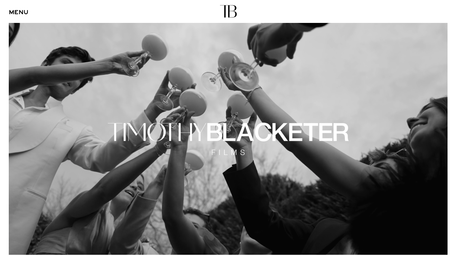
Visual restraint as a client acquisition signal
Visual restraint is one of the most powerful tools in client acquisition website design. It signals confidence without explanation.
Websites that rely on excess visuals, animations, or competing messages often appear insecure. They try to convince rather than communicate. In contrast, restrained design feels composed. It suggests that the business does not need to oversell its value.
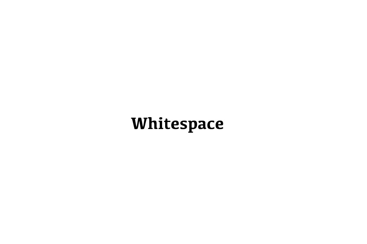
White space allows important messages to breathe. Clear hierarchy prevents cognitive overload. A focused color palette keeps attention where it matters.
This restraint naturally attracts clients who value clarity and intention. It filters out those looking for shortcuts or surface level engagement. In this way, design becomes a qualification mechanism as much as a conversion tool.
Positioning through design rather than persuasion
One of the most overlooked aspects of client acquisition website design is how much positioning can be achieved visually.
Design communicates before copy is read. The tone of imagery, the pacing of sections, and the balance between openness and density all shape how the business is perceived.
A website that feels calm and deliberate positions the business as thoughtful and experienced. A website that feels rushed or crowded positions it as reactive.
This visual positioning reduces the need for aggressive persuasion. When visitors already perceive authority, they approach conversations with trust. The sales process becomes shorter and more aligned because expectations are set early.
How client acquisition website design improves lead quality
High quality leads are a result of clarity, not tactics. When a website clearly communicates value and boundaries, the right people respond.
Client acquisition website design creates this clarity by aligning message, structure, and experience. Visitors self select based on whether the website reflects their expectations and standards.
This alignment leads to fewer but better inquiries. Conversations start at a higher level. Price resistance decreases. Trust is established before the first interaction.
From a business perspective, this shift is transformative. Time is spent on meaningful opportunities rather than filtering mismatched leads.
Conclusion
Client acquisition website design is not about making a website look impressive. It is about making it intentional. Every design decision either attracts alignment or creates friction.
When structure is clear, visuals are restrained, and messaging is positioned, the website becomes an active participant in growth. It communicates authority before a word is spoken and trust before a call is booked.
In a crowded digital environment, the most effective acquisition tool is not louder messaging. It is clearer design. A website built with acquisition in mind does not chase clients. It draws the right ones in through confidence, clarity, and purpose.
Start your project
Start your project with a free discovery call and see how we can bring your vision to life.
Don’t miss these