Modern hero section trends that elevate premium websites
The strongest hero section trends are built around clarity, focus, and emotional resonance, giving premium brands the presence and authority users expect the moment they land on a website.
In this article:
The first impression that shapes the entire digital experience
How hero section trends shape perception and trust
The emotional use of photography in hero section composition
The use of motion as a modern hero design element
The trend toward full bleed composition in modern hero layouts
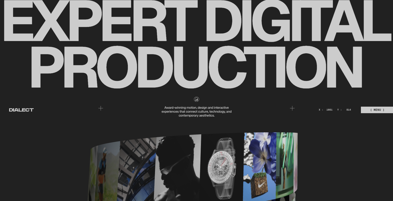
Typography as the defining element of modern hero section trends
The trend of quiet minimalism in premium hero sections
The growing preference for editorial style layouts
The importance of clarity in call to action positioning
Designing hero sections that pre qualify premium buyers
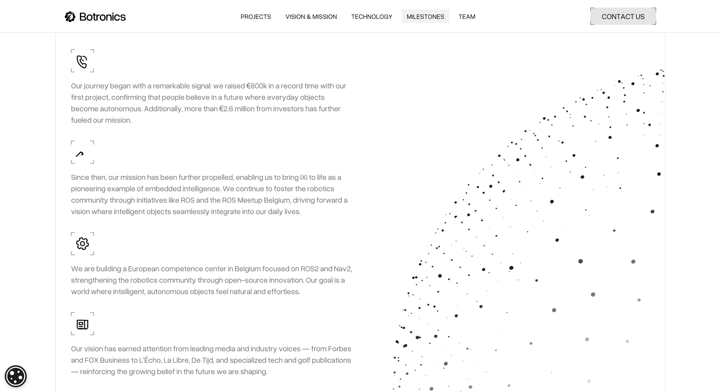
Why modern hero section trends matter for long term positioning
Conclusion

Start your project
Start your project with a free discovery call and see how we can bring your vision to life.
The first impression that shapes the entire digital experience
When a user lands on a website, the hero section becomes the moment where perception is formed, trust is established, and expectations are set. This is why hero section trends have become a core topic among brands that value refined presentation and high end digital communication. The first few seconds of a visitor’s attention determine whether they feel aligned with the brand, curious about the offer, or confident enough to continue exploring. When the hero communicates with clarity and intention, the user feels grounded. When it is unclear or generic, the user feels disconnected before the page even scrolls.
The hero is not simply a design component. It is a positioning tool. It is the emotional handshake that introduces the brand. It is the narrative anchor that determines what the user believes about the brand’s value and expertise. Premium buyers understand this instinctively. They may not speak in design terminology, but they instantly recognize when a hero section feels thoughtful, elevated, or strategically arranged.
Brands that invest in premium web design often do so because they need their hero to do more than look attractive. They need it to create presence. They need it to establish authority. They need it to define the tone of the entire site. This is where modern hero section trends become relevant. They reveal how top digital brands structure their first impression to feel confident, contemporary, and unmistakably clear.
How hero section trends shape perception and trust
Hero sections have evolved significantly. In earlier years, they often relied on ornate visuals or lengthy messaging. Today, the most effective hero designs trend toward clarity, minimalism, and emotional precision. Instead of overwhelming visitors with multiple messages, the modern hero reduces cognitive load by focusing on one central idea supported by a refined aesthetic.
This shift aligns with how premium buyers make decisions. They expect the brand to be able to express its value concisely. They expect a visual language that reflects discipline and confidence. Brands that clutter the hero or treat it as decorative real estate miss an opportunity to build trust. The visual hierarchy, the typography, the spacing, and the level of restraint all contribute to the feeling of order that high value users look for.
When hero section trends emphasize clarity, users feel like they are in capable hands. They understand the brand’s direction, the tone of the offer, and the purpose of the page. This psychological ease is what creates trust. Trust becomes the foundation of conversion. And conversion begins in the hero.
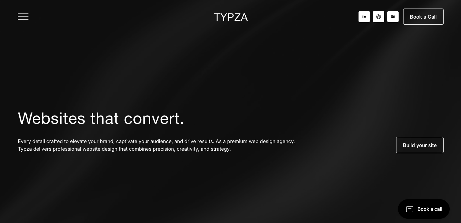
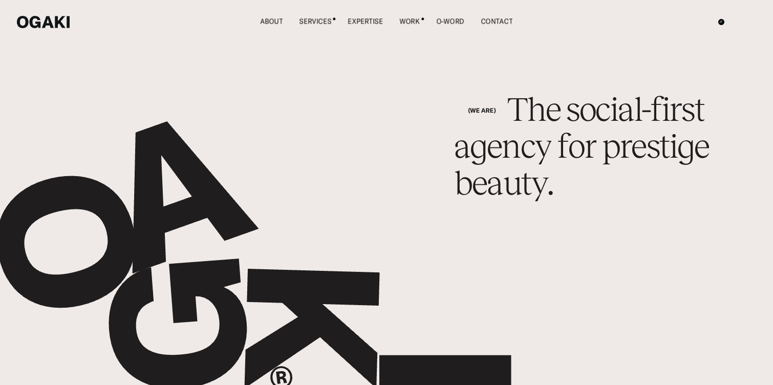
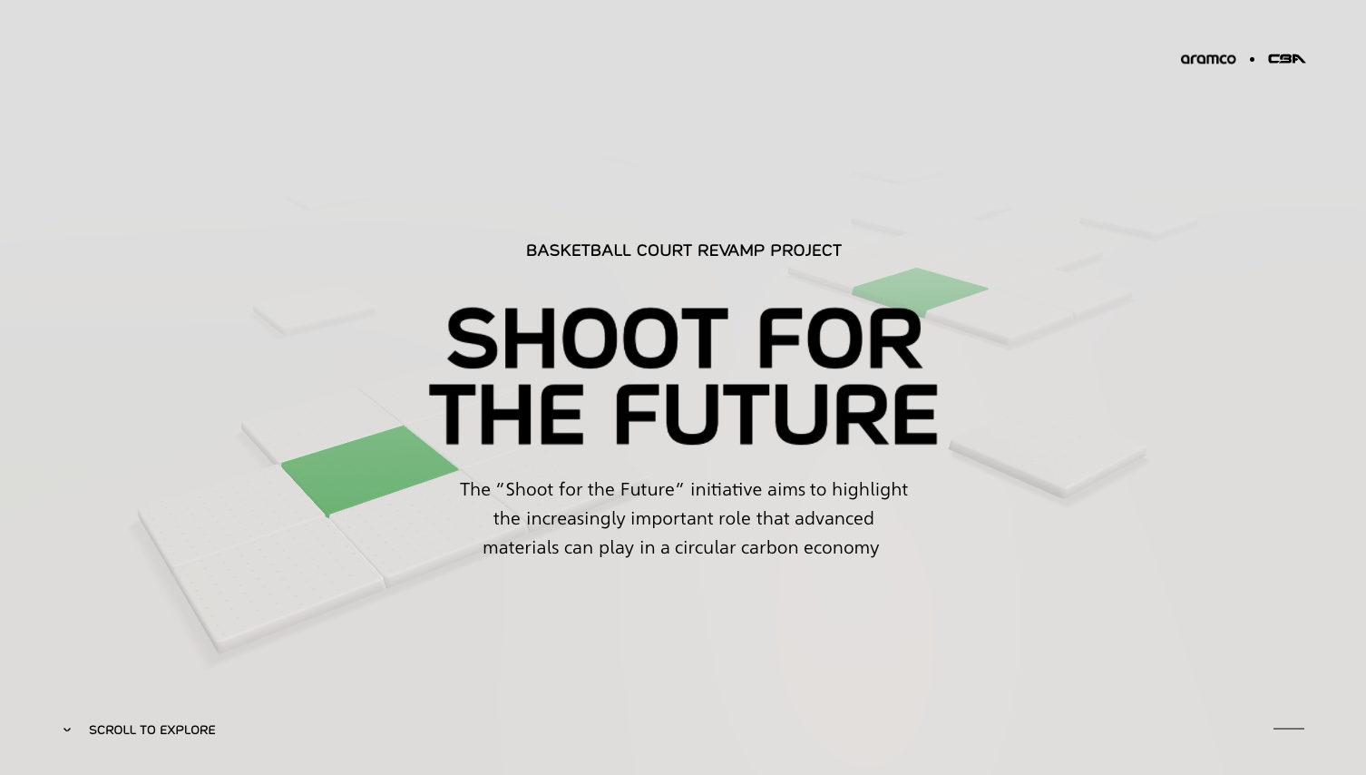
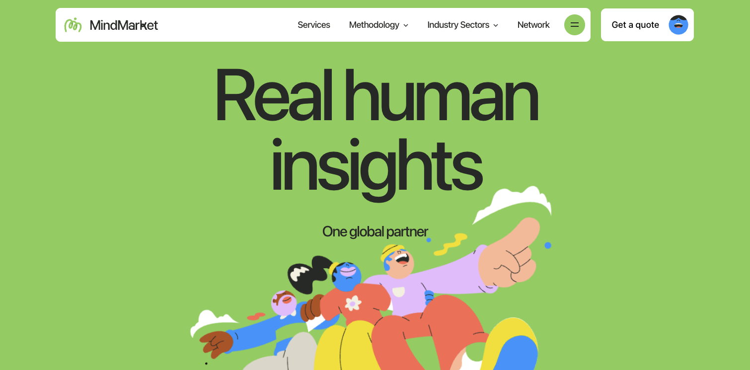
One of the strongest trends in premium digital design is the move toward simplified messaging. High converting hero sections rarely use long copy. Instead, they use one concise headline that expresses either the value or the transformation the brand provides. This simplicity feels confident. It signals that the brand understands its identity and does not need excessive explanation.
The supporting copy beneath the headline becomes another moment of intentional design. Instead of being treated as filler, it becomes a refined statement that reinforces clarity. Premium brands recognize that a hero section is not a place for convincing. It is a place for positioning. The goal is not to persuade with size or volume. The goal is to reveal expertise through clarity and constraint.
This simplicity allows the visitor to relax. They are not confronted with excessive demands for interpretation. They can understand the promise quickly and continue exploring with a sense of grounded confidence.
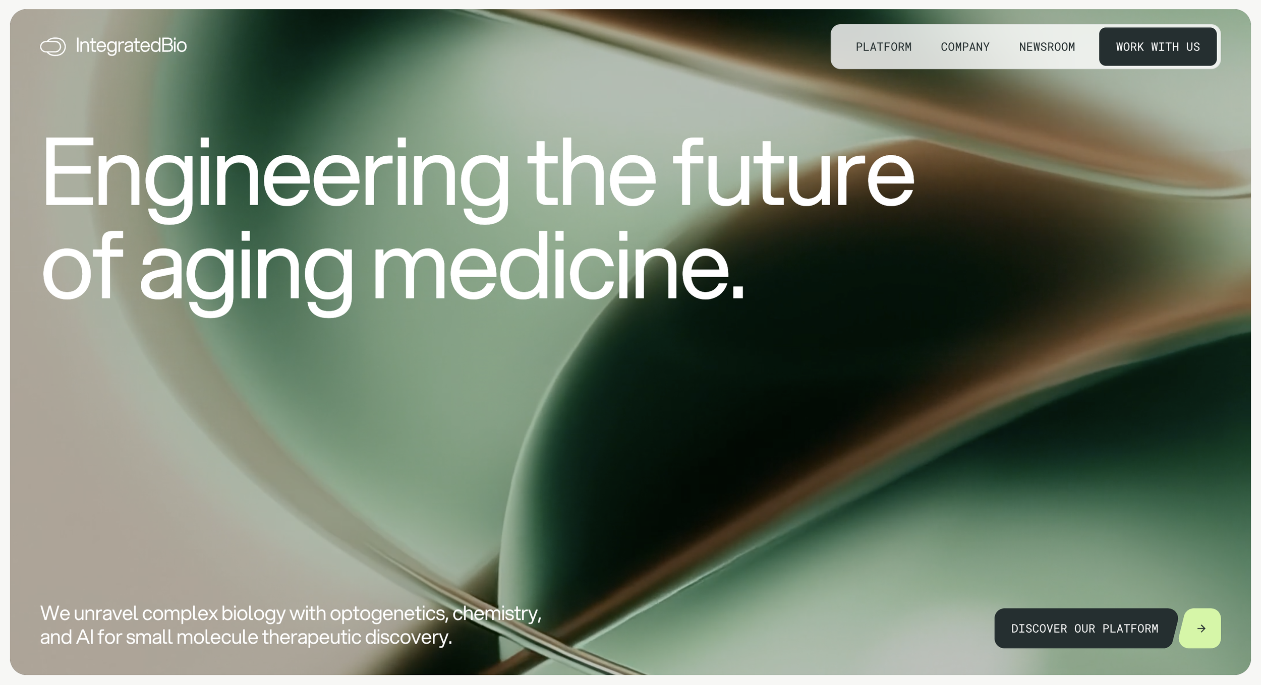
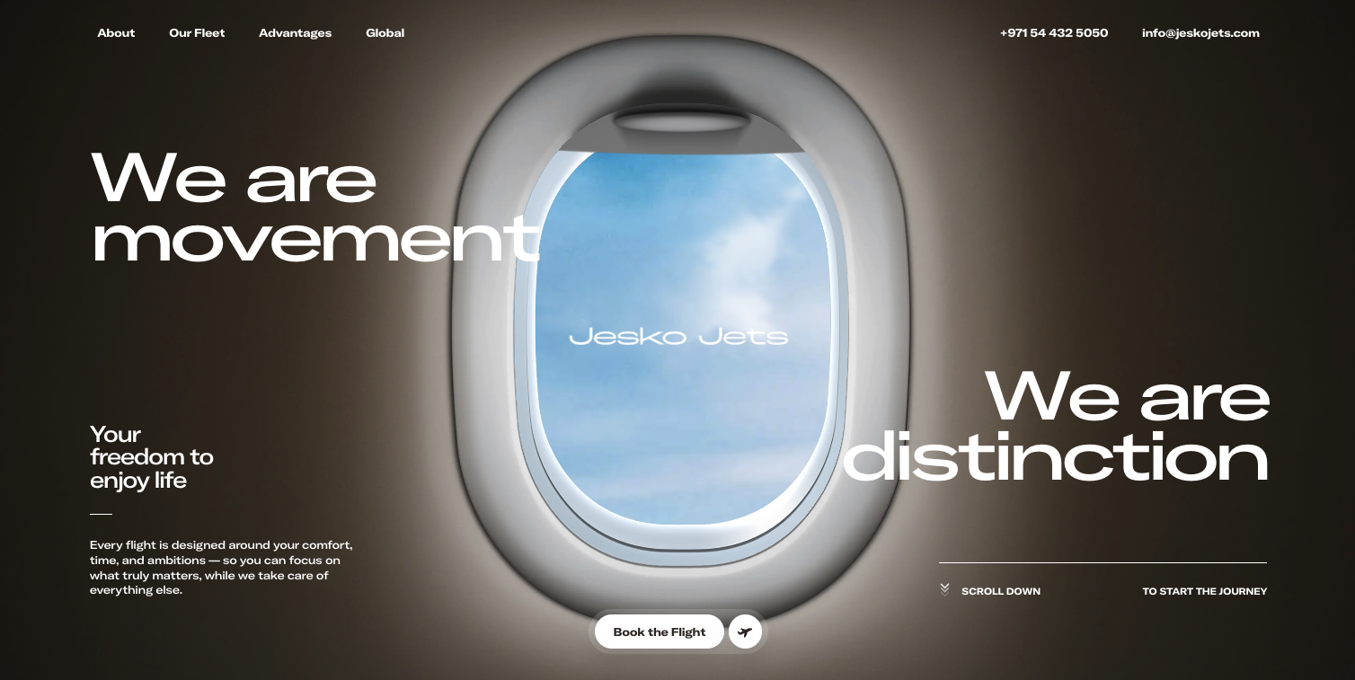
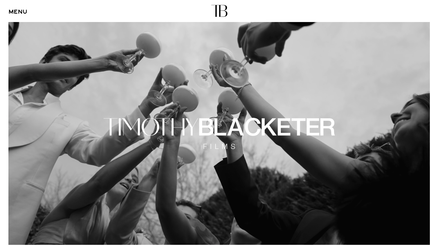
The emotional use of photography in hero section composition
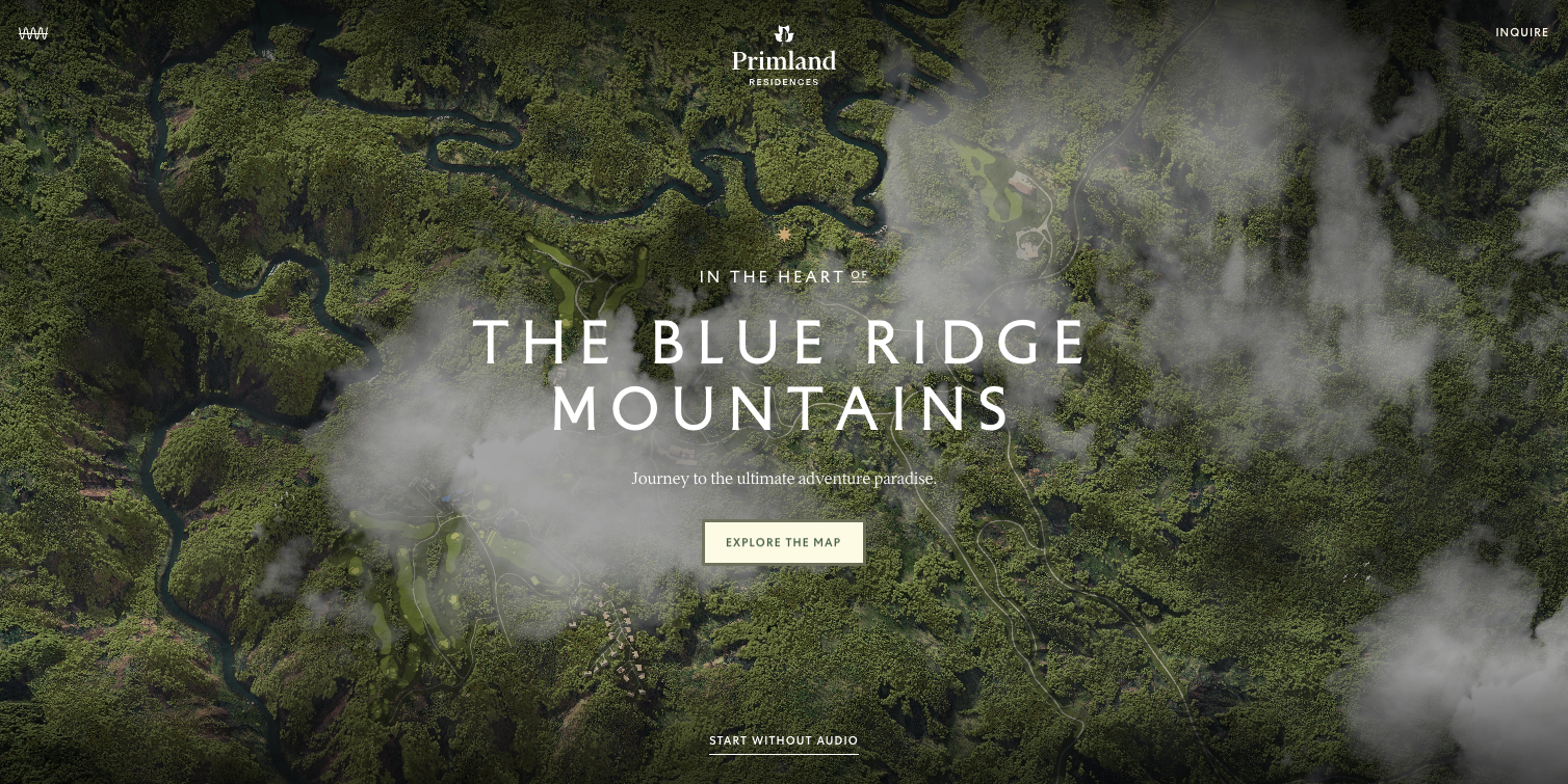
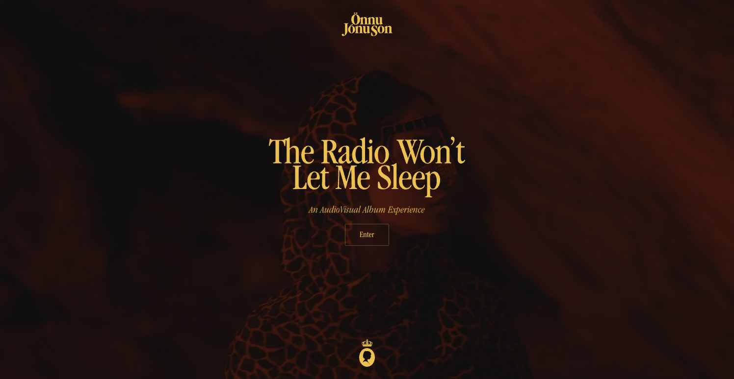
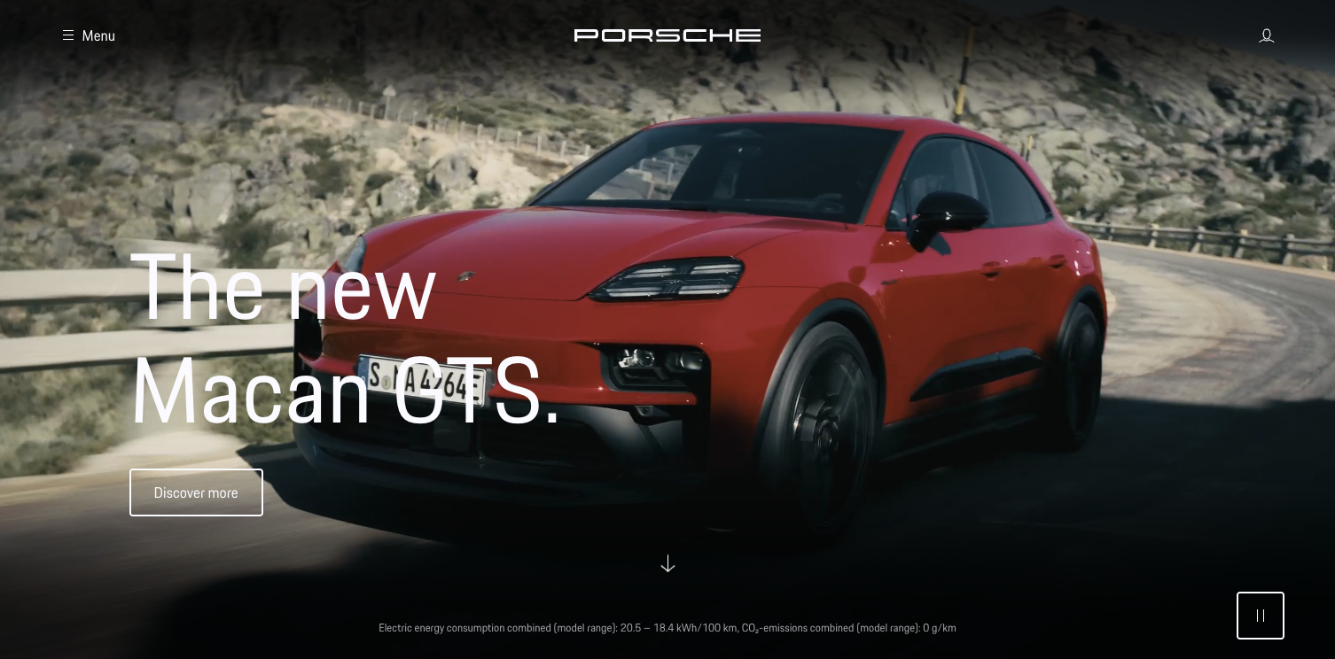
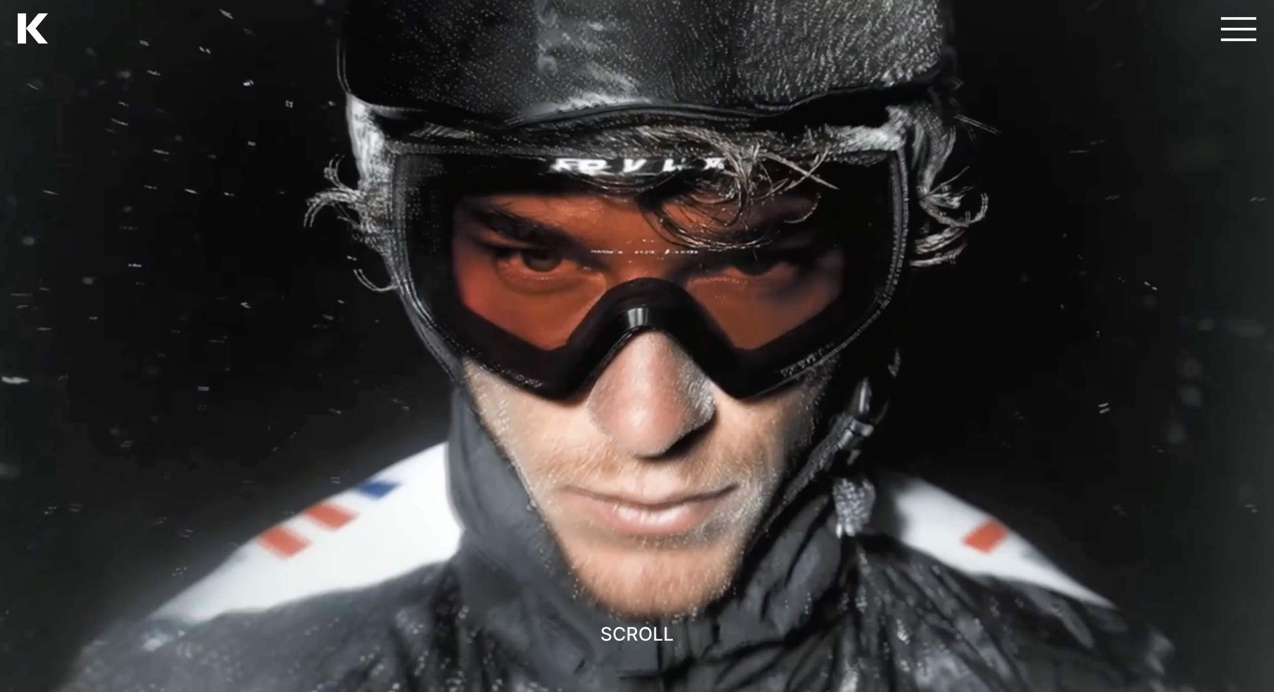
Photography plays an essential role in shaping emotion within a hero section. Modern trends lean toward imagery that feels editorial, calm, and intentional. Instead of using stock photos or overly staged compositions, brands are now gravitating toward visuals that evoke authenticity and atmosphere. The hero becomes an environment that reflects the brand’s identity.
For a premium consulting firm, this may be an understated studio portrait that communicates presence and professionalism. For a luxury interior design brand, it may be a sweeping architectural detail that expresses aesthetic sensibility. For a wellness brand, it may be a serene, textured environment that conveys calm. The key is intention. Every visual chosen for the hero must reinforce the feeling the brand wants the user to remember.
Imagery without intention becomes noise. Imagery with narrative purpose becomes the emotional anchor of the page. This is why modern hero section trends incorporate photography as a story driver rather than decoration.
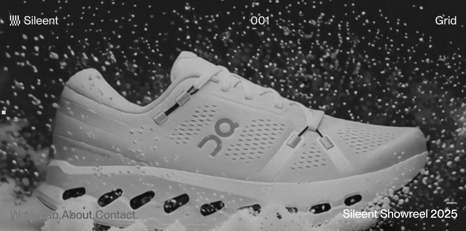
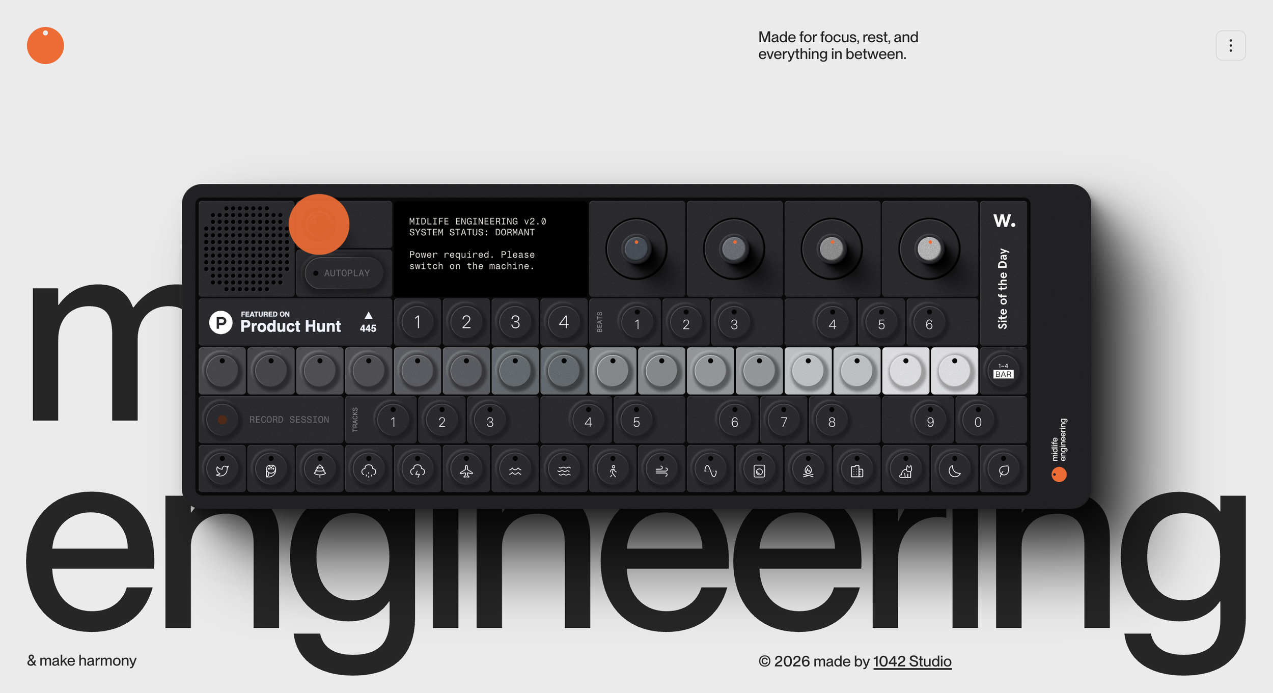
The use of motion as a modern hero design element
Motion has become one of the most influential elements in today’s hero section trends. But the motion used by premium brands is not loud or flashy. It is quiet, fluid, and purposeful. Subtle transitions, soft fades, and low contrast animations create a sense of premium refinement that mirrors high end physical experiences. These motions feel more like gestures than performances.
When used well, motion guides the eye. It creates a calm flow that introduces the brand narrative in a way that feels intentional rather than forced. It adds life and presence without distracting from the main message. Motion can highlight a phrase, draw attention to a call to action, or create a gentle rhythm that matches the emotional tone of the brand.
Premium buyers respond to this kind of motion because it reflects craftsmanship. It suggests attention to detail. It communicates that the brand understands how to balance creativity with restraint.
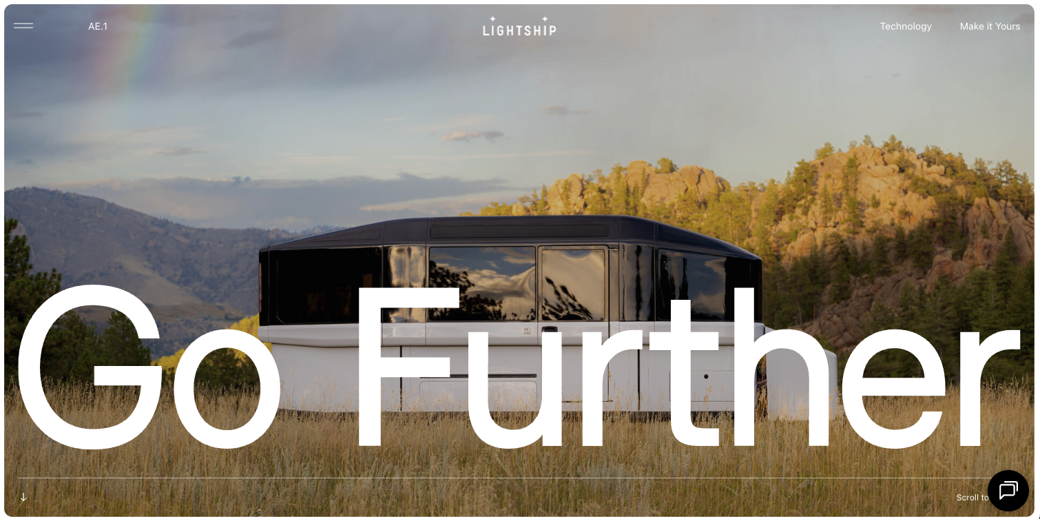
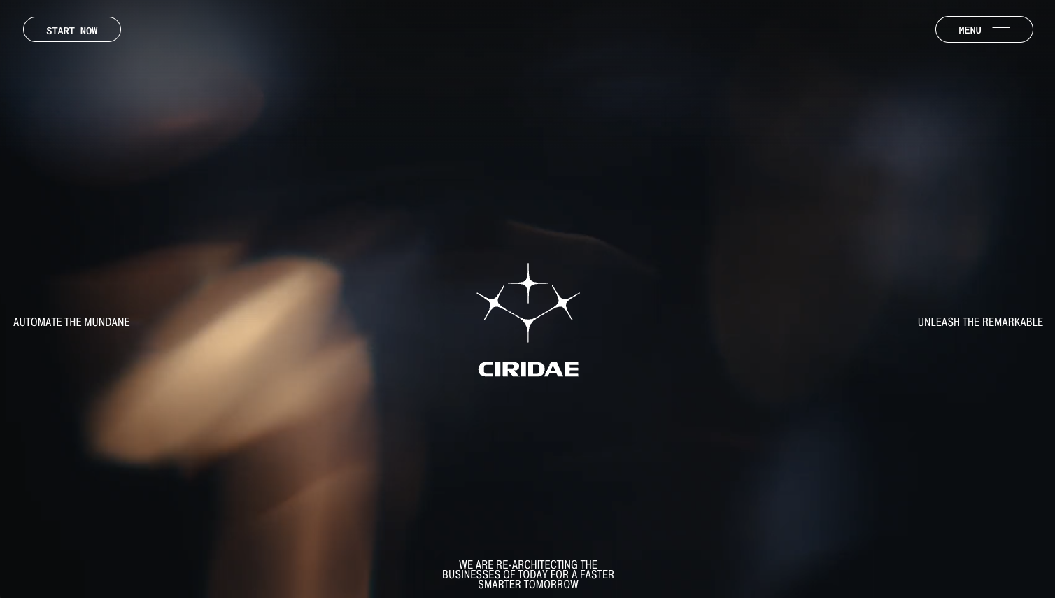
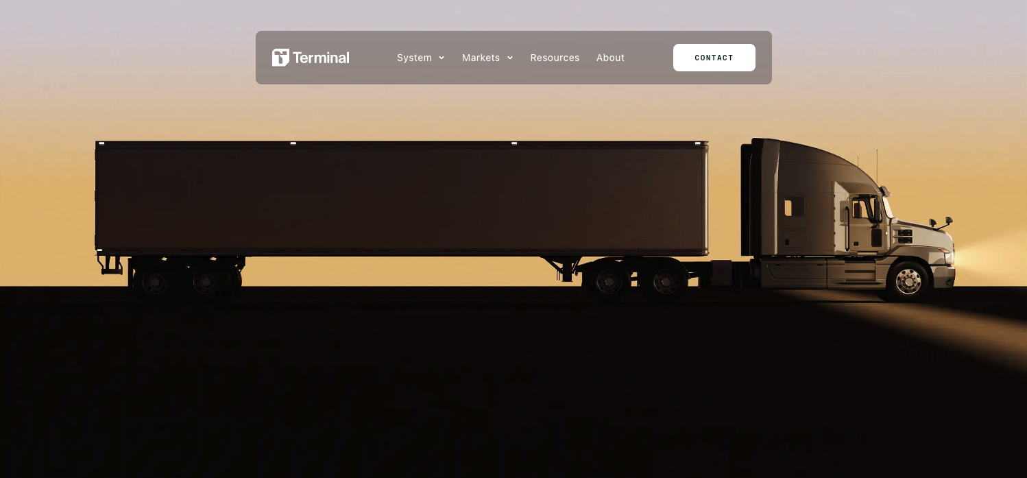
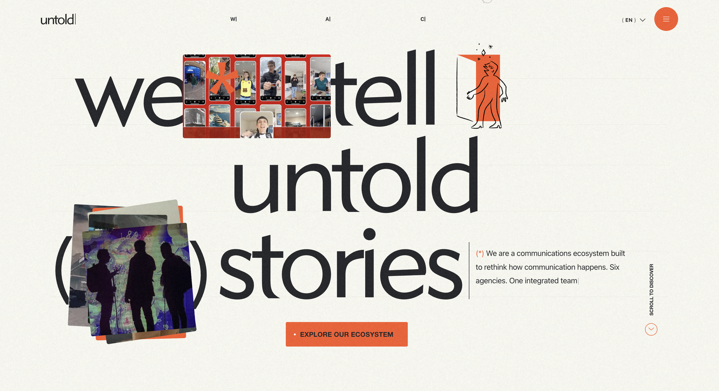
The trend toward full bleed composition in modern hero layouts
Full bleed compositions have become a cornerstone of modern hero section trends. A full bleed layout allows an image or color field to span the entire width of the screen, creating depth, scale, and immersion. Instead of feeling like a segment of the page, the hero feels like an environment that welcomes the visitor.
For premium brands, full bleed design amplifies presence. It creates an immediate sense of expansiveness and clarity. The visitor enters the brand’s world instantly. This approach works especially well for brands in luxury lifestyle, architecture, fashion, and hospitality where visuals communicate tone as strongly as copy.
Full bleed heroes also support responsive design particularly well. They scale naturally across devices and maintain impact whether viewed on a desktop or mobile screen. The result is consistency. Consistency becomes reliability. And reliability reinforces trust.
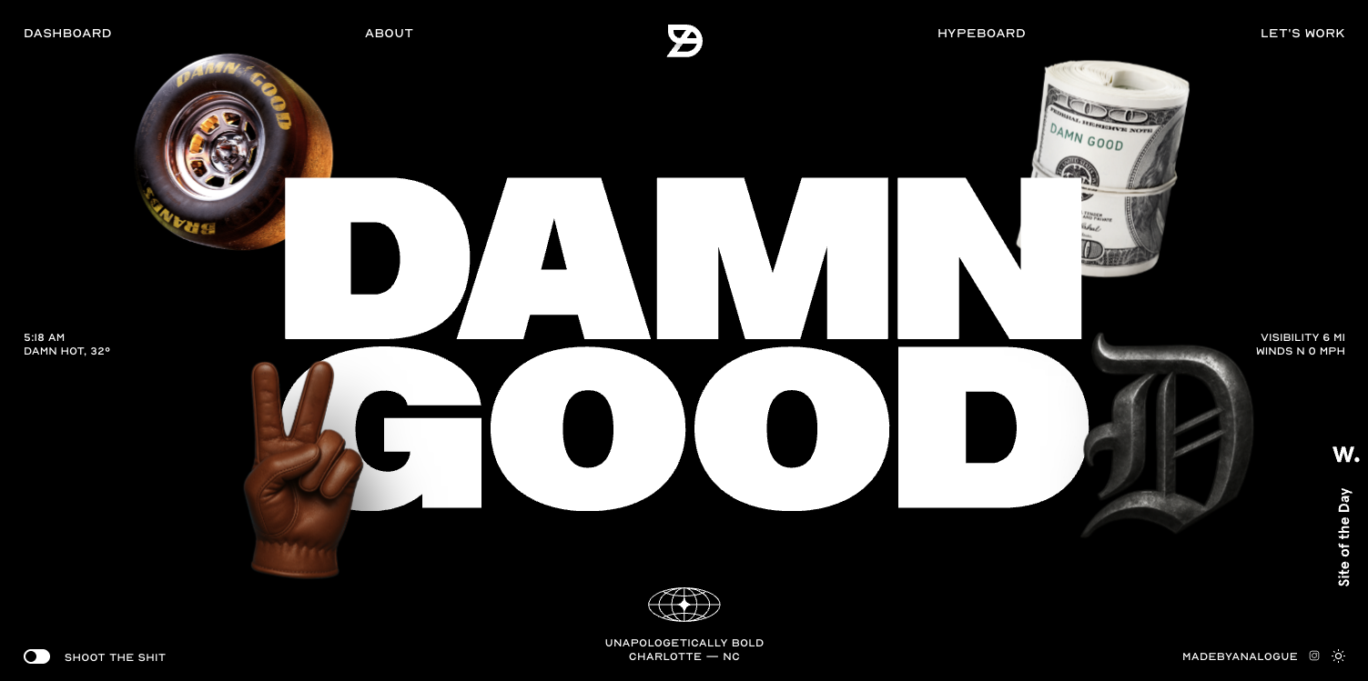
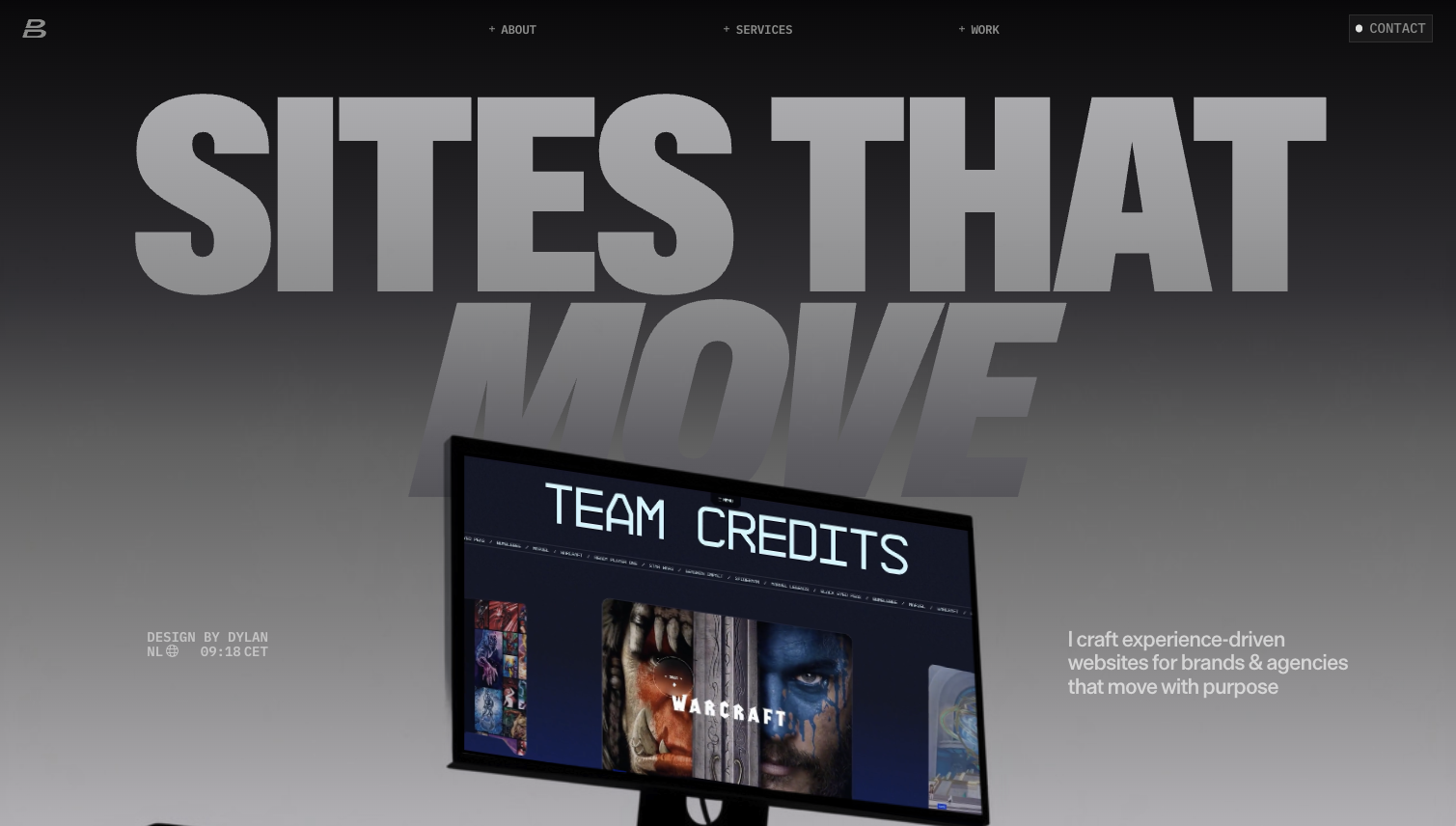
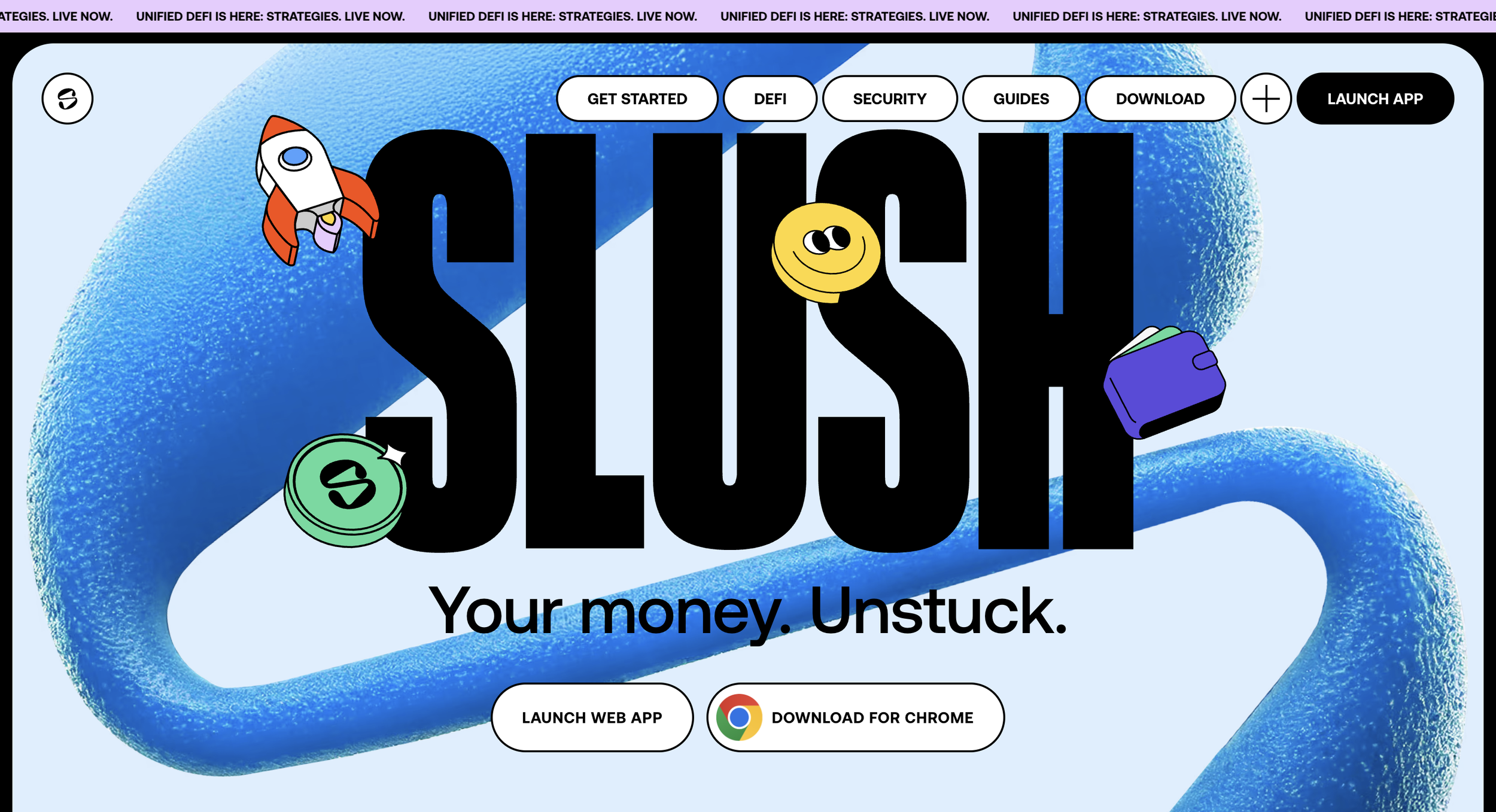
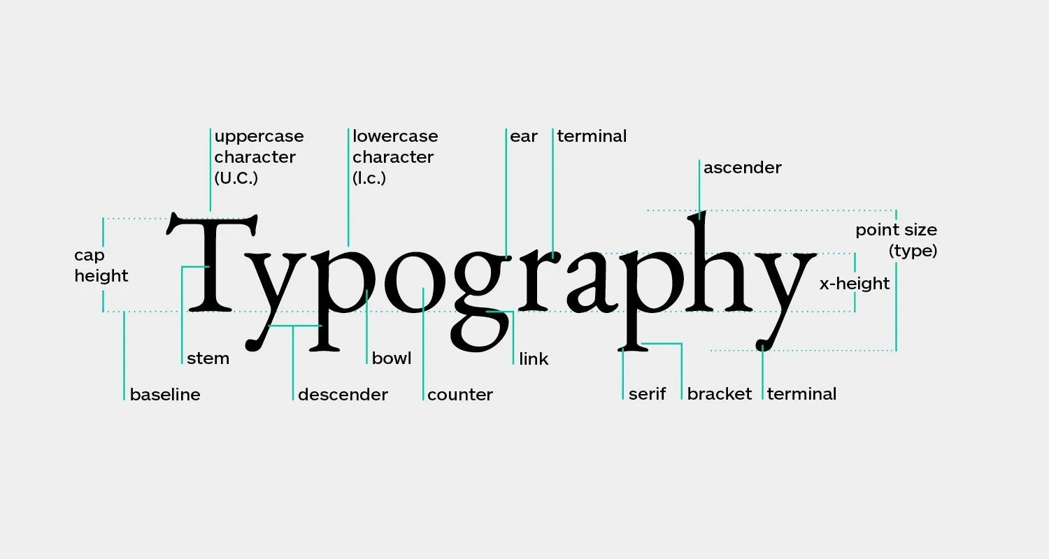
Typography as the defining element of modern hero section trends
Typography has moved from supporting role to lead role in modern hero design. Brands are using typography as a defining aesthetic component that conveys identity in the first seconds of the experience. Sharp, structured type communicates precision. Soft, serif typography communicates elegance. Bold geometric fonts suggest authority.
Modern trends reveal a strong focus on type pairing that feels curated and intentional. In hero sections, typography is often the first element users process before they interpret imagery. This means type must do more than decorate the page. It must communicate brand personality.
In premium design, typography becomes a form of art direction. The hero is where typographic decisions carry the most weight. The type is the voice of the brand. When chosen well, it creates a sense of authorship that separates the brand from competitors.
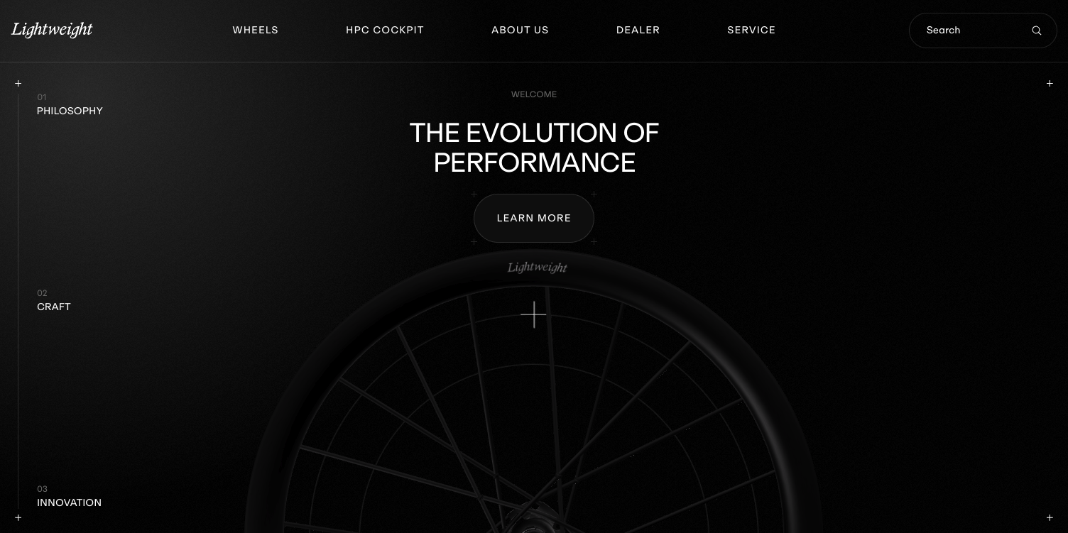
The trend of quiet minimalism in premium hero sections
Minimalism has been a core design philosophy for years, but the version that appears in modern hero section trends has evolved. It is no longer about emptiness or starkness. It is about intentional quiet. Every element that remains in the hero must justify its place. Every piece of copy must carry weight. Every space must support clarity.
Premium audiences gravitate toward this quiet minimalism because it reflects ease. It communicates that the brand does not need to shout. It suggests confidence. Brands that rely on quiet minimalism often attract clients who appreciate refinement and subtlety. The hero becomes a moment of calm clarity in a digital landscape full of noise.
This quiet minimalism sets the tone for the entire site. It becomes the foundation for a premium user experience where every detail feels considered.
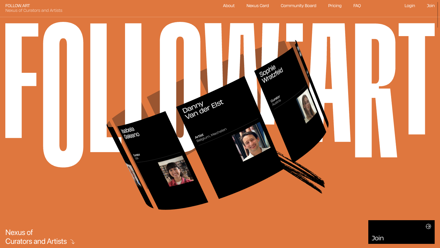
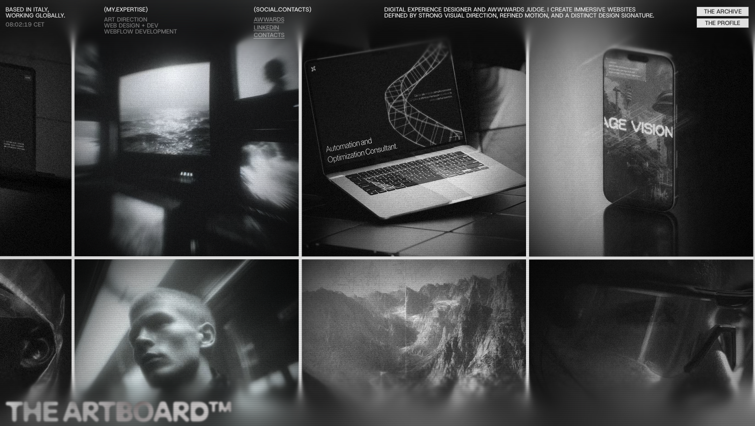
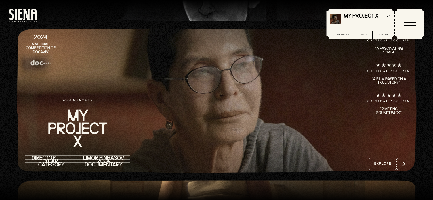
The growing preference for editorial style layouts
Editorial inspired hero sections are becoming increasingly popular among premium brands. These layouts feel like the opening spread of a high end magazine. The composition blends strong typography with refined imagery, creating a sense of curated storytelling. The user feels like they are experiencing a brand that values craftsmanship and attention to detail.
These editorial layouts often create a balance between visual impact and narrative flow. The eye moves from the headline to the supporting text to the image in a structured sequence. The layout feels intentional and designed for clarity. For brands that want to be seen as thought leaders or tastemakers, this editorial approach supports that positioning instantly.
The hero becomes a statement piece rather than a digital placeholder.
The importance of clarity in call to action positioning
Premium hero sections must guide users toward the next step without feeling pushy. The call to action in a modern hero must be visible and aligned with the narrative. It should not feel overly promotional or competing with core messaging. Instead, it should feel like a natural continuation of the brand story.
Two essential principles define the strongest CTA placements:
The CTA should sit in proportion to the hero design so that it feels integrated.
The CTA should maintain clarity by using contrast and spacing that respects the surrounding layout.
These two principles ensure that the CTA feels important without overwhelming the visual language of the hero.
Designing hero sections that pre qualify premium buyers
A hero section serves as the first filter in client alignment. It either attracts or repels based on the quality of the design language. Premium buyers look for clarity, discipline, and a sense of vision. They want to feel that the brand knows who it is. When a hero is designed with intention, it communicates that the brand is sophisticated and capable.
This means that modern hero section trends are not simply design directions. They are strategies for attracting better aligned clients. A clear hero attracts clients who value clarity. A refined hero attracts clients who value refinement. A contemporary hero attracts clients who want a modern presence. This alignment strengthens conversions and prepares buyers for consultations because they have already experienced the brand’s aesthetic leadership.
Why modern hero section trends matter for long term positioning
Hero sections define the tone of the digital brand experience. They set expectations and create a sense of identity that influences every interaction. When a brand adopts trends that emphasize clarity, refinement, and emotional resonance, the site gains longevity. The design ages well. The messaging feels timeless. The user experience stays relevant.
Premium buyers remember how a hero makes them feel. That emotional memory shapes how they evaluate the rest of the brand. When the hero is crafted with intention, the brand begins the relationship with confidence.
Conclusion
Modern hero section trends reveal a shift toward clarity, emotion, and refined simplicity. These trends reflect the expectations of premium audiences who want digital experiences that feel thoughtful, elegant, and trustworthy. The hero section becomes the stage where perception is formed and authority is established. It is where users decide whether the brand resonates with their values and whether they want to continue the journey.
By embracing these trends with intention, brands position themselves as modern, confident, and aligned with the expectations of high value clients. The hero section becomes a strategic asset rather than a decorative feature. It opens the door to deeper engagement, stronger trust, and higher conversion potential.
Start your project
Start your project with a free discovery call and see how we can bring your vision to life.
Don’t miss these