How to add a button shadow effect on Squarespace
Learn how to add a button shadow effect on Squarespace using custom CSS to create depth, hierarchy, and stronger visual emphasis on your calls to action.
In this tutorial:
Introduction
What is button shadow effect in Squarespace
How to create a button shadow effect on Squarespace
How a button shadow effect works for visitors
Why use button shadow effect on a high-quality Squarespace site
Final thoughts
Start your project
Start your project with a free discovery call and see how we can bring your vision to life.
Introduction
Flat interfaces can feel clean, but they can also feel passive.
If your calls to action blend into the layout, users hesitate. A button shadow effect adds visual depth and creates a subtle sense of elevation. When combined with hover and active states, it mimics physical interaction, making buttons feel pressable and responsive.
For founders and product leaders, these micro-interactions are not decoration. They shape perception. A well-designed button shadow effect on Squarespace can increase clarity, hierarchy, and engagement without overwhelming the interface.
What is button shadow effect in Squarespace
A button shadow effect uses CSS box-shadow and transformation properties to simulate depth. The button appears slightly lifted off the page, and when hovered or clicked, it shifts position to mimic being pressed.
This approach is commonly used to:
Add contrast in minimal layouts
Emphasize primary calls to action
Create a tactile, interactive feel
Reinforce playful or bold brand identities
Because shadows influence hierarchy, they should be applied intentionally. Overuse can clutter the interface and reduce clarity.
Need an expert to build your Squarespace website?
Book a free kick-off call with our team to discuss your project requirements in detail.
How to create a button shadow effect on Squarespace
To implement a button shadow effect, you will add custom CSS inside Squarespace.
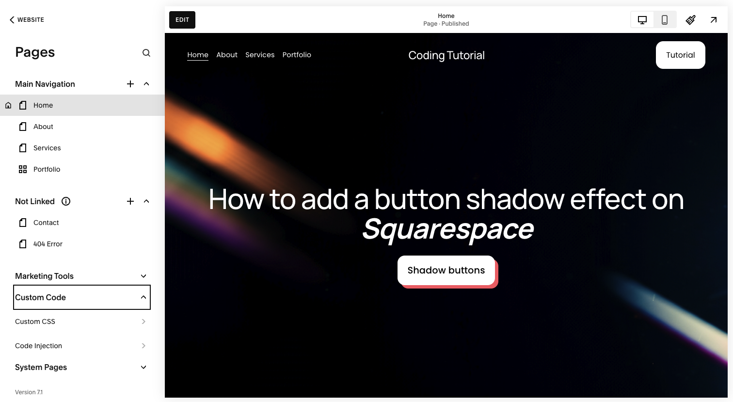
Step 1: Open the Custom CSS panel
Log into your Squarespace account.
Open your website dashboard.
Click Pages.
Scroll down and select Custom CSS under Custom Code.
This allows you to safely extend default button styles.
Step 2: Add the button shadow CSS
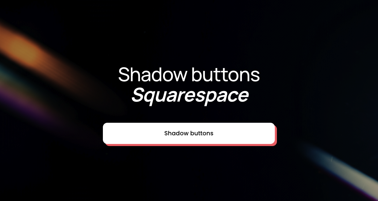
Paste the following code into the Custom CSS panel:
// Shadow buttons - Typza.com //
.sqs-block-button .sqs-block-button-element {
box-shadow: 7px 7px rgb(255, 87, 106);
transition: 120ms !important;
}
.sqs-block-button .sqs-block-button-element:hover {
box-shadow: 4px 4px rgb(255, 87, 106);
transform: translateY(2px) !important;
}
.sqs-block-button .sqs-block-button-element:active {
box-shadow: none;
transform: translateY(4px) !important;
}
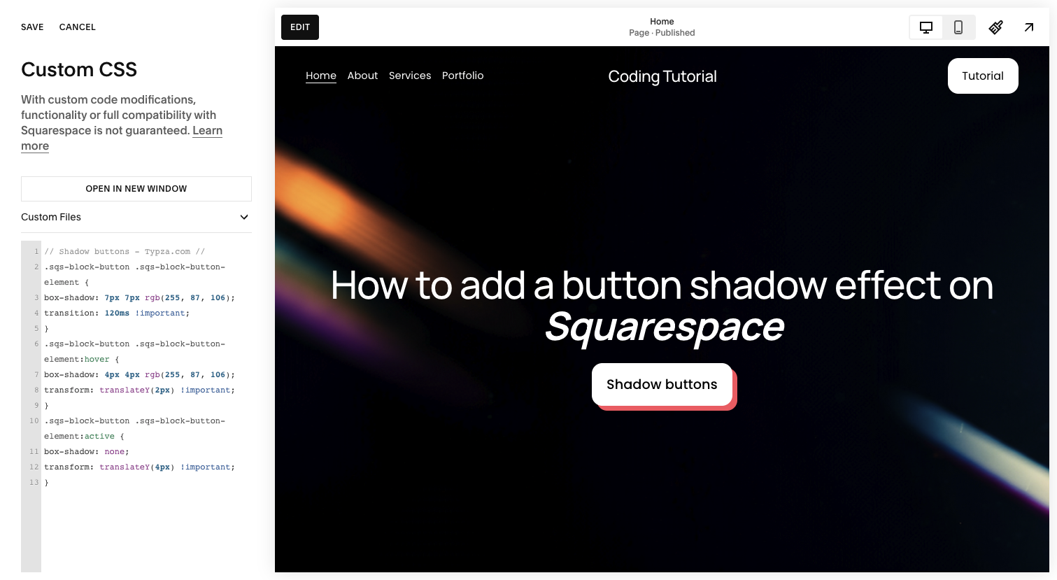
This code creates three interaction states:
Default state: A bold 7px shadow gives the button elevation.
Hover state: The shadow shortens and the button moves slightly downward, simulating pressure.
Active state: The shadow disappears and the button shifts further, mimicking a full press.
The short transition duration keeps the interaction sharp and responsive.
Step 3: Save and review across layouts
Click Save, then test the interaction:
On desktop hover
During click interactions
Across different sections and backgrounds
On mobile devices
Although hover does not trigger on mobile in the same way, the active state still applies when tapped.
Step 4: Adjust shadow styling to match your brand
You can refine:
Shadow distance for stronger or softer depth
Shadow color to align with brand accents
Transition timing for smoother or sharper motion
Subtle adjustments often produce the most premium result. Oversized shadows can feel heavy or outdated if not balanced carefully.
How a button shadow effect works for visitors
A button shadow effect works for visitors by introducing visual hierarchy and reinforcing interactivity.
When a button appears elevated, users instinctively understand it is clickable. As the button shifts and compresses on hover or click, it creates a tactile feedback loop that increases confidence in the interaction.
This improves:
Click clarity
Engagement with primary actions
Perceived responsiveness
Overall UX polish
Because the effect simulates physical movement, it feels intuitive rather than decorative.
Why use button shadow effect on a high-quality Squarespace site
For serious brands, hierarchy drives performance.
A button shadow effect can:
Separate primary actions from surrounding content
Increase visual contrast without changing color
Add personality to otherwise minimal interfaces
Improve conversion-focused layouts
However, poor implementation can introduce:
Inconsistent spacing
Overly aggressive movement
Conflicts with existing hover effects
Visual clutter across dense pages
An experienced Squarespace developer will ensure shadow depth, motion, and timing align with the broader design system. Micro-interactions should feel cohesive across buttons, cards, and navigation elements.
When executed strategically, shadows enhance performance rather than simply adding style.
Final thoughts
A button shadow effect on Squarespace is a powerful way to introduce depth and interaction without complex animations. With thoughtful use of box-shadow and transform properties, you can create a tactile, engaging experience that elevates your calls to action.
The CSS is simple. The strategic application is what separates a polished, conversion-driven site from a generic one.
For founders and product leaders focused on brand perception and measurable results, details like this are not optional. They are part of building a site that performs at a higher level.
Start your project
Start your project with a free discovery call and see how we can bring your vision to life.
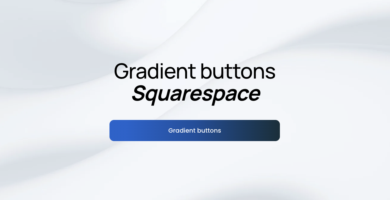
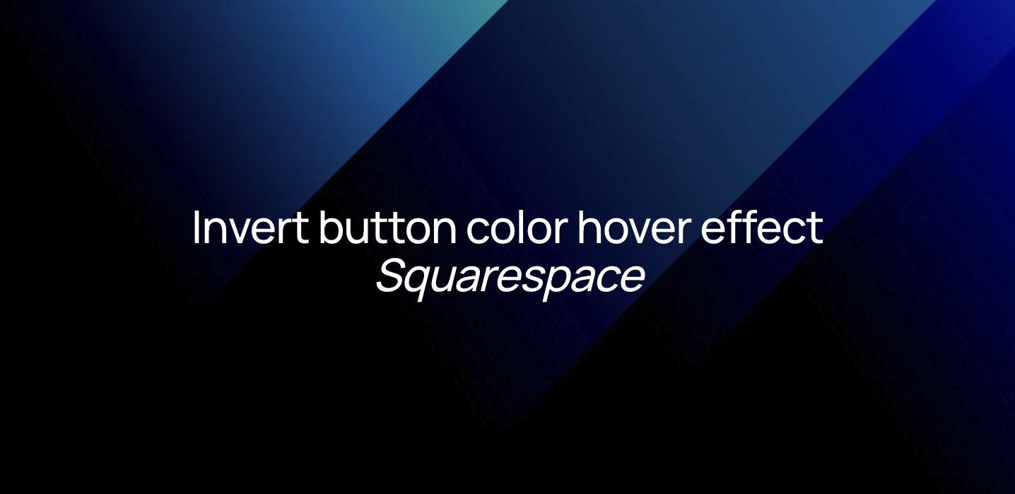
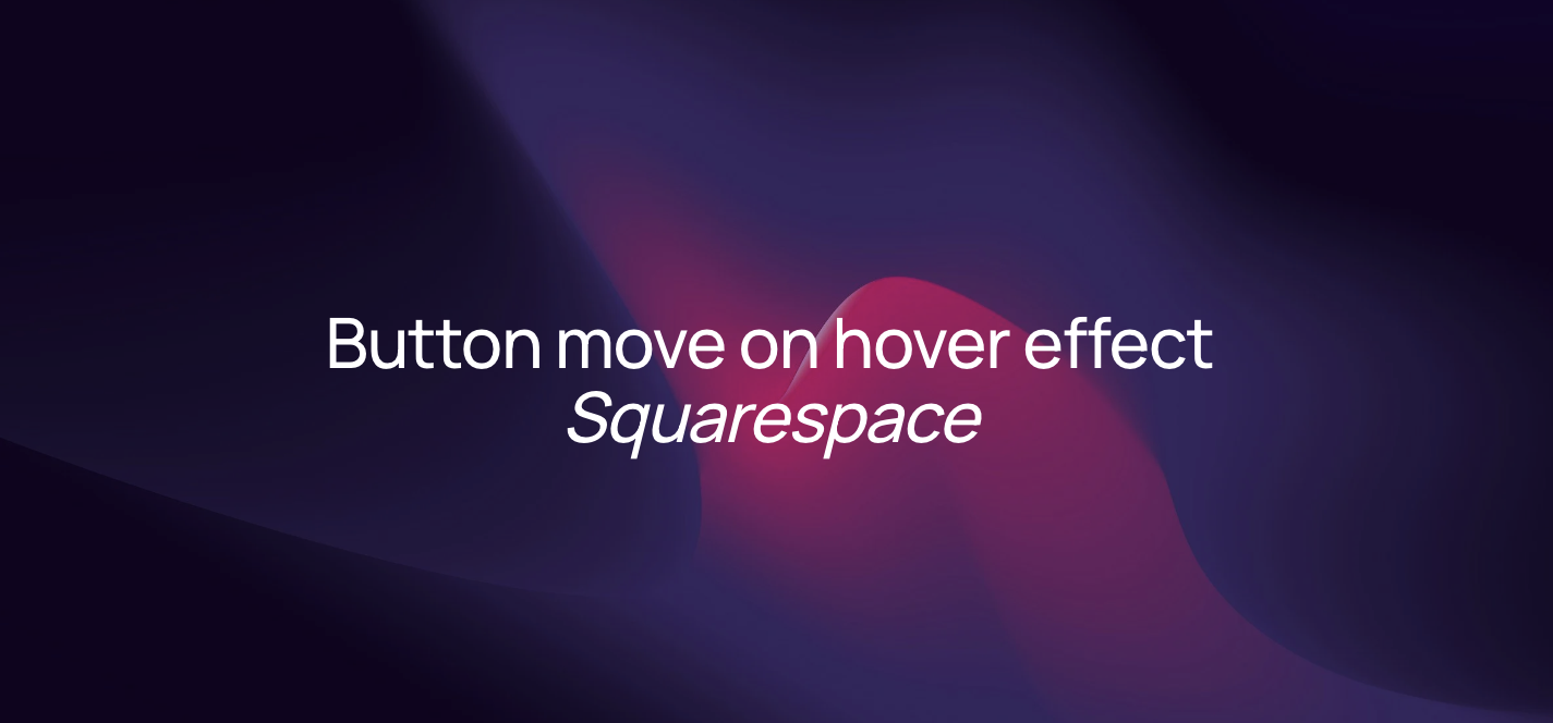
Don’t miss these tutorials