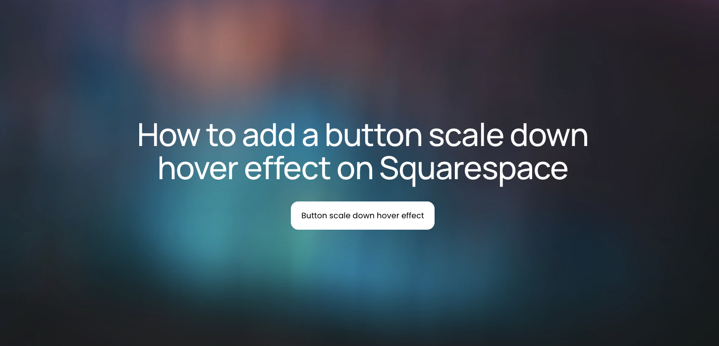
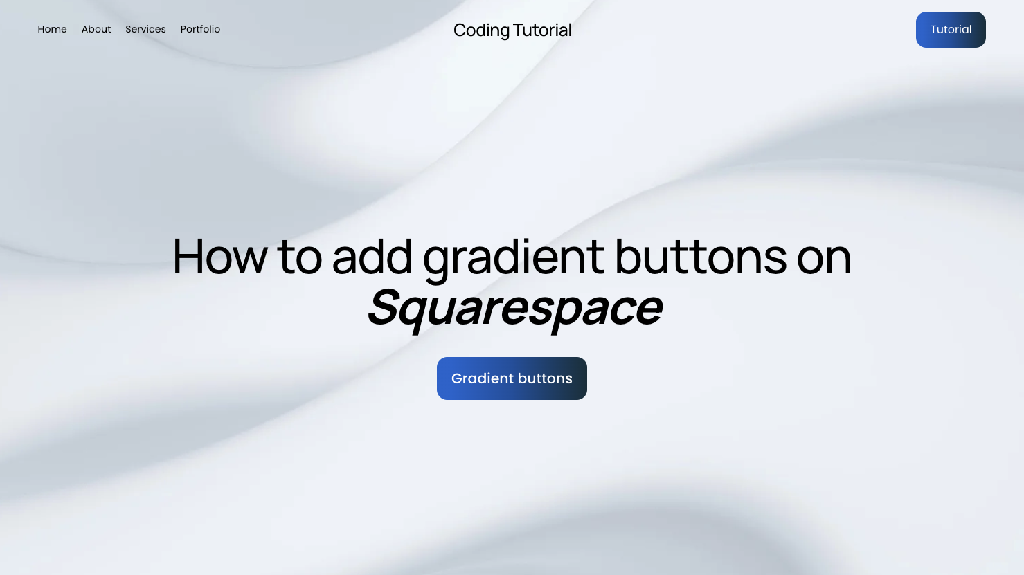
How to add gradient buttons on Squarespace
Learn how to create gradient buttons on Squarespace using custom CSS to elevate visual hierarchy and strengthen your brand presentation.
In this tutorial:
Introduction
What are gradient buttons in Squarespace
How to create gradient buttons on Squarespace
How gradient buttons on Squarespace work for visitors
Why use gradient buttons on a high-quality Squarespace site
Final thoughts

Start your project
Start your project with a free discovery call and see how we can bring your vision to life.
Introduction
Flat color buttons work. But they rarely stand out.
If your site relies on strong calls to action, visual hierarchy matters. Gradient buttons introduce depth, contrast, and sophistication without increasing visual clutter. When implemented correctly, they create a premium feel that aligns with modern SaaS, tech, and product-led brands.
Adding gradient buttons on Squarespace requires custom CSS. While the platform provides solid native styling controls, gradients allow for greater brand expression and control over interaction states.
For high-growth companies, these details influence perception and conversion.
What are gradient buttons in Squarespace
Gradient buttons use a color transition across the button background rather than a single solid color. Instead of one static brand color, the button blends multiple tones smoothly.
Common use cases include:
Emphasizing primary calls to action
Creating a modern hero section button
Reinforcing a dynamic or innovative brand identity
Adding visual interest without heavy animation
Because gradients attract attention naturally, they are best used strategically. Overusing them can dilute their impact and reduce clarity.
Need an expert to build your Squarespace website?
Book a free kick-off call with our team to discuss your project requirements in detail.
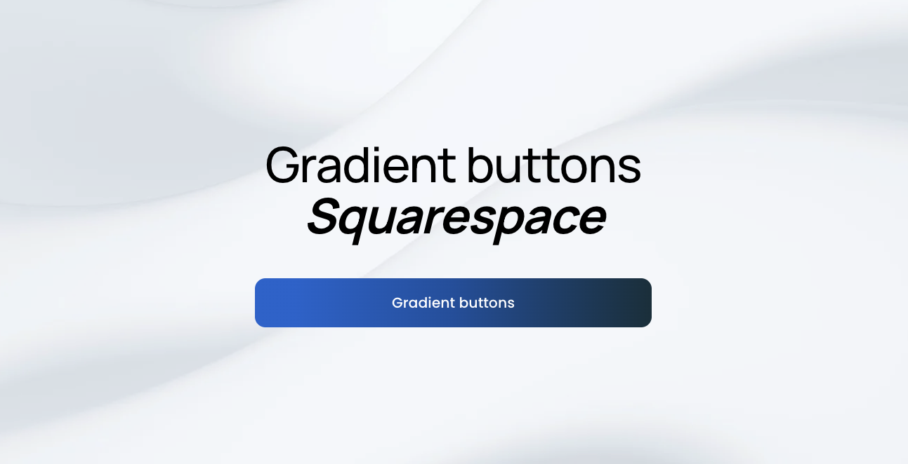
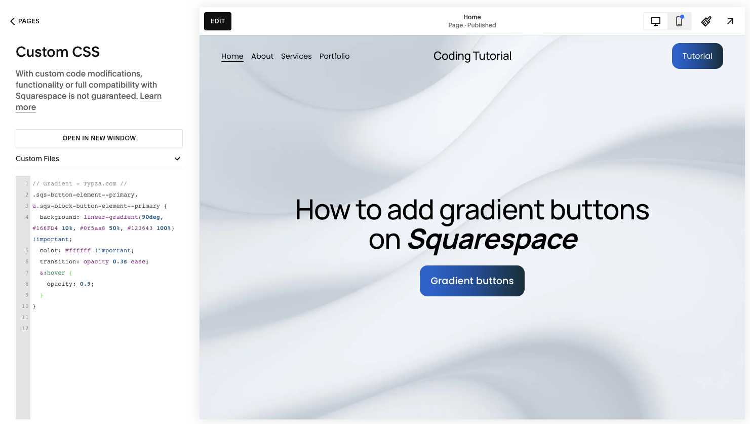
How to create gradient buttons on Squarespace
To add gradient buttons on Squarespace, you will apply custom CSS to override the default button background styling.
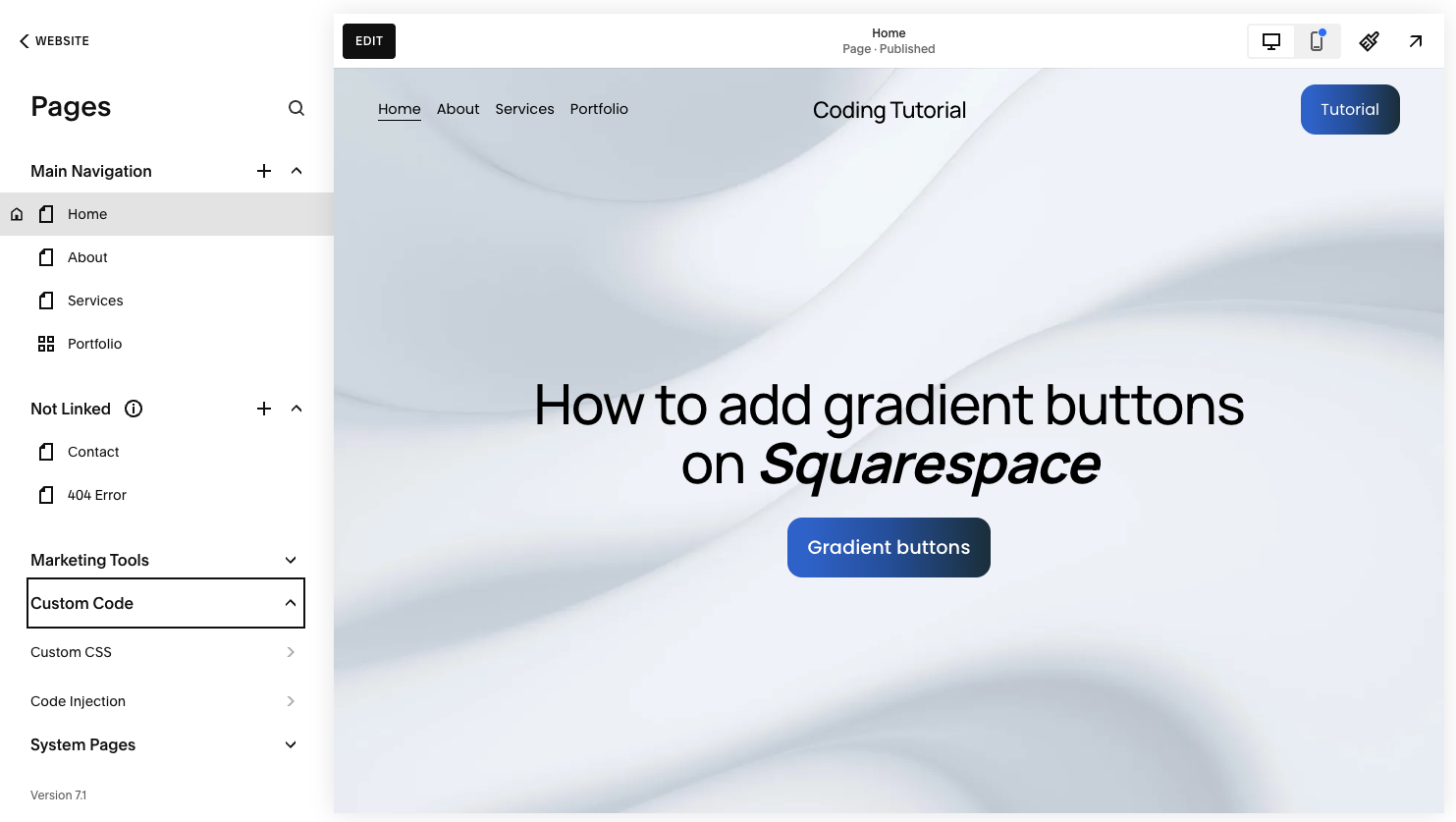
Step 1: Open the Custom CSS panel
Log into your Squarespace account.
Open your website dashboard.
Click Pages.
Scroll down and select Custom CSS under Custom Code.
This allows you to safely extend default button styles.
Step 2: Add the gradient button CSS
Paste the following code into the Custom CSS editor:
// Gradient buttons - Typza.com //
.sqs-button-element--primary,
a.sqs-block-button-element--primary {
background: linear-gradient(90deg, #166FD4 10%, #0f5aa8 50%, #123643 100%) !important;
color: #ffffff !important;
transition: opacity 0.3s ease;
}
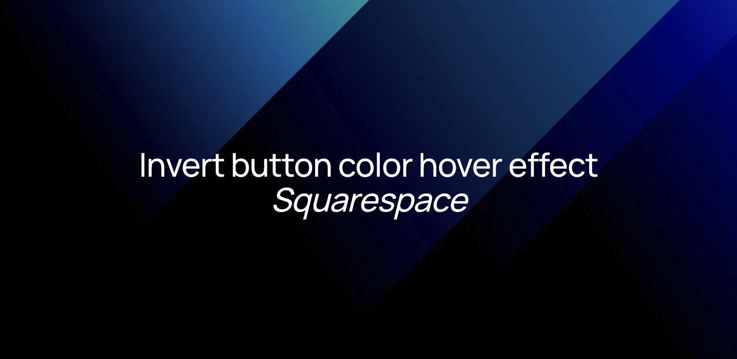
.sqs-button-element--primary:hover,
a.sqs-block-button-element--primary:hover {
opacity: 0.9;
}
This code:
Applies a horizontal gradient background
Forces white text for readability
Adds a smooth opacity transition on hover
Slightly reduces opacity when hovered
The hover effect maintains layout stability while still providing interaction feedback.
Step 3: Save and test across your site
Click Save, then review:
Hero section buttons
Form submission buttons
Product or pricing page calls to action
Mobile responsiveness
Because the code applies to all primary buttons, ensure it aligns with your design system globally.
Step 4: Customize the gradient to match your brand
You can adjust the gradient values inside:
linear-gradient(90deg, color1, color2, color3)
For example:
Change the angle from
90degto135degfor diagonal gradientsAdjust color stop percentages for stronger contrast
Simplify to two colors for a cleaner aesthetic
Always confirm text contrast remains accessible.
How gradient buttons on Squarespace work for visitors
Gradient buttons on Squarespace work for visitors by increasing visual prominence and guiding attention toward key actions.
Because gradients introduce subtle depth, they:
Naturally draw the eye
Differentiate primary from secondary actions
Reinforce perceived quality
Make conversion points feel intentional
The slight opacity shift on hover signals interactivity without resizing or shifting layout. This keeps the experience smooth and predictable.
Visitors respond to clarity. When a call to action visually stands out, decision-making becomes easier.
Why use gradient buttons on a high-quality Squarespace site
For serious brands, design consistency and hierarchy drive performance.
Gradient buttons can:
Elevate brand sophistication
Create stronger visual contrast in minimalist layouts
Reinforce modern product positioning
Increase perceived value
However, improper implementation can cause:
Inconsistent hover behavior
Clashing brand tones
Accessibility issues
Over-styled interfaces that distract from messaging
A strategic implementation ensures gradients support your broader visual identity rather than overpower it.
Experienced Squarespace execution also ensures compatibility across templates, devices, and future updates. What looks good in isolation must function cohesively across the entire site.
Final thoughts
Adding gradient buttons on Squarespace is a powerful way to modernize your interface and elevate your brand presence. With just a small amount of custom CSS, you can transform static buttons into high-impact conversion elements.
The technical implementation is straightforward. The strategic decision of where and how to use gradients is where expertise matters.
For founders, CMOs, and product leaders building serious brands, small interface decisions compound over time. When your calls to action feel deliberate and refined, your entire site performs at a higher level.
Start your project
Start your project with a free discovery call and see how we can bring your vision to life.
Don’t miss these tutorials