Why dental practice website design fails to attract new patients and how to fix it
A dental practice website that looks professional is not the same as one that consistently attracts and converts new patients. Effective dental practice website design begins with a clear commercial brief, not a visual one. This article explains what the site actually needs to do, where most practices go wrong, and which fixes produce measurable change. The aim is a site that earns new patient bookings every week, not just compliments on its design.
What dental practice website design actually needs to achieve
Dental practice website design that works is not primarily a matter of looking clean and professional. Most dental practice websites already look clean and professional. The ones that consistently attract new patients look clean and professional and do several other things simultaneously: they appear at the top of local search results when someone searches for a dentist nearby, they reassure nervous visitors quickly enough to stop them from leaving, they make booking an appointment so easy that a patient can do it at any hour without picking up the phone, and they communicate enough about the practice's approach and team that a stranger feels comfortable choosing this practice over the three others that appeared in the same search results.
The gap between a dental practice website that looks right and one that consistently fills the appointment book is the gap between a digital brochure and a patient acquisition system. Both may use the same visual language, the same stock photography of smiling faces, the same list of treatments. But one is designed from the inside out, built to represent the practice accurately, while the other is designed from the outside in, built around how a prospective patient experiences the decision to book with a new dentist. That difference in design orientation produces very different commercial results.
Understanding what is actually preventing new patients from booking through a dental practice website requires looking at it through the eyes of someone who has never been to the practice, who may have some degree of dental anxiety, who is searching on a phone, and who has two or three other practice websites open in adjacent browser tabs. From that perspective, the decisions about what to show first, how to reduce anxiety early in the visit, where to place the booking option, and what evidence to provide that this practice is the right choice become considerably clearer than they are from the perspective of the practice owner who knows and trusts the practice intimately.
The first impression problem: why anxious patients leave before reading a word
Dental anxiety affects a significant proportion of the population, with estimates suggesting that between a third and a half of adults experience some degree of nervousness about dental visits. For many of these people, the decision to look for a new dentist is already a significant step, and the website they land on is the first experience they have of the practice. If that first experience is cold, clinical, and impersonal, it reinforces the anxiety rather than alleviating it, and the visitor closes the tab and tries the next result in the search list.
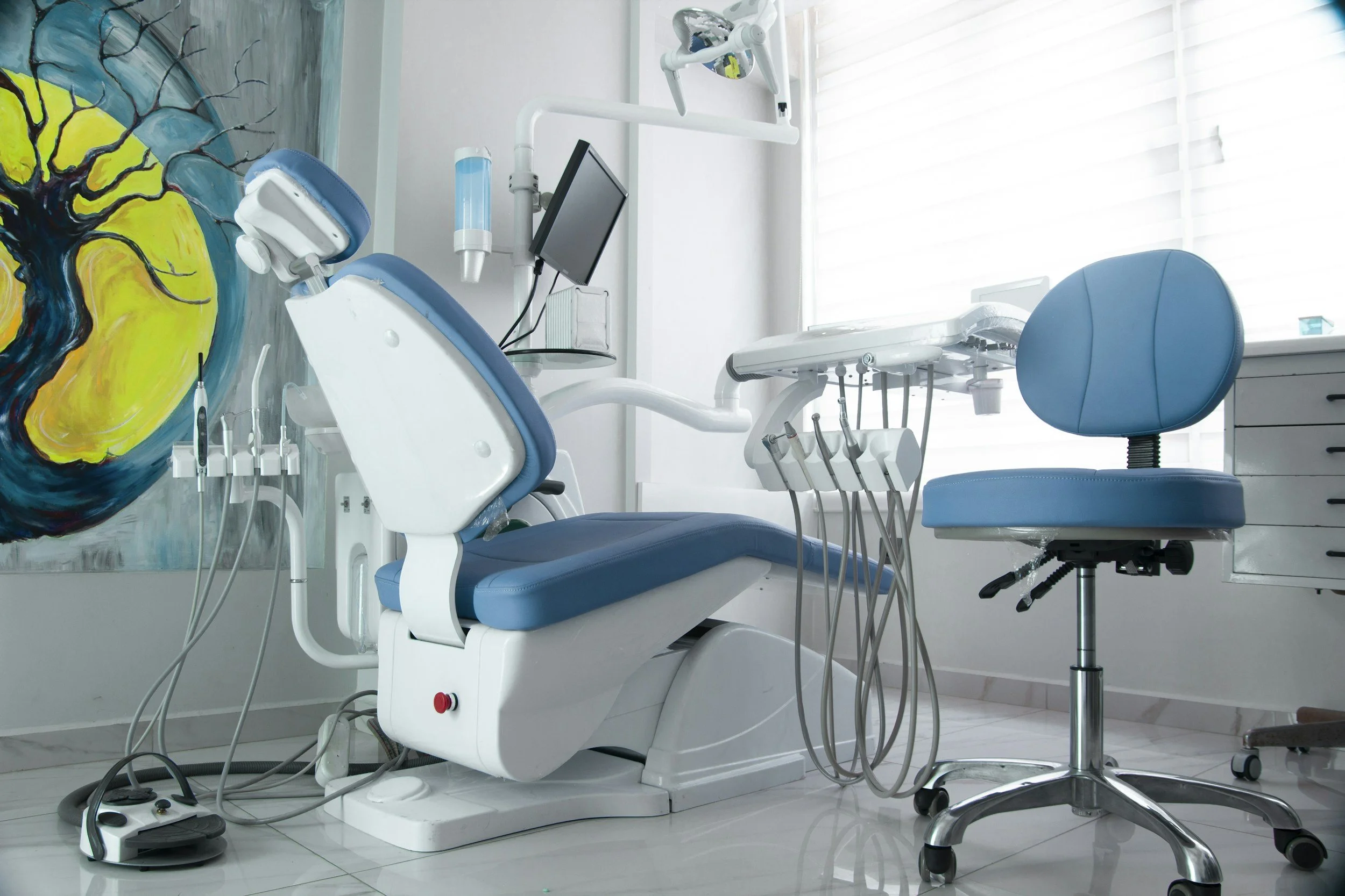
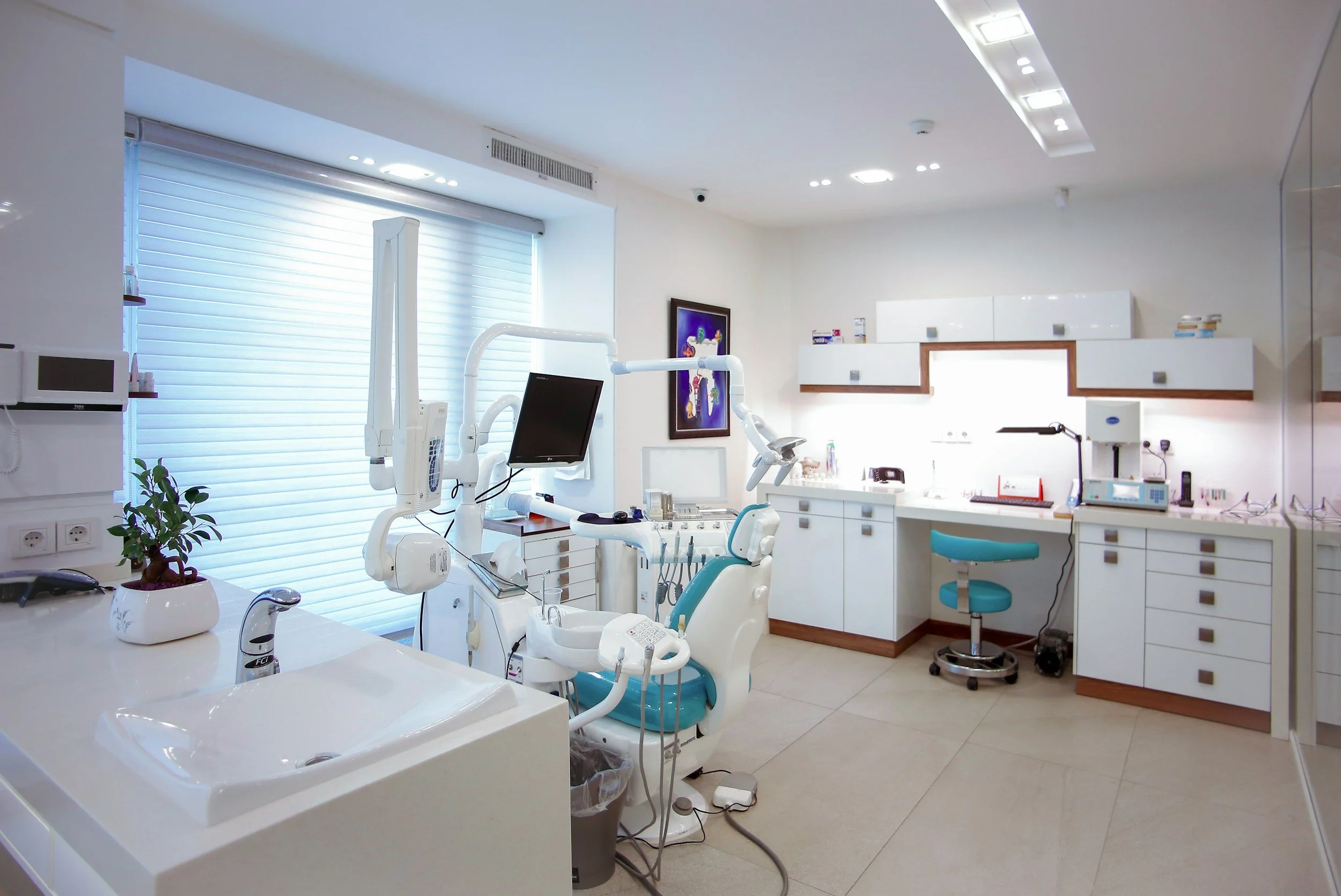
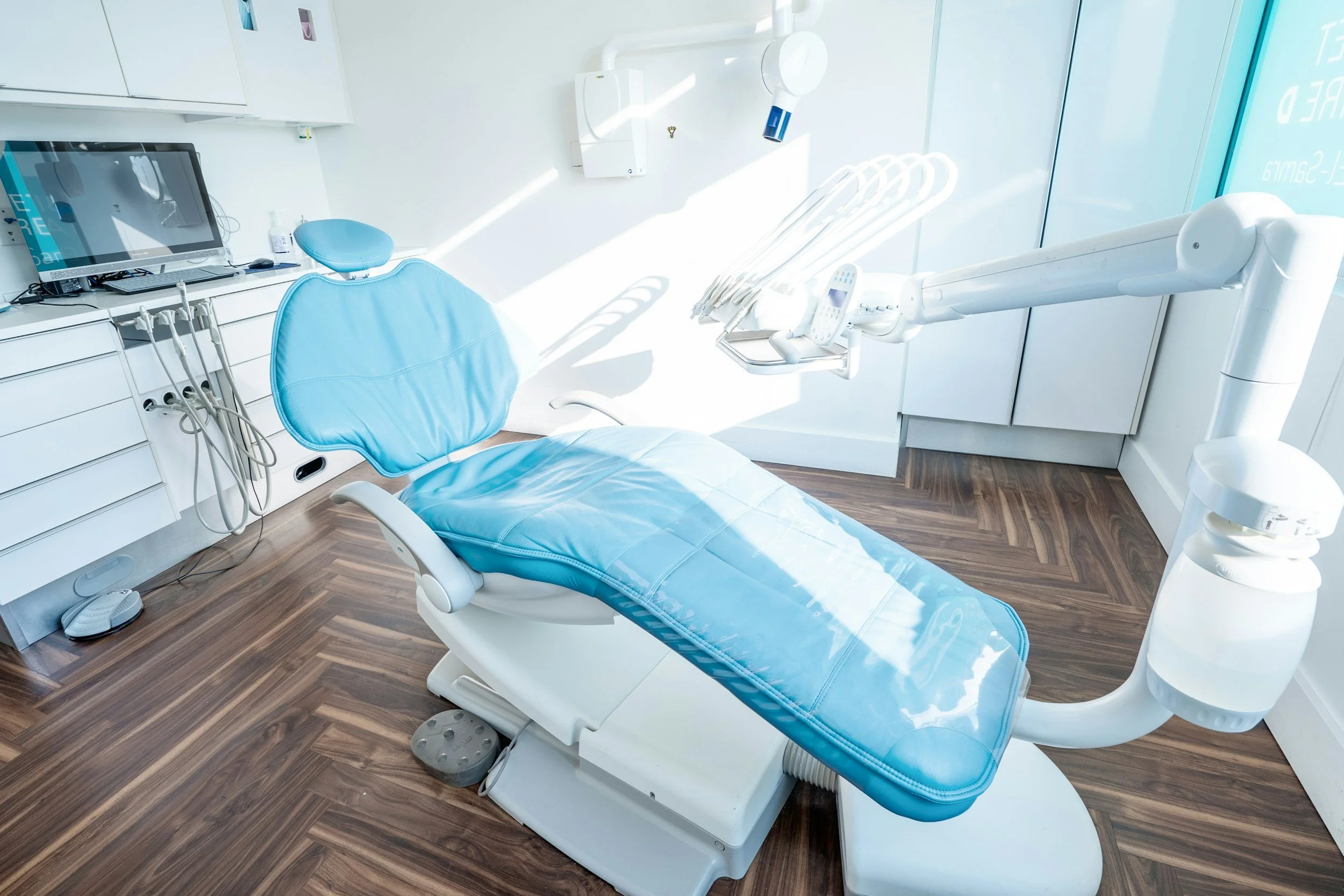
The visual and tonal language of dental practice website design has a direct effect on how anxious visitors feel within the first few seconds of arriving on the page. A homepage dominated by clinical stock imagery, formal language about treatments and procedures, and a colour palette that communicates medical sterility rather than warmth and care will consistently lose anxious visitors before they have had a chance to read anything substantive about the practice. The design is making an emotional statement before the copy has a chance to make an intellectual one, and for many anxious visitors that emotional statement is enough to make them leave.
The specific design changes that improve first impressions for dental practice websites are well understood. Warm, authentic photography of the actual team rather than generic stock images. A welcoming, friendly tone in the headline that acknowledges the nervousness many patients feel rather than launching immediately into treatment descriptions. A colour palette that suggests cleanliness and care without cold clinical detachment. These are not radical changes to the structure or content of the site. They are adjustments to the emotional register of the first impression that can significantly affect whether anxious visitors stay long enough to consider booking.
The hero section of a dental practice homepage has a specific job to do: to make the visitor who has just arrived feel that this is a practice that understands patients, not just teeth. A headline that says "we understand that visiting the dentist can feel daunting, and we have built our practice around making it easier" is speaking to the internal experience of a significant proportion of the visitors arriving on that page. It communicates empathy before competence, which is the order in which most anxious patients need to encounter these qualities before they will stay long enough to evaluate the practice's clinical credentials.
The booking barrier: why your appointment system is losing you patients overnight
The online booking system, or the absence of one, is one of the most commercially significant elements of dental practice website design, and it is one that most practices significantly underinvest in. A patient who decides at eleven in the evening that they want to book a check-up, or who is in tooth pain at the weekend and needs to find emergency treatment, cannot book through a website that only offers a phone number with office hours. They will find the practice that does offer online booking, or they will call first thing in the morning and get through to whatever practice answers fastest. Either way, the practice without online booking loses them.
The proportion of dental appointments now booked outside standard office hours has grown substantially as online booking tools have become standard in consumer services more broadly. Patients who book restaurant tables, GP appointments, and hair salon slots online have the same expectation when looking for a dentist. A practice that meets this expectation by offering seamless online booking captures a category of new patient that a phone-only booking system will consistently miss. The investment in a properly integrated booking tool is modest relative to the lifetime value of the patients it captures.
The quality of the online booking experience matters as much as its availability. A booking tool that requires the patient to navigate multiple steps, create an account before they can see available slots, or provide more information than is needed to make the initial appointment, will lose a meaningful proportion of the patients who start the booking process before they complete it. The optimal booking flow for a dental practice is: select the type of appointment, see available slots, enter name and contact details, receive confirmation. Any additional steps beyond this baseline add friction that costs completed bookings.
The placement of the booking option throughout the site is as important as its availability. A patient who has spent three minutes reading about the practice's approach to nervous patients, or who has just viewed a before-and-after gallery of teeth whitening results that resonated with something they have been thinking about, should not have to navigate to a separate page to find the booking button. The booking option needs to be present and prominent at every point in the site where a visitor might feel motivated to take the next step, which means at multiple points on the homepage, on every treatment page, and at the end of every piece of content that is designed to build interest or confidence.

A website that books patients while you sleep is worth building properly
We design dental practice websites that are built around the patient's decision-making journey — book a free call to find out what yours could be doing.
Local search invisibility: the patients who cannot find you
The majority of new dental patients find their practice through local search. When someone moves to a new area, loses their previous dentist, or decides to look for a practice closer to home or work, their first action is typically to search on Google for a dentist nearby. If the practice does not appear in the local pack, the group of three results shown above the organic listings with a map, it will capture almost none of this traffic. The practices in the local pack capture the overwhelming majority of new patient searches. The practices below the pack capture very little.
The local search visibility of a dental practice depends on a combination of factors that most practices have never systematically addressed. A well-optimised Google Business Profile with complete and accurate information, a strong review profile with regular new reviews, consistent business details across all directories, and a website with substantive local content that Google can use to confirm the practice's relevance to local searches. Each of these factors requires attention, but none requires specialist technical skills or significant ongoing expense. What they require is consistent effort applied over time, which is exactly what most dental practice websites are not doing.
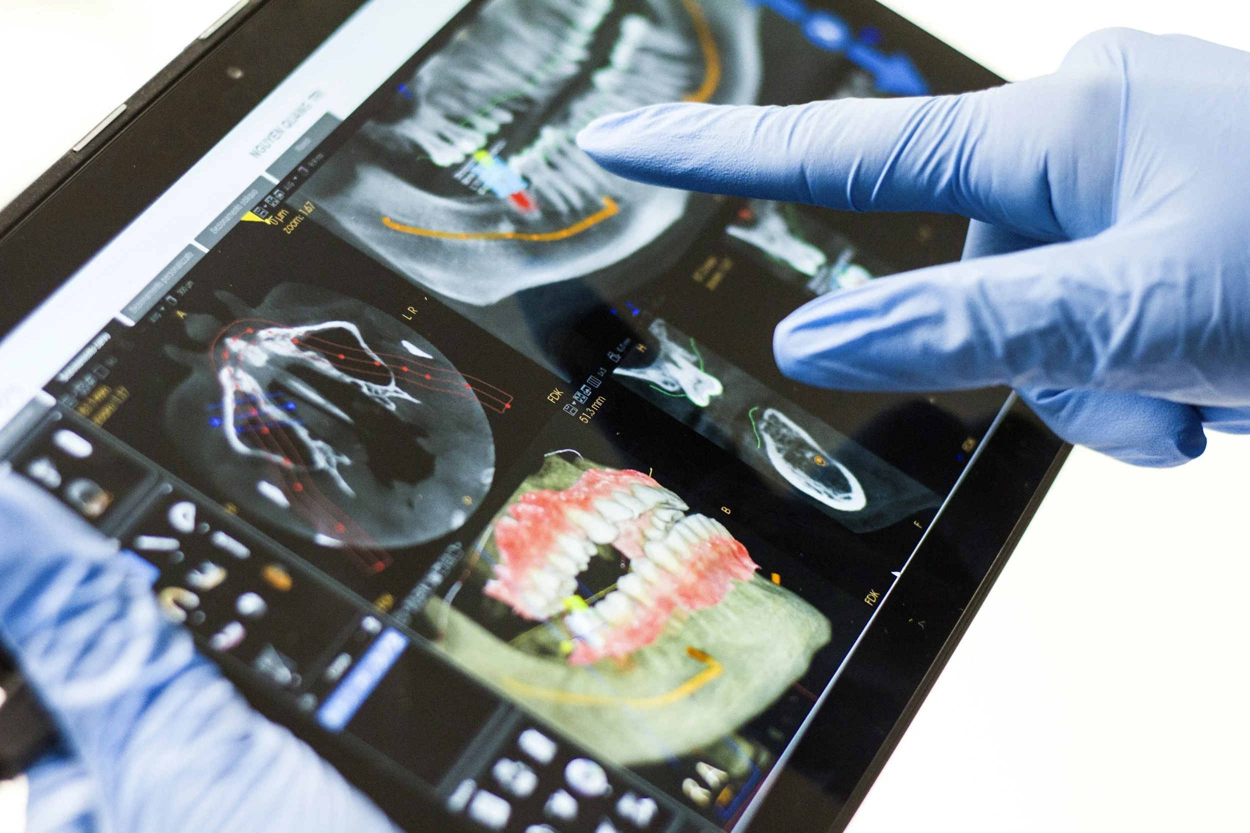
Treatment-specific search is a growing source of high-value patient acquisition that most dental practice websites are not positioned to capture. When a patient searches specifically for "dental implants [city]" or "Invisalign [neighbourhood]," they are expressing a very specific and very high-value intention. A practice that has a dedicated, substantive treatment page for each of its major offerings will appear in these searches. A practice with a generic treatments overview page that mentions all treatments briefly will not. The investment in dedicated treatment pages, written with enough depth and local specificity to rank for treatment-specific local searches, produces a consistent flow of high-value patient enquiries that a generic website cannot generate.
Neighbourhood-level search visibility is the most granular and often the most valuable form of local dental search, because dental patients typically want a practice very close to home or work. A practice in a city whose website says nothing more specific than the city name in terms of location will not rank for the suburb or neighbourhood level searches that represent the most locally relevant potential patients. Adding content that specifically references the neighbourhoods, suburbs, and nearby landmarks that define the practice's actual patient catchment area creates the local specificity that allows Google to surface the practice for the most geographically relevant searches.
Generic messaging: why every dental practice sounds the same
The copy on most dental practice websites is interchangeable between practices. Every practice is "caring," "gentle," and "family-friendly." Every practice "puts patients first" and offers "a warm welcome." These phrases are not lies. They describe values that most practices genuinely hold. But because they are universal, they communicate nothing that distinguishes one practice from another. A prospective patient who is comparing two or three practices in their area on the basis of their websites will find that the messaging gives them no basis for differentiation, which means the decision falls to whoever has more reviews, a better photo, or a more prominent position in the search results.
Differentiation in dental practice messaging does not require inventing a positioning that does not exist. It requires finding and communicating the genuine qualities that are actually distinctive about this practice, and expressing them specifically rather than generically. A practice that has invested heavily in a particular approach to nervous patient management has a genuine differentiator worth communicating specifically. A practice with a dentist who trained with a particular specialist or who has published work in a specific area of dentistry has a genuine credential worth expressing specifically. A practice that has served the local community for thirty years and whose patients often span multiple generations of the same families has a genuine local authority worth expressing specifically.
The homepage headline is where the differentiation work is most commercially important and most commonly inadequate. "Welcome to [Practice Name]" is the headline on a significant proportion of dental practice websites. It tells the visitor nothing about why this practice is worth their attention. A headline that expresses something specific about the practice's character, approach, or distinctive quality in plain, warm language gives a visitor who arrives from a search a reason to stay and read further rather than clicking back to try a competitor. That reason does not need to be extraordinary. It simply needs to be specific, genuine, and different from the generic phrases that surround it in the search results.
Patient testimonials that are specific and personal provide differentiation evidence that generic messaging cannot produce. A testimonial that says "I had not been to the dentist in eight years because of my anxiety. The team here was so patient and understanding that I actually felt calm by the end of my first appointment. I now go every six months" tells a prospective anxious patient something specific and powerful about this practice. That specificity creates the kind of recognition and trust that a claim of being "caring and gentle" cannot. The practice that features specific, personal, emotionally resonant testimonials prominently on its website is doing differentiation work that most competitors are not doing.
Specific messaging about real qualities attracts the right patients at scale
We help dental practices build websites that communicate genuine differentiation and convert visitors into booked appointments — book a free call.
Treatment pages that educate, reassure, and convert
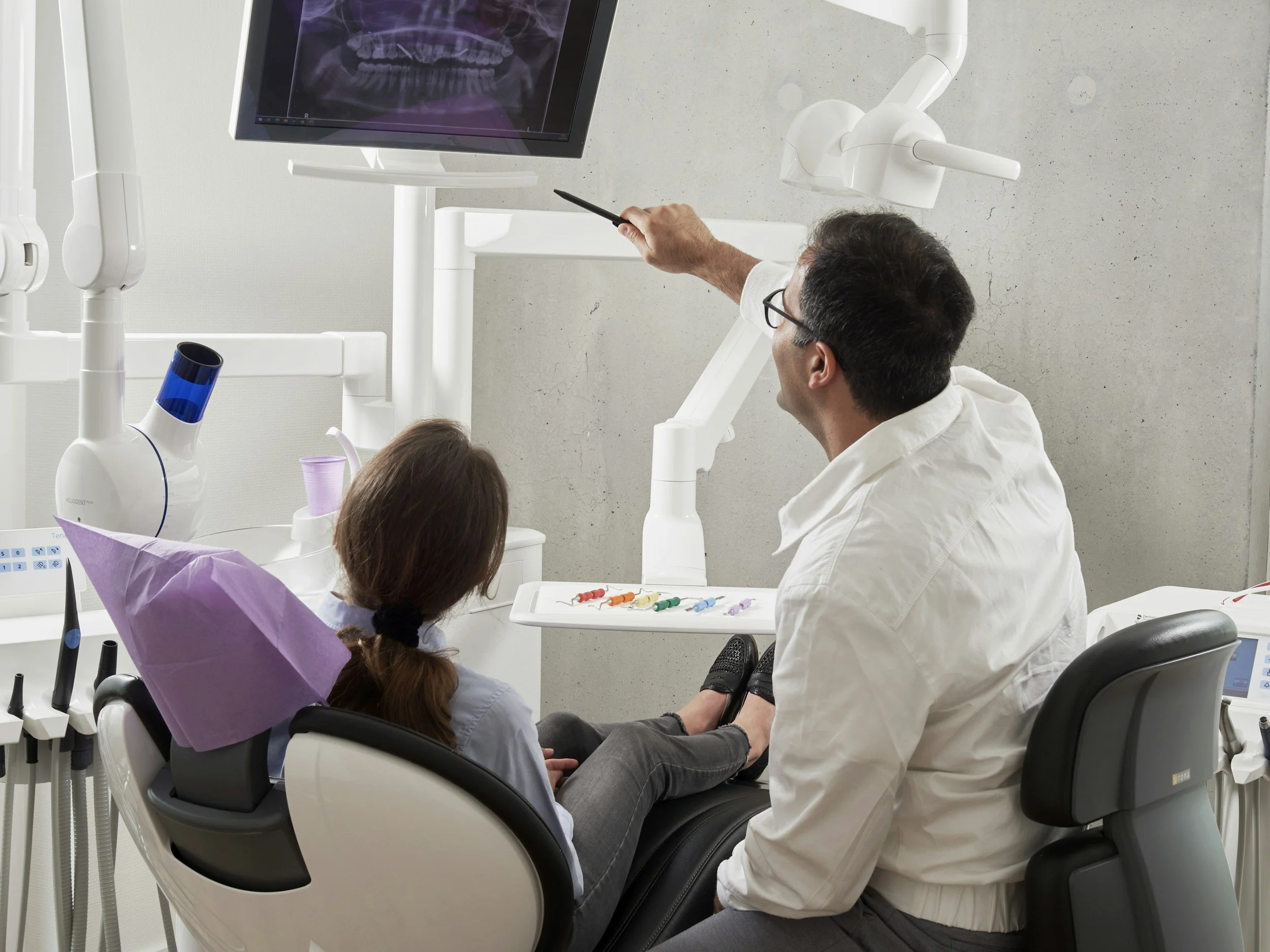
High-value dental treatments, dental implants, Invisalign, veneers, composite bonding, teeth whitening, attract patients who research extensively before making contact. These patients are not making an impulsive decision. They are weighing the cost, the process, the recovery, the results, and the trustworthiness of the practice before they commit to an initial consultation. A practice whose website provides the substantive, honest, educational information these patients are looking for will attract and convert them at a much higher rate than one whose treatment pages are brief promotional descriptions with no depth.
A well-built treatment page for a high-value cosmetic or restorative dental treatment addresses the full range of questions a prospective patient is likely to have: what the treatment involves, who it is and is not suitable for, what the process looks like stage by stage, how long it takes, what the recovery experience is like, what the results typically look like, and what it costs in general terms. Providing this information honestly and specifically, rather than withholding it in the hope that the patient will call to find out, builds the confidence and trust that high-value treatment patients need before they are willing to commit to a consultation.
Before-and-after galleries on treatment pages are among the most persuasive trust signals available for cosmetic dental treatments. A prospective patient who is considering veneers and who sees authentic, high-quality before-and-after photographs of patients whose starting point resembles their own can visualise what the treatment might achieve for them in a way that no written description can produce. These galleries communicate the clinical quality of the practice's work in a direct and credible way, and they provide the aspirational evidence that moves a prospective cosmetic patient from passive interest to active consideration of booking a consultation.
Pricing information on treatment pages is a commercial consideration that most dental practices avoid out of concern that it will discourage prospective patients or create awkward conversations. In practice, the absence of any pricing information is more likely to create hesitation than to prevent it. A prospective patient who cannot get any sense of what a treatment might cost will often postpone enquiring rather than risk discovering an unaffordable figure in person. Providing a general price range, or an explanation of the factors that affect cost, gives the prospective patient enough information to assess affordability without committing the practice to a fixed price before the individual treatment plan has been assessed.
Mobile performance for the patient searching in pain
The most urgent category of dental search happens on mobile, in pain, outside office hours. A patient with acute toothache at ten in the evening is searching for an emergency dentist on their phone. A parent whose child has knocked out a tooth is searching from the school car park. These are the searches with the highest urgency and the highest willingness to book immediately, and they are the searches most likely to be lost to a practice whose mobile website is slow, cluttered, or difficult to navigate in a stressful moment.
Mobile performance for dental practice websites is not simply a matter of the layout adjusting to fit a smaller screen. It is a matter of the most important information, the phone number for emergency contact, the booking link for urgent appointments, the address and opening hours, being immediately visible without scrolling, and the entire page loading fast enough on a typical mobile data connection to remain available to a patient who is not in a position to wait. A page that takes five seconds to load on mobile is a page that loses a significant proportion of its most motivated visitors before they have seen anything.
The phone number on a mobile dental practice website should always be a tappable tel link that initiates a call with a single tap. This is a basic mobile usability requirement that a surprising number of dental practice websites do not meet, meaning that a patient in pain who finds the practice number on the website has to memorise it, switch to the phone app, and dial manually. That friction, small as it appears in normal circumstances, is significant for a patient who is distressed and in a hurry. The practices that make every contact mechanism as easy as possible to use in the worst conditions will consistently capture the urgent patients that others lose.
The emergency and urgent care information on a dental practice website should be prominently signposted and easy to find within two taps from the homepage. A dedicated emergency page, or a clearly labelled emergency section on the homepage, that addresses what to do in common dental emergencies, provides a direct contact number for urgent cases, and explains the practice's emergency availability gives the patient in pain exactly the information they need without requiring them to navigate through a general website structure that was not designed with their urgent situation in mind.
The patient in pain who finds you first becomes a patient for life
We build dental practice websites that perform when it matters most — book a free call to see what better mobile performance means for your patient acquisition.
Building a dental practice website that fills the appointment book
Dental practice website design that consistently attracts new patients is the result of deliberate decisions at every level of the site, from the emotional register of the first impression to the accessibility of the booking mechanism at midnight, from the depth of the treatment pages to the performance of the mobile experience. None of these decisions is individually complex, but they need to be made consistently and in service of a clear commercial goal: making it as easy as possible for the right patient to find the practice, feel comfortable enough to consider booking, and complete that booking without unnecessary friction.
The practices that invest in getting these decisions right consistently find that their website becomes their most productive source of new patient acquisition, generating appointments from patients who found them through search, felt reassured by what they experienced on the site, and booked directly without needing to call. This channel is not dependent on referral relationships, does not require ongoing advertising spend to sustain, and improves over time as the practice's search authority grows and the quality of the website is maintained.
For most dental practices, the gap between the website they currently have and the website they need to achieve this level of patient acquisition is not as large as it might appear. It is rarely a question of starting from scratch. It is more often a question of addressing the specific elements that are preventing the existing traffic from converting: the first impression that is not warm enough, the booking process that is not seamless enough, the treatment pages that are not substantive enough, the local search presence that is not optimised enough. Addressing these elements systematically, in order of their likely commercial impact, transforms a professional brochure into a patient acquisition asset.
If you want a dental practice website that is built to attract and convert new patients consistently, we can help. Take a look at our approach to web design for dental practices and book a free call to talk through what better design could do for your practice's growth.
Written by
Mikkel Calmann
Web design for dental practices
Most dental practice websites were never built to generate leads. We design Squarespace websites that change that. See exactly how we approach it.
More web design insights for dental practices