The dental practice website redesign mistakes costing you new patient bookings
Most dental practice website redesigns produce a fresher version of a site that was already underperforming. A serious dental practice website redesign starts with the specific mistakes costing the practice new patient bookings, not with a visual refresh. This article names those mistakes plainly and explains what a redesign must address before it touches the design. Done in this order, the redesign produces a different commercial outcome rather than a prettier version of the same problem.

Why a dental practice website redesign must fix the right things
A dental practice website redesign is worth the investment when it addresses the specific reasons the existing site is underperforming. Many practices commission a redesign when the site begins to look dated, without a clear understanding of which specific elements are preventing new patients from booking. The result is a site that looks more current but that makes the same structural and content mistakes in a more attractive presentation. The booking rate does not improve because the things that were preventing bookings were not identified or addressed before the redesign brief was written.
The mistakes that cost dental practice websites the most new patient bookings are not primarily visual. They are structural, content-related, and technical. A site can look excellent and still fail to attract new patients because it does not rank in local search, because the booking process is too friction-heavy, because the treatment pages are too thin to convert the visitors who do arrive, or because the mobile experience is too slow for the urgent patient who is searching in pain. These are the mistakes that a properly briefed dental practice website redesign should address first, before any investment is made in visual refinement.
Understanding which of these mistakes are present on a specific practice's website requires looking at the data rather than the design. How many visitors arrive each month? What proportion book an appointment? Which pages have the highest exit rates? What proportion of traffic comes from mobile? Which search queries are driving visitors to the site? This data, available through Google Analytics and Google Search Console, reveals the actual commercial performance of the current site and provides the specific, evidence-based brief that a redesign needs to produce genuine improvement in patient acquisition rather than visual improvement alone.
No online booking or a booking process that loses patients before they complete it
The absence of online booking on a dental practice website is the single most commercially damaging mistake a practice can make, and it is still present on a surprising number of practice websites. Dental patients now have the expectation of online booking across most healthcare and consumer service categories, and a practice that offers only a phone number during office hours is failing to capture the significant proportion of new patient bookings that happen outside those hours. Research on patient booking behaviour consistently shows that a substantial proportion of appointment requests happen in the evenings and at weekends, when most dental practices are not taking phone calls.
A booking process that exists but is poorly designed loses patients at the point of completion, which is the last and most costly place to lose them. A patient who has spent four minutes reading about the practice, has felt reassured by the team photography and the patient reviews, and has decided to book, but who then encounters a multi-step booking process that requires account creation, multiple form pages, or a long waiting time for a confirmation, is a patient who may abandon the process before completing it. The completion rate of the booking flow is a direct measure of how many patients the current process is losing at this final stage.
A dental practice website redesign that prioritises booking performance will invest in a booking integration that is seamless, fast, and available across all pages of the site at every moment when a patient might feel motivated to book. The booking option should be visible in the header on every page, present as a prominent call to action on the homepage, embedded at the bottom of every treatment page, and available as a floating button on mobile that remains accessible as the patient scrolls. The path from motivation to completed booking should be achievable in under two minutes from any point on the site.
The specific booking tool chosen for the redesign matters as much as its placement. A booking system that integrates directly with the practice management software, that allows patients to select their specific treatment type and preferred dentist, that shows real-time availability, and that provides immediate confirmation by both email and text message, provides the quality of booking experience that modern dental patients expect. A booking tool that adds friction or that requires manual processing before confirmation undermines the seamlessness that makes online booking valuable for both the patient and the practice.
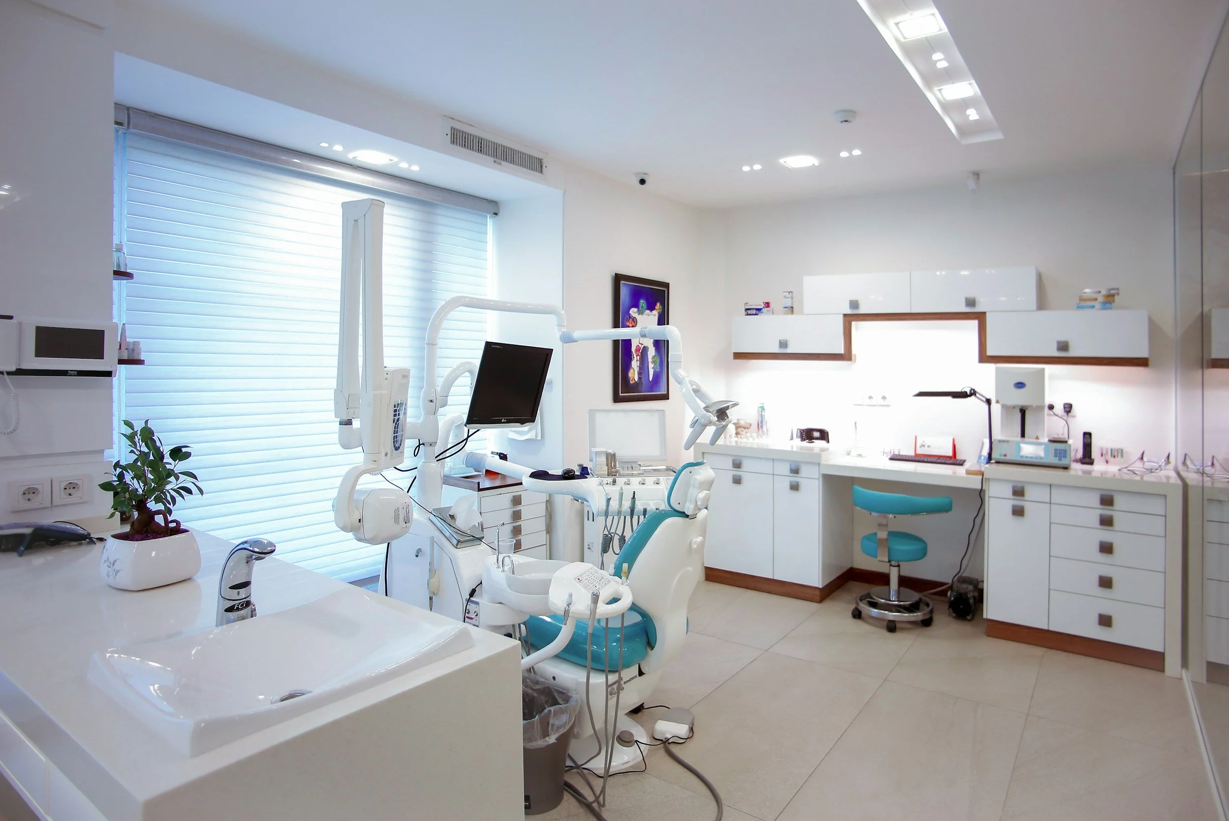
Stock photography that makes every practice look the same
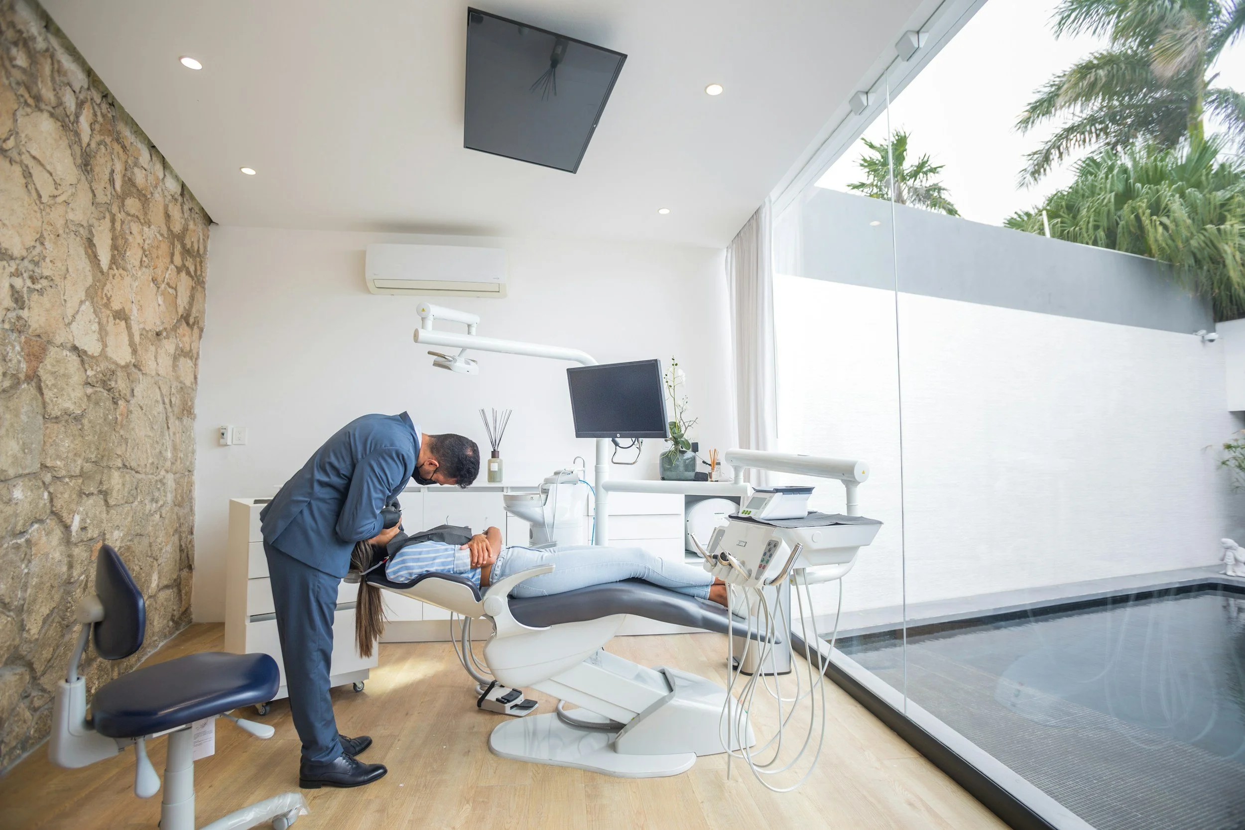
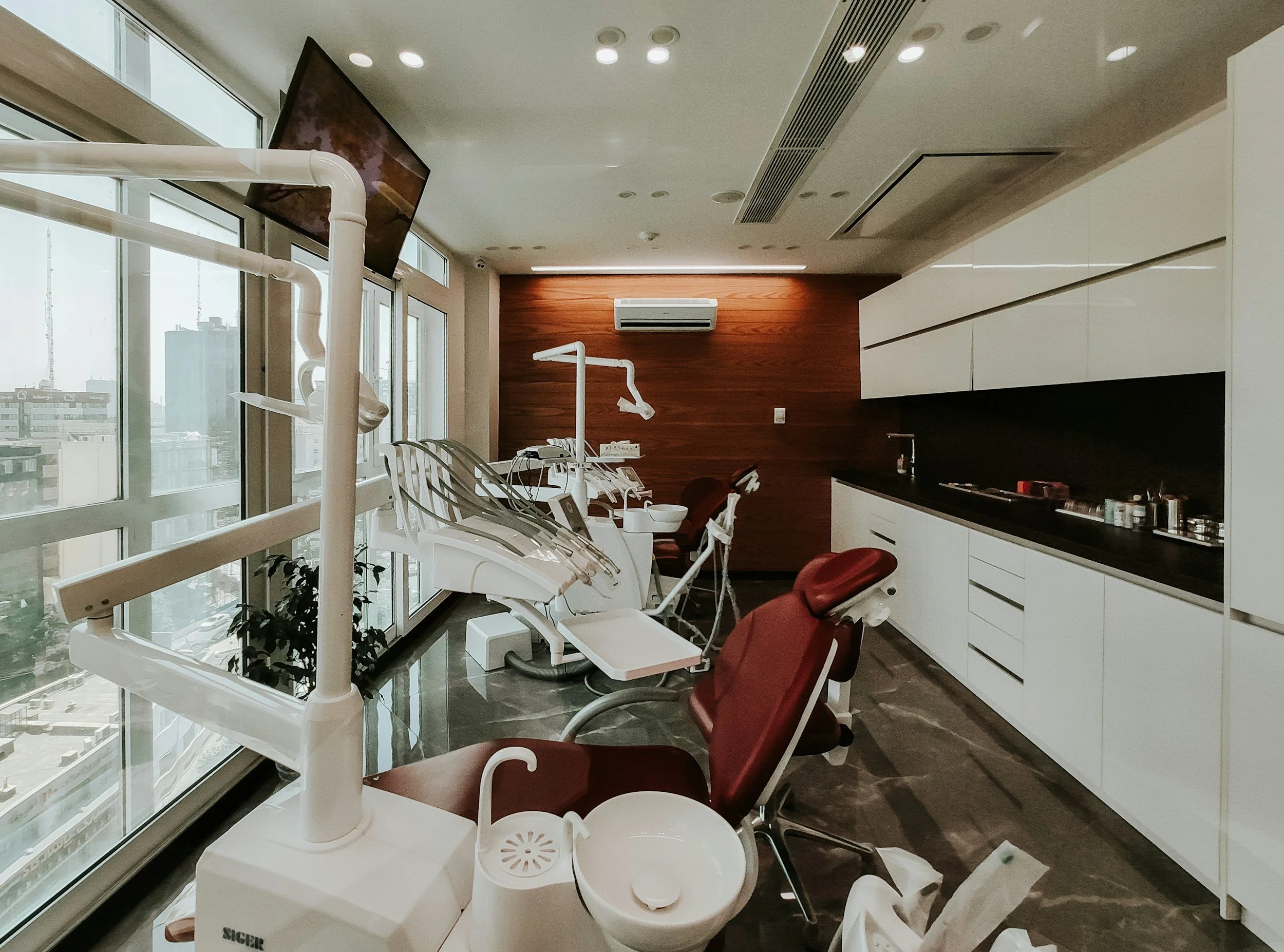
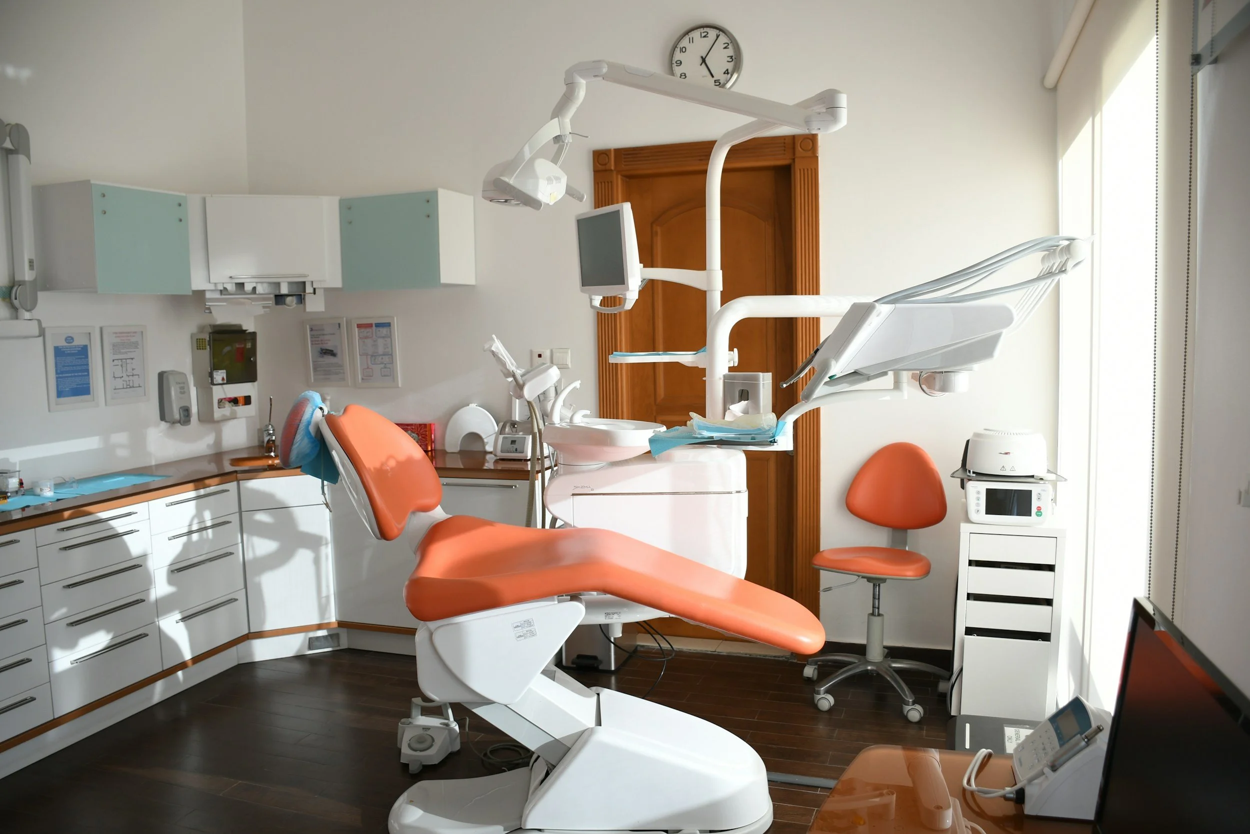
The visual language of most dental practice websites is dominated by the same pool of dental stock photography: smiling patients in dental chairs, clinical white backgrounds, generic professional photographs that are present on hundreds of other dental practice websites in the same market. This photography communicates nothing about the specific practice, the specific team, or the specific environment in which patients will be treated. For a patient who is deciding between two or three practices based on their websites, a site built on generic stock photography provides no visual differentiation and no personal connection with the specific people who will provide the care.
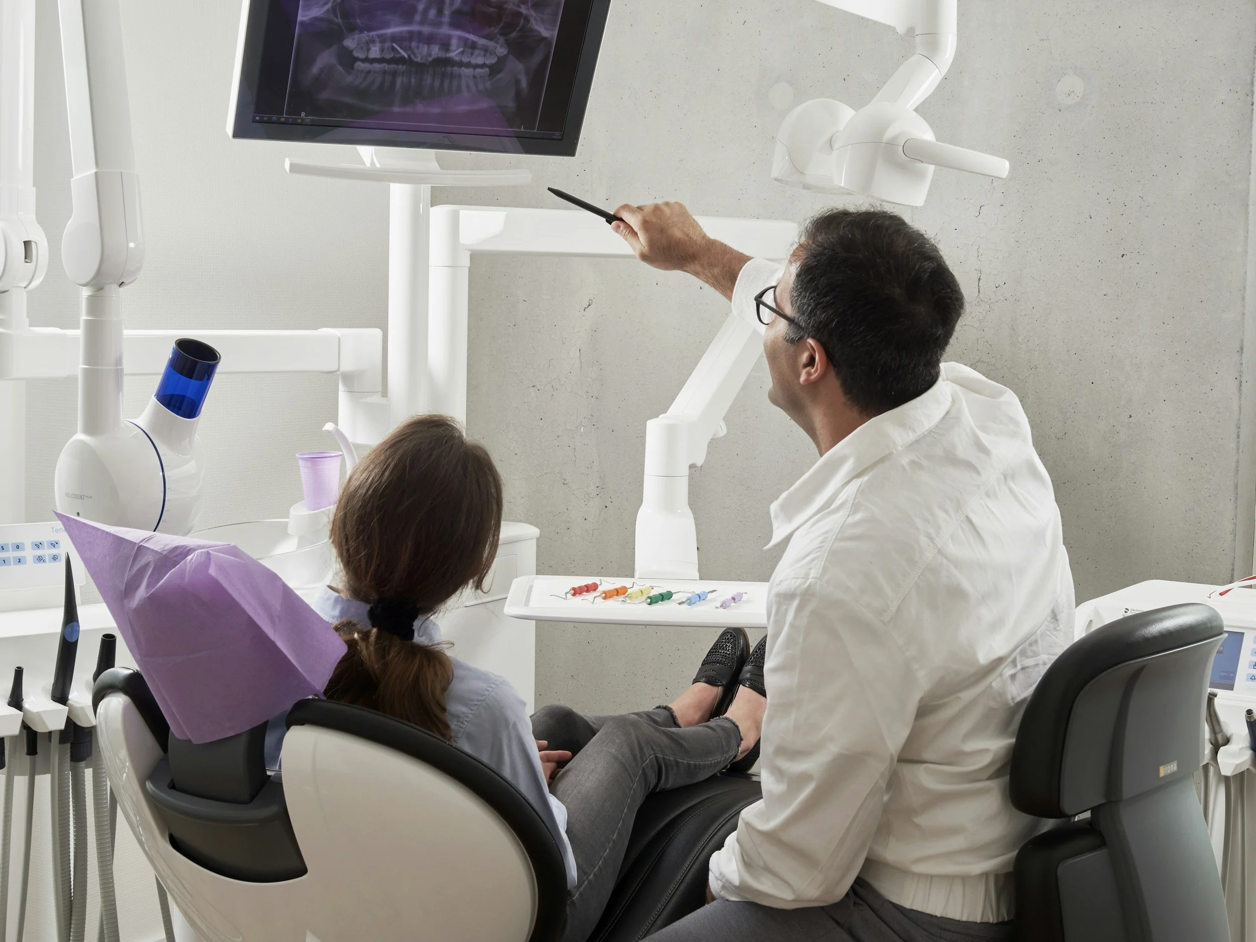
Authentic photography of the actual practice team is one of the most impactful changes a dental practice website redesign can make to the conversion performance of the site. Photographs of the real dentists and support staff, taken professionally in the actual practice environment, create a personal connection with prospective patients that stock photography fundamentally cannot. A patient who can see the actual person who will be treating them, presented warmly and professionally, arrives at their first appointment with a degree of pre-formed familiarity that meaningfully reduces appointment anxiety. For practices that serve a significant proportion of anxious patients, this reduction in pre-appointment anxiety translates directly into higher appointment attendance rates and more positive first appointment experiences.
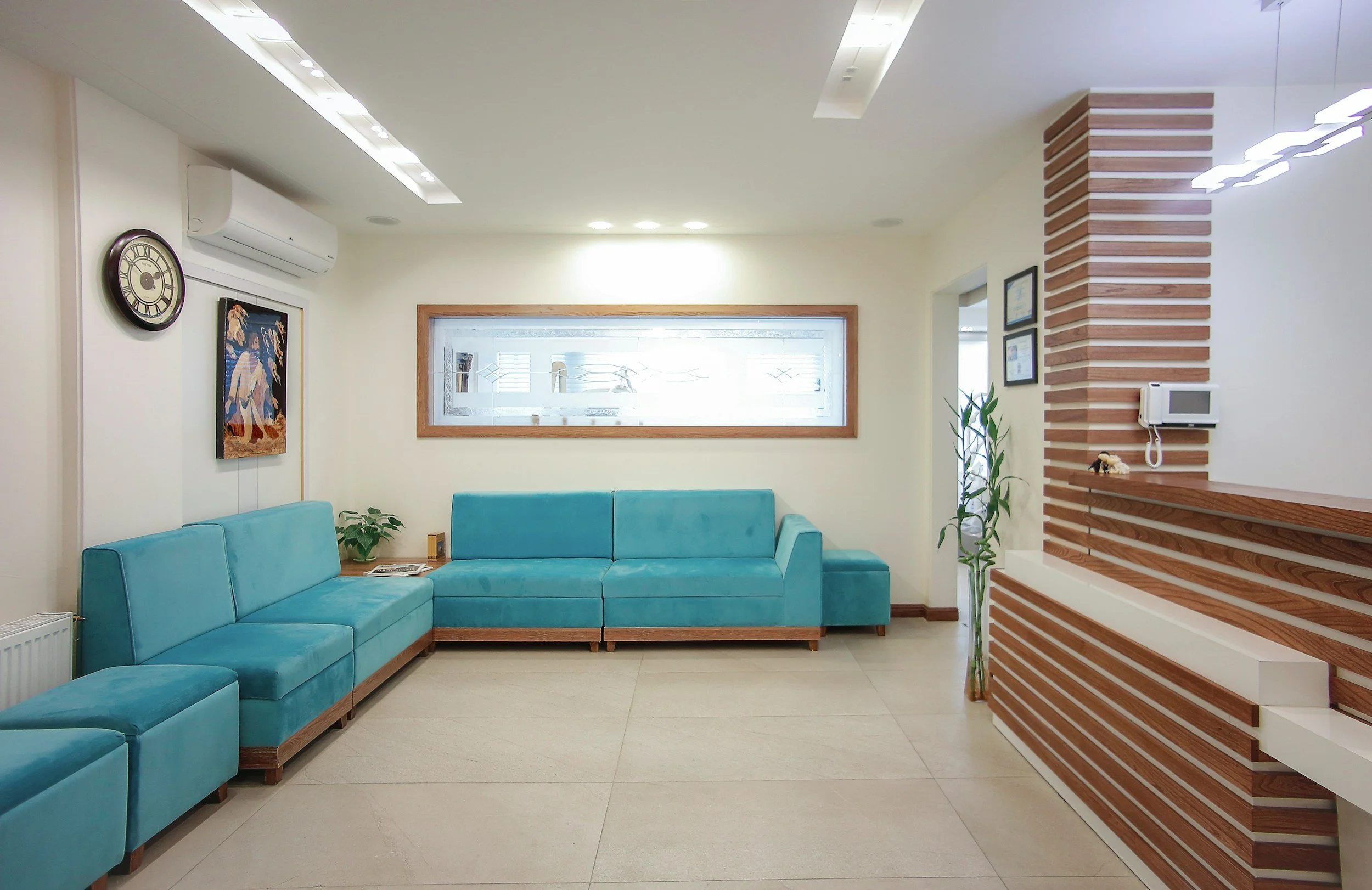
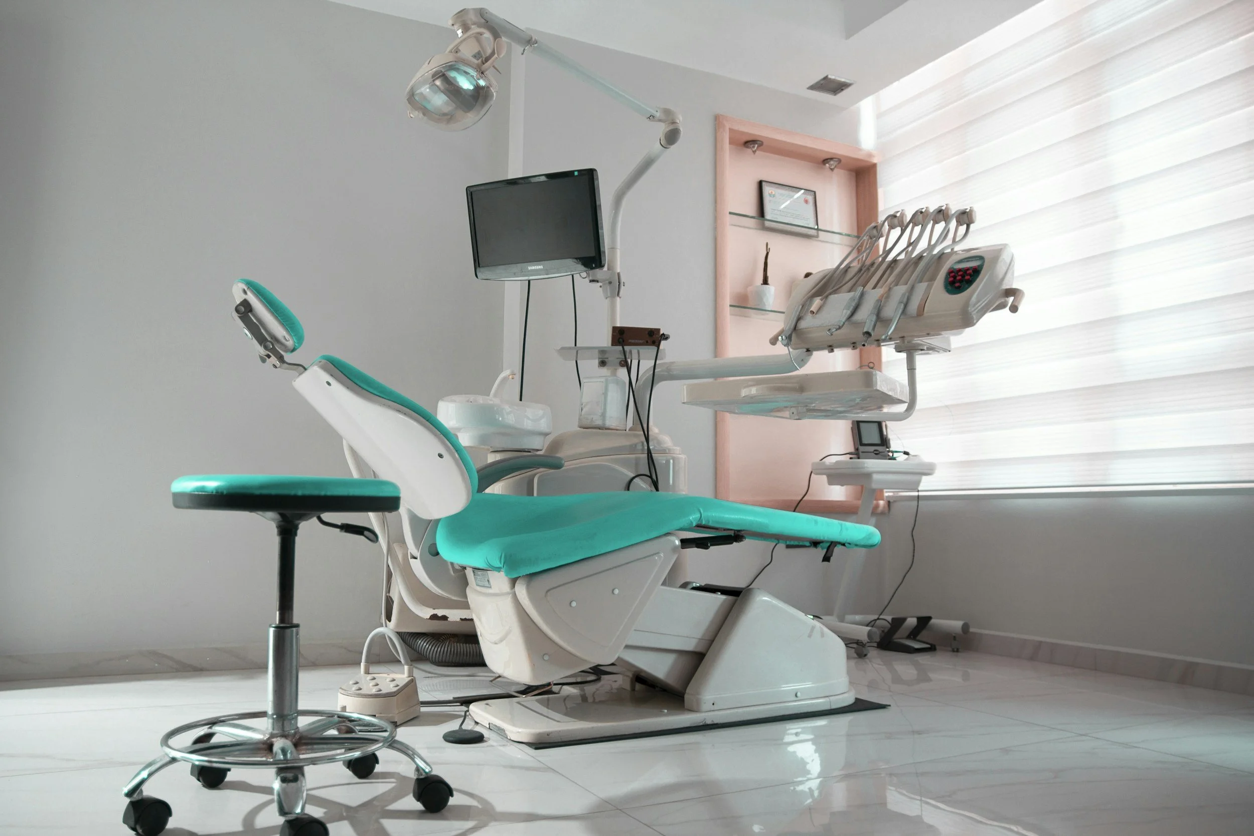
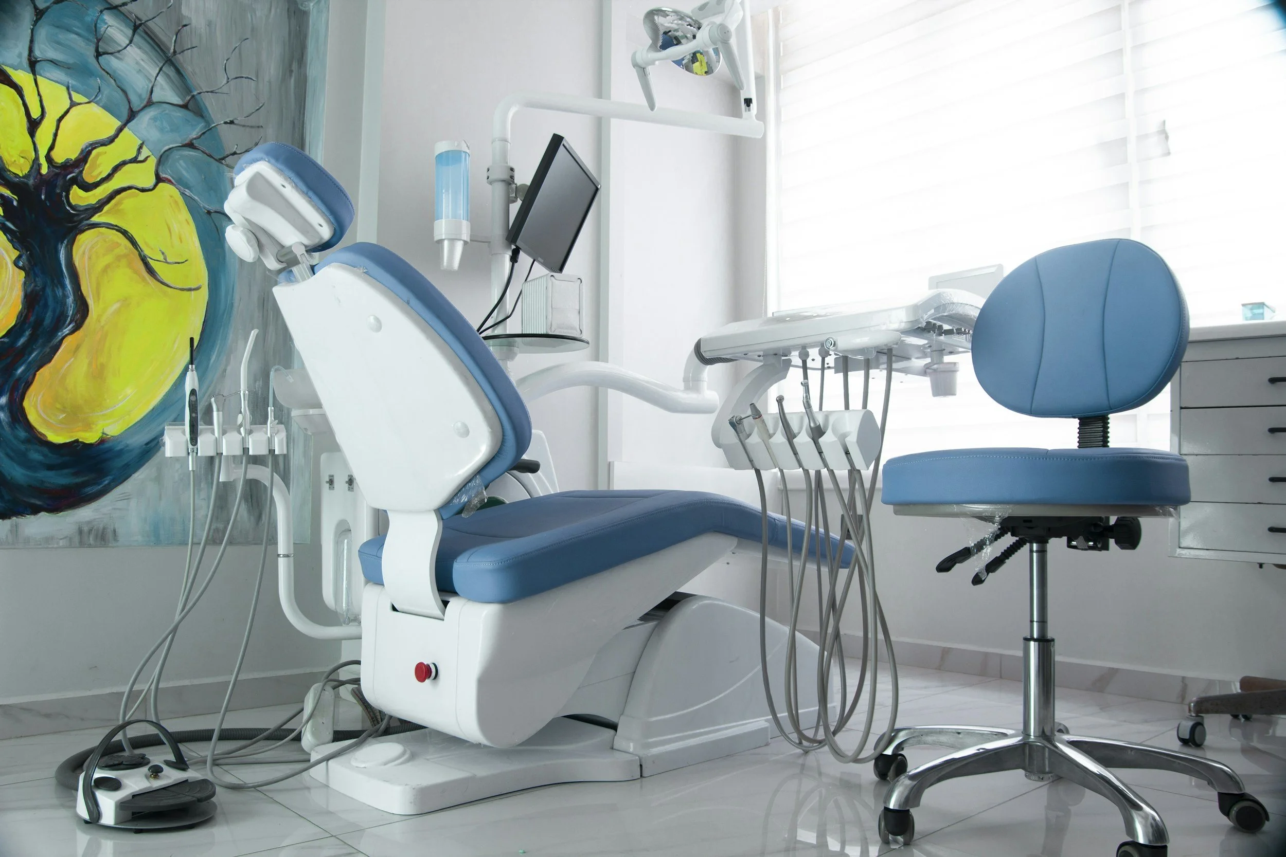
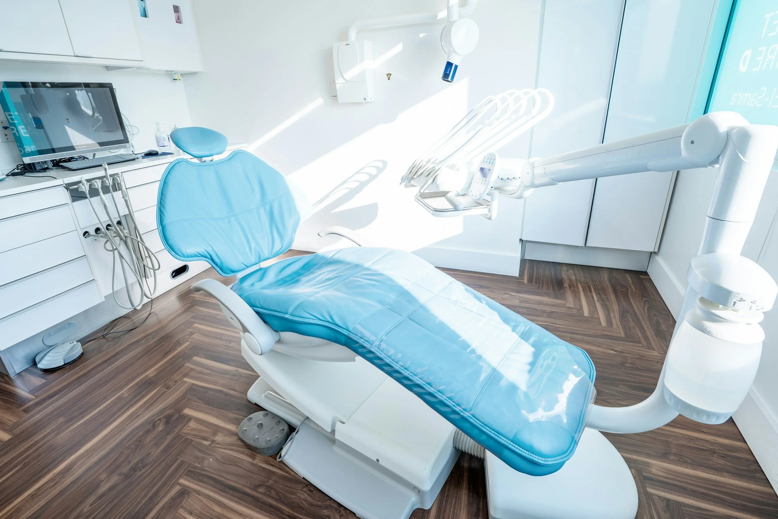
Photographs of the actual practice environment are trust signals that tell a prospective patient what the experience of visiting will be like. A modern, well-equipped, inviting practice interior communicates cleanliness, comfort, and investment in patient experience that generic stock imagery can only claim. An outdated or clinical-looking practice interior may be better represented by a redesign of the space than by photography of it, but either way the authentic representation of the actual environment is more trustworthy than imagery that bears no relation to the practice the patient will actually visit.
The investment in professional photography for a dental practice website redesign is modest relative to the commercial return it produces. A well-executed photography session that captures the team, the practice environment, and where patient consent is available, some treatment work, provides a visual library that serves the website for several years and that consistently outperforms stock imagery in conversion metrics. Practices that make this investment as part of their redesign typically see an immediate and noticeable improvement in how prospective patients engage with the team and environment sections of the site.

A redesign that fixes the right things changes how many patients book
We approach dental practice website redesign with a clear commercial brief built around patient acquisition — book a free call to discuss what yours should fix first.
Treatment pages that are too thin to rank or convert
The treatment pages on most dental practice websites are too short, too generic, and too promotional to do either of the two jobs they need to do: rank in search for the treatment-specific queries that bring high-value patients, and convert those patients once they arrive. A page of two hundred words that mentions dental implants briefly among a list of services and invites the reader to call for more information will rank for nothing significant and will convert even the visitors who do find it at a very low rate, because it is providing neither the information these patients need to make their decision nor the evidence they need to trust the practice with a high-value treatment.
A dental practice website redesign that improves patient acquisition must invest in substantive treatment pages for every major treatment the practice offers. Each treatment page should be long enough to genuinely serve the patient who is researching that treatment, specific enough to rank for the particular searches that patient is making, and trust-rich enough to convert the patient who arrives from a search with a genuine intention to pursue that treatment. This is a content investment as much as a design investment, and practices that approach their redesign purely as a visual exercise without addressing the substance of their treatment pages will not see meaningful improvement in their ability to attract high-value treatment enquiries.
The specific content requirements for each treatment page vary by treatment type and patient profile. High-investment treatments like implants and full-mouth rehabilitation require more comprehensive content because the patients researching them are doing more extensive research before committing. Lower-investment treatments like hygiene appointments or teeth whitening require less depth but still benefit from specific content that speaks to the patient's specific motivations and concerns. Understanding what the patient for each treatment specifically wants to know, and providing that information clearly and accessibly, is the brief that should guide the content development for each treatment page in a dental practice website redesign.
Separating treatments that are often grouped together into dedicated pages where the search volume and commercial importance justify the investment significantly improves the search performance of the individual treatments. A practice that has a single "cosmetic dentistry" page that mentions veneers, composite bonding, teeth whitening, and Invisalign in broad terms will not rank for the specific searches that each of these treatments generates. Separating each into its own dedicated page, with content specific to that treatment and that treatment's patient, allows each page to rank independently for its specific searches and to convert the specific patients who arrive with interest in that particular treatment.
Poor mobile experience for the patient in an urgent dental situation
Mobile performance is a critical element of dental practice website redesign because of the specific nature of the dental search experience. A significant proportion of dental searches are driven by urgency: toothache, a broken tooth, a lost filling, a dental emergency that needs immediate attention. These urgent searches happen on mobile devices, often outside office hours, and they are characterised by a very low tolerance for friction. A patient in acute dental pain who finds a practice website that takes five seconds to load on their phone, or whose phone number is not a tappable link, will not wait. They will move to the next result in the search list.
A dental practice website redesign that prioritises mobile performance starts from mobile as the primary design context, not as an afterthought adapted from the desktop design. This means ensuring that the most important information, the practice phone number, the emergency contact option, the booking button, and the address, is immediately visible on the mobile screen without scrolling. It means ensuring that the page loads in under two seconds on a typical mobile data connection. It means ensuring that all interactive elements are large enough to tap accurately with a thumb, that text is readable without zooming, and that the navigation is simple enough to use in a stressful moment without requiring fine motor control.
The emergency and urgent care information on a mobile dental practice website deserves specific design attention. A clearly labelled emergency section on the homepage, accessible within one tap from wherever the patient is in the site, that provides an immediate call option and clear guidance on what to do in specific dental emergencies, is serving the most urgent and most conversion-ready visitors the practice will receive. These visitors are not browsing for information. They are in pain and they need help. Every friction point between them and a contact with the practice is a potential lost emergency patient and a lost long-term relationship.
Testing the actual mobile experience of the current website before briefing a redesign reveals the specific mobile problems that need to be fixed. This test should be conducted on a real mobile device, using a typical mobile data connection, by someone who is navigating the site as a new patient would rather than as someone who already knows the site. The problems discovered through this test are the mobile design brief for the redesign, and addressing them specifically produces a site that performs meaningfully better for the mobile patients who represent a substantial and growing proportion of new dental patient enquiries.
The patient in pain who can reach you first becomes a patient for life
We build dental practice websites that are designed to work in the worst conditions your patients will use them in — book a free call to discuss mobile performance.
No content strategy to support long-term search visibility
A dental practice website that consists only of the static pages typical of most practice sites, a homepage, treatment pages, an about page, and a contact page, has limited capacity to build long-term search authority beyond the rankings achieved by those pages at launch. A website that also publishes regular, genuinely useful dental health content has a continuously expanding surface area for local search visibility, an ongoing signal to Google that the practice is active and engaged, and a growing library of content that attracts patients at different stages of the decision-making process, from those who are simply researching dental health topics to those who are actively looking for a specific treatment provider.
The content strategy for a dental practice website does not need to be elaborate to be effective. Publishing one well-written article per month, focused on topics that are genuinely relevant to the patients the practice most wants to attract, is sufficient to build the search authority that produces a noticeable improvement in organic traffic and patient enquiries over a twelve to eighteen month period. The specific topics should reflect the practice's commercial priorities: articles about the questions implant patients most commonly ask will attract implant researchers, articles about managing dental anxiety will attract nervous patients, articles about maintaining orthodontic results will attract current and prospective Invisalign patients.
A dental practice website redesign that includes the infrastructure for ongoing content publishing, a properly structured blog section with category organisation by treatment area or patient concern, social sharing integration, and a clear internal linking structure that connects blog content to the relevant treatment pages, provides the foundation for a content strategy that compounds in commercial value over time. Practices that invest in content as part of their redesign brief tend to see the best medium and long-term returns from the redesign investment because the content production continues to build search authority and attract patients long after the design work has been completed.
Local content is the category of dental practice blog content with the highest local SEO value and the most direct patient acquisition impact. Articles that address dental health topics specific to the local community, that reference local health initiatives or events, or that speak to the specific characteristics of the patient population in the practice's area create the geographic specificity signals that support strong local search performance. This type of content is the most difficult for national dental information services to compete with, which makes it particularly valuable for building the hyperlocal search visibility that attracts patients from the streets and neighbourhoods immediately surrounding the practice.
Pricing opacity that creates hesitation before a patient books
The absence of any pricing information on a dental practice website is a mistake that creates specific hesitation for prospective patients who are evaluating whether this practice is financially accessible to them. A patient who cannot get any sense of what a check-up, a filling, or a cosmetic treatment might cost at this practice is a patient who may delay enquiring rather than risk discovering a price point that is out of reach. That hesitation is commercially costly for practices that are financially competitive but that are allowing the uncertainty to work against them by not providing any orientation on costs.
Transparent pricing on a dental website does not require publishing a comprehensive fee schedule that commits the practice to fixed prices for every possible treatment variant. It requires providing enough cost information to allow a prospective patient to make a preliminary assessment of whether the practice is likely to be accessible to them. For routine treatments, indicative prices or price ranges give this orientation clearly. For complex treatments where the cost is genuinely dependent on individual assessment, a clear explanation of the factors that affect cost, combined with a description of the consultation process through which the specific treatment plan and its cost will be determined, provides the orientation the patient needs without creating misleading price expectations.
Finance and payment plan information is a trust signal and a commercial tool for high-value private treatments. A practice that offers financing for implants, Invisalign, or other major treatments, and that communicates this clearly on the relevant treatment pages, removes the financial barrier that prevents some patients from pursuing treatments they are clinically suitable for and that they genuinely want. Monthly payment information that breaks a large treatment cost into a per-month figure that is comparable to familiar consumer expenditures makes the financial commitment more manageable and more likely to result in a booking.
NHS versus private treatment information, where relevant, is a specific area of pricing transparency that a dental practice website redesign should address clearly. The confusion between NHS and private dental care, including what is available on the NHS, what is available only privately, and how the costs compare, is a genuine source of uncertainty for many patients that prevents them from booking. A clear explanation of the practice's NHS availability (or lack thereof), what this means for the patient's cost, and how the private treatment options the practice offers compare in value to NHS alternatives, provides the clarity that removes this specific uncertainty from the patient's decision-making process.
Pricing clarity removes hesitation and hesitation is what costs you bookings
We build dental practice websites that answer the cost questions patients are afraid to ask — book a free call to discuss how to handle pricing on yours.
Approaching a dental practice website redesign for commercial results
A dental practice website redesign that produces meaningful improvement in new patient bookings is one that is briefed, designed, and built around the specific commercial failures of the current site rather than around the visual refresh that the site may also need. The booking process, the mobile experience, the treatment page depth, the local search optimisation, the trust signal placement, and the pricing transparency are all elements that have direct and measurable effects on the number of new patients who book through the website. Addressing them systematically in the redesign produces a site that performs substantially better commercially, not just one that looks substantially better visually.
The practices that get the most from a dental practice website redesign are those that define its commercial goals clearly before the design brief is written. How many new patient bookings per month represents success for the redesigned site? From which treatment categories? From which geographic areas? With these goals defined, every design and content decision can be evaluated against the question of whether it serves the goal, and the result is a redesign that produces measurable commercial improvement rather than a visually improved version of an underperforming asset.
The redesign should also include a plan for ongoing maintenance and content development after launch, because the commercial performance of a dental practice website is not static. It improves as the review library grows, as new treatment pages are added and existing ones are updated, as the content library expands and builds search authority, and as the practice's understanding of its own patient acquisition data deepens. A redesign that produces an excellent foundation but that is then left unchanged will gradually cede its advantage to competitors who continue investing in their websites after launch.
If you want a dental practice website redesign that is briefed and executed for meaningful improvement in new patient bookings rather than visual refresh alone, we can help. Take a look at our approach to web design for dental practices and book a free call to discuss what a commercially focused redesign could achieve for your practice.
Written by
Mikkel Calmann
Web design for dental practices
Most dental practice websites were never built to generate leads. We design Squarespace websites that change that. See exactly how we approach it.
More web design insights for dental practices