



The best agency websites are judged harder than any other kind, because they are an agency's own work on show. Most lists of them celebrate scroll effects and cursor tricks, which is fun to look at and rarely what wins a client. So for each site below we picked one decision that actually helps an agency win the right work, and that a small studio could copy.
Everything described here is visible on the live sites as of November 2026. Agencies change their featured work constantly, so we focus on the structure, the wording and the positioning rather than this month's case study.
What an agency website has to do
Agency positioning has collapsed into a shared vocabulary: strategy, brand, digital, growth. When every agency website says the same words, a buyer has nothing to compare except price, which is the one comparison a good agency should never invite. Heavy animation rarely fixes that; it tends to read as compensating for a thin proposition.
The best agency websites do three things instead. They say something specific about who they are for or how they work. They prove it with recognisable work presented clearly. And they make it easy for a serious buyer to find the work that matches their own problem and take one clear next step.
Here are eight creative and marketing agency website examples, grouped by what they teach.
Agency websites with a sharp position
1. Collins: selling the outcome, not the service
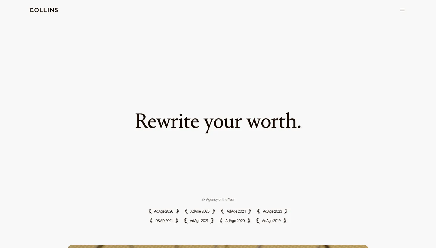
Collins opens with "Rewrite your worth." Below an awards strip, it introduces "Eleven ways we help brands find and command their unique premium", with programmes named after the client's situation: Brand Refresh ("Stay Relevant. Stay Valuable."), Reposition ("Don't Become the Best. Become the Only."), Expansion and Turnaround. Case studies follow, labelled with client names.
Naming offers after the client's situation rather than the agency's deliverables is a powerful shift. A company going through a turnaround recognises itself instantly, without having to translate "brand strategy" into its own problem.
Borrow this: name your services after the situations clients are in, such as launching, repositioning or rebranding after a merger, not after what you produce.
2. Wieden+Kennedy: one sentence of attitude

Wieden+Kennedy calls itself "An independent creative network", and its about section opens with "We were founded as an ad agency that didn't like advertising." Work appears as video case studies labelled with the office that made them and "Brand: Campaign", for clients such as Nike, LEGO and McDonald's, and the site lists its offices around the world.
A single line of attitude tells a client more about how an agency thinks than a page of values. Labelling work by office also shows a global network without having to claim it.
Borrow this: write one honest sentence about why your agency exists or what it refuses to do, and put it where clients will read it.
3. Mother London: personality as the proof
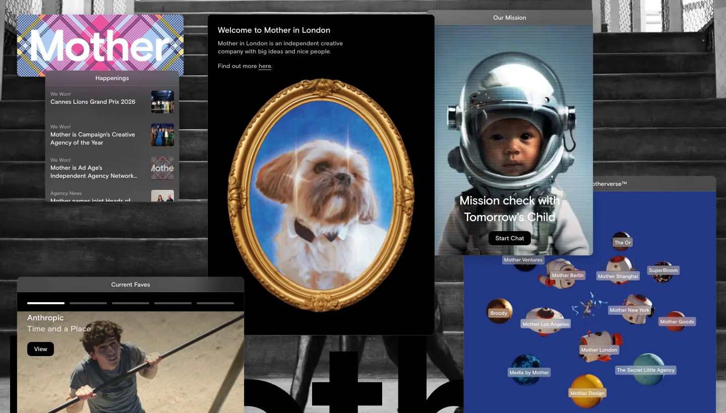
Mother London welcomes visitors with "Mother in London is an independent creative company with big ideas and nice people." Its "Current Faves" show work for brands such as IKEA, KFC and Uber Eats, and it introduces sister companies in other cities with a short line each.
For an agency selling creativity, a site with a recognisable voice is itself a sample of the work. The plain, warm wording also does something quieter: it tells clients the people will be pleasant to work with.
Borrow this: let your own voice into the homepage. If you sell creative work, your website copy is the first sample a client reads.
Agency websites that make the work easy to find
4. Pentagram: filter by discipline and sector
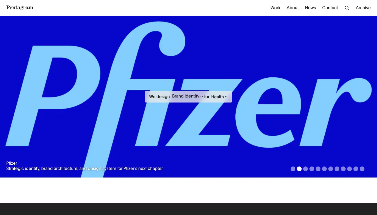
Pentagram opens with "We design everything for everyone" and lets visitors filter work two ways: by discipline, such as brand identity, packaging and typefaces, and by sector, such as arts and culture, finance and health. Each project card has a one line description and sector tags, and long-running relationships are shown year by year.
A large body of work is only useful if a buyer can find the part that matters to them. Two simple filters let a hospital find health work and a museum find culture work in seconds.
Borrow this: tag every case study by service and by industry, and let visitors filter by both. Even ten projects are easier to browse that way.
5. Instrument: work filtered by what you need
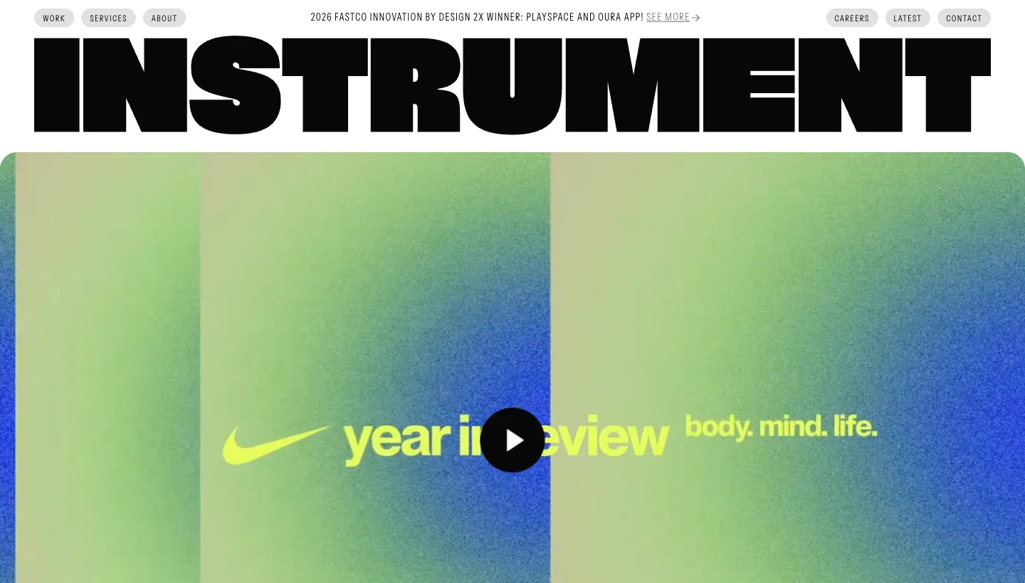
Instrument describes itself as "a digital-first design agency where creativity meets technology." Its recent work has filter tabs for brand, marketing and product, with projects credited to clients such as Oura, Notion and Nike, and its services section says it covers all three so "every touchpoint works together and tells the same story." A client roster and recent awards follow.
Buyers usually arrive with one kind of need. Filter tabs that match the agency's own service lines connect what the client wants to what the agency sells.
Borrow this: make your work filters match your service lines exactly, so a buyer who needs one service can see that service's results.
6. Koto: a line for every project
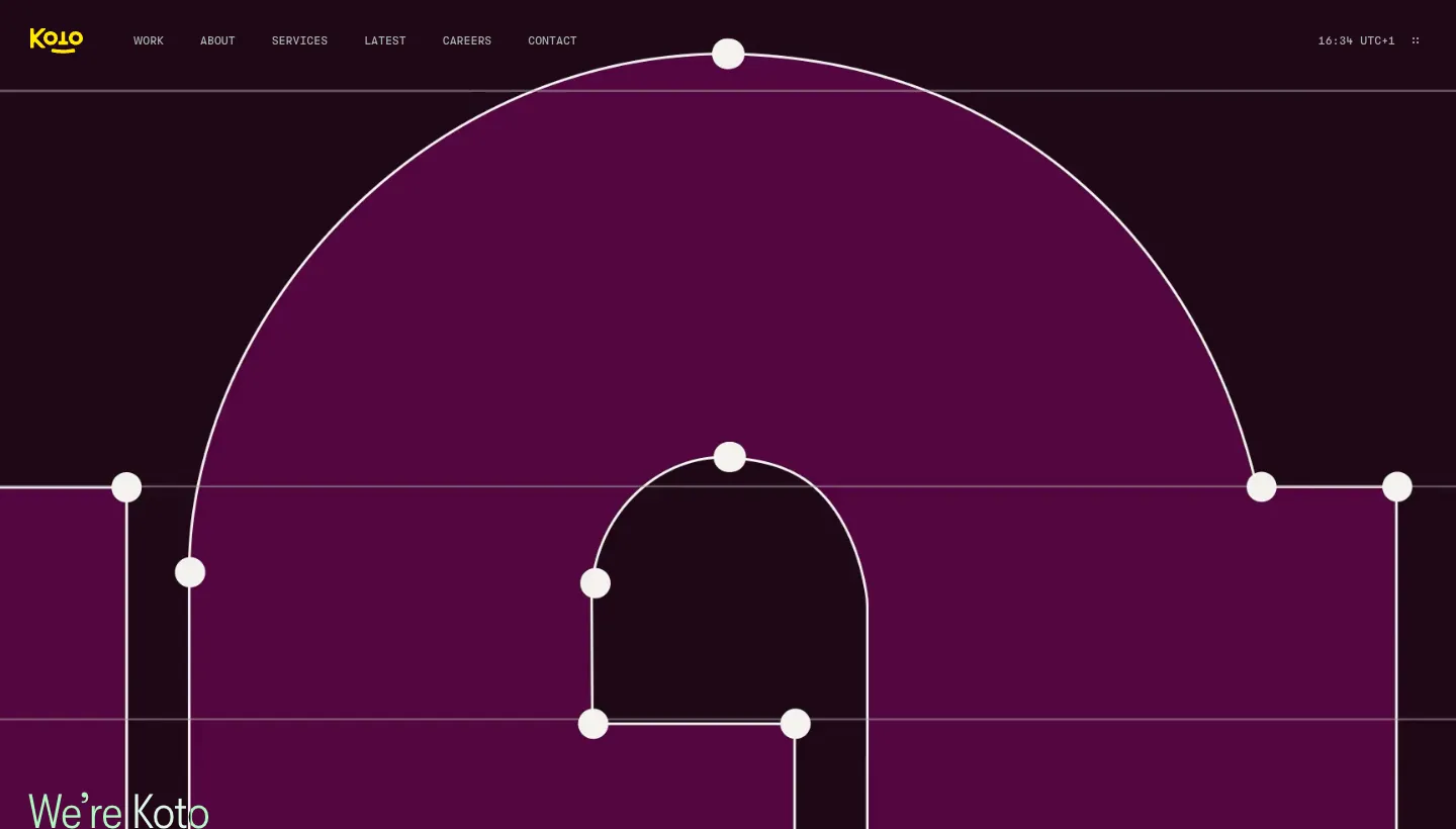
Koto opens with "We're Koto" and "We make ambitious ideas for ambitious brands." Each featured project card shows the client's logo, a one line description, the year and the category, such as Tripadvisor's "Every type of traveler, every type of trip". The site also shows each of its studios by city, with a photo and a contact email.
A one line description per project tells a scanning buyer what each piece of work was about before they click. Studio photos and city contacts make a large agency feel approachable.
Borrow this: give every case study a single line that sums up the idea, and show where your team actually works.
Agency websites that lead with a clear offer
7. R/GA: what you do, in one sentence
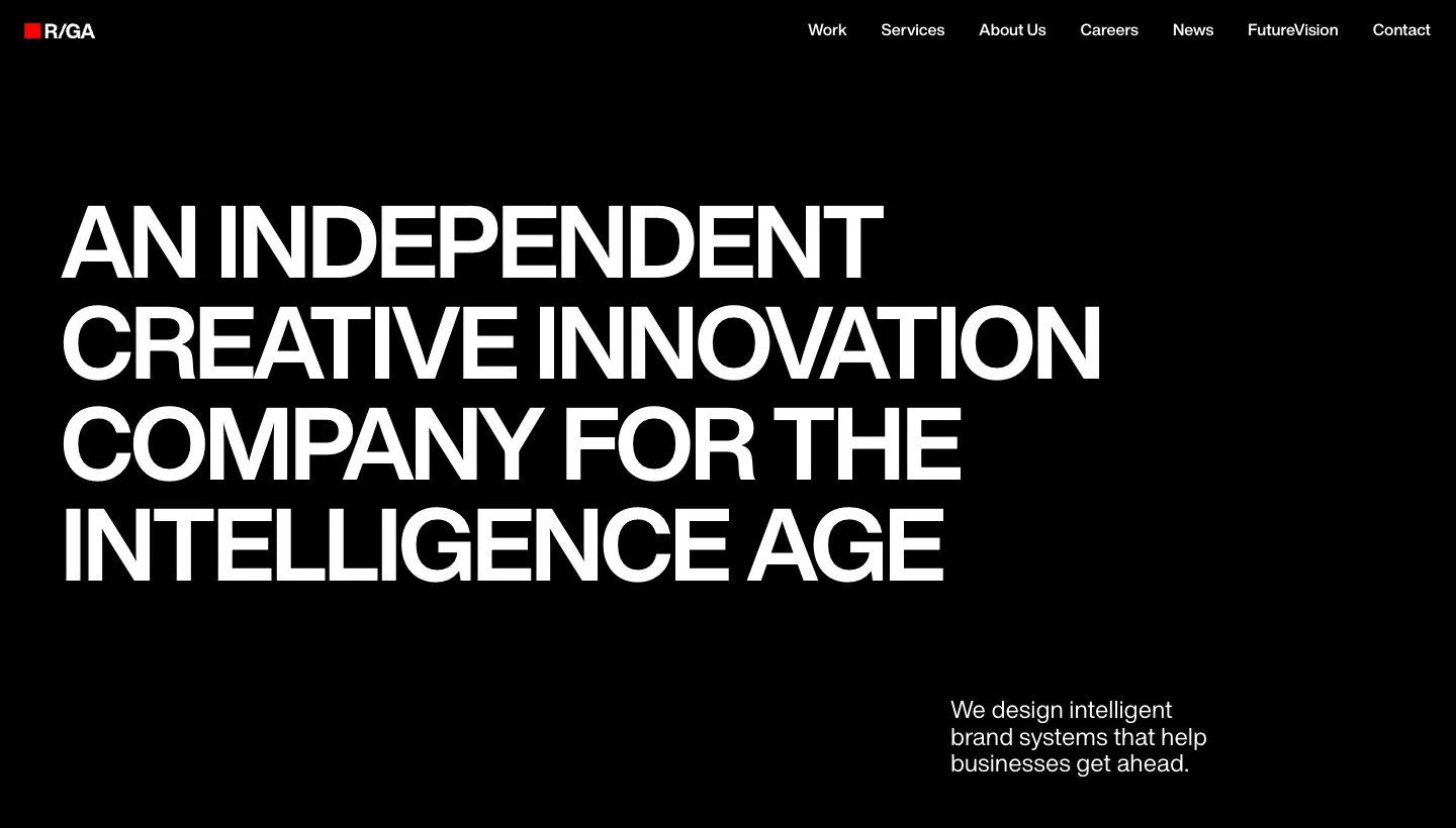
R/GA opens with "We design intelligent brand systems that help businesses get ahead," and describes itself as "An independent creative innovation company for the intelligence age." A short "What we do" section links to how it can help, a news feed shows its latest launches and its offices are listed by country.
In a crowded market, a homepage that says exactly what the agency does, for whom and to what end, saves the buyer from guessing. A current news feed shows the agency is moving with its market.
Borrow this: write one sentence that says what you make and the result it creates for clients, and make it your headline.
8. Ajarro: restraint as confidence

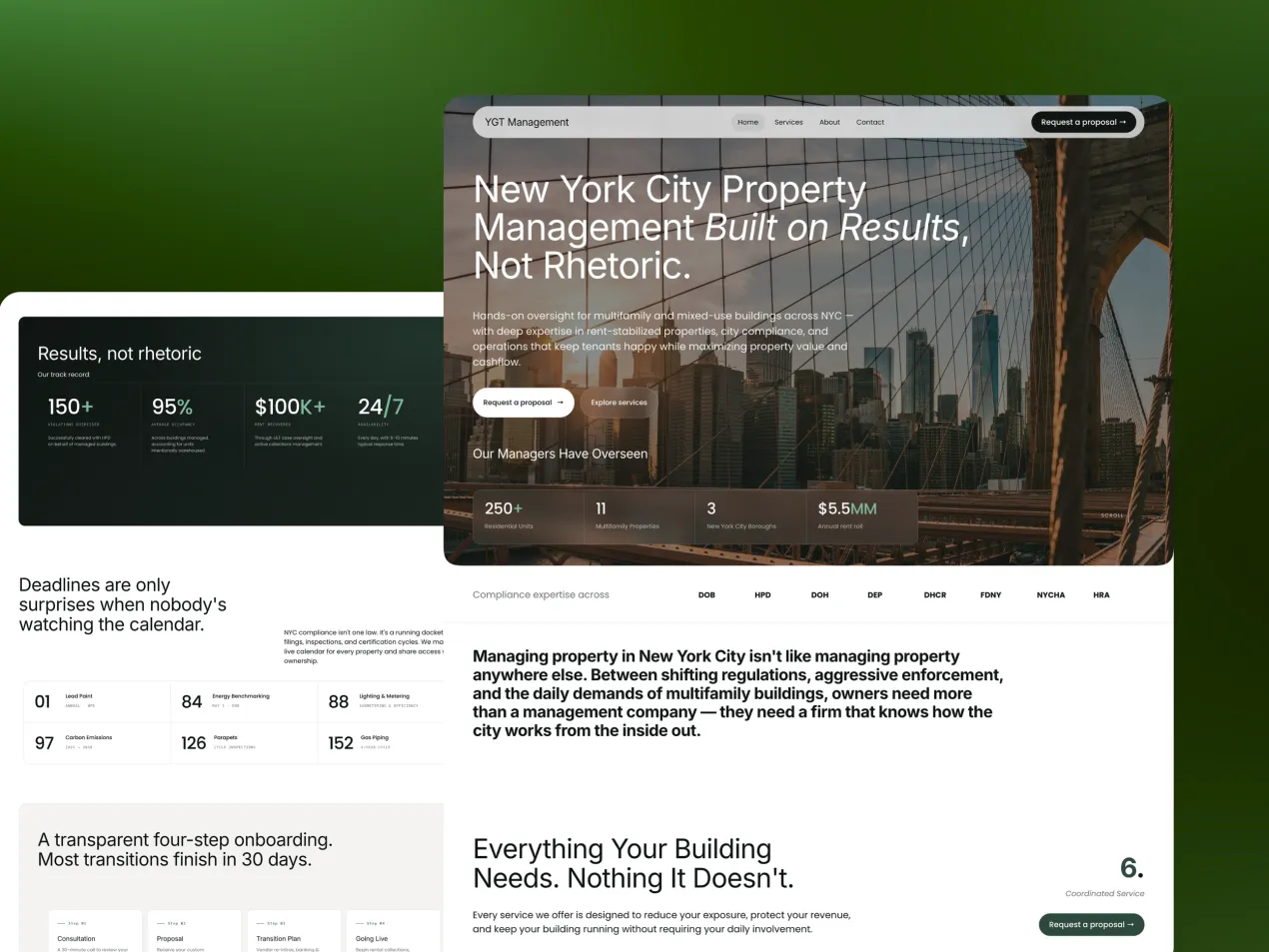
Ajarro is a creative agency competing for considered, higher value engagements, and its website is one we wrote and designed. The problem was the shared vocabulary every agency uses: when every site says strategy, brand, digital and growth, the buyer has nothing to compare except price.
So we started with positioning that commits: a stated view on who the agency is for and who it is not, in language a competitor couldn't reuse without it reading false. Then we let restraint do the signalling: confident typography, generous space and work presented without decoration, rather than heavy animation. There is one clear route to a real conversation instead of four competing calls to action, and enough depth for a buyer who is seriously considering an engagement. The site went live four weeks after kick-off, including all copywriting. The Ajarro case study has the full story.
Borrow this: say who you are not for. It is the fastest way to make the right buyers recognise themselves.
What the best agency websites have in common
Across all eight, the same habits show up.
They say something specific
Collins sells outcomes, Wieden+Kennedy states an attitude, Ajarro says who it is not for. None of them could be swapped for a competitor.
The work is easy to find
Pentagram and Instrument filter by service and sector, Koto adds a line per project. Buyers find their own problem quickly.
The proof is recognisable
Named clients, awards and real campaigns. Specific proof beats general claims.
The voice matches the work
Mother London's warmth and Wieden+Kennedy's attitude are samples of what the agency would bring to a client.
The short version
The best agency websites aren't the ones with the most impressive animations. They are the ones with a specific position, work that is easy to filter by service and industry, recognisable proof and a voice that sounds like the agency. A small studio can do every one of these: one sentence on who you are for and who you are not, services named after client situations, case studies tagged and summarised in a line, and one clear next step.
Start with your headline. If a competitor could use it without changing a word, rewrite it first. Our guide to creative website design shows how we approach it.
FAQ
What makes a good agency website?
A specific position that says who the agency is for and how it works, case studies that are easy to filter by service and industry, recognisable proof such as named clients and awards, a voice that matches the agency and one clear next step for a serious buyer.
What should an agency homepage include?
A headline that says what you do and for whom, a short line on what makes you different, your strongest work with client names, proof such as awards or a client roster, your services named in the client's terms and a single clear way to start a conversation.
How should an agency show case studies?
Tag each one by service and industry, give it a one line summary of the idea, name the client, and show the problem, what you did and the result. Pentagram, Instrument and Koto all make their work easy to filter and scan.
Do agency websites need animation to stand out?
No. Motion can help when it has a purpose, but heavy animation often reads as covering a thin proposition. A specific position and strong work presented clearly usually do more. On the Ajarro site, restraint was the signal of confidence.
How can a small agency compete with large agencies online?
By being more specific. A small agency can say exactly who it serves and who it doesn't, which large agencies rarely can. Clear positioning, well presented case studies and a personal voice let a small studio stand out.
Should an agency show prices on its website?
Many don't, but it can help to show starting prices or typical engagement sizes. It filters out poor fits and reassures serious buyers that you are in their range.