




Lists of the best videographer websites tend to be a scroll of moody showreels with a line of praise under each. Beautiful, but not much help when your own site needs to turn a visitor into a booked shoot. So for each site below we picked one decision that wins work, and that an independent videographer or small production company could copy.
Everything described here is visible on the live sites as of November 2026. Film-makers update their featured work often, so we focus on the structure and wording rather than which project leads this month.
What a videographer website has to do
A videographer's website has a hard job. The work is video, which is heavy to load and easy to skip. The buyer is often a marketing manager, an agency producer or a couple planning a wedding, and each wants something different: proof you have made films like theirs, a sense of your style, an idea of the cost and an easy way to ask.
The best videographer and film-maker websites solve this by sorting work by the kind of job, showing names people recognise, being clear about what working together looks like and making contact simple. They also load fast, because a showreel nobody waits for convinces nobody.
Here are eight videographer website examples, grouped by what they teach.
Videographer websites that sort the work by the job
1. Shane Hurlbut, ASC: reels, narrative and commercial
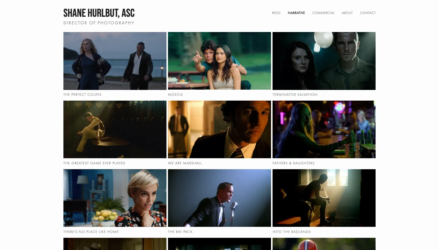
Shane Hurlbut's site introduces Shane Hurlbut as a director of photography and keeps the menu to five items: reels, narrative, commercial, about and contact. Narrative work appears as a grid of film titles, each opening its own page.
Separating narrative from commercial work lets a feature producer and a brand producer each go straight to their own kind of job. A reels page gives the busy visitor a single place to start.
Borrow this: split your work by the kind of client who will hire you (weddings, brand films, music videos, documentary), and keep a single reel page for anyone in a hurry.
2. Phedon Papamichael: a list of titles that speaks for itself
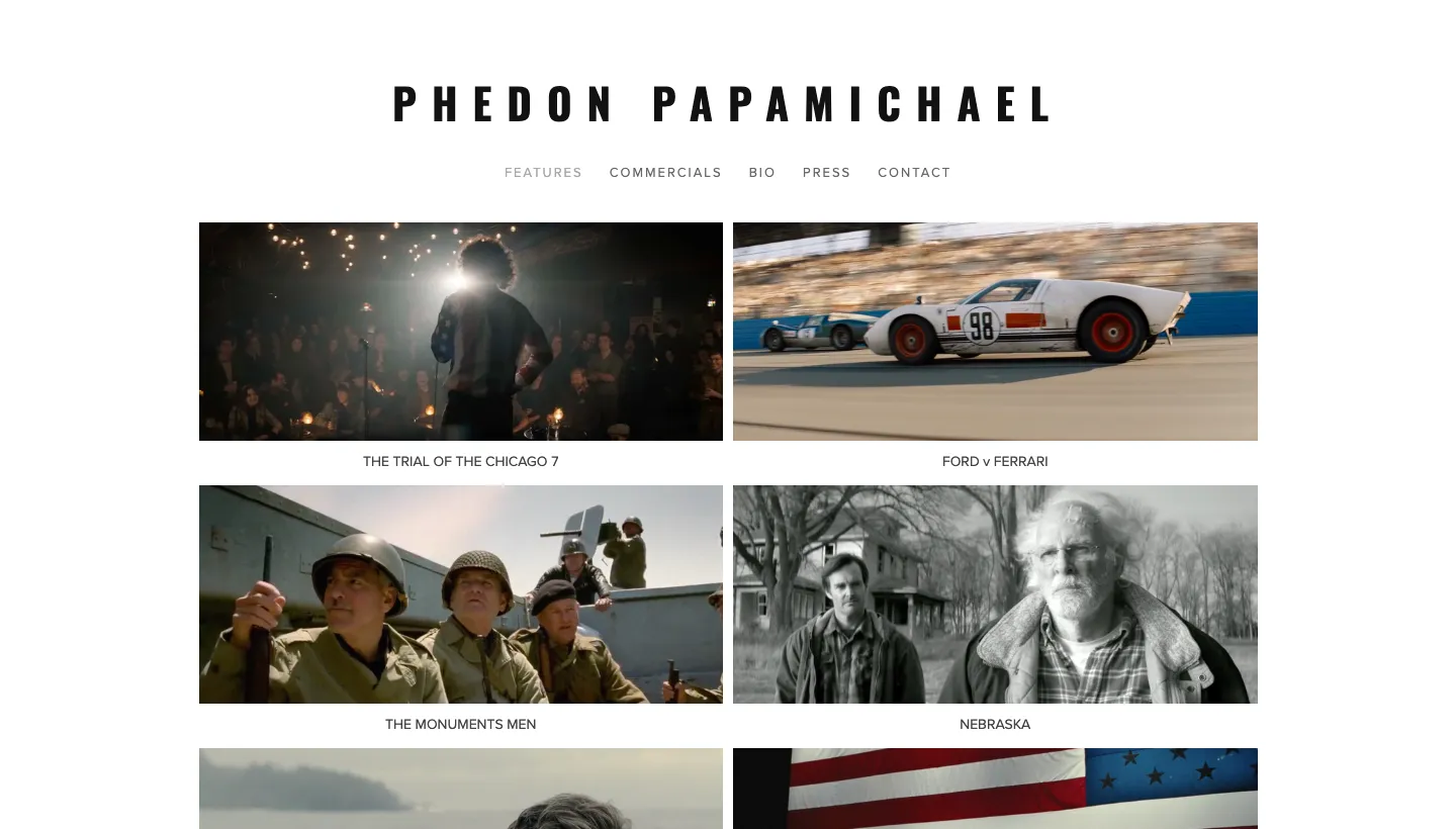
Phedon Papamichael's site has five menu items, features, commercials, bio, press and contact, and the features page is a simple list of film titles, from Ford v Ferrari to Nebraska and Walk the Line.
When the credits are well known, a plain list is the strongest possible proof. There is nothing to load, nothing to skip and nothing to misread.
Borrow this: if you have worked for brands or on projects people recognise, list them plainly by name. Recognisable names do more than any adjective.
3. Khalid Mohtaseb: motion and stills side by side
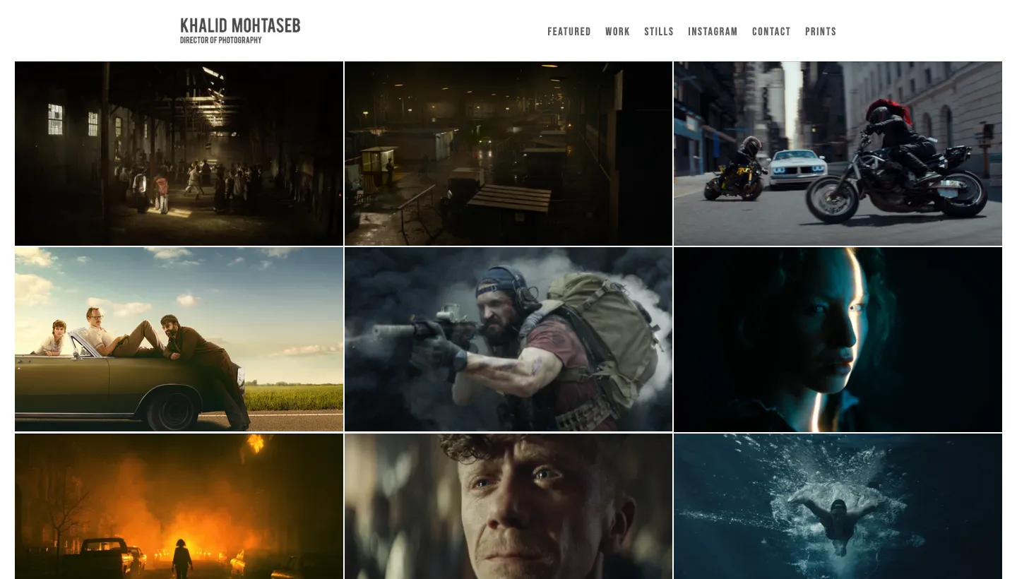
Khalid Mohtaseb is a director of photography whose site separates featured work, work by type (narrative, commercial and personal), stills and prints. Featured projects are named after the brand and the film, such as BMW and Nike projects.
Many clients need both video and photography from one shoot. Showing stills alongside motion work tells them they can get both, and selling prints turns the personal work into income.
Borrow this: if you also shoot stills, give them their own section, and name each project after the client so visitors recognise the brands you have worked for.
Videographer websites with clear proof
4. Karen X Cheng: results in the headline
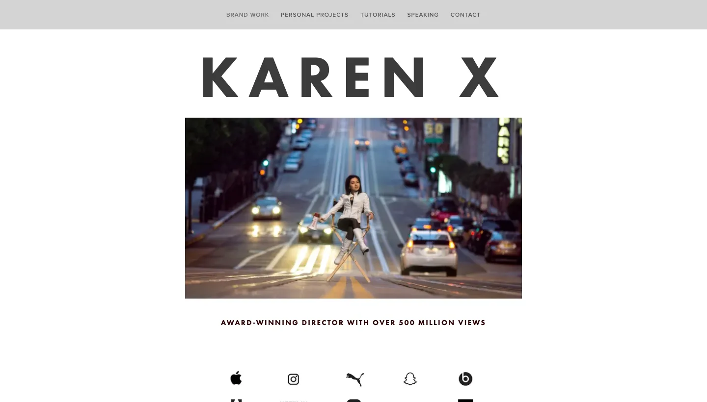
Karen X Cheng's site opens with "Award-winning director with over 500 million views." Press quotes from Adweek, Inc. and Fast Company follow, along with awards, and a booking email address is shown in plain text. Projects appear as looping clips with a title and a short caption, split into brand work and personal projects.
For a director known for social video, view counts are the proof clients care about. Putting a number in the headline answers the buyer's first question, "can you make something people actually watch?", before they scroll.
Borrow this: put your single most convincing result in your headline, whether that is views, awards or a well known client. Then show the booking contact without making anyone hunt for it.
5. Atlantic Pictures: what working together looks like
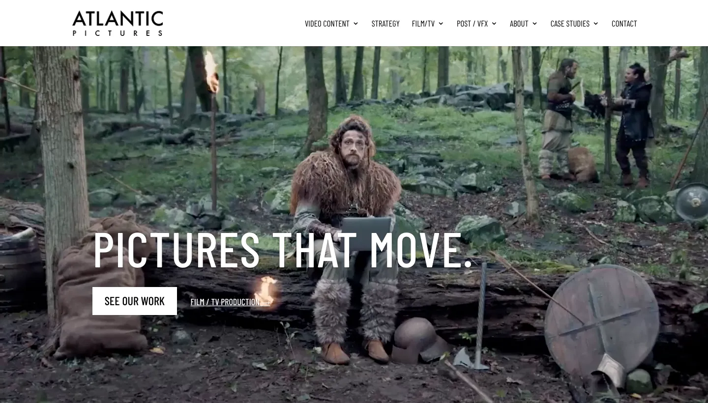
Atlantic Pictures opens with "PICTURES THAT MOVE." and describes itself as "A content partner for brands, built on the craft of feature film and prestige TV production." Its menu separates video content for brands from film and TV production, logos of brands and studios follow, and it says plainly: "We build long-term content partnerships, not one-off shoots." The contact section gives a full address and phone number.
That one sentence tells a marketing team exactly what kind of relationship to expect. Separate reels for brand work and film and TV let each kind of client see their own kind of project.
Borrow this: say in one sentence how you like to work with clients, whether that is long term partnerships, single projects or weddings only, so the right people get in touch.
Videographer websites that do more than show work
6. Brandon Li: two inboxes, two kinds of enquiry
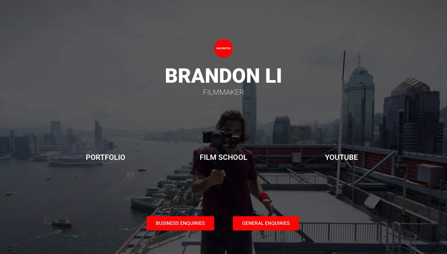
Brandon Li's site is almost entirely navigation: a portfolio link, a film school and a YouTube channel. Contact is split into "BUSINESS ENQUIRIES" and "GENERAL ENQUIRIES", each with its own email address.
Separating business enquiries from everything else means paid work never gets lost among fan mail and questions. For a film-maker with an audience, that matters.
Borrow this: if you get a lot of non-work messages, give clients their own contact route and label it clearly.
7. Taylor Cut Films: courses and presets alongside the work

Taylor Cut Films sorts its work into commercials, music videos and films, and the main menu also offers filters, sounds and courses, with a member login.
Selling presets, sound packs and courses turns a film-maker's skills into income that doesn't depend on the next shoot. It also brings other creators to the site, some of whom become clients or collaborators.
Borrow this: if other film-makers ask how you get your look, consider selling a preset pack or a short course from your site.
8. Timothy Blacketer Films: the price guide as a page

Timothy Blacketer is a fashion and editorial film-maker, and his price guide used to live in a PDF. As a download it was hard to read on a phone, easy to lose in an inbox and separate from the site where clients were already looking at his work. We turned it into a page on his existing Squarespace site, keeping the look of the original document.
The page recreates the PDF's fonts, colours and layout, the contents page became links to each section, and every package and price is laid out so clients can compare options without downloading anything. The layout was rebuilt for phones rather than shrunk, and prices and packages can be updated without a developer. It was built in two days. The Timothy Blacketer Films case study shows how.
Borrow this: if your pricing lives in a PDF, put it on your website as a page. Clients read pricing next to the work, on their phones, and a page is easier to update than a document.
What the best videographer websites have in common
Across all eight, the same habits show up.
Work is sorted by the kind of job
Narrative or commercial, brand or film and TV, weddings or music videos. Shane Hurlbut, Khalid Mohtaseb and Atlantic Pictures all let each kind of client go straight to their own work.
Proof is specific
Recognisable titles, named brands, view counts and press quotes. Phedon Papamichael and Karen X Cheng let the names and numbers speak.
Contact and terms are clear
A booking email in plain sight, separate routes for business enquiries, a sentence on how they work, pricing as a page. Clients know what to do next.
The site does more than one job
Stills, prints, courses and presets turn a portfolio into a small business.
The short version
The best videographer websites aren't the ones with the longest showreels. They are the ones that sort work by the kind of job, show proof clients recognise, make contact and pricing clear and load quickly. An independent videographer can do all of it: a short reel, work split by client type, client names on every project, a pricing page and a booking email in plain sight.
Start with your homepage. If a client can't tell what kind of films you make, who you have made them for and how to book you in ten seconds, fix that first.
FAQ
What should a videographer website include?
A short showreel, your work sorted by the kind of job (such as weddings, brand films or music videos), the names of clients and projects, a short about section, your services and pricing or a starting price, and a clear way to book or enquire.
Should a videographer show prices on their website?
It helps. Clients often want a rough idea of cost before they get in touch. A pricing page with packages or a starting price filters out poor fits and makes the right clients more confident. Timothy Blacketer moved his price guide from a PDF onto a page so clients can compare packages next to the work.
How long should a videographer showreel be?
Short. Many visitors only watch the first seconds, so lead with your strongest shots and keep it brief. Longer full projects can sit on their own pages for clients who want to see more.
How do you make a video portfolio load fast?
Host your videos on a video platform and embed them, use a still image as a placeholder until someone presses play, and avoid autoplaying large files on the homepage, especially on phones.
Should videographers sell other things on their website?
If you have something to sell, such as presets, courses or prints, it can add income that doesn't depend on shoots. Taylor Cut Films and Khalid Mohtaseb both offer more than their client work from their sites.
What is the best platform for a videographer website?
One you can update yourself when you finish a project. Squarespace suits many videographers and film-makers because it handles video embeds and galleries well and can be styled to match your work.