



Most lists of architecture portfolio examples are a wall of beautiful renders with a line of praise under each. That is pleasant to scroll and hard to learn from, because your work is not their work. So for each portfolio below we picked one decision: how it organises projects, what it says, or what it leaves out. Every one of those decisions works whether you are a student, a sole practitioner or a firm of fifty.
Everything described here is visible on the live sites as of November 2026. Practices update their homepages often, so we focus on the structure rather than the project that happens to be featured this week.
What makes an architect portfolio work
An architect portfolio has two readers. The first is scanning: a client, a hiring practice or a competition panel deciding in a few seconds whether you are worth a closer look. The second is reading closely, trying to judge how you think. Most portfolios only serve the first reader. They show finished images and stop.
The best ones serve both. They make the work easy to browse by type or place, and they give each project enough context (the site, the brief, the idea, the drawings) that the close reader can follow the thinking behind the result. They also say plainly who the practice is and what it is open to, so the right people get in touch.
Here are nine architecture portfolios, grouped by what they teach.
Portfolios that make a large body of work easy to browse
1. BIG: the menu is the filter
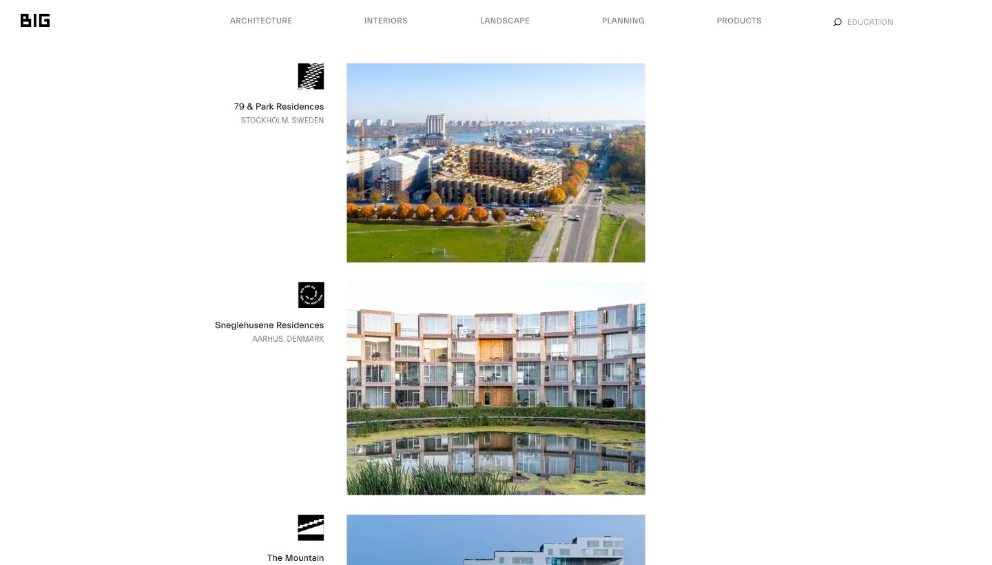
BIG (Bjarke Ingels Group) has hundreds of projects, and it sorts them through the main menu rather than a separate filter bar. Projects opens into Architecture, Interiors, Landscape, Planning and Products, and each of those opens again into types such as culture, education, housing, parks or furniture. The project list itself is simple: a large image, a small icon unique to each project, the project name and its location.
A visitor who only cares about housing or landscape can get there in two clicks, without wading through everything else. The small icon per project is a nice touch too: it gives each building an identity before you have read anything.
Borrow this: if you work across more than one type of project, let people choose their type from the menu. A client planning a house doesn't need to scroll past your masterplans.
2. Olson Kundig: projects sorted by what clients are building
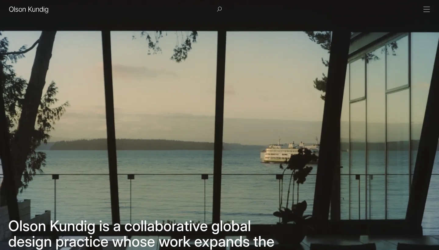
Olson Kundig lists thirteen project types under Projects, from Residential and Hospitality to Academic, Spiritual and Products. The homepage opens with one sentence about the practice and then shows a row of featured projects, each with a title and a location, which you move through with arrows. It also asks visitors whether they want motion turned on, with an "Enable Motion" button and a "No Thanks" option.
Sorting by building type matches how clients think. A hotel group searches for hospitality work, a family for houses. The motion prompt is worth noticing for a different reason: it respects visitors who prefer less movement on screen, which matters on an image-heavy site.
Borrow this: name your project categories the way a client would describe their own project, and keep animation optional.
3. Tatiana Bilbao Estudio: an index you can read in one glance
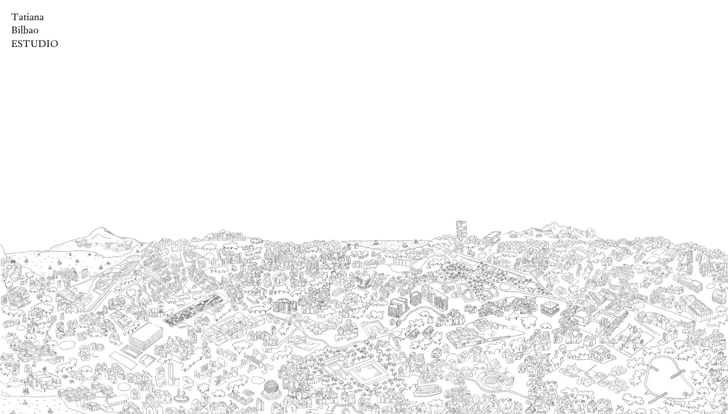
Tatiana Bilbao Estudio takes the opposite approach to the image grid. The homepage is called "City Map" and is built around a large city drawing, and the menu leads to a "Project Index": around seventy projects listed as plain text, from houses and housing to museums, masterplans and exhibitions.
A text index shows the range of a practice faster than any grid. You see in seconds that this studio designs minimum housing and museums, furniture and masterplans. The drawing on the homepage tells you the studio thinks about the city as a whole before you have opened a single project.
Borrow this: add a plain text list of every project somewhere on your site. It is quick to scan, it loads instantly, and it shows your range honestly.
Portfolios that say what the practice believes
4. Studio Gang: a short statement, then the work
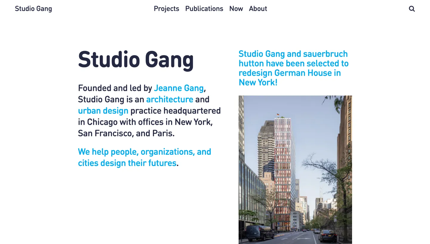
Studio Gang says who it is in its opening lines: a Chicago practice with offices in New York, San Francisco and Paris, which helps "people, organizations, and cities design their futures." Projects appear in a single column, each with a title, a photo and a short paragraph about the project. Under the label "In Her Own Words", the site also features Jeanne Gang on topics such as pay equity and bird-friendly building codes.
The short paragraph per project is the important part. It tells the reader what the building is for before they decide whether to click. And the features on the founder's positions give a potential client a reason to choose this studio that has nothing to do with style.
Borrow this: write two or three sentences for every project on your list, saying what problem it solved. If you hold a clear view on how buildings should be made, give it a page.
5. Snøhetta: one line per project
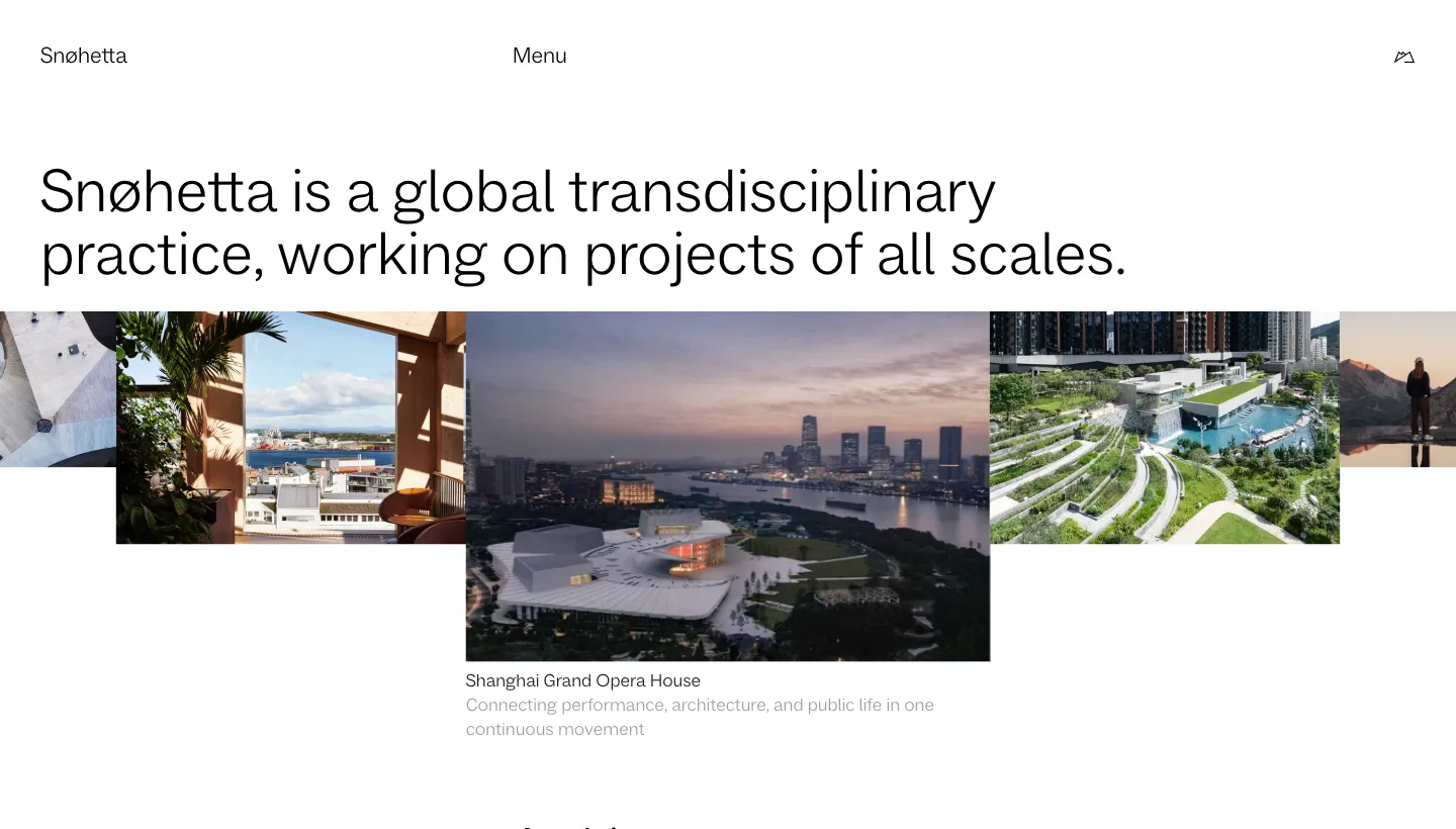
Snøhetta describes itself as "a global transdisciplinary practice, working on projects of all scales." Its highlighted projects are a list of names, each with a one-line descriptor, and the site groups work by discipline: architecture, landscape, interior and product. It also has a settings panel where visitors can switch on dark mode, a simplified view or low resolution images.
One line per project is a discipline worth copying. It forces you to say what each project is about, and it gives a scanning reader a reason to stop. The low resolution option shows a rare awareness that not every visitor is on fast broadband.
Borrow this: write one plain sentence for each project that says what makes it different. If you can't, that project may not belong on the homepage.
6. MVRDV: projects grouped by theme, not by type
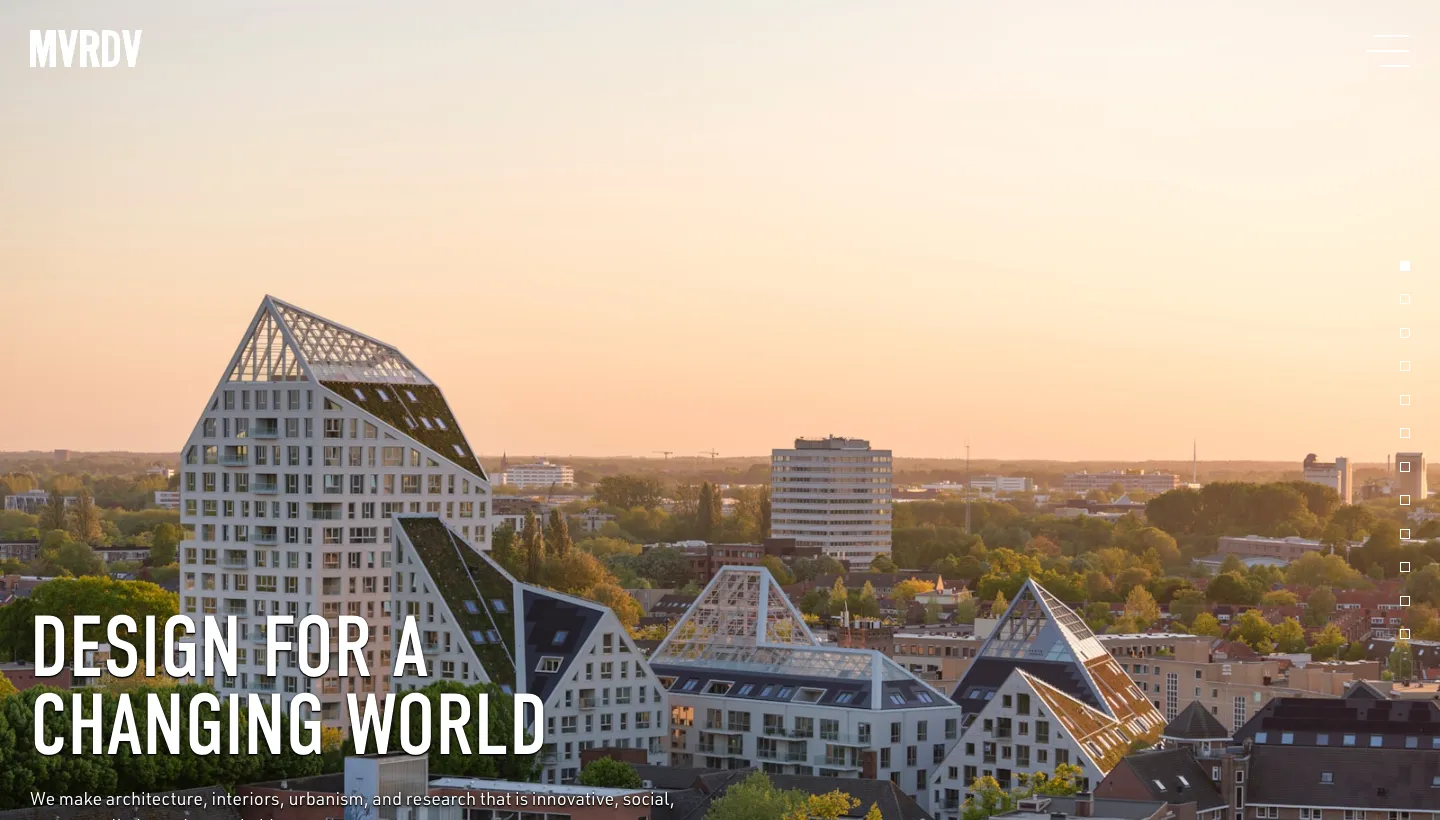
MVRDV opens with "Design for a changing world" and organises its homepage by theme: transformations, urbanism, housing, culture, sustainability, research and more. Each theme gets a large photo, a headline written with some wit, a short paragraph and one project or article to start with. The site is also available in five languages.
Themes tell a reader what the practice cares about, not just what it has built. A developer interested in reusing existing buildings can go straight to the transformations theme and see the argument and the proof together.
Borrow this: if your work keeps returning to two or three ideas, use them as the way into your portfolio. It makes you memorable in a way a project type never will.
Portfolios where restraint does the work
7. John Pawson: almost nothing, on purpose
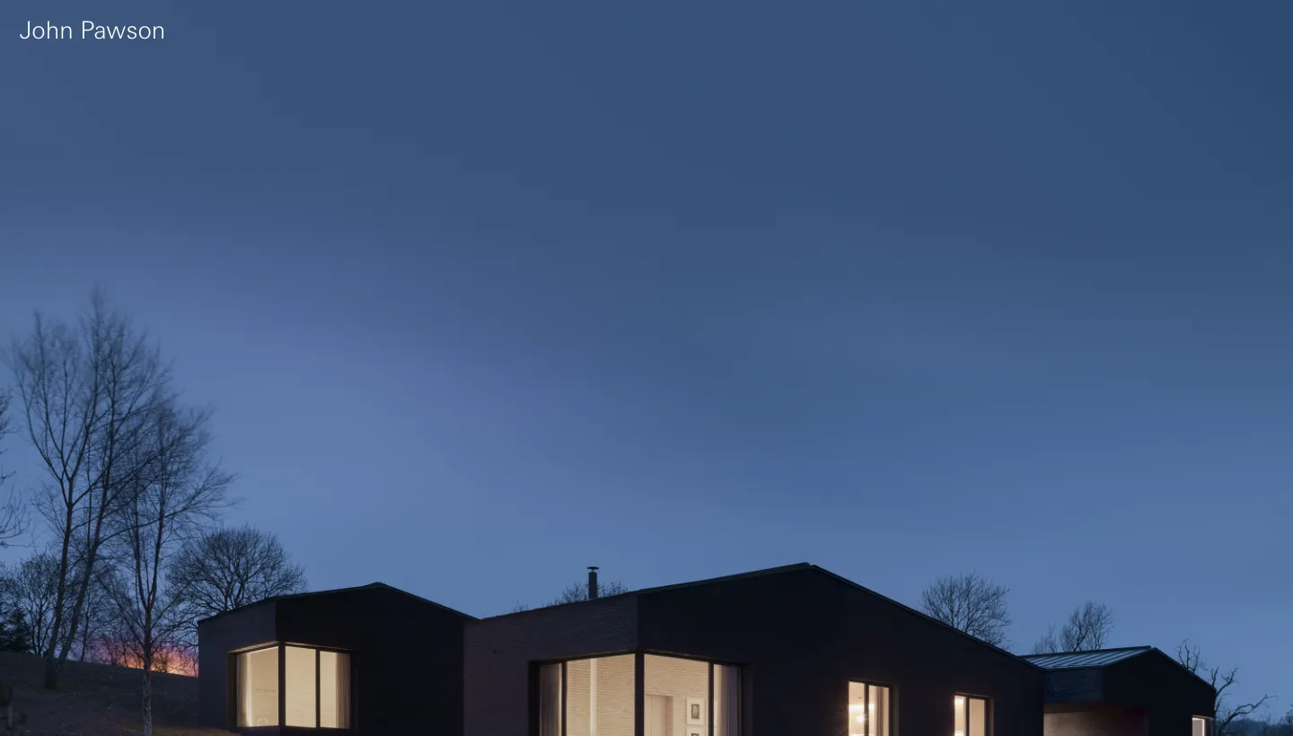
John Pawson's site has four menu links: Architecture, Design, Journal and Office. The homepage is a full-width slideshow of photographs with no captions and no headline.
For a practice known for minimalism, the portfolio is the argument. Any extra text or interface would contradict the work. This only works when the photography is exceptional and the name is already known, but it is a useful reminder that a portfolio's design should agree with the architecture inside it.
Borrow this: make the portfolio look like your work. If your buildings are quiet, the site should be quiet too.
8. Norm Architects: architecture next to everything else the studio makes
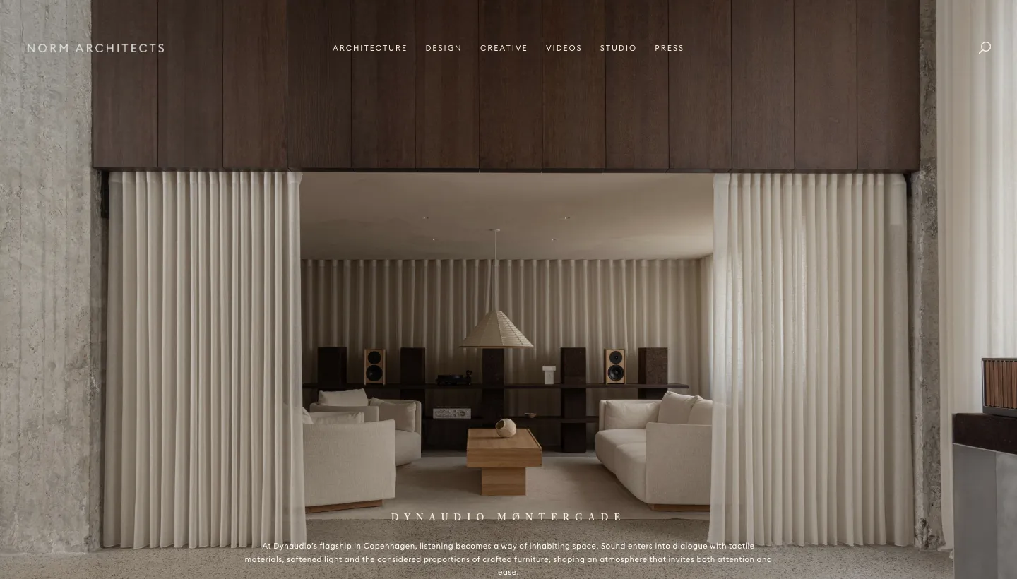
Norm Architects organises its menu into Architecture, Design, Creative, Videos and Studio. Projects appear as stacked entries with a title, a short atmospheric description, tags, a year and a "View" button. The writing is part of the design: one residence is described with the line that luxury is expressed "not through abundance, but through presence."
Showing furniture, objects and photography alongside buildings tells a client that the studio thinks about a space down to the chair. The descriptions do what images can't: they say how a place is meant to feel.
Borrow this: if you design interiors, furniture or details as well as buildings, show them. And describe how a space feels, not just what it is made of.
9. Stratamaki Studio: every project shown in layers
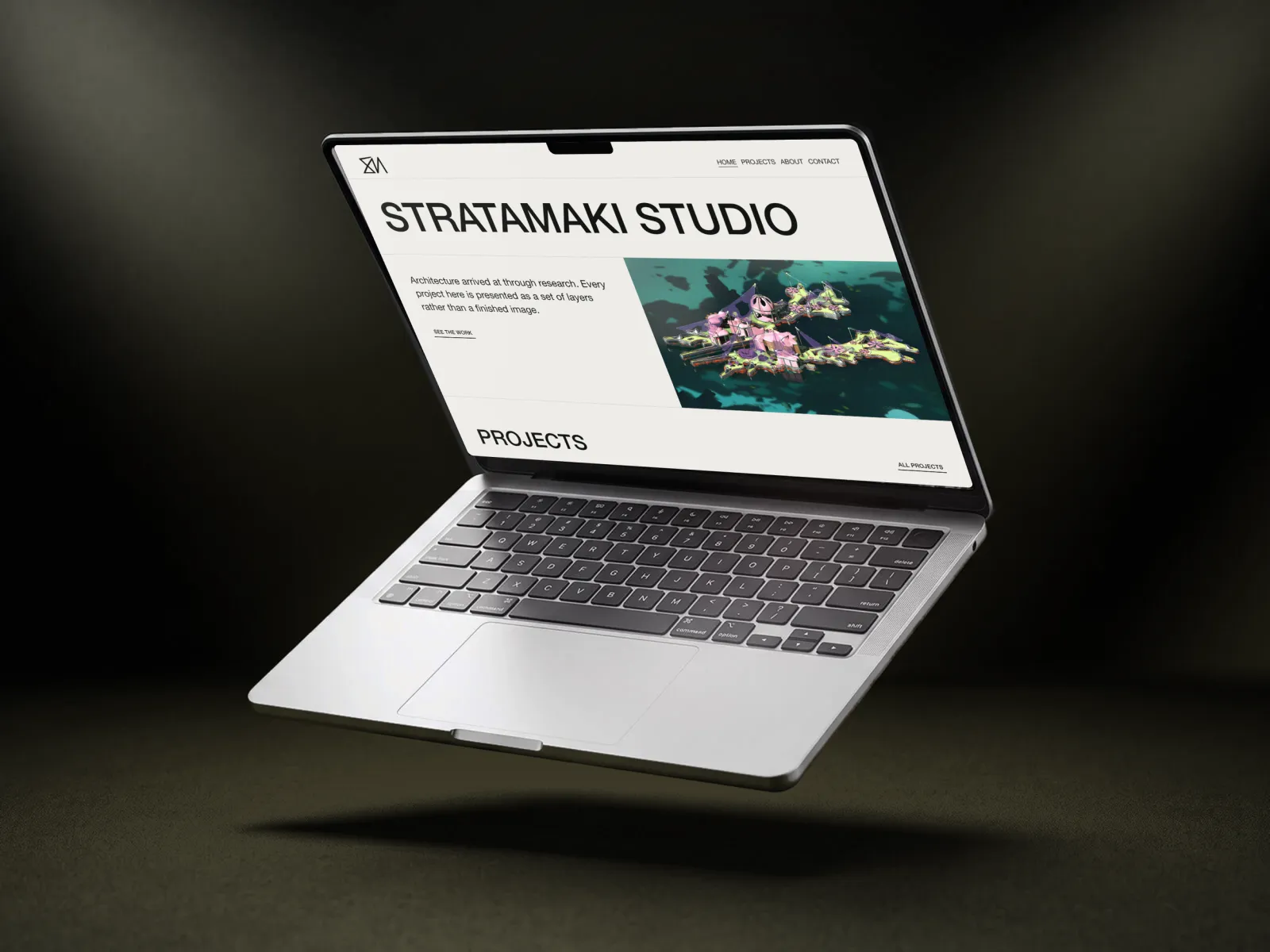
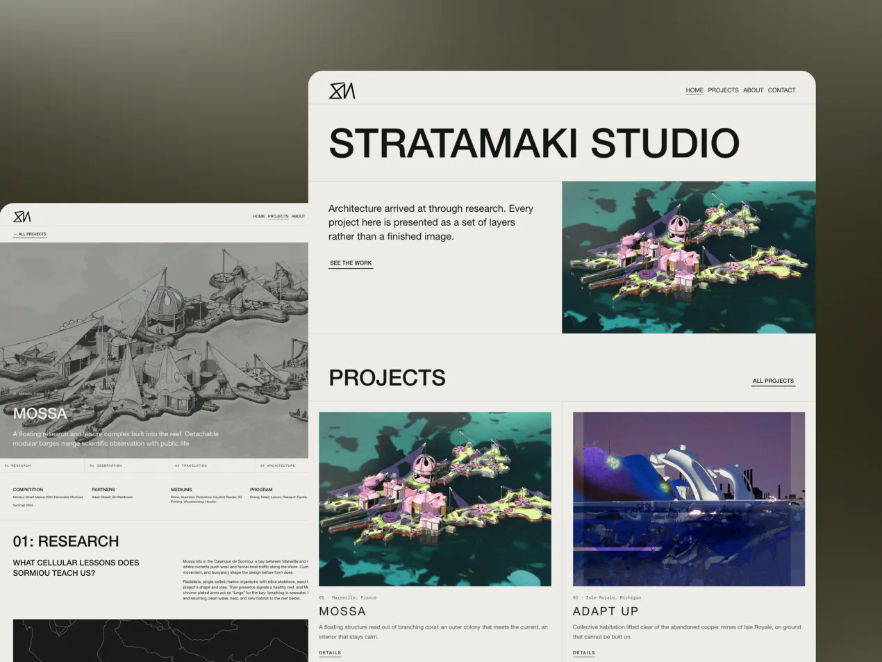
Stratamaki Studio is the portfolio of architect Michael Kats, and it is one we designed and built. His practice moves between research and making, and the problem was a familiar one: architecture portfolios tend to look alike, a grid of renders, a name and a contact link. For research-led work, that format hides the part that matters, because the thinking lives in the site analysis, the drawings and the material studies.
So every project page moves through the same layers: site, research, drawing, form. The reader follows the thinking and not only the outcome. The design borrows from a drawing set, with paper tones, hairline rules and monospace details, so the interface steps back and the drawings carry the colour. Every project leads with its number and place, the resume sits on the page with the full CV as a PDF, and every page says what Michael is open to: practice, collaboration and teaching. He can add new projects himself, without a developer. The Stratamaki Studio case study shows the full build.
Borrow this: give every project the same structure, from the starting point to the final form. A consistent structure makes a handful of projects read as a body of work.
What the best architecture portfolios have in common
Looking across all nine, the same habits show up.
They are easy to browse in the way clients think
BIG and Olson Kundig sort by building type. MVRDV sorts by theme. Tatiana Bilbao lists everything as text. None of them make a reader scroll through every project to find the one that matters to them.
Every project has words, not just images
A line, a paragraph or a full set of layers. Snøhetta, Studio Gang and Norm Architects all tell you what a project is about before you click. Images show the result. Words show the thinking, and the thinking is what clients hire.
The site agrees with the work
John Pawson's quiet site suits quiet buildings. Stratamaki's drawing-set design suits research-led work. A portfolio that fights the architecture inside it makes the work look weaker.
They say who they are and what they want
Studio Gang leads with its locations and purpose, Stratamaki with what the architect is open to. A reader should never have to guess whether to get in touch.
The short version
The best architecture portfolios aren't the ones with the most renders. They are the ones that make a large body of work easy to browse, give each project enough words to show the thinking, and look like the architecture they present. A student with three projects can do every one of these things: a clear structure per project, a sentence on what each one solved, a plain index and a site that matches the work.
Pick the idea closest to your own portfolio's weak spot and start there. If you also want the site to bring in enquiries, our guide to SEO for architects covers the search side.
FAQ
What should an architecture portfolio include?
A short statement of who you are and what you do, a selection of your strongest projects, and for each project the site, the brief, the idea and the drawings that got you to the result. Add a way to browse by project type, an about page or CV, and a clear way to get in touch.
How many projects should an architect portfolio have?
Fewer than most people think. Five to eight well explained projects usually make a stronger case than twenty images without context. A larger practice can show more, as long as visitors can filter by type.
Should an architecture portfolio be a website or a PDF?
Both have a place. A website can be found in search, shared as a link and updated anytime. A PDF is still expected for many job applications and competitions. Many architects keep the website as the main portfolio and offer a PDF version for download.
What makes an architecture student portfolio stand out?
Showing process. Panels and hiring practices want to see how you think, so include sketches, site analysis, models and the drawings that changed the design, not only the final render. A consistent structure for every project also makes a small body of work feel serious.
Do architecture portfolios need text?
Yes. Images show the result, but the words explain the problem, the idea and the decisions behind it. Even one sentence per project helps a reader decide whether to look closer, and it gives search engines something to understand.
Can I build an architecture portfolio on Squarespace?
Yes. Stratamaki Studio is a Squarespace portfolio we built, with a layered structure for every project and a resume on the page. The architect adds new projects himself, without a developer.