



Most of the best church websites belong to large churches with media teams, and most lists of them stop at "look how beautiful this is." That doesn't help a parish with one volunteer who updates the site on Sunday evening. So for each church below we picked one thing it does well that a small congregation could copy, usually without spending anything.
Everything described here is visible on the live sites as of November 2026. Churches update their homepages every week with new sermons and events, so we focus on the structure and wording rather than this week's message.
What a church website is really for
A church website has one visitor who matters more than any other: the person who has never been. They might have just moved to the area, they might be returning to faith after years away, or they might be a parent looking for something for their children. Before they come on a Sunday, they want to know four things: when, where, what it will be like, and whether they will feel out of place.
Your members already know all of that. They use the site for the calendar, giving and the latest sermon. A good church website serves both, but it answers the newcomer first, because the newcomer is the one who will leave if the answer isn't there.
Here are eight church website examples, grouped by what they teach.
Church websites that make a first visit easy
1. North Point Community Church: service times in the first screen
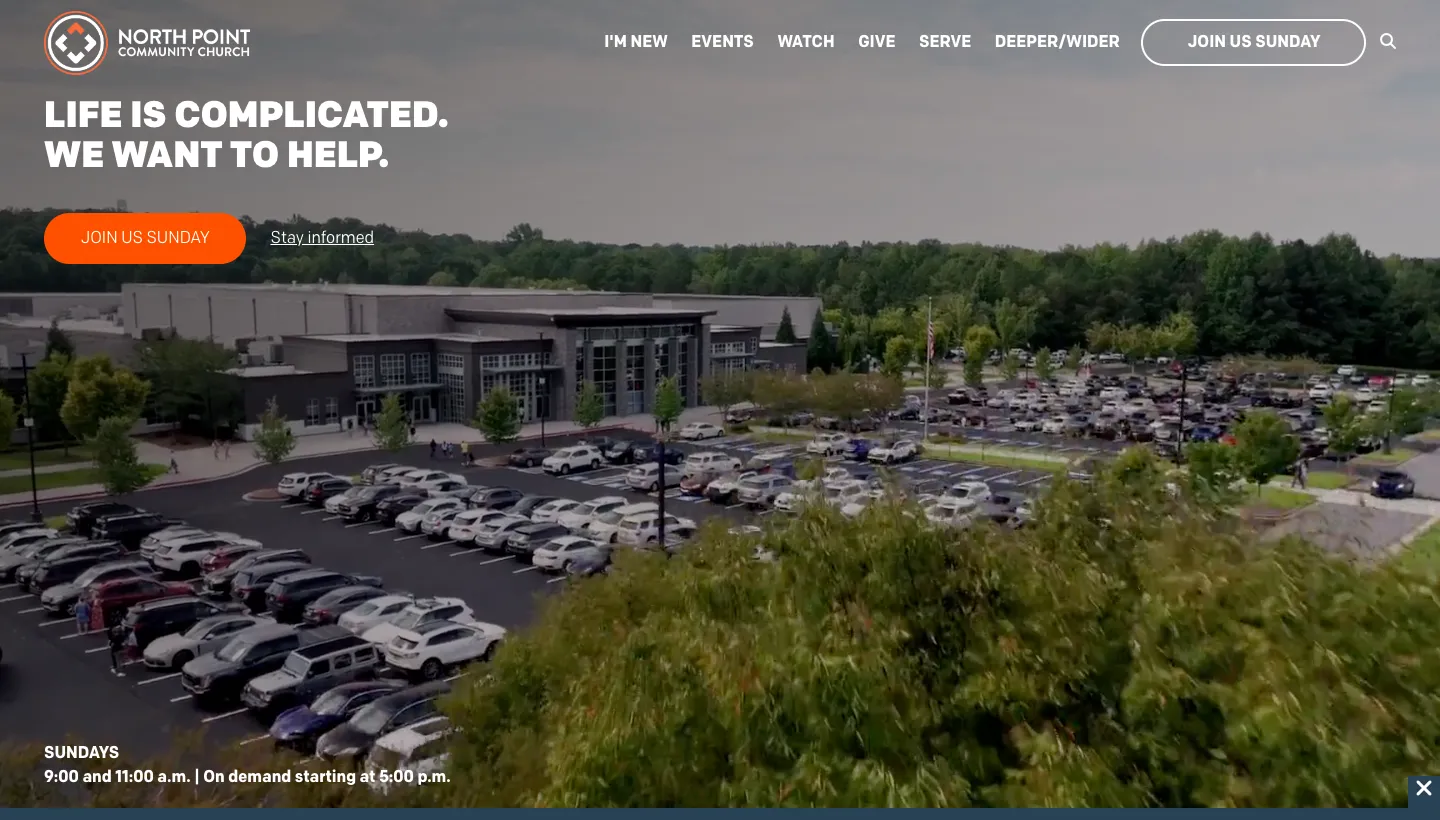
North Point Community Church opens with a headline that speaks to ordinary life: "Life is complicated. You want to get it right. We want to help." Directly under it are a "Join Us Sunday" button and the service times, 9:00 and 11:00 on Sundays, plus a note that the service is available on demand from 5:00 p.m. The first link in the menu is "I'm New".
Service times are the single most searched piece of information on any church website, and here they sit in the first screen, under a headline a stranger can relate to. A newcomer doesn't have to open a menu to find out when to come.
Further down, each ministry stage has a card with a short promise: preschool is "Building a foundation that lasts" and high school is "Experiencing a place to belong". Parents often decide where the family goes based on the children's programme, and one line per age group answers their real question before they visit.
Borrow this: put your service times and address in the first screen of your homepage, add a menu link called "I'm New", and give each children's and youth group a one-line promise in plain words.
2. Saddleback Church: let visitors pick their own starting point
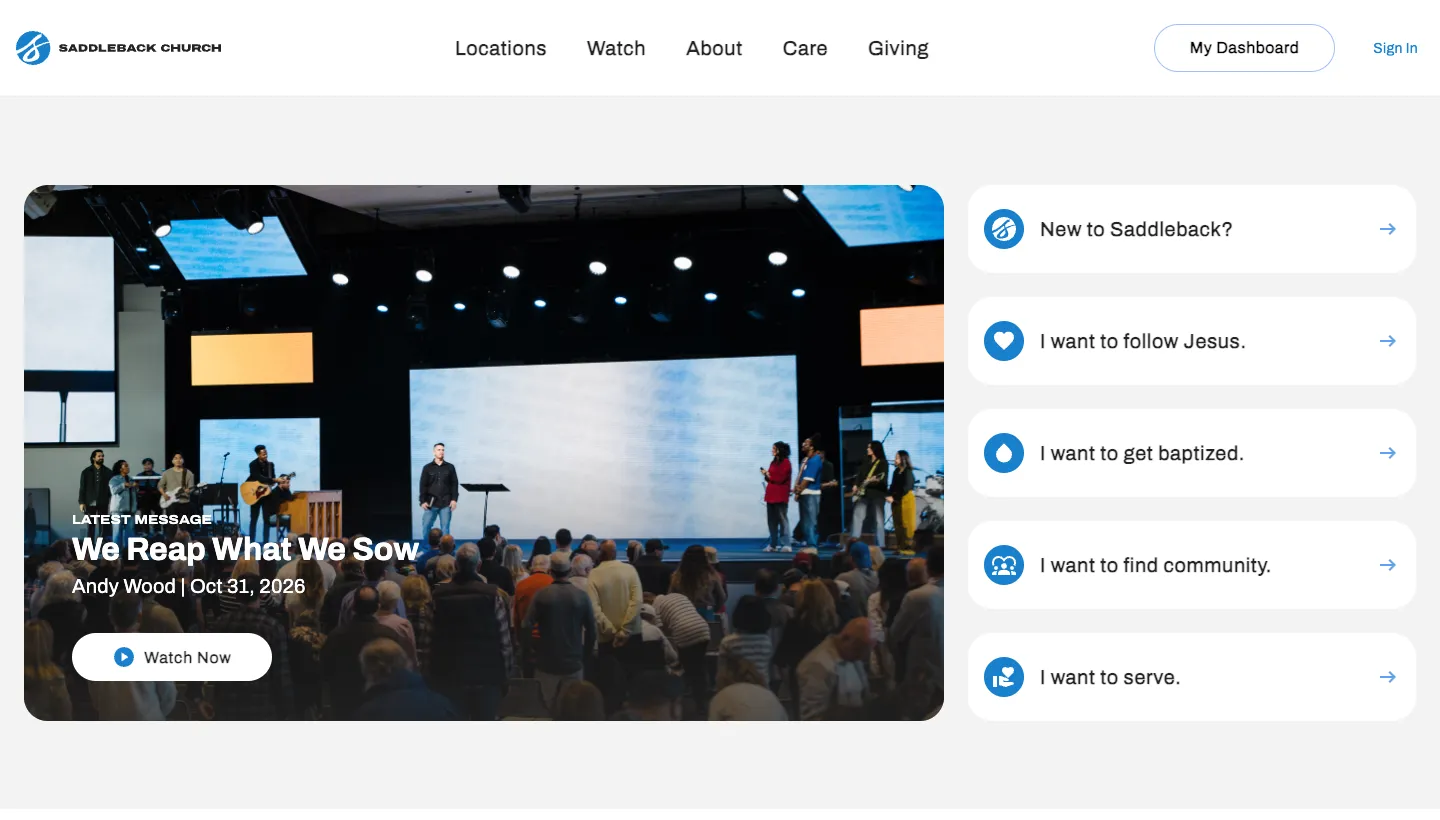
Saddleback Church shows five large buttons under its latest message, each written in the visitor's own words: "New to Saddleback?", "I want to follow Jesus.", "I want to get baptized.", "I want to find community." and "I want to serve." The homepage also shows that the church has locations on four continents, with a "Find a Location" button.
Writing the options as "I want to" turns a menu into a conversation. Each visitor finds the sentence that matches where they are, rather than guessing which department handles their question.
Borrow this: write your main next steps as the sentences a visitor would say, starting with "I want to".
3. Redeemer: choose your church before anything else
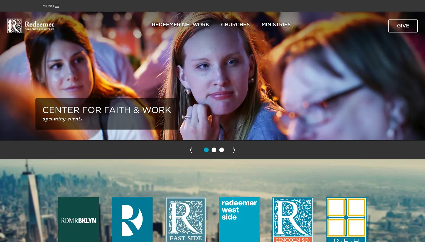
Redeemer in New York is a network of several churches, and its homepage says so in its header: "A Family of Churches and Ministries for the Good of the City." The menu lists each church by neighbourhood, from Brooklyn and Downtown to East Harlem, and a row of church logos at the bottom of the page links to each one's own site.
A newcomer to a multi site church has one question before any other: which one is mine? Listing churches by neighbourhood answers it in the way people actually think about where they live.
Borrow this: if your church meets in more than one place, or shares a site with other congregations, let visitors choose their location first, named the way locals would name it.
Church websites that make it easy to take part from anywhere
4. Elevation Church: four ways to attend, side by side
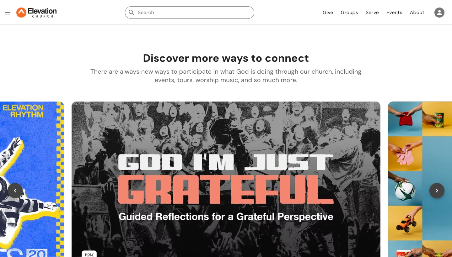
Elevation Church opens with "Welcome to Elevation Church" and "See what God can do through you," followed by its latest sermon. Below, it sets out four ways to take part, each with its own link: a physical campus ("Find a location"), live streams ("Find a time"), a watch party and a pop-up.
Many people now watch a service online before they ever walk in. Showing online and in-person options as equals tells those people that watching from home is a real way to belong, and that the church will meet them where they are.
Borrow this: if you stream your services, put the stream next to your in-person times as a proper option, not a footnote.
5. Church of the Highlands: a clear path after the first visit
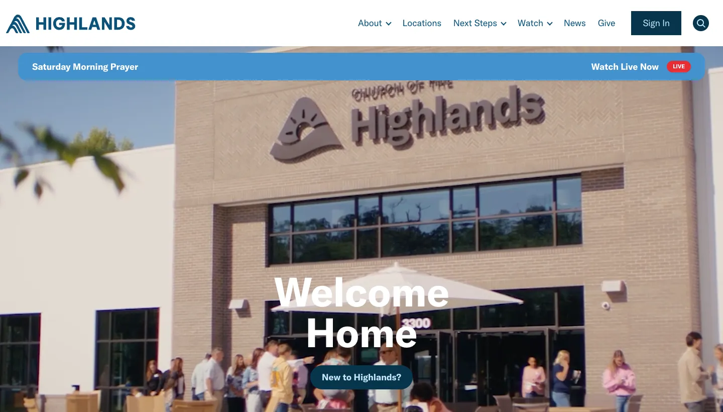
Church of the Highlands opens with "Welcome Home" and a tagline that sums up what the church is for: helping people "Know God, Find Freedom, Discover their Purpose & Make a Difference." A "Plan Your Visit" block says "We'd love for you to join us this Sunday!" and next-step tiles for small groups, the Growth Track, baptism and the volunteer team follow.
The tagline and the tiles match each other. Each of the four next steps lines up with part of the purpose, so a visitor can see what the second, third and fourth visits might look like, not only the first.
Borrow this: write down what your church is for in one sentence, then make sure each next step on your homepage connects to it.
Church websites that carry history and community well
6. Trinity Church Wall Street: worship times plus the life of the church
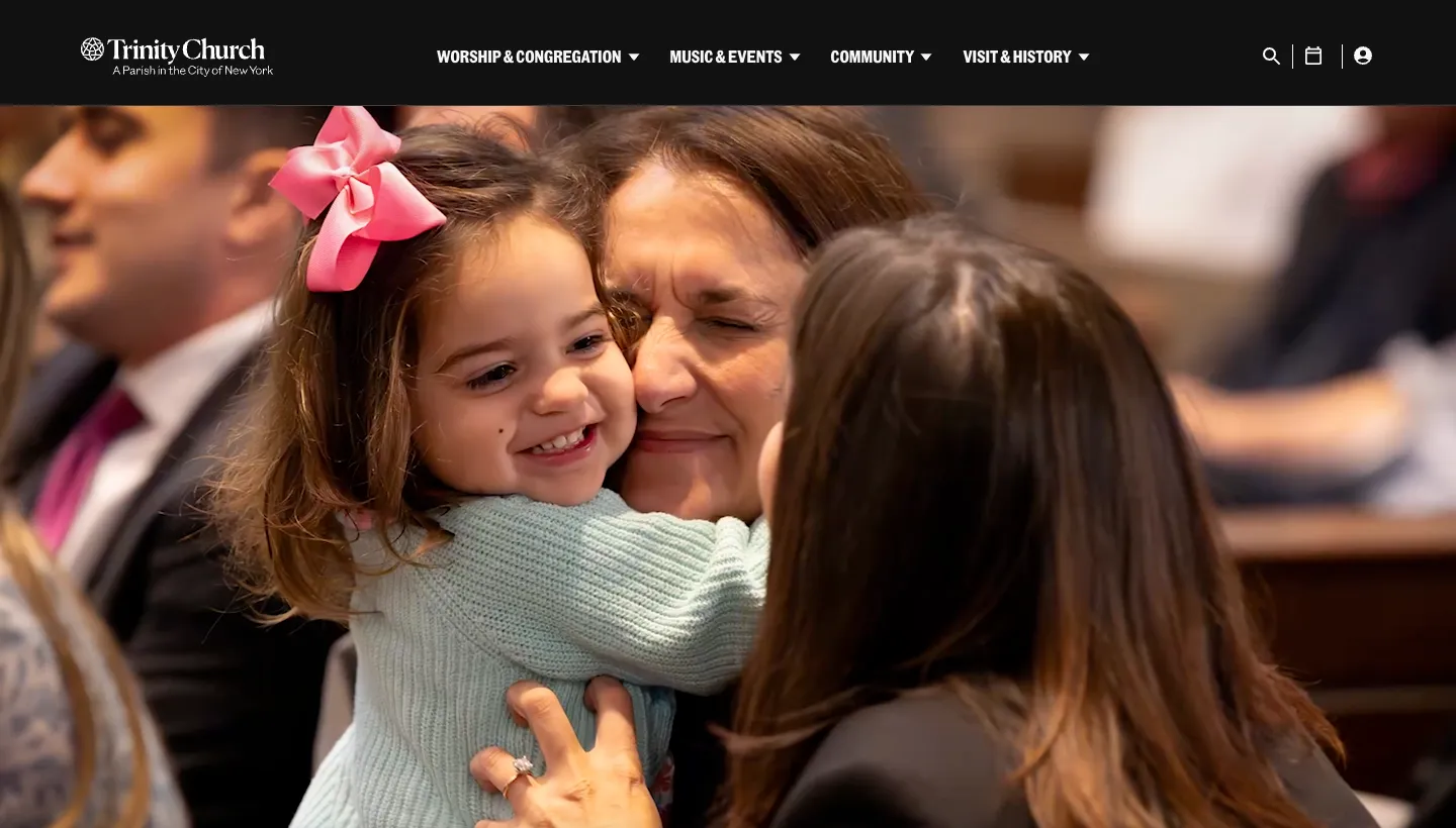
Trinity Church Wall Street shows "Join us for Sunday worship" with the three Sunday service times at the top of the homepage. Below that is a calendar of the month ahead, with faith discussions, choral evensong and free lunchtime jazz concerts, alongside talks, a podcast and short reflections on the week's reading.
A calendar of real events shows a living church. A visitor who isn't ready for a Sunday service can start with a concert or a discussion group, and many people's first step into a church is exactly that.
Borrow this: list what happens during the week, not only on Sunday. A concert, a coffee morning or a study group can be the easiest first visit.
7. Westminster Abbey: worshippers and tourists, each with their own way in
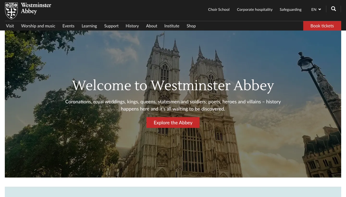
Westminster Abbey has two very different audiences, and it separates them in the menu. "Visit" covers opening times, prices and tours. "Worship and music" covers services, sermons and music. The homepage lists the day's services with times and places, and says services are open to everyone free of charge.
Many historic churches struggle to welcome tourists and worshippers on the same page. Separate routes mean neither audience has to read past the other's information.
Borrow this: if your building draws visitors as well as a congregation, give each group its own menu section, and say clearly that services are free and open to all.
8. St Paul's Cathedral: practical answers before people arrive
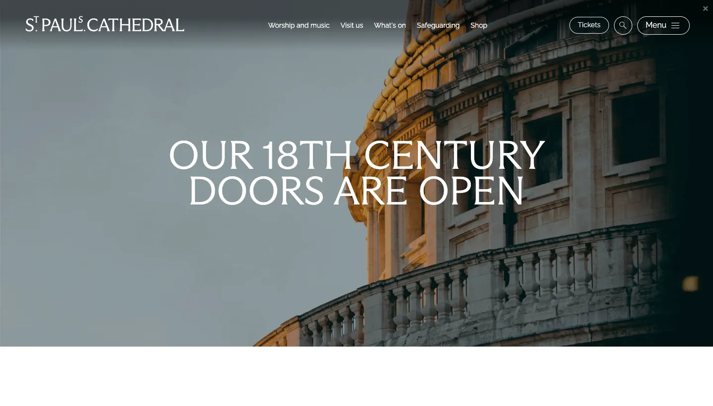
St Paul's Cathedral opens with "Our 18th century doors are open," then answers the practical questions straight away: opening times, last entry, ticket prices, the bag size limit, how to get there and accessibility. It states clearly that worship is free, and points to a service schedule and calendar.
People who are nervous about visiting a church often worry about practical things: where to go, what to bring, whether there is a dress code. Answering those questions plainly removes the excuse not to come.
Borrow this: add a short "what to expect" section with the practical details: parking, which door to use, how long the service lasts and what to wear.
What the best church websites have in common
Across all eight, the same habits show up.
They answer the newcomer first
Service times, the address and an "I'm New" link sit near the top. North Point, Trinity and Elevation all make the first visit easy to plan without opening a menu.
They write in the visitor's words
"I want to find community." "Life is complicated." Saddleback and North Point speak the way people think, not the way church committees write.
They show the whole week
Trinity's calendar and Elevation's online options show that a church is more than one hour on Sunday. Each event is another way in.
They separate audiences cleanly
Westminster Abbey and St Paul's give tourists and worshippers their own routes. Redeemer lets visitors choose their church by neighbourhood. Nobody has to read past information meant for someone else.
The short version
The best church websites aren't the ones with the biggest video budgets. They are the ones that answer a newcomer's questions in the first screen, speak in the visitor's own words and show everything the church does during the week. A small parish can do every one of these things this month: service times at the top, an "I'm New" page, a line for each age group and a calendar that is kept up to date.
Start with the first screen of your homepage. If someone who has never been can't tell when and where to come within five seconds, fix that before anything else. For more on explaining what your church does in plain words, our piece on communicating your mission online covers the writing side.
FAQ
What should a church website include?
Service times, the address with directions, a page for first time visitors, what to expect on a Sunday, information on children's and youth groups, a calendar, recent sermons and a simple way to give. Contact details and a short statement of what the church believes complete the essentials.
What makes a good church website?
It answers a newcomer's questions quickly. Someone who has never been should find when and where to come, what the service is like and what is on offer for their children within seconds of arriving on the homepage. It also needs to be easy for a volunteer to keep up to date.
Should a church website have a plan your visit page?
Yes. A plan your visit page tells a newcomer where to park, which door to use, how long the service lasts, what to wear and what happens with their children. These practical worries stop many people from coming, and a short page answers them.
How often should a church website be updated?
The calendar and service times should always be current, so at least weekly. A website with last year's Christmas services still on the homepage tells visitors nobody is looking after it. Choose a platform your volunteers can update without help.
Should a church stream its services online?
If you can do it well, it helps. Many people watch a service online before visiting in person. Elevation Church presents its live streams next to its physical campuses as an equal way to attend.
What is the best platform for a church website?
One your team can update without a developer. Squarespace suits many churches because volunteers can change service times, add events and post sermons themselves, and the templates work well on phones.