A personal website has one job that a company site doesn't: it has to sound like a person. These personal website examples come from writers, engineers, authors and founders whose sites bring them readers, clients or invitations. None of them looks alike, and that is the point.
We picked them because each one makes a clear decision about what a visitor should do first. For every site we say what it does, who it suits and what you could borrow. Everything described here is visible on the live sites as of November 2026.
What makes a personal website work
Most personal sites fail in the same way. They list everything the person has ever done, in the order they did it, and leave the visitor to work out why any of it matters.
The good ones choose. They decide who the site is for, what that visitor should feel in the first few seconds and what the one next step is. A writer wants subscribers. A freelancer wants enquiries. An engineer wants the right hiring manager to read on.
Three things show up again and again in the sites below:
A first screen that says who you are in one line. Not a tagline that could belong to anyone, but a sentence only you could write.
One main action. A newsletter, a contact page or a portfolio. The sites that try to push all three at once usually end up pushing none.
Proof in your own voice. Work, writing or results, shown in a way that also shows how you think.
Keep those three in mind as you look through the list.
1. Brittany Chiang: a portfolio that reads like a CV
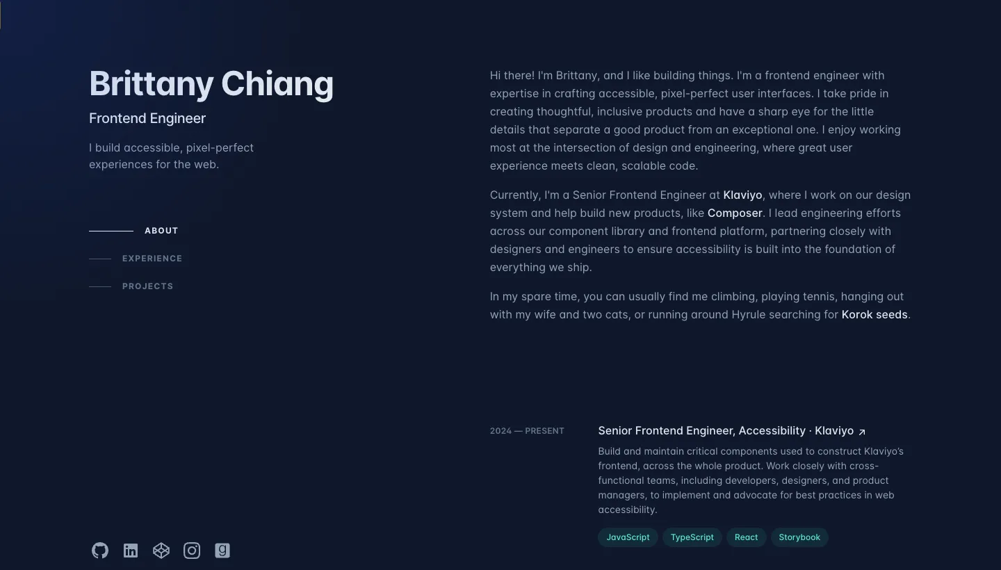
Brittany Chiang's site opens with her name, the title "Frontend Engineer" and a single line about building accessible, pixel-perfect experiences for the web. On a desktop screen the left side stays fixed with a short menu (About, Experience, Projects) while the right side scrolls through each section.
What it gets right is the order. A recruiter sees the role first, then the experience, then the projects, which is exactly the order a hiring decision is made in. Links to GitHub, LinkedIn and CodePen sit under the menu, so the evidence is one click away.
Borrow this: if your site exists to get you hired, structure it like the decision. Role first, experience second, work third.
2. Derek Sivers: "me in 10 seconds"
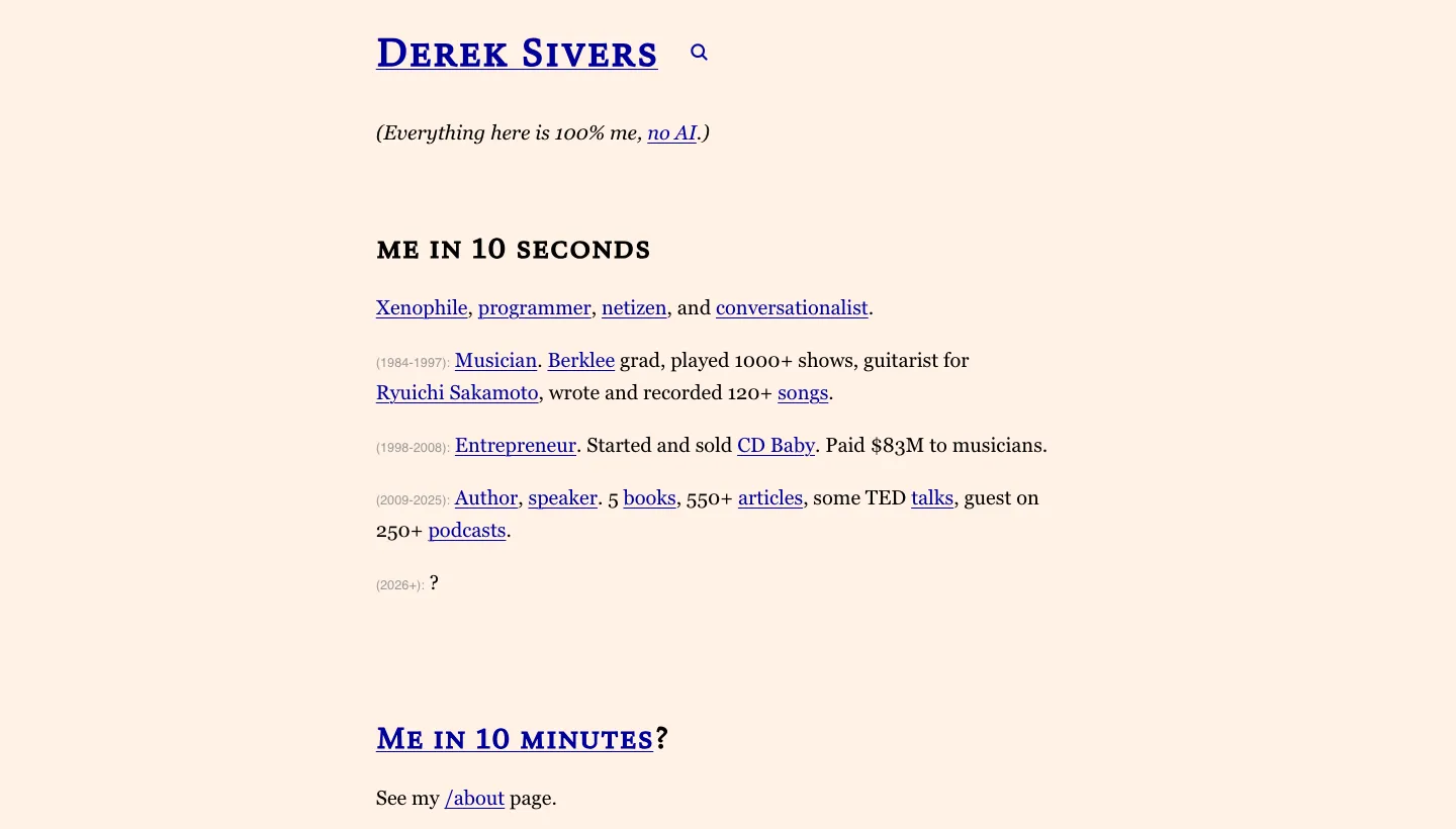
Derek Sivers puts a section called "me in 10 seconds" at the top of his homepage. It sums up his life in a few dated lines: musician, then entrepreneur who started and sold CD Baby, then author and speaker. Below it are links to a longer about page, a contact line saying he replies to every email, and his newest articles.
He is also the person behind the now page idea. His /now page says what he is doing this month and when it was last updated, and it invites readers to make one for their own site.
Borrow this: give visitors a ten-second version of you before the ten-minute version. And if people often ask what you are working on, a now page answers it without a newsletter.
Personal sites built around writing
3. Austin Kleon: the blog is the front door
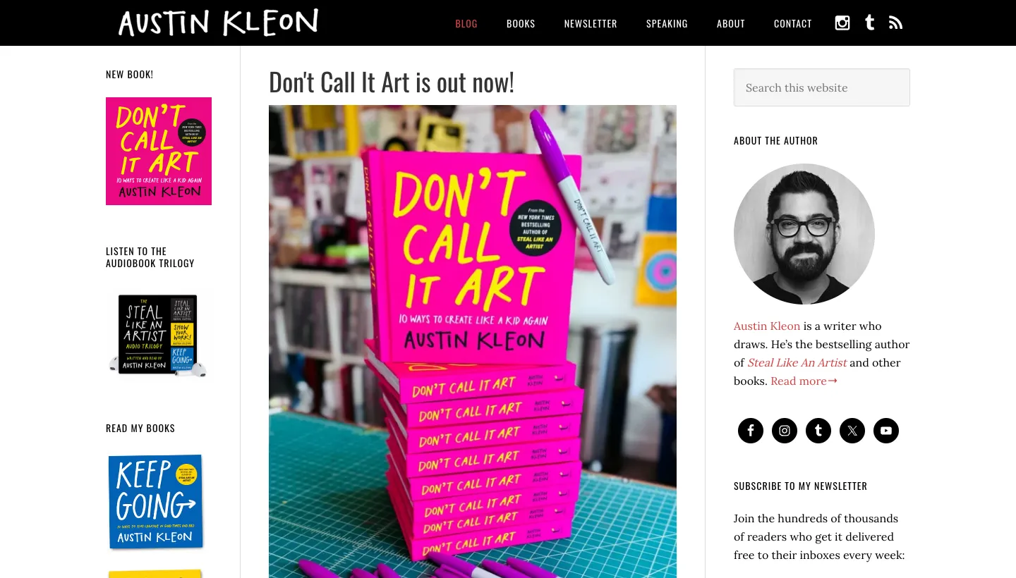
Austin Kleon's homepage is mostly his blog. The menu is short (Blog, Books, Newsletter, Speaking, About, Contact) and the top of the page promotes his newest book with a clear "Buy the book" button. Under that come recent posts, some of them as small as a mixtape he made.
The lesson is that regular, slightly odd, very personal posts are the brand. You can tell who he is from three posts, and the books and speaking pages are there for the people who arrive convinced.
Borrow this: if you write often, let the newest writing lead. Put the thing you sell (a book, a course, a talk) in one clear spot above it.
4. Seth Godin: the subscribe box comes first
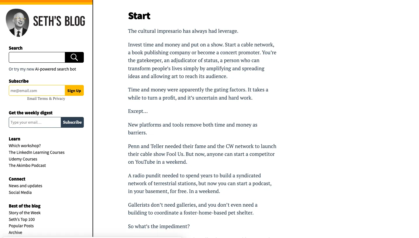
Seth's Blog puts search and a "Get the weekly digest" subscribe box at the top, before the day's post. Further down are links to courses, the podcast, his best posts and the full archive.
Seth Godin has published there daily for years, so the site is built around one job: turning a reader of today's post into a subscriber for tomorrow's. Everything else is secondary.
Borrow this: if your goal is an audience, ask for the email address early and explain what they get, in this case a weekly digest.
5. Paul Graham: almost nothing, on purpose
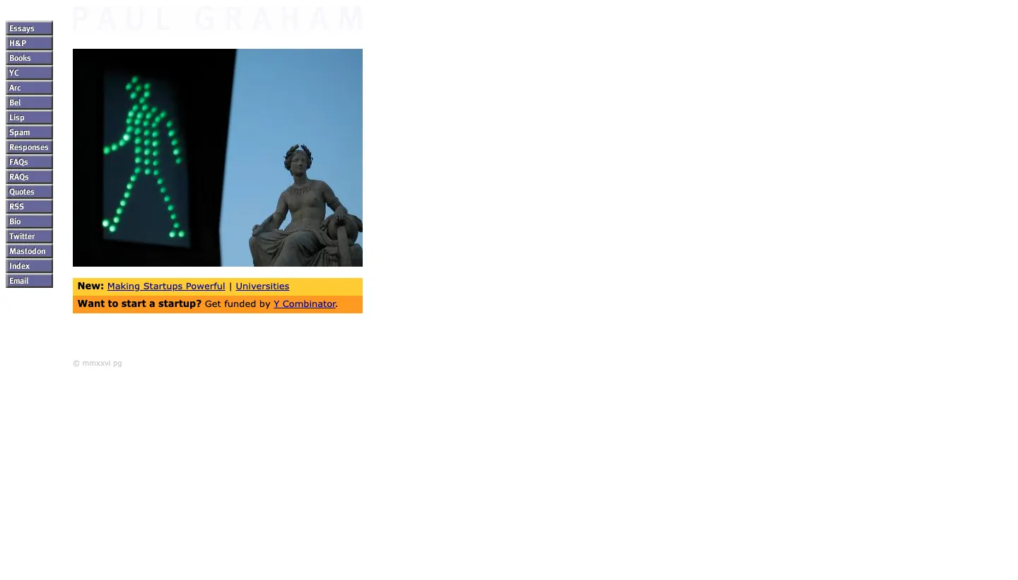
Paul Graham's site is close to bare. The homepage shows a link to his newest essay and a link to Y Combinator, with the essays one click away. There are no hero images, no testimonials and no pop-ups.
It works because the essays are the product, and people arrive looking for them by name. A plainer site for a better-known writer is a confident choice, not a lazy one.
Borrow this: very little, unless your work already has a following. A bare site tells visitors the work speaks for itself, so the work has to.
Personal brands that sell
6. Marie Forleo: a welcome for the new visitor
Marie Forleo's site opens with the headline "Create a Business and Life You Love". The menu starts with "New Here?" and "Free Tools", and the homepage greets visitors with a short note that assumes they heard her name somewhere and offers "a quick lay of the land". Her courses, such as B-School and The Copy Cure, are in the menu, and B-School is described with nearly 80,000 students.
The smart part is the "New Here?" link. A personal brand with years of videos, books and courses has a lot to show, so the site gives first-time visitors their own route through it.
Borrow this: if you have a lot of content, give new visitors a single starting page instead of the whole archive.
7. Tim Ferriss: proof stacked at the top
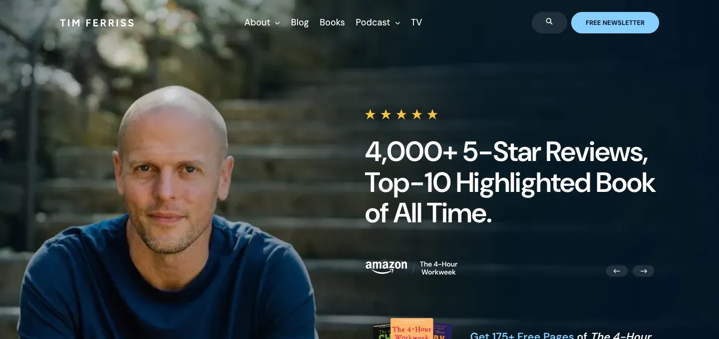
Tim Ferriss's blog has a short menu (About, Blog, Books, Podcast) and a free newsletter link. Near the top it offers free chapters from his books in exchange for an email address, then introduces the podcast, which the site says has more than one billion downloads.
Every element on that first screen is either proof or an offer. Quotes, the review count and the download figure all do the same job: they make signing up feel like the obvious next step.
Borrow this: put your strongest proof right next to your main action, not on a separate testimonials page.
Personal sites that show the work
8. Josh W. Comeau: the site is a demo
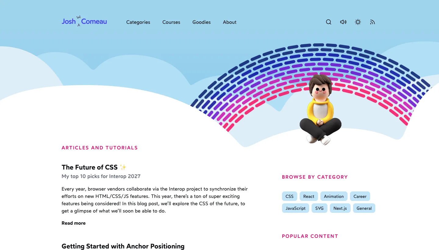
Josh W. Comeau teaches CSS and JavaScript, and his site shows what he teaches. There is a dark mode toggle, a switch to turn sounds off and generative art you can edit in the header. Below that come articles and tutorials, browse-by-category links and his interactive courses.
For someone who teaches front-end skills, these small interactions are the portfolio. A visitor learns he knows his craft before reading a word.
Borrow this: if what you do can be shown on the page itself, show it there. A designer's site can be the best example of their design, and a writer's site the best example of their writing.
9. Gary Does Copy: the writing does the selling
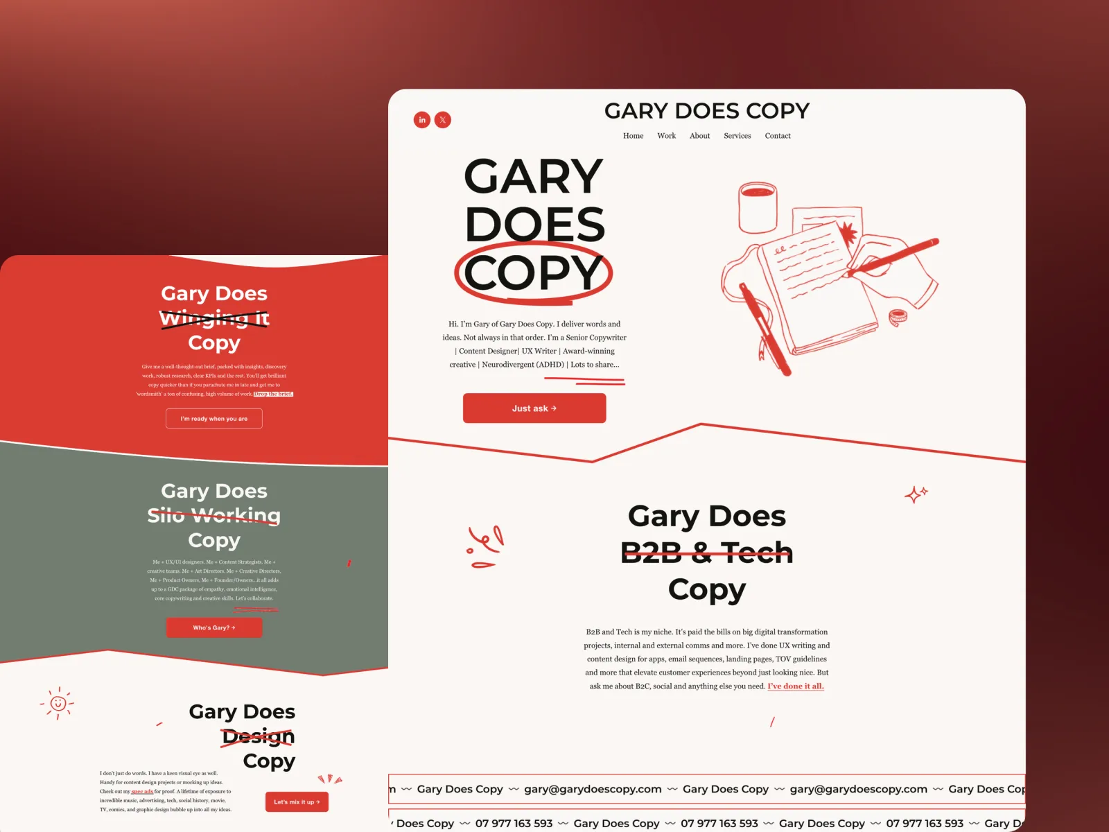
Gary Does Copy is a site we designed and built, so we can tell you the thinking behind it. Gary is a copywriter, and his homepage opens with "GARY DOES COPY" in large type and a short hello in his own voice. The menu is Work, About, Services and Contact.
His old site had flattened his personality into a generic services page, which is a problem for a copywriter: the website is the work sample. So we let the writing lead on every page and designed around his voice instead of competing with it. It still works like a CV (who he is, what he makes, how to hire him), but every section is written so the personality does the persuading. The full story is in the Gary Does Copy case study. It took four weeks from kick-off to launch, and Gary now adds new work himself.
Borrow this: if words are your trade, your homepage copy is your portfolio. Write it like a piece you would show a client.
Mistakes these sites avoid
Looking across all nine, it is just as useful to notice what none of them do.
They don't open with a vague tagline
None of them leads with "Passionate creative helping brands grow". Each first screen says something specific: a role, a book, a podcast, a ten-second life story. If your opening line could sit on a competitor's site, it isn't doing its job.
They don't list every skill
Brittany Chiang says frontend engineer, not "designer, developer, strategist and speaker". A long list of skills makes a visitor wonder which one you are actually good at.
They don't hide the next step
Whether it is a subscribe box, a contact link or a "New Here?" page, the next step is easy to find on every one. Look at your own homepage and ask what a visitor is supposed to do. If the answer takes more than a second, they won't do it.
They stay current
Derek Sivers dates his now page. Austin Kleon's newest post is at the top. A personal site with a copyright year from three years ago tells people you stopped. Our post on signs a website looks outdated covers what visitors notice first.
How to choose what your personal site should do
Before you copy any of these, decide which of three jobs your site has:
Get you hired. Follow Brittany Chiang and Gary Does Copy. Lead with the role, show the work, make contacting you easy.
Build an audience. Follow Seth Godin and Austin Kleon. Lead with writing, ask for the email address and post often.
Sell something you made. Follow Marie Forleo and Tim Ferriss. Give new visitors a starting point and put proof beside the offer.
Then write your first screen in one sentence. If you can't, the design won't fix it. That sentence is usually the hardest part of the whole project, and it is where we start with every personal brand site we build.
The short version
The best personal websites don't try to show everything. They pick a reader, say one clear thing about the person and make one next step obvious. The design follows from those choices, which is why a near-blank page works for Paul Graham and a playful interactive one works for Josh Comeau.
If you are planning your own, start with the examples closest to your goal, not the ones that look nicest. Then make sure every page sounds like you, because that is the one thing nobody else can copy.
FAQ
What should a personal website include?
At minimum: a first screen that says who you are and what you do in one line, a short about section, examples of your work or writing, and a clear way to contact you or subscribe. Everything else depends on whether the site's job is to get you hired, build an audience or sell something.
What is a now page?
A now page is a single page that says what you are focused on at the moment, with the date it was last updated. Derek Sivers started the idea, and many personal sites now link to one from the homepage.
Should a personal website have a blog?
Only if you will keep it up. A blog with regular posts can become the main reason people visit, as it is for Austin Kleon and Seth Godin. A blog whose last post is two years old makes the whole site look abandoned, so it is better to leave it out.
Should I use my name as the domain?
For most personal brands, yes. Your name is what people search for after meeting you or reading your work. A brand name like Gary Does Copy also works when it is memorable and says what you do.
How long does it take to build a personal website?
It depends on how much is written and how many pages there are. Gary Does Copy took four weeks from kick-off to launch, including the full redesign. Most of the time goes into the words, not the build.
What is the difference between a portfolio and a personal website?
A portfolio shows your work. A personal website shows your work and you: your voice, your story and why someone should choose you. For freelancers and personal brands, the second is what wins the enquiry.