



A life coach website has a harder job than most. Coaching is personal, the results are hard to show in a photo and every visitor arrives with a slightly different problem. People need to feel that this coach understands them, and that working together would be worth the money, before they book a call.
The seven sites below do that in different ways. Some ask the visitor a question straight away. Some lead with a bold point of view. Some build trust through a podcast, a book or a newsletter. For each one we say what it does well and what you could borrow. Everything described is visible on the live sites as of November 2026.
What makes a coaching site work
The best coaching sites answer three questions quickly: who is this for, what will change, and why trust this person? They also offer more than one way in, because not every visitor is ready to book a session on their first visit.
Three things show up again and again:
A clear first choice. Visitors are sorted by what they want, or by how ready they are.
A point of view. The coach says what they believe, not just what they offer.
A low-commitment next step. A podcast, quiz, newsletter or free training for people not ready to buy.
Sites that sort visitors first
1. Jody Moore: one question, two doors
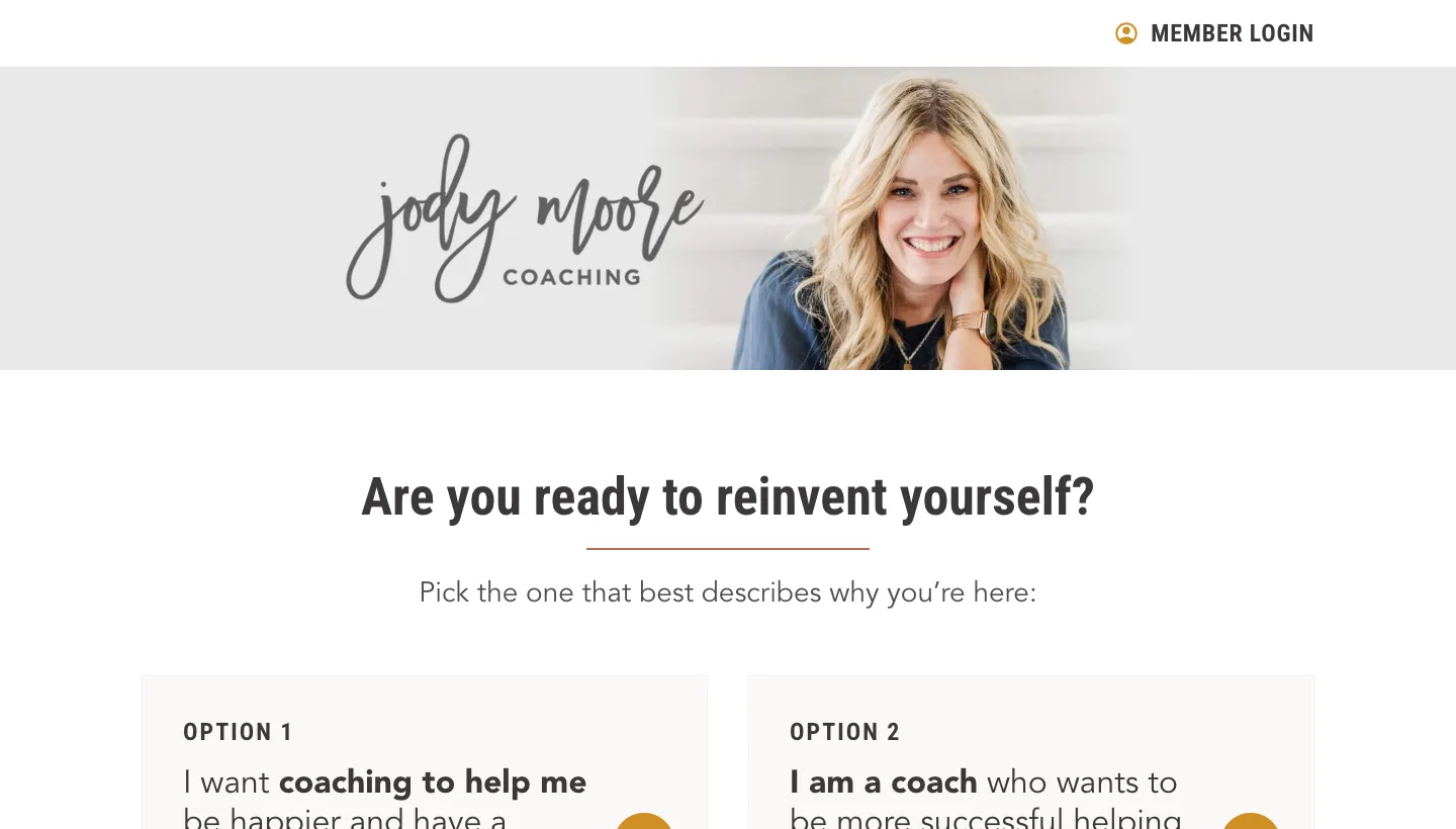
Jody Moore's homepage asks "Are you ready to reinvent yourself?" and then offers two options. Option 1 reads "I want coaching to help me be happier and have a better life." Option 2 reads "I am a coach who wants to be more successful helping others."
A coach who serves two audiences could easily confuse both. This homepage lets each visitor pick their door in the first screen, in their own words.
Borrow this: if you serve two kinds of client, ask visitors to choose on the homepage, and write each option as something they would say.
2. Rich Litvin: a quiz with a bold promise
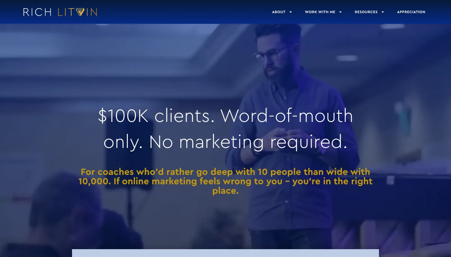
Rich Litvin opens with "$100K clients. Word-of-mouth only. No marketing required." and a call to take "The $100K Test", described as six questions in three minutes. Further down, a section titled "Why Most Coaches Shouldn't Work With Me" makes clear who the work is for.
The quiz gives curious visitors something to do before they are ready to talk, and the "shouldn't work with me" section filters out people who aren't a fit.
Borrow this: add a short quiz or self-assessment, and say plainly who you don't work with.
Sites that lead with the person
3. Martha Beck: credentials with warmth
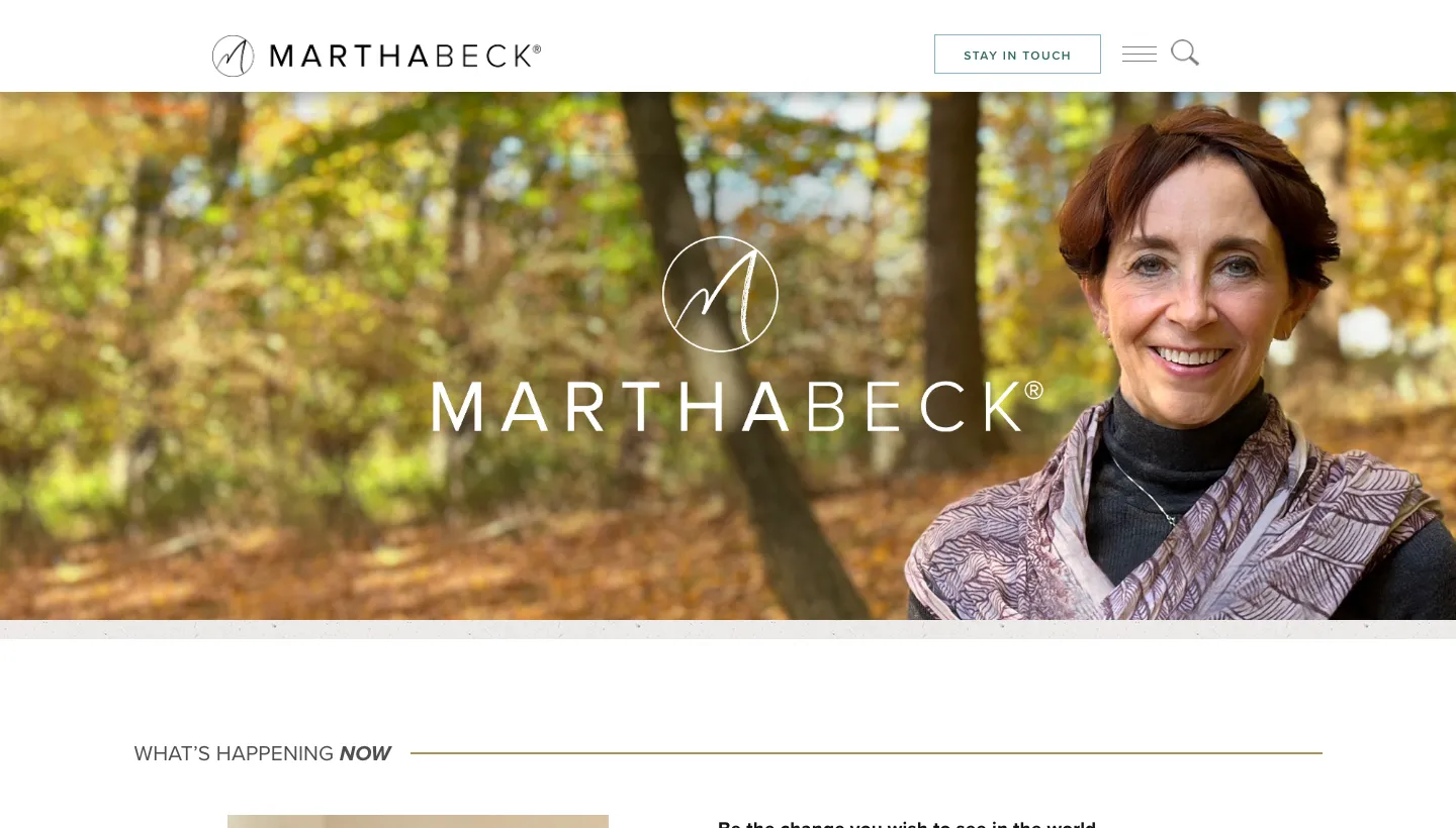
Martha Beck's site opens with a large portrait and her name, then a section on her Wayfinder Life Coach Training. Her about section introduces her as a Harvard-trained sociologist, coach and New York Times bestselling author with nine non-fiction books.
The credentials are impressive, but they are written in a personal voice, with Martha explaining in her own words why she writes. Authority and warmth sit side by side.
Borrow this: list your credentials, then follow them with a sentence in your own voice about why you do this work.
4. Marie Forleo: a guided tour for new visitors
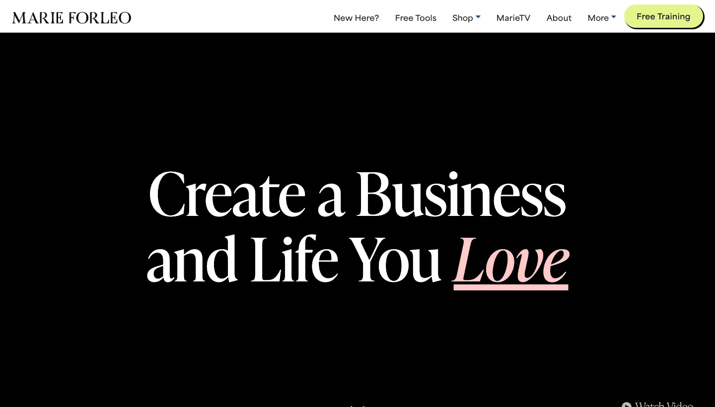
Marie Forleo's homepage leads with "Create a Business and Life You Love". The navigation starts with "New Here?", and the page introduces her with "HEYA! I'M MARIE." and a quick lay of the land so visitors can find what they need. Her programmes follow, each with a clear promise and a link to success stories.
The "New Here?" link is a small detail that matters. A site with lots of content needs a front door for people who have just arrived.
Borrow this: add a "start here" page that tells new visitors who you help and where to begin.
5. Susan Hyatt: a voice you can't mistake
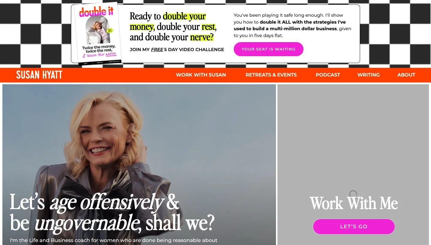
Susan Hyatt's site opens with "Let's age offensively & be ungovernable, shall we?" Each of her offers is introduced with a line starting "For the woman who...", so readers can see straight away whether it is meant for them.
A strong voice attracts the right clients and gently turns away the wrong ones. Nobody reading this site is unsure who it is for.
Borrow this: introduce each offer with one sentence describing the person it is for.
Sites that teach first
6. The Life Coach School: a numbered path
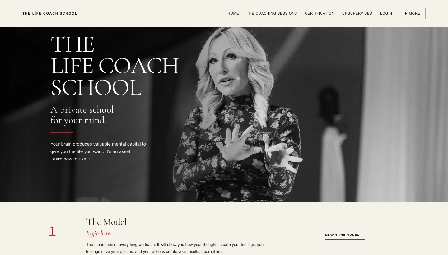
The Life Coach School lays out its homepage as a numbered path. Step 1 is "The Model", with the instruction "Begin here." The steps that follow are the podcast, recorded coaching sessions and certification. Numbers underneath show 35K+ students and coaches trained, 73M+ podcast downloads and 18+ years of teaching.
A clear sequence turns a large body of work into an easy journey. Visitors know exactly where to start.
Borrow this: number your resources and offers in the order you would recommend them.
7. Brendon Burchard: the newsletter as the front door
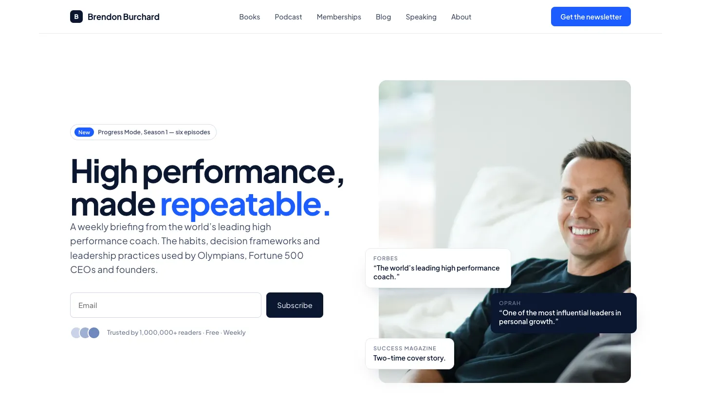
Brendon Burchard's homepage leads with "High performance, made repeatable." and a sign-up for a weekly briefing, noting it is trusted by over a million readers, free and weekly. Press quotes and his books follow.
For a coach with a large audience, the newsletter is the natural first step. It costs the visitor nothing and keeps them close until they are ready to buy.
Borrow this: make your free newsletter or resource the main call to action for first-time visitors, and say exactly what they will get.
How to apply this to your own site
Start with the first screen. Say who you help and what changes for them, in words your clients would use. Then give visitors two ways forward: one for people ready to book, and one for people who want to learn more first, such as a free guide, a short quiz or a podcast.
Add proof next. Testimonials that describe a specific change, with the client's first name and situation where they agree, are more persuasive than general praise. If you have credentials, list them, but follow them with something personal. People choose a coach they like as much as one they trust.
Finally, make booking easy. Show what the first call involves, how long it takes and what it costs, if anything. Many visitors hesitate because they don't know what will happen on the call. Our page on coaching website design shows how we structure these pages.
Mistakes to avoid
Vague promises like "unlock your potential" could belong to any coach. Stock photos of people on mountain tops tell visitors nothing about you. Hiding prices completely makes many people assume you are too expensive. And a single "contact me" button gives visitors who aren't ready yet nowhere to go.
Measure what matters
Track booked calls, newsletter sign-ups and where each came from. Ask new clients what made them book. After a few months, you will see which pages and offers bring in the right people.
Questions to ask before hiring a web designer
Have you worked with coaches before? How will the site sort different kinds of client? Can it include a quiz, newsletter sign-up or booking calendar? Who writes the copy, and will it sound like me? Who owns the website and content?
The short version
The best coaching sites sort visitors early, show a clear point of view, pair credentials with warmth and give people who aren't ready to book something useful to do. Ask a question on the homepage, add a quiz or start-here page, introduce each offer by who it is for and make your newsletter or free resource the easy first step.
FAQ
What should a life coach website include?
A clear statement of who you help and what changes, testimonials with specifics, your story and credentials, your offers, a free first step such as a newsletter or quiz, and an easy way to book a call.
How do I make my coaching website stand out?
Say what you believe, write in your own voice and name the person you help. A clear point of view does more than any design trend.
Should coaches show prices on their website?
Many do, at least as a starting point. Showing prices filters out people who can't afford you and reassures those who can. If you prefer not to, explain what affects the price.
Do life coaches need a blog or podcast?
Not necessarily, but some free way for visitors to get to know you helps. A newsletter, quiz or short guide can do the same job with less ongoing work.
How do coaches get clients from their website?
By making the first step easy: a clear booking link for people who are ready, and a free resource for people who aren't, followed by emails that build trust over time.
How much does a coaching website cost?
It depends on what is included. Our Hosted for You plans, which include the design, hosting and every change you send, start from $197 a month billed yearly.