


The best startup websites solve a problem established companies don't have: explaining something new to people who have never heard of you. There is no brand recognition to lean on and usually no long list of customers. The site has a few seconds to say what the product does, for whom and why it is better, and to make trying it easy.
The seven examples below come from developer tools, productivity apps and fintech. They differ in style, but they share a habit: short headlines in plain words, the product itself on show and one obvious next step. For each one we say what it does well and what you could borrow. Everything described is visible on the live sites as of November 2026. For established software companies, see our separate roundup of the best SaaS websites.
What makes a startup site work
A good startup site gets three things right in the first screen:
A headline that names the job. What the product does, in words a buyer would use.
The product, not an illustration. A real screenshot, demo or sample of the output.
One next step. Sign up, download or book a demo, with as little friction as possible.
Everything below the first screen supports those three: proof, detail and answers to objections.
Sites that say it in three words
1. Resend: the category in the headline
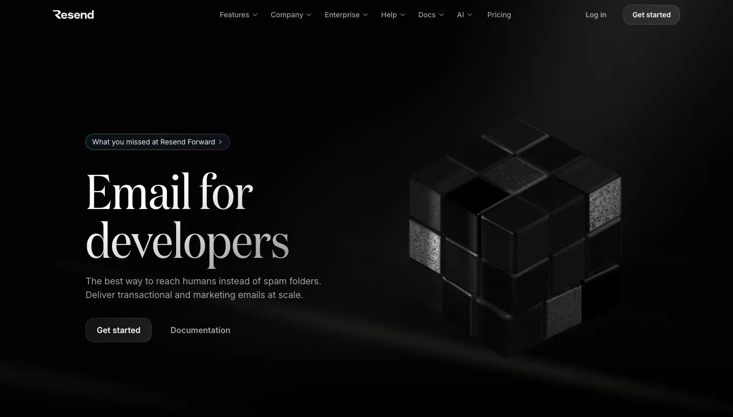
Resend opens with "Email for developers" and a line saying it delivers transactional and marketing emails at scale. Underneath, a section headed "Integrate this weekend" shows real code for sending an email, with tabs for many programming languages.
Three words tell a developer exactly what this is and who it is for. The code sample proves it is as simple as it claims.
Borrow this: if your buyer is technical, show the few lines it takes to get started.
2. Granola: the objection answered up front
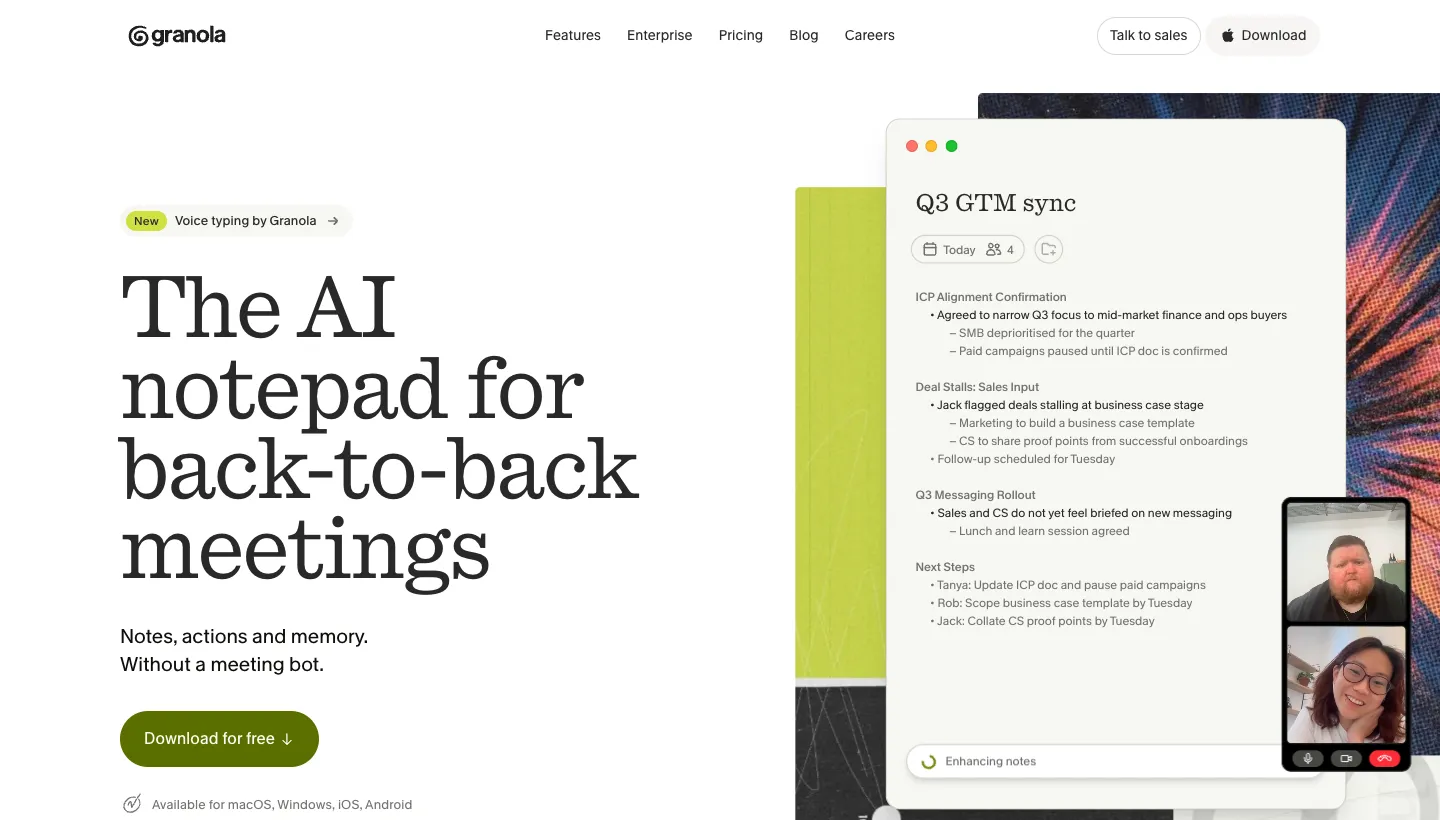
Granola calls itself "The AI notepad for back-to-back meetings" and adds "Notes, actions and memory. Without a meeting bot." Next to the headline, a sample of real meeting notes shows exactly what the product produces.
"Without a meeting bot" answers the main worry people have about AI note-takers before they even think to ask it.
Borrow this: find the biggest objection to products like yours and answer it in your second line.
3. Cal.com: the next step in the hero
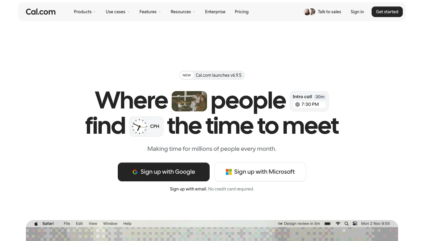
Cal.com leads with "Where people find the time to meet" and "Making time for millions of people every month." Directly below are buttons to sign up with Google or Microsoft, with a note that no credit card is required.
Putting one-click sign-up in the first screen removes almost all friction from trying the product.
Borrow this: if people can try your product for free, let them start from the homepage, and say what they don't need to give you.
Sites that make trust visible
4. Mercury: a big claim, backed up
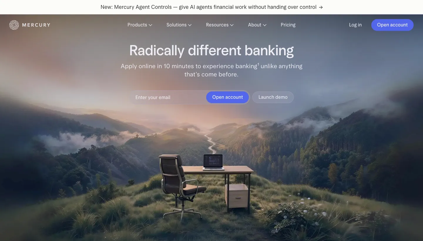
Mercury opens with "Radically different banking" and says you can apply online in 10 minutes. Further down, it says it is loved by 450K+ entrepreneurs and quotes Karri Saarinen, founder of Linear, on why it is built differently. A clear note explains that Mercury is a fintech company, not a bank, and names its partner banks.
In a category where trust matters most, the site pairs a bold promise with plain disclosures and a quote from a well-known founder.
Borrow this: pair your boldest claim with your most credible proof, close together.
5. Ramp: a promise in five words
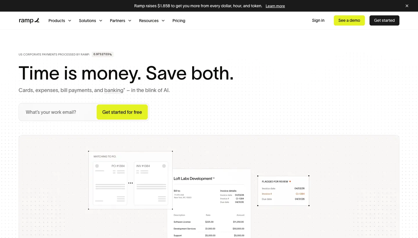
Ramp leads with "Time is money. Save both." and an email field with a button to get started for free.
The headline is short enough to remember and speaks to finance teams' two biggest concerns at once.
Borrow this: write a headline your buyer could repeat to a colleague.
Sites that show the product working
6. Clerk: the product as the demo
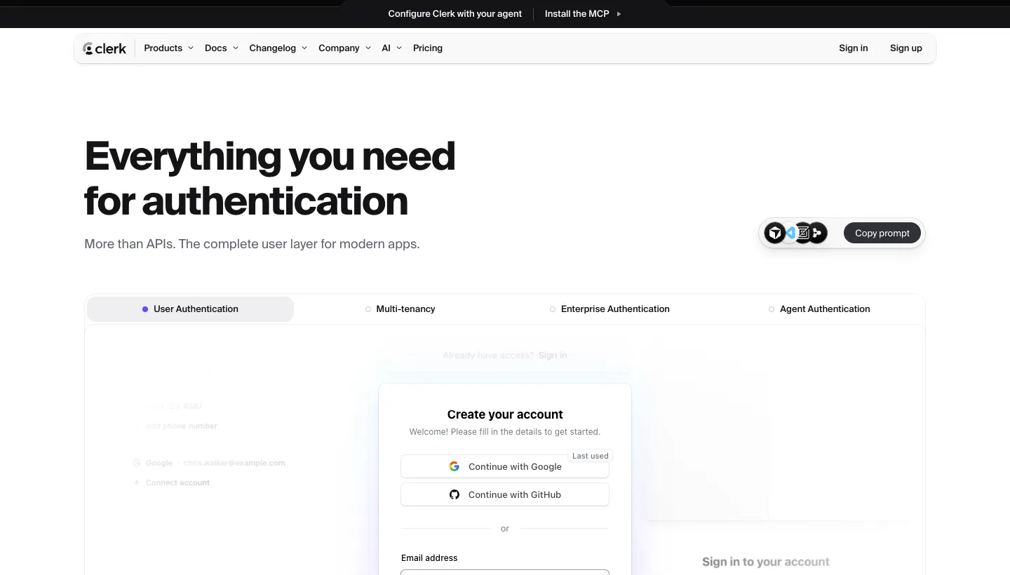
Clerk opens with "Everything you need for authentication" and "More than APIs. The complete user layer for modern apps." Below, interactive examples of sign-in forms, account settings and billing screens show what developers will actually ship to their users.
Showing the finished interface answers the question every developer has: what will this look like in my app?
Borrow this: show what your customer's customer will see, not just your dashboard.
7. Attio: two routes for two buyers
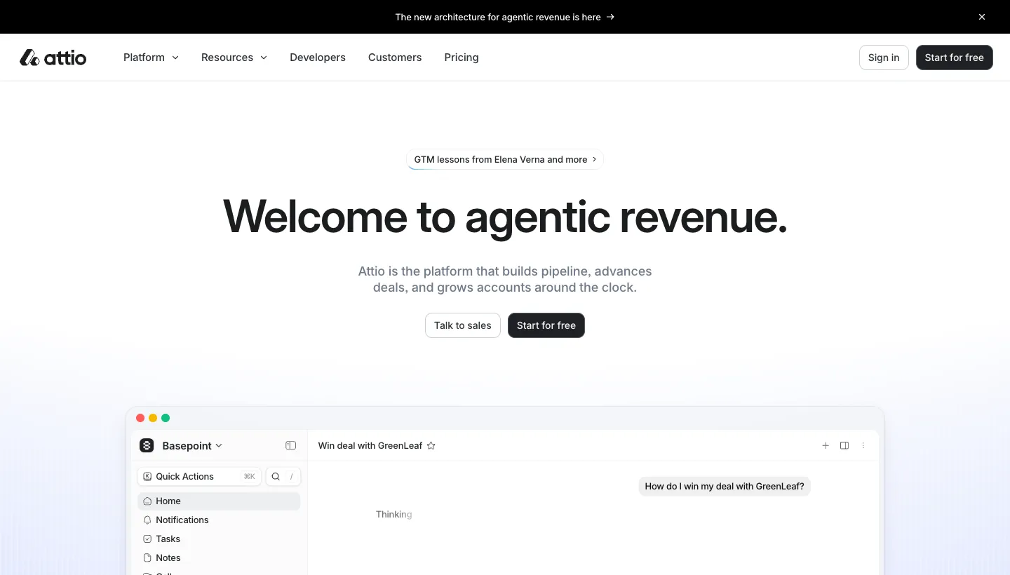
Attio leads with "Welcome to agentic revenue." and offers two buttons: "Talk to sales" and "Start for free". Underneath, a preview of the product shows a list of companies with fields filled in by AI.
Some buyers want to try a tool themselves, others want a conversation first. Offering both in the first screen serves each without slowing the other.
Borrow this: if you sell to both small teams and larger companies, give each its own button.
What these sites have in common
None of the seven relies on a long explanation above the fold. Each picks one idea and states it plainly: email for developers, notes without a bot, banking that is different. Each shows something real straight away, whether that is code, a sample of notes or the product screen. And each asks for one action, with a second option only where two kinds of buyer need different routes. Those habits cost nothing to copy, whatever your budget or stage.
How to apply this to your own site
Start with the headline. Write ten versions of what your product does, in words a buyer would use, and test them on people outside the company. Pick the one they repeat back most accurately.
Then replace any illustration with the real product: a screenshot, a short clip, a code sample or an example of what it produces. Add the one next step you most want people to take, and remove anything that competes with it in the first screen.
Below that, add proof as you get it: customer quotes, logos, numbers and short stories. Early on, a single quote from a real user is worth more than a page of claims. Our guide to SaaS marketing covers what to do once the site is working.
Mistakes to avoid
Headlines full of buzzwords, abstract illustrations instead of the product, three different calls to action in the first screen and pricing hidden behind a sales call all make a new product harder to understand and harder to try.
Measure what matters
Track sign-ups, activated users and demo requests by source, not just visits. Watch where visitors drop off on the homepage and test changes to the headline first. It is usually the cheapest change with the biggest effect.
Questions to ask before hiring a web designer
Have you worked with startups before? How will you learn our product and our buyers? Who writes the copy? How quickly can we change the headline and test new versions? Who owns the website and content?
The short version
The strongest startup sites say what the product does in a few plain words, show the product itself, answer the main objection early and make the first step easy. Back bold claims with proof, offer separate routes for different buyers and keep testing the headline. Our page on website design for tech startups shows how we build these sites.
FAQ
What makes a good startup website?
A headline that says what the product does in plain words, the real product on show, one clear next step and proof such as customer quotes or numbers as soon as you have them.
What should a startup homepage include?
A clear headline and supporting line, a screenshot or demo, a sign-up or demo button, answers to the main objection, customer proof and a short explanation of how it works.
Should a startup show pricing?
If you can. Hidden pricing makes buyers assume the product is expensive or complicated. If pricing depends on usage, explain what it depends on and give a starting point.
How often should a startup update its website?
Often, especially the headline. Early-stage companies learn quickly what buyers respond to, and the website should keep up.
Do startups need a custom website?
Not always at the start. A clear template site can work while you find your message. Once the product and positioning settle, a custom site helps explain what makes you different.
How much does a startup website cost?
It depends on page count, copy and features. Our Rebuild projects, which include positioning and copywriting, start from $9,500, with the exact price agreed in writing.