What separates a high-performing event planner website design from a portfolio gallery
An event planner website design only earns the commission when it convinces a discerning client that the planner can deliver an event flawlessly. Most event planner sites stop at a portfolio gallery, which is why beautifully photographed past events still fail to convert. The difference between a site that produces enquiries and one that does not sits in a small set of deliberate decisions about positioning, evidence, and pace.

Why most event planner websites fail to convert
An event planner website design only earns the commission when it convinces a discerning client that the planner can deliver an event flawlessly. Most event planner sites stop at a portfolio gallery, which is why beautifully photographed past events still fail to convert. The difference between a site that produces enquiries and one that does not sits in a small set of deliberate decisions about positioning, evidence, and pace.The issue is rarely the photography. Most planners investing in a website already have excellent event photography. The issue is that the site treats those images as the entire argument rather than as one layer of a deeper case. A prospective client who lands on an event planner website is already visually saturated. They have spent days on Instagram, Pinterest, and competitor websites. What they are looking for when they arrive on yours is not more beautiful images. They are looking for reasons to trust. They want to know that you have handled events at the scale and complexity of theirs. They want to see that other serious clients chose you and were not disappointed. They want to understand what working with you actually involves before they pick up the phone. A high-performing event planner website design answers those questions in a deliberate sequence before the prospect ever reaches the contact form.
The positioning decision is where the gap begins. An event planner whose website presents them as capable of every event type, from intimate birthday parties to five-hundred-person corporate conferences, is communicating versatility at the expense of authority. A serious client commissioning a high-value event wants a specialist. They want someone whose entire professional identity maps to the kind of event they are planning. The planner who owns a specific category, corporate conferences, luxury weddings, brand activations, or large-scale private celebrations, and who builds their website entirely around that category, will consistently outrank and outconvert the generalist. The positioning decision is not about turning away business. It is about building a digital presence that signals unmistakable expertise to the clients most likely to commission at the highest level.
The evidence structure that moves a prospect from inspired to enquiring
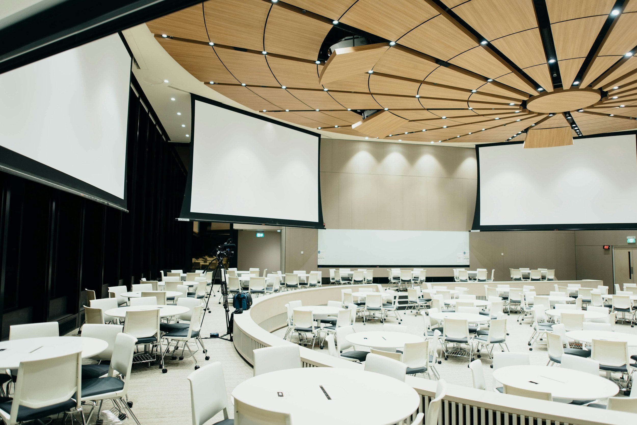
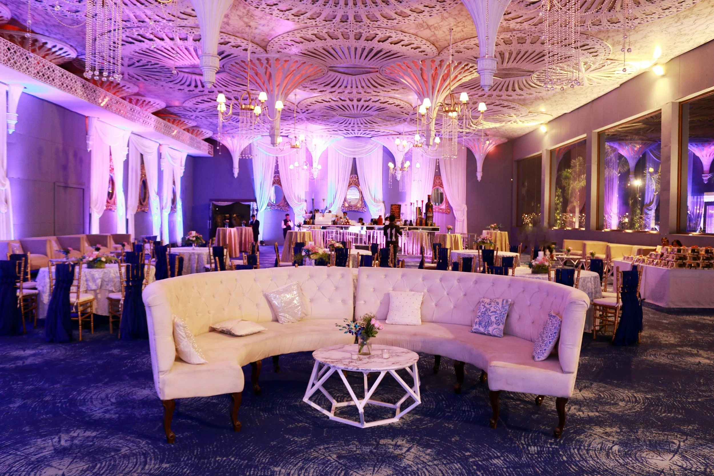
Once positioning is right, the evidence structure determines whether a visitor stays long enough to make contact. Evidence on an event planner website is not just the portfolio. It is the specific combination of portfolio, context, and social proof that works together to remove doubt. Each element does a different job. The portfolio demonstrates visual capability. The event descriptions, headings, guest counts, and venue names give the portfolio professional weight. Testimonials from named clients at recognisable events provide third-party verification of delivery. Awards, press features, and venue partnerships confirm standing within the industry. The absence of any one of these layers leaves a gap that even excellent photography cannot fill.
The most common evidence failure is portfolio context. An event planner who posts twenty stunning images with no captions, no event descriptions, no indication of guest numbers or venue, is presenting beautiful work that a prospective client cannot place themselves inside. The client planning a 300-person gala does not know, from a gallery alone, whether you have ever run an event at that scale. Adding a single descriptive sentence to each portfolio feature, naming the event type, the guest count, the venue, and the brief, transforms a gallery into a portfolio of professional evidence. That shift alone regularly changes the enquiry rate of a site without touching anything else.
Testimonials carry more weight than most planners expect, but only if they are specific. A testimonial that says the planner was professional and the event was beautiful is almost worthless as conversion evidence. A testimonial that names the event, describes the challenge that was navigated, and confirms the outcome from the perspective of someone who stood in that room is a different kind of signal entirely. It tells the next prospective client at a comparable event that a peer made the same decision they are considering, that things went wrong in the way things always go wrong, and that this planner handled it without the client feeling the impact. That is the testimonial worth putting on the page, and it is the one that consistently makes the difference between a site that earns enquiries and one that earns only admiration.
How the enquiry pathway determines whether interest becomes contact
The final layer where event planner website design either earns or loses the commission is the enquiry pathway. This is the series of decisions around what the visitor is asked to do, how they are asked to do it, and what happens between expressing interest and having an initial conversation. Most event planner websites get this wrong by offering only a generic contact form with three blank fields and no indication of what happens next. A prospective client who has invested twenty minutes researching the site and is ready to enquire deserves more than a form that tells them nothing about what to expect, how long a response will take, or whether their type of event is the right fit for this planner at all.
A structured enquiry form that gathers event type, approximate guest count, date, location, and rough budget does three things simultaneously. It qualifies the enquiry before the planner has to spend time on a call. It signals to the prospective client that the planner operates professionally and takes the intake process seriously. And it reduces the number of misaligned enquiries that eat into planning time without converting. The difference between an open contact form and a structured one is not about friction. It is about signalling. A planner who asks the right questions before the first conversation is telling the prospective client that their time is valuable and the process is thoughtful, which is exactly the signal a high-value commission client wants to receive.

Your website should earn commissions, not admiration.
We build event planner websites designed around the decisions that actually convert serious enquiries.
The role of personal brand in a high-converting event planner site
Personal brand on an event planner website is not about personality for its own sake. It is about giving the prospective client enough of a sense of who you are as a creative and operational professional that they can begin to imagine working with you before the first call happens. An event planner website that reads like a service brochure, listing capabilities without communicating a point of view, gives the prospect no reason to choose this planner over another planner with an equivalent portfolio. It is the presence of a distinct creative voice, a consistent aesthetic, and a visible professional philosophy that separates planners who attract inbound enquiries from those who are always chasing them.
The about page is the most underused page on most event planner websites. Planners often treat it as a CV, listing training, certifications, and years of experience in a tone that reads more like a LinkedIn summary than a conversation with a prospective client. The about page that converts is the one where the planner communicates what kind of events they are genuinely built for, what their creative instinct looks like in practice, and what a client can expect from working with them beyond the deliverable of the event itself. This is where trust is built at a human level, and trust is what separates the enquiry that converts into a commission from the enquiry that ends after one exploratory call.
Visual identity reinforces the personal brand signal at every point the prospective client encounters the site. An event planner working at the luxury end of the market whose website uses generic stock imagery, inconsistent typography, and a colour palette that looks lifted from a template, is sending a signal about creative judgment before the visitor has seen a single event photograph. The visual presentation of the website is itself a portfolio item. It demonstrates how the planner approaches an environment they have complete creative control over. That means the event planner website design decisions around typography, white space, image curation, and navigation flow are not just aesthetic choices. They are professional evidence.
What the best-converting event planner websites have in common
Across the range of event planner websites that consistently generate high-quality enquiries, a handful of characteristics appear repeatedly. They have clear positioning that signals a specific type of event expertise rather than general availability. They present portfolio work with enough context for a prospective client to see themselves in it. They carry specific, named testimonials from events at a recognisable scale. They have an enquiry pathway with enough structure to qualify and warm the prospect before any call takes place. And they present the planner as a professional with a distinct creative point of view, not a vendor waiting to be briefed.
None of these elements are technically complicated. The gap between the event planner website that earns commissions and the one that earns only traffic is almost never about the platform, the photography budget, or the design budget. It is about commercial intent. The planners who build websites that convert have decided what the website is for, and every decision on the site reflects that clarity. The planners whose websites underperform are typically those who built the site to impress peers, to document work, or to tick a professional box, rather than to earn a specific kind of client at a specific kind of commission level.
The good news is that most of these gaps can be closed without a complete rebuild. A positioning clarification in the homepage headline, a context refresh across the portfolio, a structured enquiry form replacing the generic contact page, and a testimonial curation exercise will typically produce a measurable change in enquiry rate within weeks. The work is not always extensive. It is specific, and it is worth doing with the same deliberateness the planner brings to an event brief.
Positioning is where every winning site starts.
We help event planners build websites that attract the commissions they are actually built to deliver.
Mobile experience and site speed as conversion factors
An event planner website design decision that is often treated as a technical afterthought has a direct impact on enquiry rate: load speed and mobile experience. The majority of prospective event clients are browsing on mobile, often in the evening, often while simultaneously comparing three or four other planner websites. A site that takes more than three seconds to load on a mobile connection, that requires horizontal scrolling to read the service description, or that has a contact form that does not render properly on a phone screen, is losing enquiries at the final step. The visual quality of a website that loads slowly is irrelevant because the prospective client never waits to see it.
The most common performance issue on event planner websites is unoptimised photography. Large, high-resolution images that look excellent in design previews can add seconds to mobile load times. Modern image formats and simple compression processes can reduce image file sizes by sixty to seventy per cent without a visible quality loss. That single change often moves a four-second load to under two seconds, which has a direct and measurable effect on how many visitors stay on the site long enough to engage with the content and reach the enquiry form.
Mobile layout deserves the same care as desktop layout. A portfolio grid that works beautifully on a 1440-pixel screen can render as tiny, unreadable thumbnails on a phone. Navigation that is intuitive on desktop can become a confusing tap target on mobile. A contact form that feels simple on a laptop can require excessive zoom and scroll on a smaller screen. Testing the website on an actual mobile device, not just a resized browser window, reveals the experience the majority of prospective clients are actually having. Closing the gap between the mobile experience and the desktop experience is one of the highest-return improvements available to most event planner websites currently losing enquiries at the final stage.
Turning the website into a long-term enquiry engine
A well-built event planner website is not a one-time project. It is an asset that compounds over time if it is maintained and developed deliberately. The event planner who adds new portfolio features with proper context after each significant event, refreshes testimonials as new commissions complete, updates the positioning statement as the business evolves, and publishes periodic content that addresses the questions prospective clients are actually searching for, builds a website that becomes progressively stronger as a source of qualified inbound enquiries over twelve, twenty-four, and thirty-six months.
The SEO dimension of this compounding is significant. An event planner website that publishes genuinely useful content around specific event types, venues, and planning considerations will gradually accumulate search visibility for the specific long-tail queries that high-intent prospective clients use when they are seriously researching planners. A post about planning a 200-person wedding at a particular type of countryside venue, written with real operational insight, will attract exactly the kind of prospective client who is planning that event and needs that expertise. That kind of organic search visibility takes months to build but, once established, delivers qualified traffic that referrals and social media cannot replicate at the same consistency or at the same cost per enquiry.
The planners who treat their website as a living professional asset, rather than a digital brochure to be rebuilt every few years, are the ones who develop the most durable and the most commercially productive online presence. The investment required to keep a well-built site current and improving is modest compared to the investment required to rebuild it from scratch. And the commercial return, in the form of a steady stream of well-qualified enquiries from clients who already understand what the planner does and who have already decided they want to work with them, compounds with every month the site is maintained with that level of care and commercial intent. If you want to talk about what your event planner website could look like when it is built to earn rather than simply to exist, we are ready to help.
Brow portfolio and local SEO fill the diary.
We build brow specialist websites where local search visibility and portfolio depth work together to convert brow-curious visitors into confirmed bookings.
What a high-performing event planner website design achieves over time
The planners who consistently attract the right commissions at the right level share a common characteristic: their websites are built around commercial clarity rather than creative display. They have made deliberate decisions about positioning, evidence, enquiry process, and copy that reflect a clear understanding of what a prospective client needs to see before they are ready to make contact. None of those decisions are technically complex. They are commercially intentional, and the intention behind them is legible to any prospective client who lands on the site.
The result is not simply more enquiries. It is a specific improvement in the quality of enquiries, as the positioning clarity and the evidence depth filter for the clients whose event type, scale, and budget are genuinely aligned with what the planner does best. Misaligned enquiries decrease. Well-qualified commission conversations increase. The initial consultation becomes a creative conversation rather than a qualification exercise, because the prospective client has already done the qualifying before they made contact.
If you want to talk about what this level of commercial clarity looks like for your specific website and your specific market, we are ready to help you build it.
Written by
Mikkel Calmann
See a converting event planner site in action.
Our event planner website work is built around the decisions that earn commissions, not just compliments.
More web design insights for event planners