


Lists of the best SaaS websites usually praise gradients and animations, and most of those sites belong to companies with a hundred people in marketing. That is no help to a startup whose website is one founder's evening project. So for each site below we picked one decision that wins trials or demos, and that a small software company could copy without a design team.
Everything described here is visible on the live sites as of November 2026. Software companies redesign often, and most are currently rewriting their homepages around AI, so we focus on choices that will outlast this year's headline.
What a SaaS website has to do
A SaaS homepage has a harder job than most. The product is invisible until someone signs up, the buyer is often comparing three or four tools at once, and the person who finds the site is not always the person who pays. In a few seconds, the page has to say what the product does, who it is for, why it is better than the alternatives and what to do next.
The best SaaS websites solve this with a clear headline, a real look at the product, specific proof and a next step that matches how ready the visitor is. A developer wants to try it now. A manager wants a demo. A finance lead wants the price. Good sites serve all three without making any of them hunt.
Here are eight SaaS website examples, grouped by what they teach.
SaaS websites that show the product honestly
1. Linear: the product is the hero image
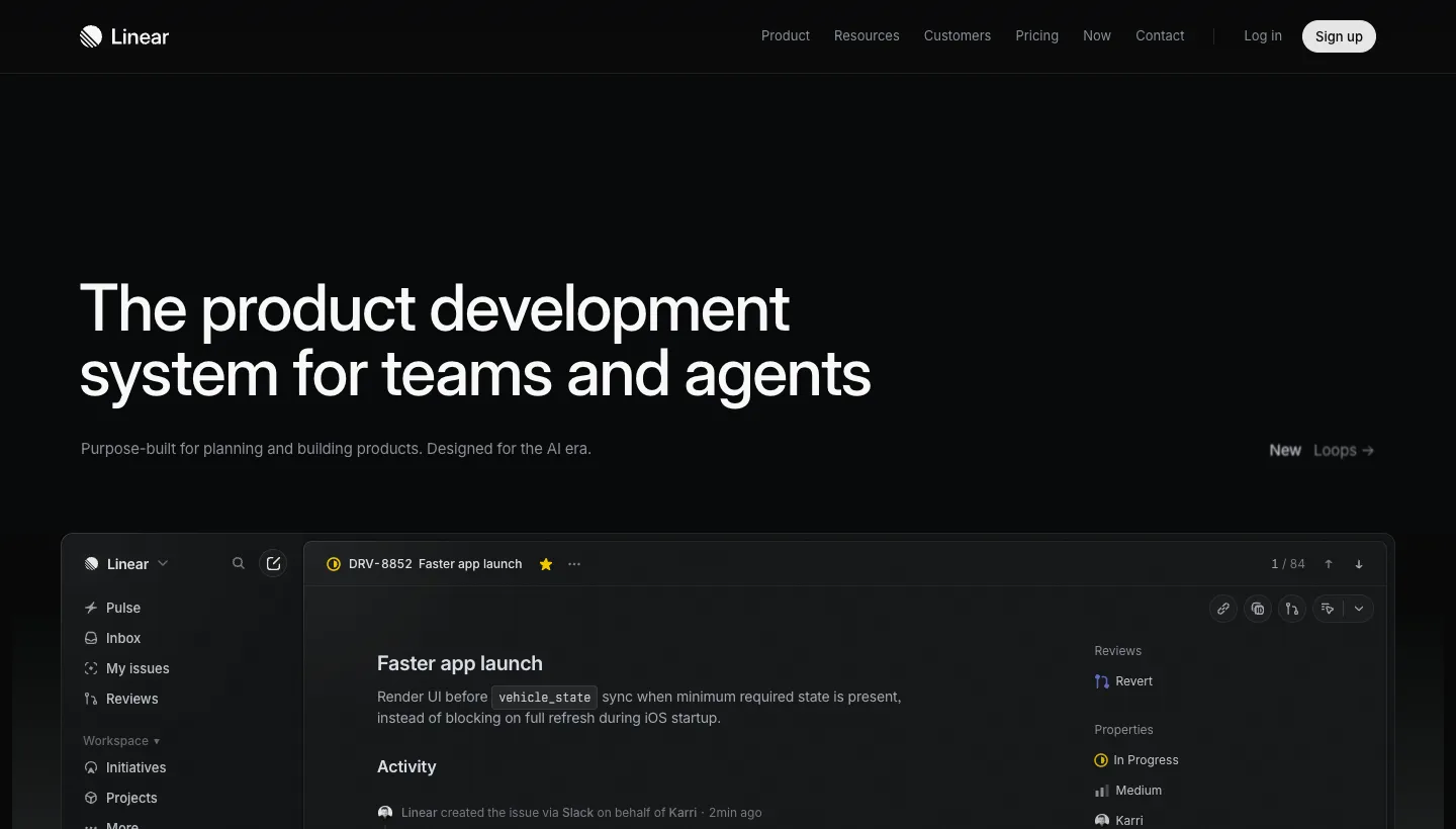
Linear describes itself as "The product development system for teams and agents." Instead of illustrations, the homepage shows the product itself: an issue with its activity feed and comments, a board with backlog, to do, in progress and done columns, and a pull request review panel. Feature sections are labelled like figures in a technical document, and a changelog with recent releases sits on the homepage.
Showing the real interface answers the buyer's first question, "what will I actually be using?", before they sign up. The changelog on the homepage answers the second: is this product still improving?
Borrow this: replace illustrations with clean, real screenshots of your product doing its main job, and show your latest updates on the homepage.
2. Plausible: a live demo and an honest comparison
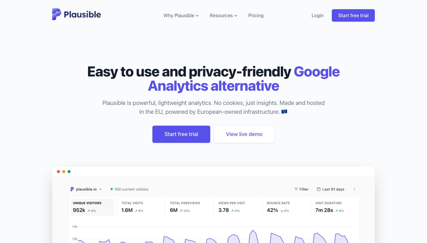
Plausible opens with "Easy to use and privacy-friendly Google Analytics alternative." Next to "Start free trial" is a "View live demo" button, and a dashboard screenshot sits near the top. The site links to comparison pages against the tools buyers are likely using already, and the pricing is on the homepage, with a monthly and yearly toggle and plans by monthly pageviews.
A live demo lets a sceptical buyer try the product with no sign up. Naming the incumbent in the headline tells visitors exactly what Plausible replaces, and showing prices up front saves them a step.
Borrow this: if you replace a well known tool, say so in your headline, and give buyers a way to see the product without creating an account.
3. Raycast: the product's feel, not just its features
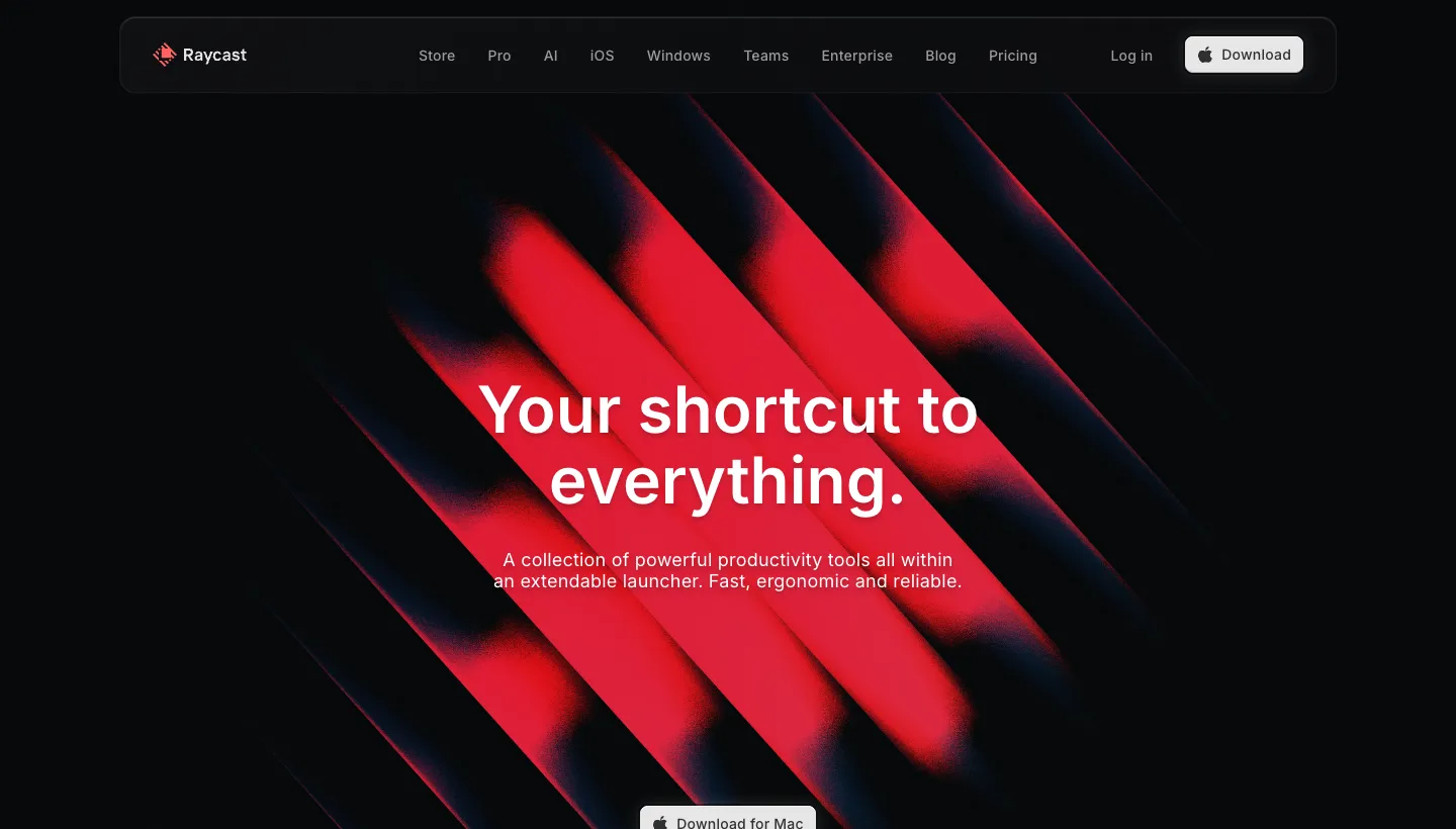
Raycast opens with "Your shortcut to everything." and later, "It's not about saving time. It's about feeling like you're never wasting it." The homepage shows the product through an interactive keyboard graphic, a grid of extensions for tools such as Linear, Notion and Slack, and screenshots of its built-in features. Developers and founders who use it are shown by name.
For a tool people use dozens of times a day, how it feels matters as much as what it does. The copy sells the feeling; the extension grid proves it works with the tools visitors already use.
Borrow this: show the tools your product works with by name and logo. "Works with what you already use" removes one of the biggest reasons not to try.
SaaS websites that make the next step easy
4. Calendly: sign up in one click
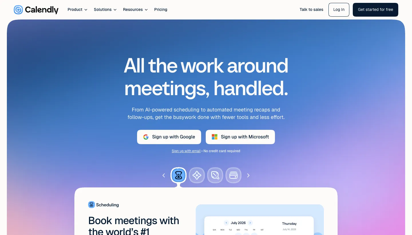
Calendly opens with "All the work around meetings, handled." The sign up options sit right there: sign up with Google, sign up with Microsoft or sign up with email, with "No credit card required". A "Talk to sales" option sits alongside for larger teams. The homepage also shows logos for the calendar and video tools it connects to.
Every field and step before a trial loses people. Signing up with an account the visitor already has removes most of them, and the credit card line removes the last worry.
Borrow this: offer sign up with Google or Microsoft if your audience uses them, and say clearly when no card is needed.
5. Stripe: proof in numbers, then the right door for each buyer
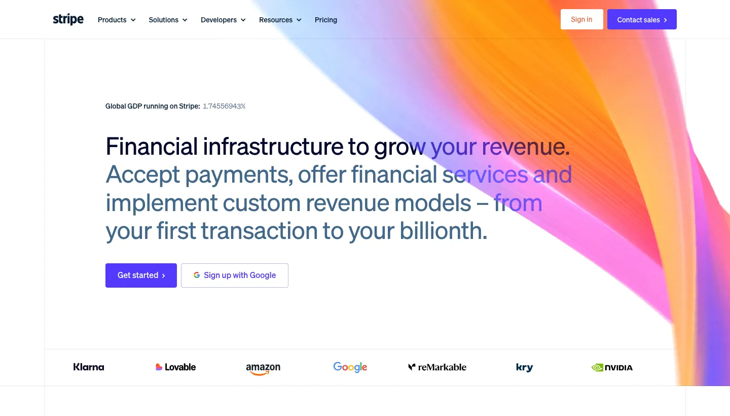
Stripe opens with "Financial infrastructure to grow your revenue." The hero offers "Get started" and "Sign up with Google", with "Contact sales" further on. Customer logos follow, then figures for scale and reliability, then separate sections for enterprises and startups, each with its own customer examples. Developer documentation and the API reference sit in the main menu.
A payments buyer needs to trust the provider with their revenue. Large figures and well known customer names build that trust quickly, and separate stories for enterprises and startups let each buyer see someone like themselves.
Borrow this: split your proof by customer type. A startup founder wants to see other startups; an enterprise buyer wants to see enterprises.
6. Notion: a door for every role
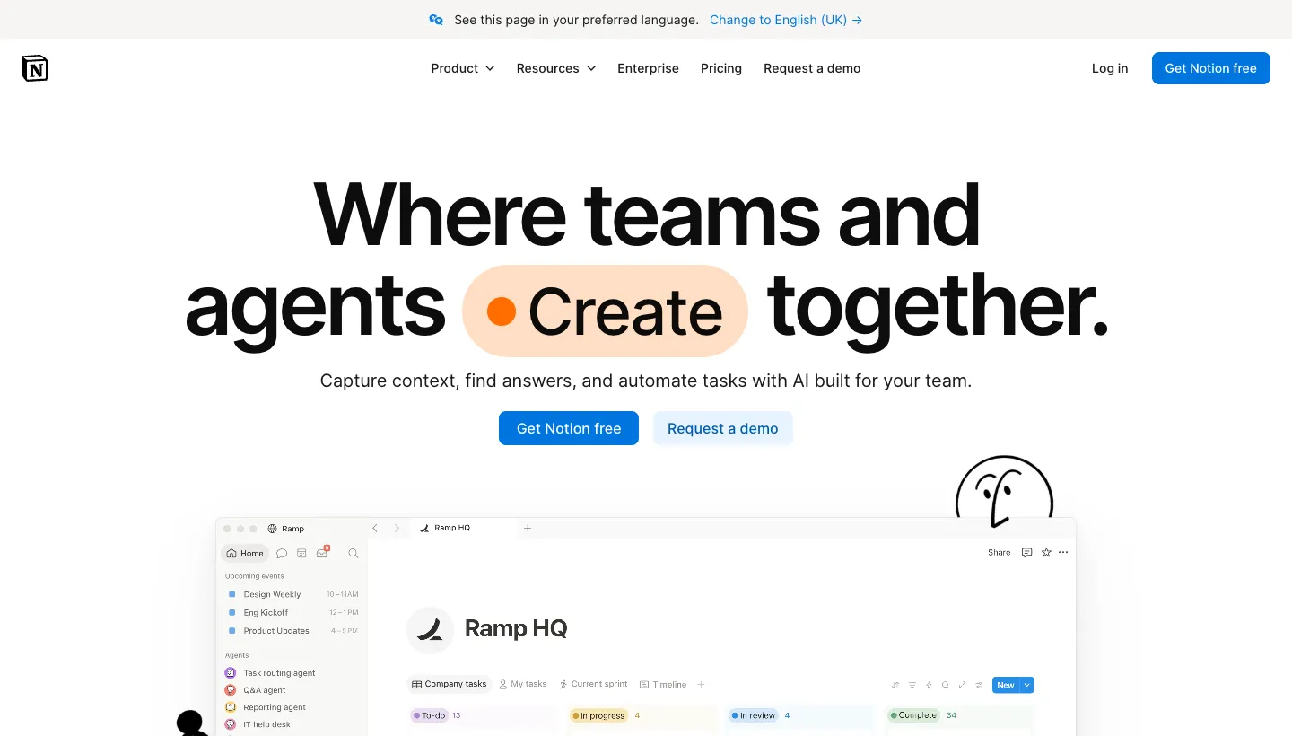
Notion opens with a headline about teams and AI agents working together. The main buttons are "Get Notion free" and "Request a demo". Below, the product is shown in desktop screenshots for each job it does, and example use cases cover support, product feedback, security and reporting. A logo wall and figures on its user base provide proof.
Notion is used for very different things by very different teams. Use case examples let each visitor find their own job in the product, rather than reading a general claim and imagining the rest.
Borrow this: list three to six concrete jobs your product does, each with a screenshot. Specific uses convert better than broad promises.
SaaS websites with a clear voice
7. Basecamp: a founder talking to you
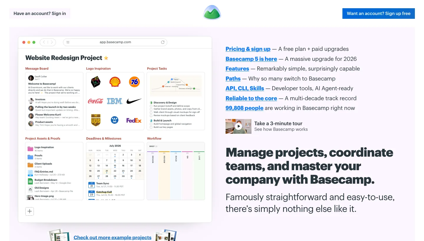
Basecamp opens with "Manage projects, coordinate teams, and master your company with Basecamp," and calls itself "Famously straightforward and easy-to-use." The main buttons are "Try Basecamp Free" and "Take a 3-minute tour". A letter from Jason Fried speaks to the reader directly, and a sample project shows the message board, to dos, calendar and files as a customer would see them.
In a crowded category, voice is a differentiator. A founder speaking plainly is more memorable than another list of features, and the sample project shows exactly what the reader would get.
Borrow this: let a founder explain, in a few plain paragraphs, why the product exists and who it is for. And show a realistic example of the product in use, not an empty template.
8. 3POMarket: credible before launch
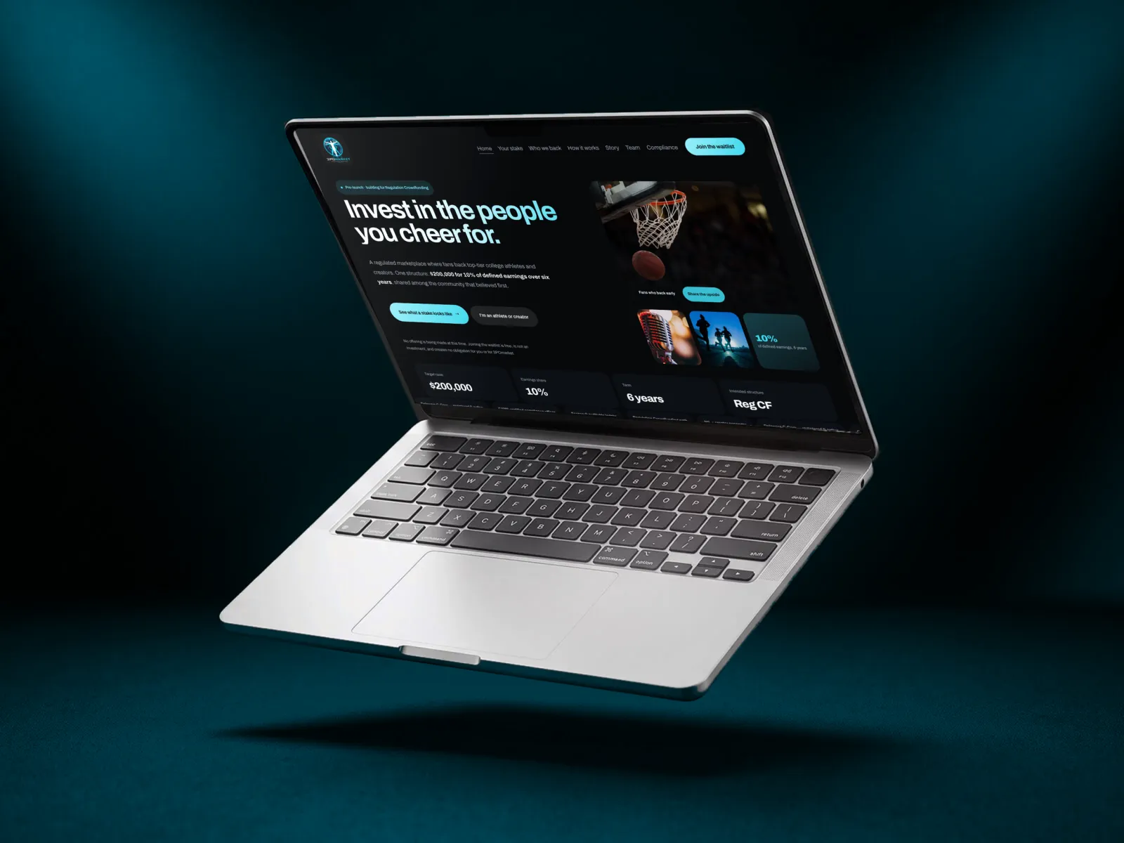
3POMarket is a fintech marketplace we designed before it launched. Fans will be able to invest in college athletes and creators and share in what they earn, and the site had to be taken seriously before the platform existed. By the client's own account, the draft looked like a generic dark SaaS template: flat type, a weak hero, the same card grid in every section and no credibility signals.
We replaced it with a clear visual system in the client's own colours, real photography and a live stake calculator, where two sliders update the investor's share and payouts in real time, worded as illustrative arithmetic rather than a forecast. A compliance section tags each item as registered, intended, in place or in design, so visitors can see what exists and what is still planned. Investors and athletes each get their own path and waitlist. The 3POMarket case study has the full story.
Borrow this: if you are pre-launch, be honest about what exists and what is planned. Clear labels build more trust than vague promises, and an interactive tool shows the product's idea before the product itself is ready.
What the best SaaS websites have in common
Across all eight, the same habits show up.
They show the real product
Linear, Plausible and Notion use real interfaces, not abstract illustrations. Buyers want to see what they will use.
The headline says what it is
"Google Analytics alternative." "Your shortcut to everything." The best SaaS headlines tell a stranger what the product does, or what it replaces, in one line.
Proof is specific to the buyer
Stripe splits stories by company size; Raycast names the founders who use it. Specific proof from someone like the reader beats a generic logo wall.
The next step matches the visitor
A free trial for the ready, a demo for the careful, a tour for the curious. Calendly and Basecamp both offer more than one way forward, each clearly labelled.
The short version
The best SaaS websites aren't the ones with the flashiest animations. They are the ones that say what the product does in a line, show the real interface, prove it with customers like the reader and make the next step short. A startup can do every one of these things: a plain headline, three good screenshots, one real customer quote, a sign up with Google and a clear price.
Start with your headline. If a stranger can't tell what your product does and who it is for in five seconds, fix that before anything else. The same rules apply to the best startup websites in any category: our tech startup website design page covers how we approach them.
FAQ
What makes a good SaaS website?
A good SaaS website says what the product does and who it is for in one line, shows the real interface, offers proof from customers like the visitor and makes the next step short, whether that is a trial, a demo or a price. It also loads fast and works on phones.
What should a SaaS homepage include?
A clear headline, a screenshot or demo of the product, three to six specific use cases, customer proof such as logos and quotes, the tools you integrate with, and clear calls to action for a trial and for a demo. Pricing or a link to it should be easy to find.
Should a SaaS website show pricing?
In most cases, yes. Buyers comparing tools want to know the price range before they invest time in a trial or demo. Plausible shows its plans on the homepage. If pricing is custom for larger customers, show the starting point and explain what affects it.
Free trial or demo: which is better for SaaS?
It depends on the buyer. Products that are easy to try alone suit a free trial, while products that need setup or involve a larger purchase suit a demo. Many of the best SaaS websites offer both, like Notion's "Get Notion free" and "Request a demo".
How do you build trust on a pre-launch startup website?
Be honest about what exists and what is planned, show the team and their background, and use any proof you have, such as partners or waitlist numbers, without exaggerating. On 3POMarket, every compliance item carries a status tag showing whether it is in place or still planned.
What platform should a SaaS company use for its website?
One the marketing team can update without waiting for engineers. Many startups use a website builder for the marketing site and keep the product separate. Speed, easy editing and good SEO basics matter more than the specific tool.