Lists of the best ecommerce websites usually pick the biggest brands and praise their budgets. That doesn't help a store with forty products and a team of three. So for each store below we picked one thing it does well that a smaller shop could copy, without a large budget or a team of developers.
Everything described here is visible on the live sites as of November 2026. Stores change often, especially around sales season, so we focus on choices that last rather than this week's offer.
What separates a good online store from a forgettable one
Most online stores look fine. The difference between a fine store and a great one is usually not the design. It is how quickly a visitor understands three things: what you sell, why it is different, and what happens after they pay.
The stores on this list answer those questions early and plainly. They show the product the way a buyer needs to see it. They put the reassurance (shipping, returns, sizing) where the doubt appears, not hidden in the footer. And they sound like one company, from the homepage headline to the last line of the product page.
Here are ten online store examples, grouped by what they teach.
1. Allbirds: answering the sizing question before it is asked
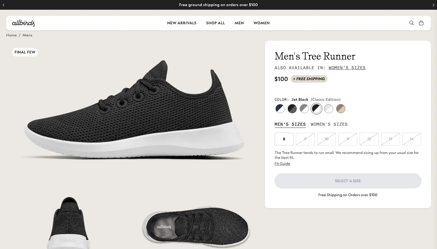
On the Allbirds product page for the Men's Tree Runner, right next to the size buttons, a line says the shoe tends to run small and recommends sizing up, with a link to a fit guide. The cart shows how much more you need to spend for free shipping.
Sizing is the biggest reason people hesitate to buy shoes online, and a fit note in the right place answers it at the exact moment of doubt.
Borrow this: find the question your customers email you most before buying, and answer it beside the buy button.
2. Bellroy: a product page that does the explaining
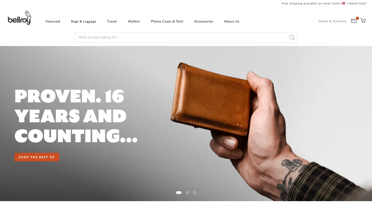
Bellroy sells wallets and bags, and its product pages are built in clear sections: features, specifications, materials, and a 3-year warranty with extended returns. On the Note Sleeve wallet page, headings explain what each part of the wallet is for, such as keeping your most used cards in easy reach.
A wallet looks like any other wallet in a photo. Bellroy's pages explain why this one is different, one feature at a time.
Borrow this: if your product's advantage is in the details, give each detail its own short heading and photo.
Stores where the brand does the selling
3. Glossier: a short menu and a clear voice
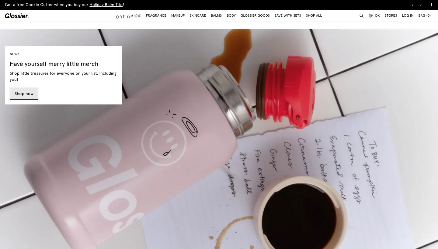
Glossier keeps its main menu short: fragrance, makeup, skincare, balms, body, Glossier goods and sets. The tagline "You look good." sits at the top, and product names and headlines share the same playful tone.
A short menu makes the range feel focused, and a consistent voice makes even small items such as a keychain feel like part of the brand.
Borrow this: group your products into as few categories as you honestly can, and write every product name and headline in the same voice.
4. Teenage Engineering: personality in the product copy
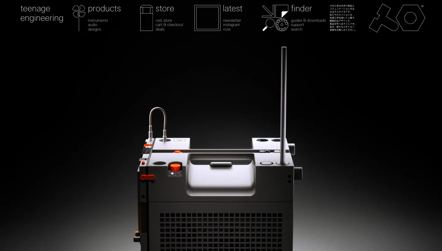
Teenage Engineering makes music gear, and its site reads like no other electronics store. The menu is all lower case, and product copy jokes with the reader, at one point asking whether a long product shadow is hiding extra features.
Electronics stores tend to sound the same. A store with this much personality is remembered, and for a design-led brand that memory is part of what people buy.
Borrow this: if your brand has a voice, let it into the product copy, not just the About page.
5. Mejuri: the story and the store, side by side
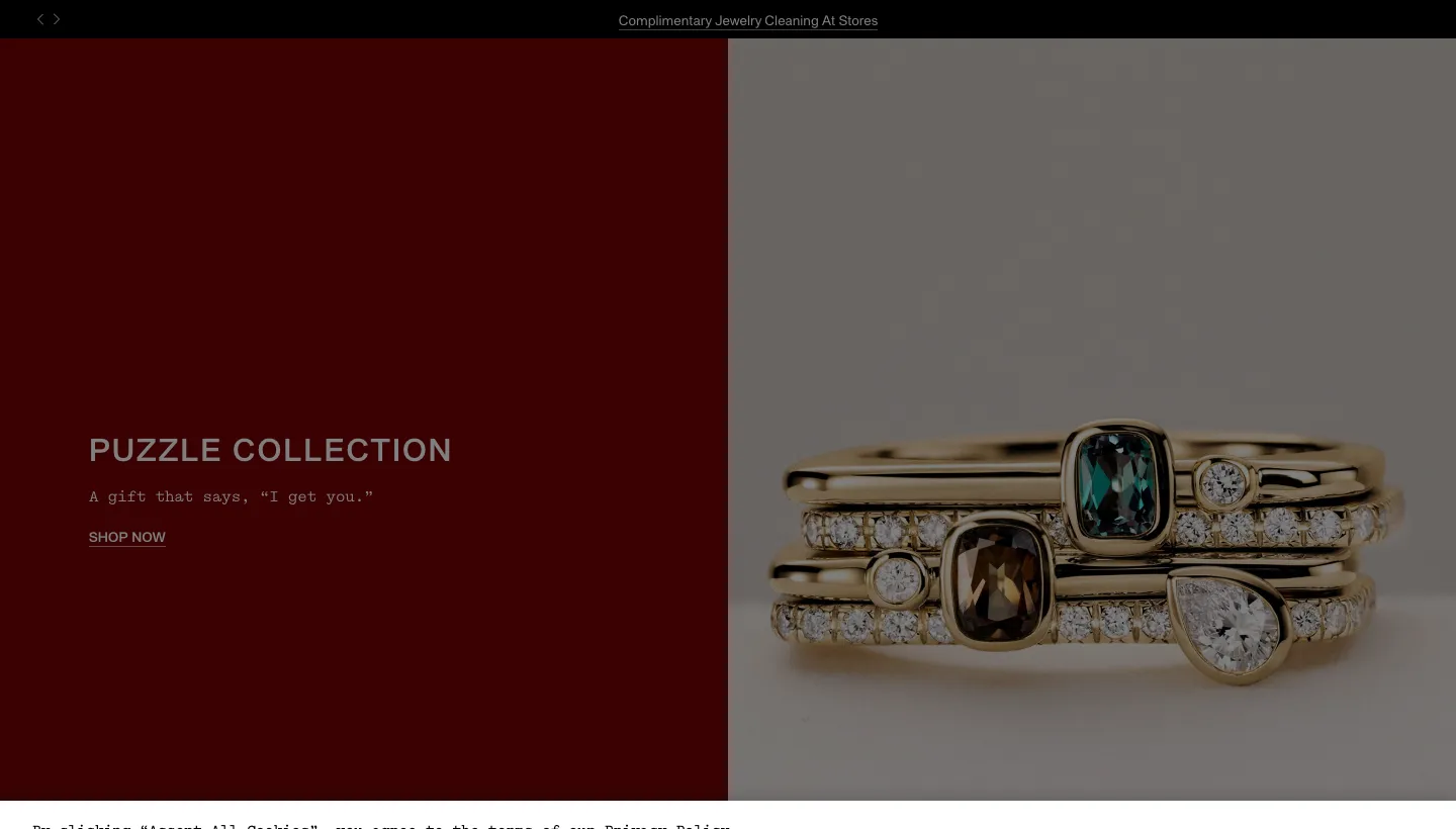
Mejuri sells fine jewelry, and its homepage explains why in a short passage under the heading "Jewelry you can live in": fine jewelry shouldn't wait for birthdays and anniversaries. Further down, the site promotes its physical stores and lets visitors book a piercing appointment.
The story gives buyers permission to buy for themselves, and the stores and piercing studio add trust to a higher-priced online purchase.
Borrow this: write down the one belief behind your product in a few plain sentences and put it on the homepage, not just the About page.
6. Bombas: the mission on the homepage
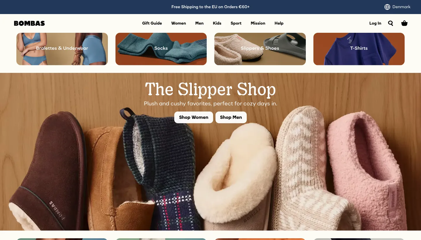
Bombas puts its giving model on the homepage: "One purchased = one donated". The product grid also uses quick view and shows pack savings next to the price.
The mission turns a basic purchase, socks, into one with a reason behind it. Pack savings shown beside the price make the larger order the obvious choice.
Borrow this: if you give back or make things responsibly, say it in one line where people shop, not on a separate page.
Stores that make buying easy
7. Our Place: reassurance at the top of the page
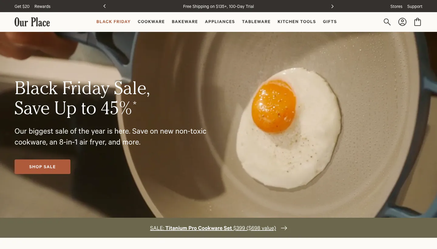
Our Place sells cookware, and near the top of its homepage it lists free shipping above a set amount, a 100 day trial and free returns.
Cookware is an investment, and a trial period removes the fear of choosing wrong. Putting it near the top means every visitor sees it before they start browsing.
Borrow this: list your returns, trial or guarantee near the top of the homepage. If it is generous, it is a selling point, not small print.
8. Ugmonk: small store, strong proof
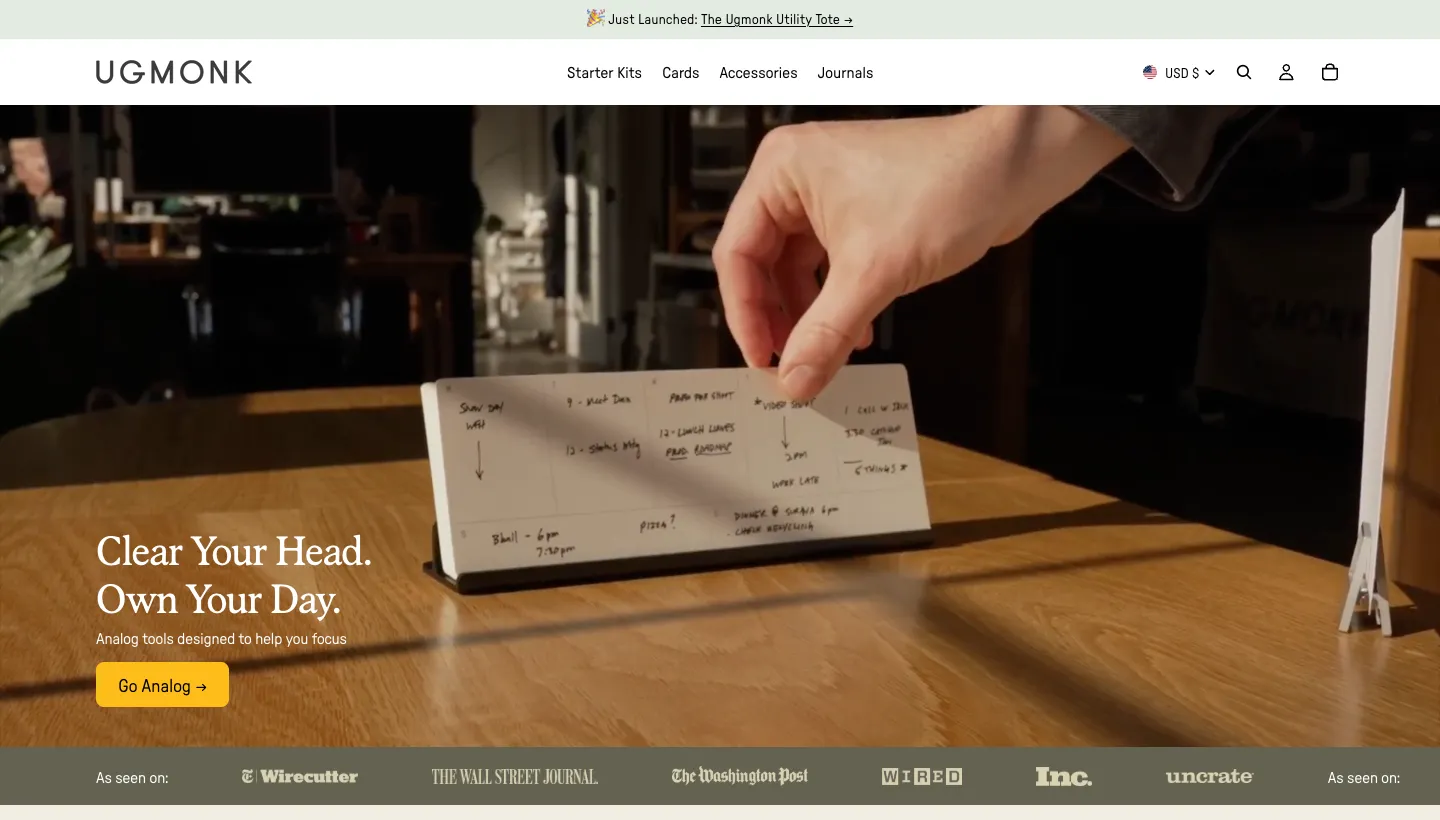
Ugmonk sells analog productivity tools, including cards, journals and desk kits. The homepage says it is designed and shipped in Pennsylvania, invites visitors to join 150,000 people who have gone analog, and marks one kit as featured on Wirecutter.
Ugmonk is a good example for small stores because its proof is specific: a place, a number and a named publication. Each product card also says what the product is for in one line, such as keeping your ideas front and center.
Borrow this: specific proof beats general praise. A real number, a real place or a named review is worth more than five stars on their own.
9. Everlane: values in the main menu
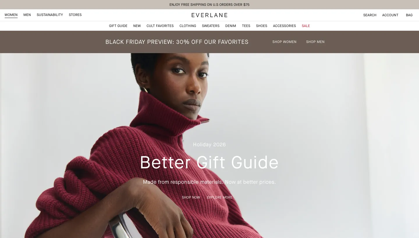
Everlane puts "Sustainability" and "Stores" in its main navigation next to women and men, and the homepage describes the brand as responsibly crafted, designed to last and priced fairly.
For buyers who care how clothes are made, finding that answer in the main menu, not the footer, is part of the reason to buy.
Borrow this: if a value is part of why people choose you, give it a page and put that page in the main menu.
10. SonicWave Audio: selling something you can't hear
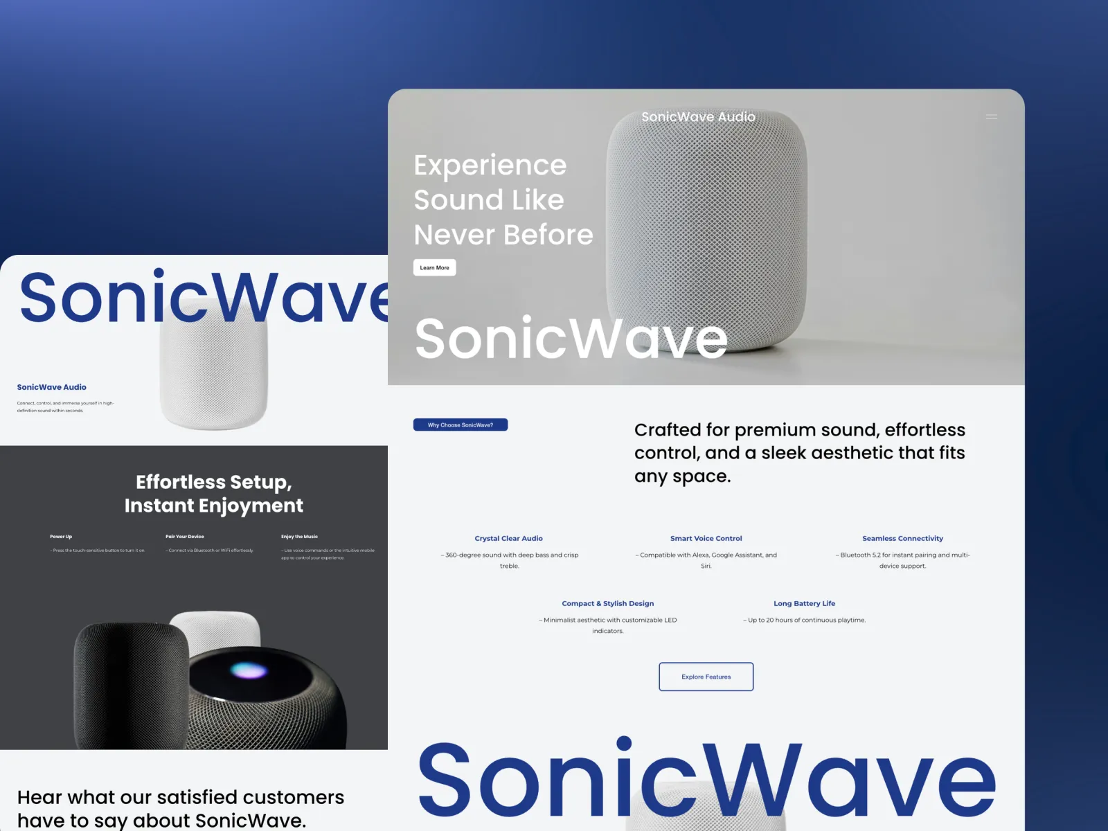
SonicWave Audio is a store we designed and built. It sells premium speakers and sound systems, which is a hard thing to sell online: the main benefit is something you can't hear through a screen. Most audio stores respond with lists of specifications, which only convince the few buyers who can read them.
So we sold the object. Large photographs show the speakers in real rooms, so buyers can picture one in their own space. Specifications are still there, placed as confirmation rather than the main argument, and the phone version was designed first because that is where most browsing happens. The SonicWave Audio case study has the full story. It went live five weeks after kick-off.
Borrow this: sell what your buyer can actually judge on a screen. For most products that is how it looks in their life, not its spec sheet.
What the best ecommerce sites have in common
Looking across all ten, the same habits show up.
They put reassurance where the doubt is
Allbirds puts the sizing note by the sizes. Our Place puts the trial at the top. Bellroy puts the warranty on the product page. None of them make a shopper hunt through the footer for the answer that decides the sale.
They have one voice
Glossier, Teenage Engineering and Ugmonk all sound like themselves on every page. That consistency is what makes a store feel like a brand rather than a catalogue.
They show the product the way a buyer judges it
Shoes by fit, wallets by feature, speakers by how they look in a room. Think about how your customer decides, and design the product page around that.
Their proof is specific
A named publication, a number of customers, a place of manufacture, a giving model. Specific proof is easier to believe than adjectives.
The short version
The best online stores aren't the ones with the most features. They are the ones that answer a shopper's doubts at the right moment, in a voice you would recognise anywhere. A small store can do every one of the things on this list without a large budget: a fit note, a clear returns line, a short menu, specific proof and product pages built around how the buyer decides.
Pick the two ideas closest to your own store's weak spot and start there. If you would like help with the rest, this is what we do every day.
FAQ
What makes an ecommerce website good?
A good online store makes three things clear quickly: what you sell, why it is different and what happens after someone pays. It shows products the way buyers judge them, answers doubts such as sizing, shipping and returns where they come up, and makes checkout short.
Which platform do these stores use?
They use a mix of platforms, and you can't always tell from the outside. The platform matters less than the decisions on the page. For small and medium stores, our Shopify vs Squarespace comparison explains which platform suits which shop.
How many products should a small online store launch with?
Enough to show what the brand stands for, and few enough that every product page can be done properly. Many strong stores start with a focused range and add to it once they know what sells.
Should an online store have a blog?
It helps when buyers research before they buy, such as with audio, cookware or skincare. Guides and comparisons bring in search traffic and answer questions that would otherwise stop the sale. If nobody will keep it updated, leave it out.
How important is mobile design for an online store?
Very. For many stores most browsing happens on a phone, so product photos, buttons, sizing and checkout need to work on a small screen first. For SonicWave Audio we designed the phone version before the desktop one for that reason.
How long does it take to build an online store?
It depends on the number of products and how much content is written from scratch. The SonicWave Audio store went live five weeks after kick-off, including the store build.