
The visual language of premium real estate websites.
An in-depth editorial breakdown of the sophisticated design choices that shape high-end property websites—and why the visual language behind premium real estate websites is often the decisive factor in whether a buyer chooses to inquire, tour, or invest.
Written by Mikkel Calmann
Dec 26, 2025

Luxury buyers don’t read websites, they read atmosphere
In the world of high-end property, the visitor’s first impression is immediate and emotional. Before they examine square footage, features, or amenities, they’re absorbing the visual language of premium real estate websites: the tone, the refinement, the confidence, the aesthetic precision.
The problem? Most real estate websites focus on listing features, surface-level visuals, or overly tactical layouts—resulting in an experience that feels transactional rather than aspirational. Affluent buyers are not browsing; they’re evaluating. And what they’re evaluating is whether the digital experience matches the quality of the homes themselves.
When a website lacks cohesion, sophistication, or emotional depth, high-value prospects sense misalignment. They may still admire the property, but they won’t feel compelled to inquire.
A premium real estate website must communicate value before the property does.
Why aesthetic precision is non-negotiable in the luxury market
High-end real estate buyers are not general consumers; they are experienced decision-makers with refined taste. They’re familiar with art galleries, boutique hotels, design showrooms, and architectural publications—and they expect that same visual standard online.
Premium visual language becomes a filtration mechanism, separating serious prospects from casual browsers.
It signals:
cultural fluency
design awareness
brand maturity
elevated service
architectural understanding
When a buyer sees that level of refinement, they don’t just trust the property—they trust the brand representing it.
The foundation of premium real estate websites is atmosphere
Atmosphere is the first layer of luxury perception. It’s not created by effects or embellishments, but by compositional decisions that feel effortless and intentional.
Luxury buyers want to be transported. They want to feel like they are entering a world—not browsing a webpage.
Atmosphere is shaped by:
lighting and tone
spatial pacing
elegant density (or intentional simplicity)
typographic openness
cinematic image scale
When the digital environment echoes the serenity and exclusivity of high-end properties, the buyer experiences coherence. That coherence is what builds confidence.
Visual pacing as a luxury signal
Premium real estate websites never rush the viewer. They invite, guide, and unveil. The pace of visuals—how content flows, how sections breathe, how imagery transitions—creates the emotional tempo of the brand.
Fast pacing cheapens the perceived value.
Slow, deliberate pacing elevates it.
A luxury coastal developer I worked with had stunning properties but a website that felt fragmented and crowded. The images were beautiful but stacked with no rhythm, leaving the buyer overwhelmed rather than intrigued. By redesigning the pacing into an editorial flow—hero, narrative, gallery, detail moments—we gave the properties room to command attention. Inquiry quality improved within weeks because the site finally matched the level of the homes.
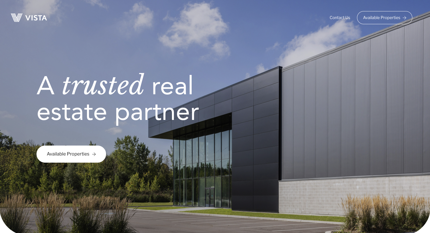
Hero sections that establish a world
The hero section of premium real estate websites must do more than show a beautiful property. It must establish:
scale
exclusivity
tone
lifestyle
A cinematic hero image or video is not chosen because it’s impressive—it’s chosen because it communicates the soul of the space. The hero is the architectural thesis of the brand.
For a penthouse development in New York, we used a wide-angle dusk image showing panoramic city light reflections. The mood it conveyed—quiet power, contemporary urban luxury—said more than any headline could. Prospects mentioned the “feeling” of the hero before mentioning the price.
This is the power of atmosphere-led design.
Typography that speaks the language of architecture
Premium typography is architectural. It expresses structure, hierarchy, weight, and identity.
In real estate, typography becomes an extension of the properties themselves.
The type communicates:
elegance (serif)
modernity (clean geometric)
sophistication (transitional fonts)
exclusivity (high-contrast editorial type)
High-end buyers instantly sense whether the typography aligns with the style of the homes. A heritage European-style residence should not use the same typography as a modern minimalist development. Matching typographic language to architectural style creates visual fluency—one of the quiet signals that experienced buyers interpret as expertise.
Image selection as curated storytelling
Luxury buyers do not want quantity; they want curation.
A premium real estate website’s imagery must express:
light quality
materiality
craftsmanship
spatial emotion
architectural intention
This is why curated image sets outperform traditional property slideshows.
Instead of showing every corner, we reveal the moments that matter. A single image of stone texture in golden-hour light can communicate more than ten full-room shots.
One developer saw a dramatic shift in buyer quality after we reduced their gallery from 40 images to 12. Those 12 images were atmospheric, intentional, and emotionally compelling. The site went from an MLS-style presentation to an editorial showcase.
Curation creates desire. And desire drives inquiries.
Narrative structure over listing structure
Most real estate websites follow a listing structure:
image → description → features → amenities.
Premium real estate websites follow a narrative structure:
moment → mood → story → detail → discovery.
Narrative structure creates emotional progression. It mirrors how buyers explore premium properties in real life—beginning with atmosphere, then experiencing flow, then exploring detail.
For one luxury developer, we crafted the site so that each scroll felt like entering a new space: first the view, then the materials, then the lifestyle, then the architectural philosophy, then the floor plans.
Buyers described it as “walking through the property online.”
This is narrative design in practice: guiding buyers through an emotional arc.
The power of spatial composition
High-end buyers value space—not just physical space, but visual space.
Visual space communicates:
calm
clarity
sophistication
exclusivity
Cluttered layouts make even luxurious properties feel less valuable. Clean, intentional, editorial spacing mirrors the way luxury interiors are presented in design publications.
For a luxury desert retreat brand, we used wide spacing, airy compositions, and dramatic image scale. The effect was instant: the site felt architectural, modern, and serene—qualities the property already possessed but hadn’t been visually expressed online.
Editorial detail moments
Premium real estate websites incorporate detail moments that feel like magazine spreads. These details give buyers a sense of intimacy and craftsmanship without overwhelming them.
Detail moments include:
close-ups of materials
atmospheric environmental shots
texture-focused vignettes
lifestyle cues (but subtle, not staged)
These micro-moments deepen emotional connection. They show the artistry behind the architecture.
Luxury navigation as an experience
Navigation for high-end real estate brands must feel effortless. The buyer should feel guided, not managed.
Premium navigation is:
simple
intuitive
quiet
confident
No crowded menus.
No multiple dropdowns.
No visual noise.
One developer told me their old navigation felt like a “spreadsheet.” We redesigned it into a quiet, minimal menu with clear pathways, leading users through curated sections. This single refinement reduced bounce rate significantly and extended viewing time.
Cinematic transitions
Subtle transitions create a premium cinematic experience. But these should never feel gimmicky. They must serve the architecture.
Transitions should feel like:
entering a room
shifting perspectives
revealing a view
stepping closer
When done correctly, transitions reinforce the essence of the property. They elevate immersion while maintaining elegance.
Case study: A boutique developer’s transformation
A boutique developer approached me because buyers were praising the homes but not converting through the website. The properties themselves were exquisite—custom stonework, thoughtful architecture, incredible views—but the site felt generic.
We rebuilt the visual language from the ground up:
cinematic hero
architectural typography
intentional visual pacing
curated imagery
narrative-led flow
atmospheric detail moments
After launch, the quality of inquiries changed almost instantly. Buyers referenced the site as the reason they felt confident enough to request tours. Several mentioned that the site “felt like the home.”
When a premium real estate website mirrors the emotional quality of the property, conversion is a natural next step.
Why visual language determines perceived value
Affluent buyers rely on intuition. They evaluate from the lens of design literacy, aesthetic maturity, and lifestyle alignment. The visual language of a website determines whether they see the property as:
aspirational
valuable
architecturally meaningful
worthy of inquiry
When the digital experience aligns with the quality of the physical property, trust is created. And trust is the currency of high-value transactions.
The real estate brands that win are the ones who design for perception
Premium real estate websites don’t sell properties; they sell the experience of imagining a life within them. Every visual, spatial, and narrative decision becomes part of that emotional journey.
Brands that understand this attract buyers who value:
design
lifestyle
architectural meaning
crafted experiences
intentional living
These are the buyers who submit inquiries, book tours, and commission custom builds.
Conclusion
The visual language of premium real estate websites is an ecosystem of refined choices—pace, imagery, narrative, composition, typography, and transitions. Each decision shapes perception, and perception shapes value. In the luxury market, the site is not a promotional tool—it is an extension of the property.
When the digital atmosphere resonates with the architectural atmosphere, the right buyers feel it instantly. They don’t need convincing; they simply recognize alignment.
If your aim is to attract clients who respond to beauty, precision, and elevated design, your website must speak their language—the visual language of premium real estate.
Flexible custom packages.
Three tiers scoped for where you are and where you're going. Not sure which fits? Book a call — we'll go over your project together and make sure you land on the right one.
Launch build
Look credible, fast.
$2,500starting from
A focused, conversion-aware website that gives you confidence sharing your link anywhere.
- Up to 4 structured pages
- 1 focused revision round
- Fully mobile-optimised
- SEO foundations included
- Launch-ready in 3 weeks
- 30 days email support
Best for businesses launching or replacing an outdated site.
Start your projectAuthority build — Most popular
Elevate your brand.
$4,000starting from
A refined, strategically designed website that positions your business as established and credible.
- Everything in Launch, plus:
- Up to 7 pages
- Custom styling & layouts
- 2 revision rounds
- Blog integration
- 5-week build timeline
- Training walkthrough
Best for growing businesses that want their site to reflect their expertise.
Start your projectScale build
No limits. Full depth.
$8,000starting from
A fully bespoke build with advanced functionality, custom code, and no artificial constraints.
- Everything in Authority, plus:
- Unlimited pages
- Unlimited custom code
- Unlimited revisions
- Plugin costs covered
- Priority support
- Complete SEO setup included
Best for established businesses investing in a long-term digital foundation.
Start your project
Mikkel Calmann
I’m Mikkel Calmann, a certified Squarespace designer and Circle Member. We’ve worked with businesses of all sizes, crafting strategic websites that look great and perform even better. If you’d like to discuss a project, feel free to email us at mikkel@typza.com or reach out to us here. You can also book a free 15-minute consultation here.