Property & constructionSites that prove the work before the first call, from planning to handover.
Every industry buys differently, so every industry gets its own page.All industries →

Modern Hero Section Trends for Premium Websites

By Mikkel Calmann, Founder, TypzaUpdated 6 min read

On this page
  1. Why the hero does so much of the work
  2. One short headline
  3. Editorial photography instead of stock
  4. Quiet motion
  5. Full-width composition
  6. Typography as the main event
  7. Quiet minimalism and editorial layouts
  8. A clear call to action
  9. How to choose the right trend
  10. FAQ
  11. More insights

The hero section trends worth copying all do one thing well. They give a visitor one clear message, one strong visual idea and one obvious next step. Premium sites have stopped using the top of the homepage to say everything at once. Below are the trends we see working, when each one fits, and how to choose.
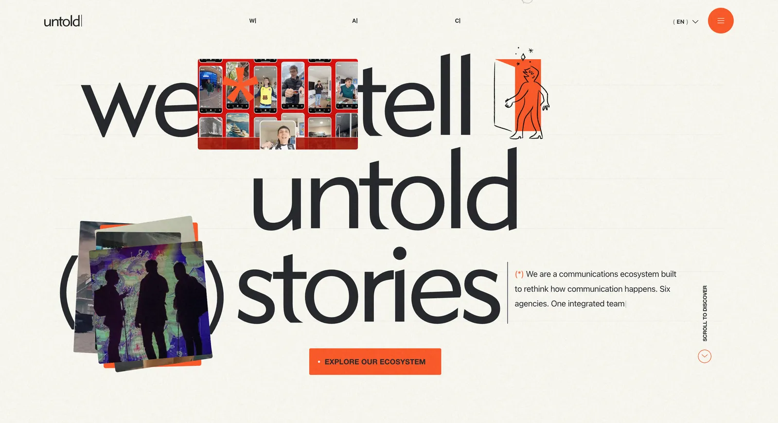
Untold website hero image

Why the hero does so much of the work

Your hero is the first thing a visitor sees, and they judge the rest of your business by it. In a few seconds they decide if you look credible, if you serve people like them, and if the page is worth a scroll.

That makes the hero a positioning decision first and a design decision second. A premium buyer may not know the word "hierarchy", but they notice when a page feels ordered and sure of itself. They also notice when it feels like a template with the name swapped.

One short headline

The strongest trend is also the simplest. High-converting heroes use one short headline that says what you do or what changes for the client. Older heroes stacked a headline, three value statements and a slider. Most of that has gone.

Keep the line under the headline to one sentence, and use it to add the detail the headline left out: who it's for, or how the work is done. Then stop. If you need a paragraph to explain the headline, rewrite the headline.

Editorial photography instead of stock

Hero images now look more like magazine photography and less like advertising. They're calm, well lit and clearly belong to one business. A consulting firm might use an understated studio portrait. An interior designer might show one architectural detail. A wellness brand might use a soft, textured room.

Ask one question of any hero image: what should a visitor feel when they see it? If you can't answer, the image is filling space. Generic stock fails this test nearly every time, because the visitor has seen it on three other sites this week.

Quiet motion

Motion on premium sites has become slower and smaller. Think soft fades, gentle reveals and a video background that barely moves. Used well, it points the eye at the headline or the button and makes the page feel carefully made.

Two rules keep it honest. The message must make sense with the motion switched off, and the motion must not slow the page down. A beautiful video that takes six seconds to load on a phone costs you more than it earns.

Full-width composition

Full-width heroes run an image or a block of color across the whole screen, so the visitor feels they've stepped into the brand instead of looking at a box on a page. This works especially well in luxury, architecture, fashion and hospitality, where the picture does as much selling as the words.

Check the crop on a phone before you commit. A wide photo that looks superb on a laptop can lose its subject on a narrow screen, so choose images with room to be cropped.

Typography as the main event

Many premium heroes now use no image at all. Large, well-chosen type carries the whole first screen. Sharp, structured letters feel precise. A refined serif feels elegant. A heavy geometric face feels authoritative.

This suits businesses without strong photography, and it loads fast. It only works if the words are good, because there's nothing else to look at. For more on pairing fonts, see our list of the best typography combinations.

Quiet minimalism and editorial layouts

Minimalism has moved away from empty, cold pages toward something warmer. Every element left in the hero has to earn its place, and nothing competes with the headline. Editorial layouts take this further and treat the first screen like the opening spread of a magazine. The eye moves from headline to supporting line to image in a set order.

These layouts suit brands that want to be seen as experts with taste. They're a poor fit if your buyers need a price, a phone number or a booking button right away.

A clear call to action

Premium doesn't mean hiding the button. A visitor should be able to find the next step without hunting for it. Give the button enough contrast and space to stand out, and write a label that matches the promise above it. One primary button is plenty, with a quieter text link beside it if you really need a second path.

How to choose the right trend

Start with what you can do well. If you have great photography, lead with it. If you don't, lead with type until you do. Then match the trend to your buyer. Someone choosing an architect wants to look around, and someone booking an emergency dentist wants the phone number.

Your hero also sorts your audience. A restrained, confident first screen tends to attract people who value that, and it puts off some bargain hunters. We see that as a useful filter. For the structure behind a strong first screen, read our guide to hero section design for premium brands.

FAQ

What should a hero section include?

A hero section should include a short headline, one supporting sentence, one strong visual and one clear button. Most businesses can remove anything beyond that. Older heroes stacked a headline, three value statements and a slider, and most of that has gone. Write a button label that matches the promise above it, and give the button enough contrast and space to stand out.

Are video backgrounds still a good idea?

Yes, video backgrounds can still work if the video is short, subtle and fast to load, and the headline still reads clearly on top of it. The message must make sense with the motion switched off. A beautiful video that takes six seconds to load on a phone costs you more than it earns. Test it on a phone on a normal connection before you keep it.

How long should a hero headline be?

A hero headline should be short enough to read at a glance. If it wraps past two or three lines on a laptop, try cutting it. Don't sacrifice clarity for length, though. A clear line of ten words beats a clever line of four. The best headlines say what you do or what changes for the client.

Do hero trends go out of date quickly?

The styling of hero sections goes out of date quickly. The basics of clarity, hierarchy and a single next step have held up for years, so build on those and treat the styling as the part you can change later. Current trends such as quiet motion and editorial layouts all follow the same rule: one clear message, one strong visual and one obvious next step.
More insights

7 Ways to Get Your Business Recommended by AI

8 min

ChatGPT just recommended your competitor, and it probably wasn't because they're better. Their website was just easier for AI to read. Here are 7 fixes that change that.

10 Minimalist Luxury Websites for Design Inspiration

11 min

From The Row to Aman Resorts, these 10 minimalist luxury websites prove that restraint, not decoration, is what makes a brand feel expensive.

Your Website Might Be Pushing Visitors Away

11 min

A website can look attractive and still be quietly driving visitors to your competitors. Here's how to spot the functional issues hiding behind good design.

The Hardest Lesson We Learned in Web Design

12 min

Skipping clear expectations with clients almost sank our early web design projects. Here's the process we built after learning that lesson the hard way.

Website Features That Are Killing Your Sales

11 min

Flashy features like auto-play video and stacked pop-ups feel modern, but they're often the exact thing driving your visitors away before they convert.

The Trick That Made Our Websites Convert Better

12 min

One of the simplest conversion fixes is also the most overlooked: make your call-to-action actually look and read like a button, not a suggestion.

The Website Feature We Used to Love (But Don't)

11 min

Animations once felt like the mark of a modern website, until we noticed they were slowing sites down and pulling attention away from what actually converts.

The One Page Every Website Needs to Convert

10 min

Homepages and service pages get all the attention, but the page most businesses are missing entirely is the one that actually builds trust: a case studies page.

The One Website Investment Every Business Needs

9 min

With a limited budget, skip the flashy extras, the highest-return investment for any website is clear UX and high-quality visuals.

A Quick Fix That Instantly Improves Your Website

11 min

You don't need a redesign to see real improvement, these four small, fast fixes can noticeably boost how your website performs today.

The Detail That Makes a Website Look High-End

12 min

Flashy effects don't make a website feel premium, consistent color, clean typography, and generous whitespace do. Here's why that small discipline matters so much.

The Biggest Misconception About Web Design

11 min

A gorgeous website that loads slowly and confuses visitors will always lose to a plainer one that performs. Here's why looks are the wrong priority.

How to Add a Video Background in Squarespace

7 min

A video background can make your Squarespace site feel dynamic and premium, if it's set up right. Here's the step-by-step process and the pitfalls to avoid.

How to Create a Squarespace Duplicate Website

8 min

Squarespace has no one-click "duplicate site" button, but there are safe, reliable ways to clone your site for testing, backups, or new projects.

Is Squarespace Better Than WordPress?

9 min

Squarespace and WordPress solve very different problems. Here's an honest, side-by-side breakdown to help you pick the platform that actually fits your goals.

WordPress to Squarespace Migration Guide

8 min

Moving off WordPress doesn't have to risk your rankings or your content, follow this step-by-step migration plan to switch platforms cleanly.

How to Add HTML to Squarespace (3 Methods)

8 min

Need more control than Squarespace's blocks allow? Here are the three safe ways to add custom HTML to your site, and the mistakes that break pages.

How to Download Images From Squarespace

8 min

Squarespace has no built-in "download all" button for your images. Here's the safe workaround to recover full-quality files whenever you need them.

10 SEO Squarespace Tips to Boost Visibility

12 min

A beautiful Squarespace site won't rank on its own, these 10 practical SEO tips help turn your design into organic traffic.

How to Become a Web Designer: Beginner Guide

9 min

Thinking about a career in web design? Here's the realistic, step-by-step path from design fundamentals to a portfolio that actually gets you hired.

Squarespace Website Not Working? Full Fix Guide

8 min

When your Squarespace site goes down or starts acting strange, the cause is almost always one of a handful of predictable culprits. Here's how to find and fix it fast.

How Long Does It Take to Build a Website? 2026

9 min

A simple site typically takes about three weeks and a bigger one about five, but that estimate only holds if feedback comes back fast. Here's the real timeline, stage by stage.

Why Photos on Your Business Website Matter

8 min

Photos on your business website aren't decoration, they're often what decides whether a visitor keeps reading or leaves. Here are six real reasons they matter.

Mobile-First Website Design: Beginner's Guide

9 min

Mobile-first website design just means building for a phone screen first, then working up to bigger screens. It sounds like a small technical detail, it isn't.

Why Website Visitors Leave Without Contacting You

9 min

Website visitors leave without contacting you for one boring reason far more often than any exciting one: you never gave them an obvious way to. Here are six fixable causes.

7 Things to Look for Hiring a Web Designer

10 min

It's hard to judge a web designer until after you've already paid them. Here are seven things to check beforehand so you don't find out the hard way.

7 Things to Prepare Before a Website Project

9 min

Most website project delays trace back to one thing: nobody prepared what the designer actually needed before the project began. Here are seven things to sort out first.

Custom Website vs Template: Which to Pick?

8 min

A template and a custom website can both technically get you online, the honest difference shows up later, once you're trying to stand out and convert, not just be found.

How to Match Your Website to Your Brand (2026)

8 min

Matching your website to your brand doesn't mean an exact copy of your logo file. Here's what genuinely needs to stay fixed, and where print-first brand guidelines have room to flex on screen.

Professional Website Cost: What to Budget in 2026

9 min

"It depends" isn't a dodge, a professional website's cost genuinely hinges on scope, copywriting, and features. Here's what actually drives the price, and what to budget beyond the initial quote.

Previous

Does Your Real Estate Website Need Full IDX, or Is It Actually Hurting You?

How does your website score?

Enter your address and email. You get scores for speed, search, accessibility and trust in about a minute, and the full report by email.