



The best nonprofit websites tend to belong to large organisations with digital teams, and most lists of them say little more than "moving photography, clear donate button." That is true and not very useful to a small charity run by six people and a board of volunteers. So for each nonprofit below we picked one decision that earns trust or support, and that a smaller organisation could copy without a large budget.
Everything described here is visible on the live sites as of November 2026. Nonprofits change their homepages with every campaign and appeal, so we focus on the structure and the wording that stay in place all year.
What a nonprofit website has to do
A nonprofit website asks people for something with nothing to sell in return. A visitor gives money, time or their name, and in exchange they want two things: to believe the cause matters, and to trust that their support will actually reach it. Most nonprofit sites do the first part well. They have a moving story and strong photos. Fewer do the second part, and that is where donations are lost.
The best nonprofit websites answer the trust question as plainly as the emotional one. They show where the money goes, what has already been achieved and who checks their work. Then they make the next step easy, whether that is a donation, a monthly gift, a fundraiser or a volunteer shift.
Here are eight nonprofit website examples, grouped by what they teach.
Nonprofit websites that make trust visible
1. charity: water: proof built into the promise
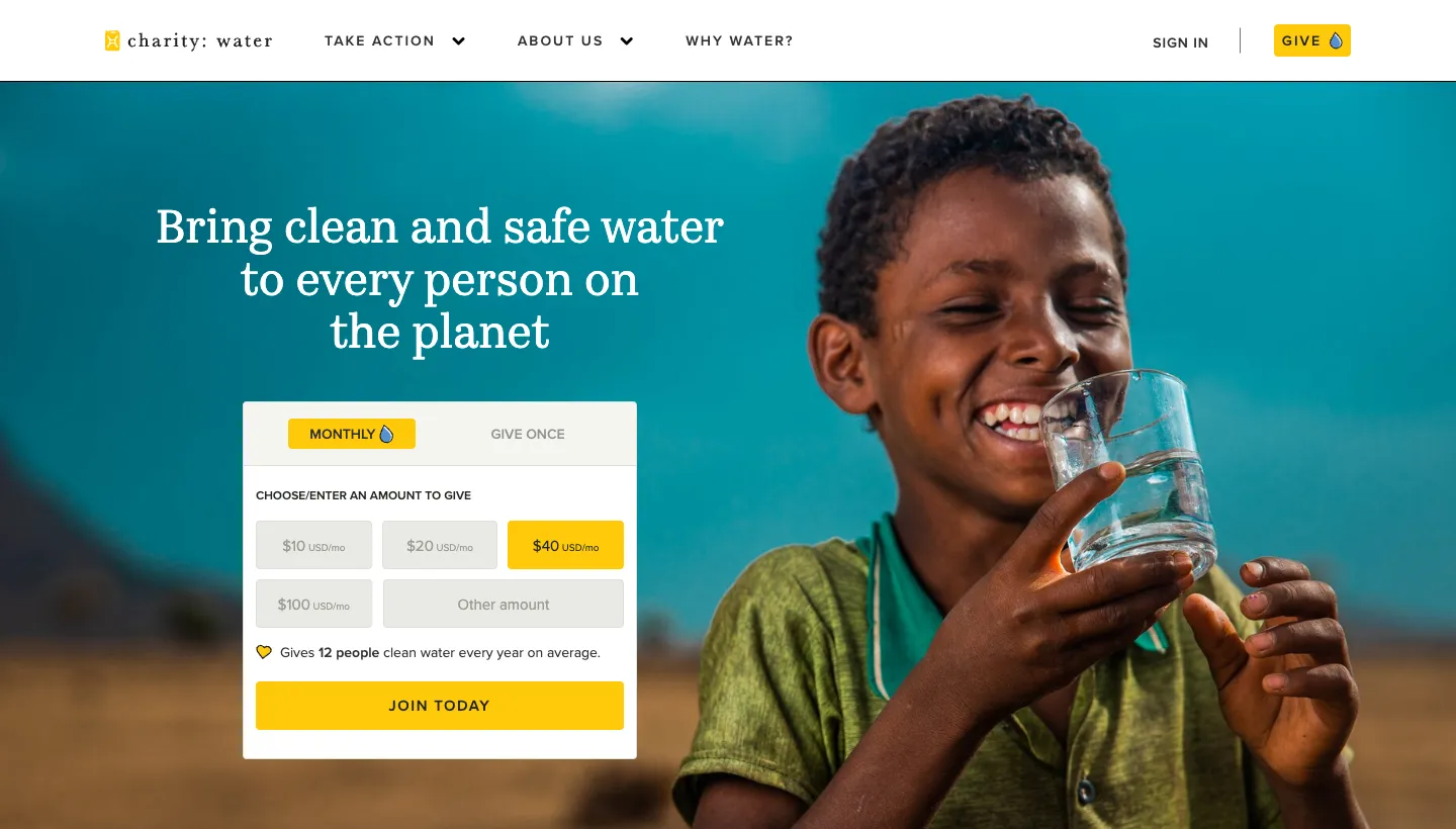
charity: water opens with its mission in one line: "Bring clean and safe water to every person on the planet." Its tagline is "Give water. Get proof. Every single time.", and the homepage explains that 100% of public donations fund water projects because private donors cover operating costs. An impact section shows totals to date, each with a short note on how the figure is counted, and badges from charity rating organisations sit nearby.
The promise of proof answers a donor's biggest doubt before they have to ask it. And the note under each figure, explaining how it is counted, makes the numbers easier to believe.
Borrow this: say plainly where a donation goes, and explain how you count your impact figures. A sentence of method makes a number credible.
2. Doctors Without Borders: the money in a simple chart
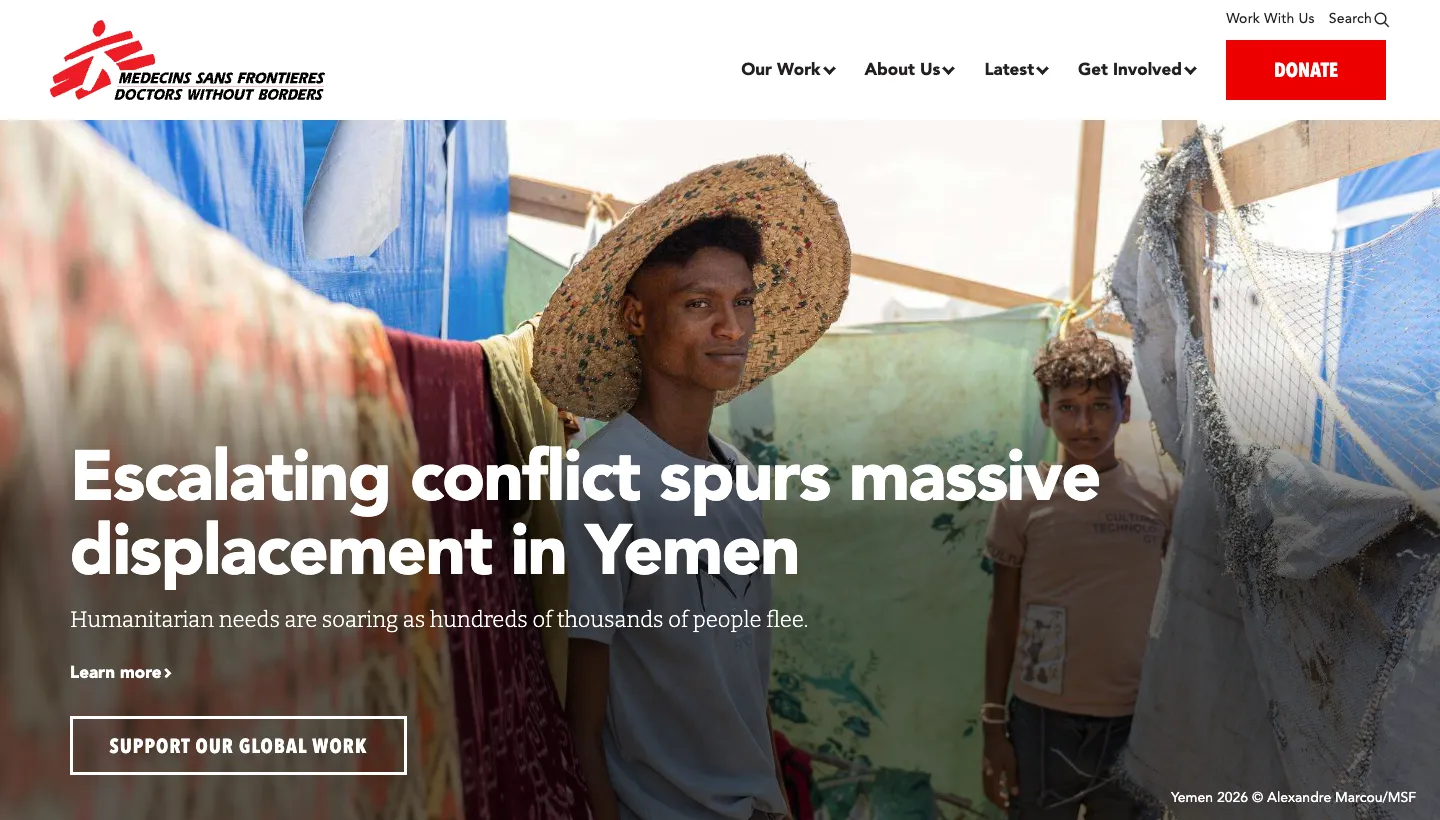
Doctors Without Borders states its mission in a sentence, "We provide independent, impartial medical humanitarian assistance to the people who need it most," and shows its reach in large figures: countries, medical consultations and patients admitted, citing its international activity report. A "How we use funds" section shows how spending splits between programmes, fundraising and administration.
A simple breakdown of spending is one of the strongest trust signals a nonprofit can show, and many smaller organisations bury it in an annual report PDF. Putting it on the homepage says you are comfortable being asked.
Borrow this: put a simple breakdown of how you spend money on your homepage or donate page, with a link to your full accounts.
3. GiveDirectly: evidence next to every claim
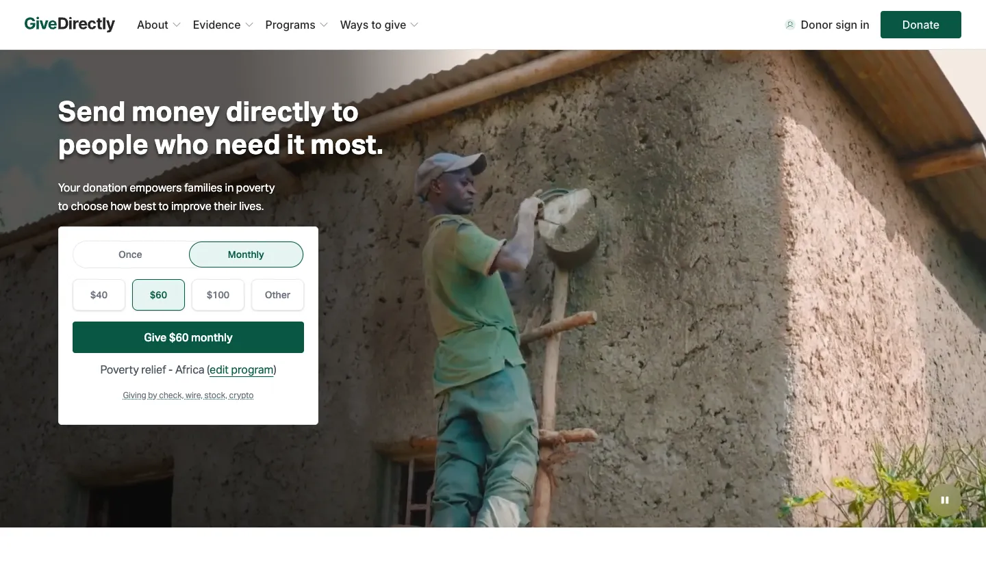
GiveDirectly opens with "Send money directly to people who need it most." A "Why cash?" section makes four short claims, each backed by a figure, such as the share of funds delivered directly to recipients. Further down are press quotes, charity ratings, research partners and short stories from recipients in their own words about what they did with the money.
GiveDirectly's approach is unusual, so it expects scepticism and answers it with evidence at every step. Recipient stories in their own words do the emotional work, while the figures do the convincing.
Borrow this: if your approach is different from what donors expect, pair each claim with one piece of evidence, and let the people you help speak for themselves.
Nonprofit websites that make giving personal
4. Kiva: choose the person you support
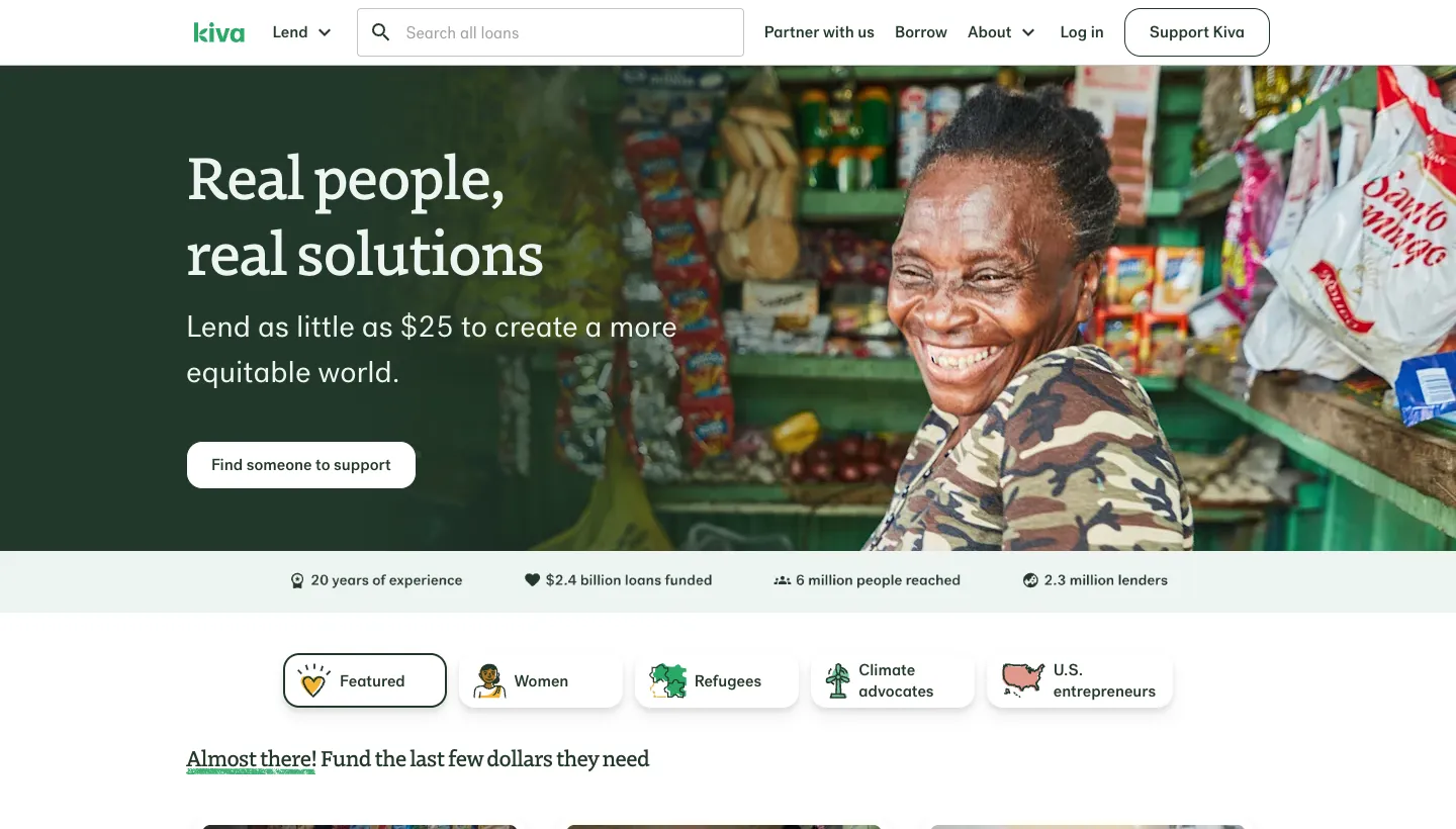
Kiva opens with "Real people, real solutions" and "Lend as little as $25 to create a more equitable world." The main button says "Find someone to support", and borrower cards show a photo, a country, what the loan is for and how much is still needed. Filters let lenders browse by groups such as women, refugees and climate advocates.
Letting people choose who they help turns a donation into a connection. The "still needed" amount on each card adds a clear goal that a small gift can complete.
Borrow this: if you can, let supporters choose a specific project, person or place to fund, and show how close it is to its goal.
5. Feeding America: help for those who need it, on the same page as giving
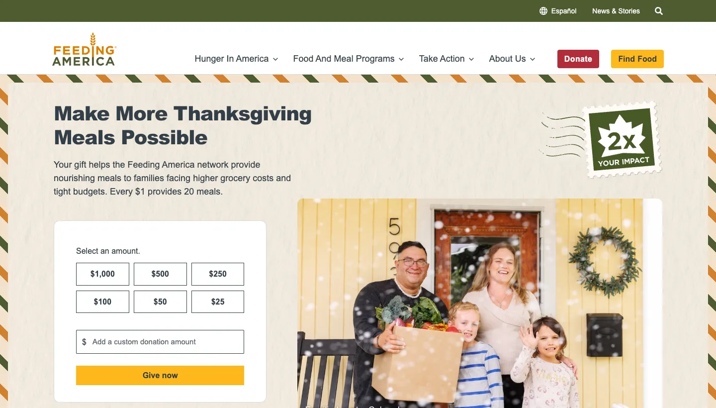
Feeding America puts donation options at the top of its homepage, with preset amounts and a choice of one time or monthly giving. On the same page, a "Find Food Near You" tool asks for a ZIP code or uses your location, and another section helps people find volunteering near them. The homepage also shows the scale of the network in large figures.
A nonprofit website often has two audiences who never meet: people who want to help and people who need help. Feeding America serves both from the homepage without either getting in the other's way.
Borrow this: if people come to your site looking for help, give them a clear, separate way in near the top. Don't make them read a donation appeal to find it.
6. Habitat for Humanity: from national to local in one step
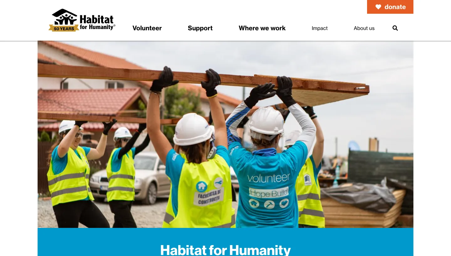
Habitat for Humanity opens with "Every donation helps a family build a safe and affordable home," with "Donate Now" and "Donate Monthly" buttons in the header. A "Find your local Habitat" section asks for a ZIP code, so visitors can volunteer, shop at a ReStore or get involved near home.
Many people want to help their own community, not a national organisation in the abstract. A local finder connects a big brand to something a visitor can do this weekend.
Borrow this: if you work in more than one place, let visitors find their nearest branch or project in one step, and give monthly giving its own button.
Nonprofit websites that show progress
7. The Ocean Cleanup: a clear goal and the progress towards it
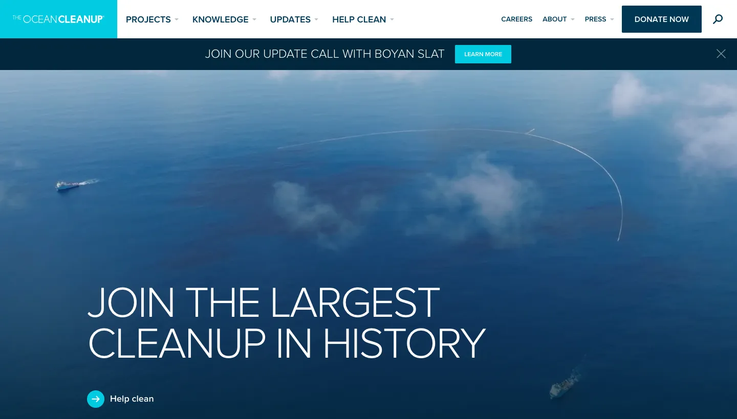
The Ocean Cleanup opens with "Join the largest cleanup in history" and states a goal with a date: to clean up 90% of floating ocean plastic by 2040. Large counters show what has been achieved so far, including kilograms of trash removed and peer-reviewed publications. Community stories from people in Indonesia, Guatemala and Jamaica follow, each with a photo and a quote.
A goal with a date gives supporters something to follow over years, not just a reason to give once. Each update becomes a reason to come back.
Borrow this: set one clear, public goal and show your progress towards it on the homepage. Update the number regularly.
8. Khan Academy: the mission in one sentence, the results in figures
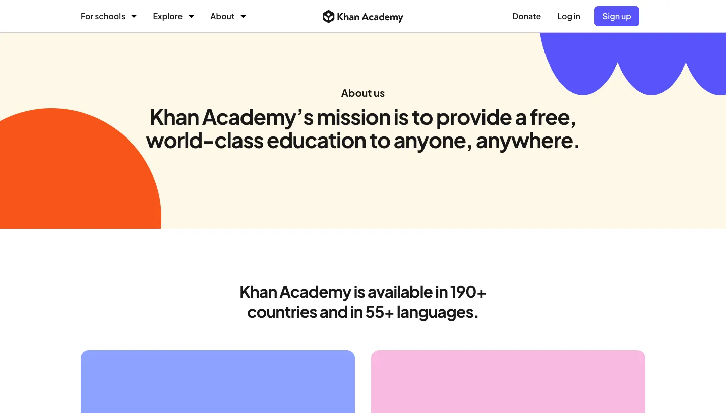
Khan Academy states its mission in one line: "to provide a free, world-class education to anyone, anywhere." Its about page backs it with figures for learners, countries and languages, and a "Give the gift of learning" section explains that the organisation relies on donations to keep its tools free.
Many people use Khan Academy without knowing it is a nonprofit. The about page connects the free service people already value to the donations that pay for it.
Borrow this: if people use your services for free, tell them who pays for it and ask them to join. Users are often your most natural donors.
What the best nonprofit websites have in common
Across all eight, the same habits show up.
The mission fits in one sentence
charity: water, Doctors Without Borders and Khan Academy can each be understood from a single line at the top of the page. If your mission takes a paragraph, a visitor will leave before they reach the end of it.
They answer the trust question openly
Spending breakdowns, rating badges, research and proof of projects. The best nonprofits treat "where does my money go?" as a question to answer proudly, not a risk to manage.
They show real people
Recipient stories, borrower cards and community quotes, with names and places. Specific people are more convincing than any general statement about need.
They offer more than one way to help
Monthly giving, fundraising, volunteering, local branches. A visitor who can't give money today can still sign up, share or show up.
The short version
The best nonprofit websites aren't the ones with the biggest campaigns. They are the ones that state the mission in a sentence, answer the trust question openly, show real people and make the next step easy, whatever size of help a visitor can offer. A small charity can do every one of these things: a one line mission, a simple spending breakdown, a recipient story with permission, a clear goal and a monthly giving option.
Start with your donate page. If a supporter can't see where their money goes and give monthly in under a minute, fix that first.
FAQ
What makes a good nonprofit website?
A good nonprofit website states the mission in one clear sentence, shows real impact with specific figures and stories, explains where donations go, and makes it easy to give, volunteer or get help. It should also work well on phones and be easy for staff to update.
What should a nonprofit homepage include?
A one line mission, a clear donate button, a short summary of your impact, a real story from someone you help, other ways to get involved, and proof of trust such as ratings, registration details or a spending breakdown. If people also come to you for help, give them a clear way in near the top.
How can a nonprofit website increase donations?
Make giving quick, offer monthly giving as an option, show what a gift achieves, and answer the question of where the money goes. Many donors leave a donation page because they can't find that answer or because the form asks for too much.
Should a nonprofit show how it spends money?
Yes. A simple breakdown of spending between programmes, fundraising and administration is one of the clearest trust signals you can give. Doctors Without Borders shows its breakdown on the homepage, with the full report available for anyone who wants the detail.
How often should a nonprofit update its website?
Update the homepage whenever you run a new appeal or reach a milestone, and refresh impact figures at least once a year. Stories and news should be added regularly, so supporters can see the work continuing.
What is the best platform for a nonprofit website?
One your team can update without a developer, that works with your donation provider and costs little to run. Squarespace suits many smaller nonprofits for that reason, while larger organisations with complex donor systems may need a custom build.