




The best recruitment websites solve a problem most industries don't have: two audiences who want opposite things. Candidates want to search jobs, upload a CV and hear back. Clients want to know you understand their market and can fill a hard role quickly. Put both on one homepage without a plan and each feels the site wasn't made for them.
The seven examples below solve that in different ways. Volume staffing firms lead with job search. Executive search firms barely mention vacancies and lead with expertise. Some split visitors on the first screen. For each one we say what it does well and what you could borrow. Everything described is visible on the live sites as of November 2026.
What makes a recruitment site work
The best recruitment sites decide which audience matters most on the homepage and serve the other one well a click away. They also show proof in a form each audience trusts: job counts and salary guides for candidates, specialisms, results and insight for clients.
Three things show up again and again:
A clear first split. Candidates and clients get separate routes, ideally in the first screen.
Specialisms named plainly. Sectors and role types listed, not "we work across all industries".
Insight that earns trust. Salary guides, hiring reports and market updates that give both audiences a reason to return.
Sites that split visitors on the first screen
1. Michael Page: two buttons, two journeys
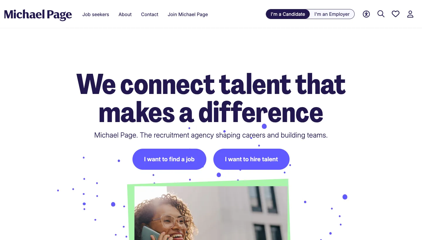
Michael Page opens with "We connect talent that makes a difference" and two buttons directly underneath: "I want to find a job" and "I want to hire talent". The top bar repeats the split with "I'm a Candidate" and "I'm an Employer". Below, a job search box sits next to links to browse by industry, sector, location and job title, and the page later promotes its 2026 salary guides and a statistic that "98% of our candidates would work with us again."
The two buttons do the hardest job on any recruitment site in one line: they let each visitor say who they are before they see anything irrelevant.
Borrow this: put a candidate button and a client button side by side in your first screen, worded in the visitor's own words.
2. Robert Half: proof in three numbers
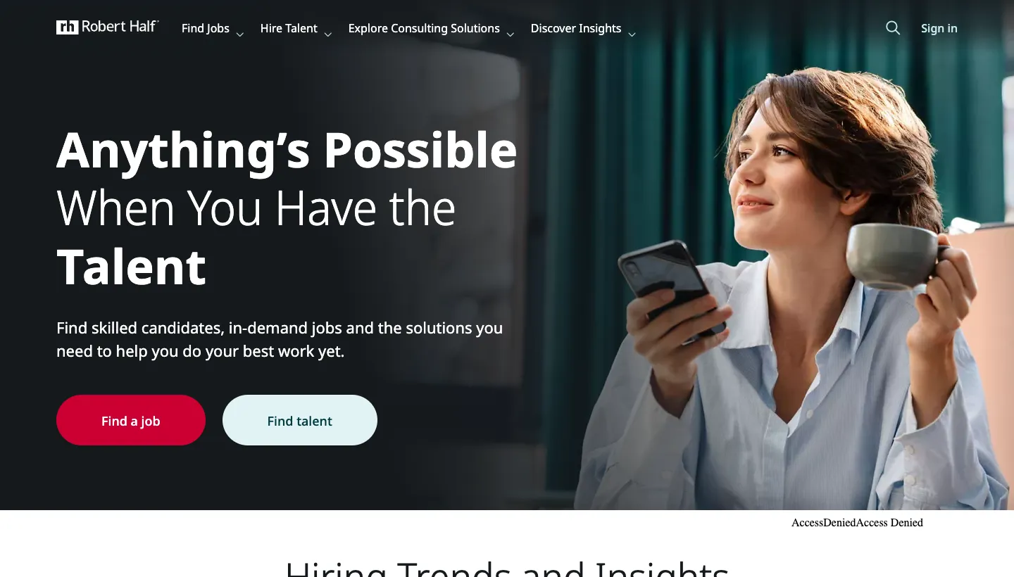
Robert Half leads with "Anything's Possible When You Have the Talent" and two buttons, Find a job and Find talent. Its "Why Robert Half" section uses three numbers: #1 on Forbes' list of America's Best Professional Recruiting Firms "for 8 consecutive years", 2 million+ contract and full-time placements, and 300+ locations. A salary guide covering seven professional fields sits higher up.
Each number answers a different doubt a client might have: are you good, are you experienced, are you near us?
Borrow this: pick three facts that answer your clients' three biggest doubts, and put them together.
Sites that lead with the job search
3. Randstad: the search box is the homepage
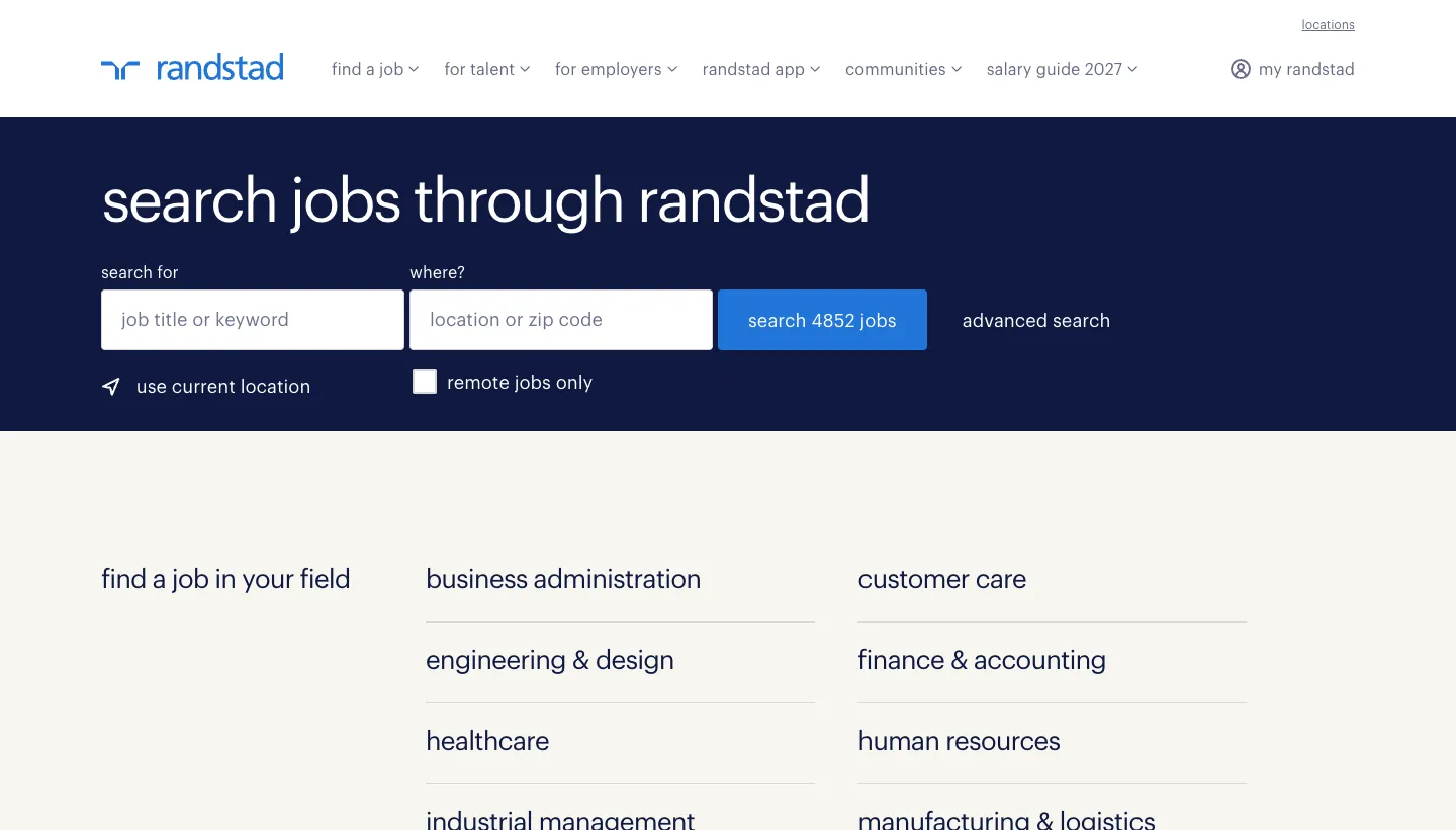
Randstad's US site opens with "search jobs through randstad" and a search form: job title or keyword, location, a remote-only checkbox and a button showing the number of live jobs. Below, it lists fields to browse, from engineering and design to skilled trades, then jobs by city. The page also carries a clear warning that people unconnected to Randstad are impersonating its recruiters and posting fake job ads.
For a high-volume staffing firm, candidates are most of the traffic, so giving them the search box first is the right call. The fraud warning is a quiet trust signal that also protects the brand.
Borrow this: if most of your visitors are job seekers, lead with search, and show how many live roles you have.
4. Insight Global: one line, then the industries
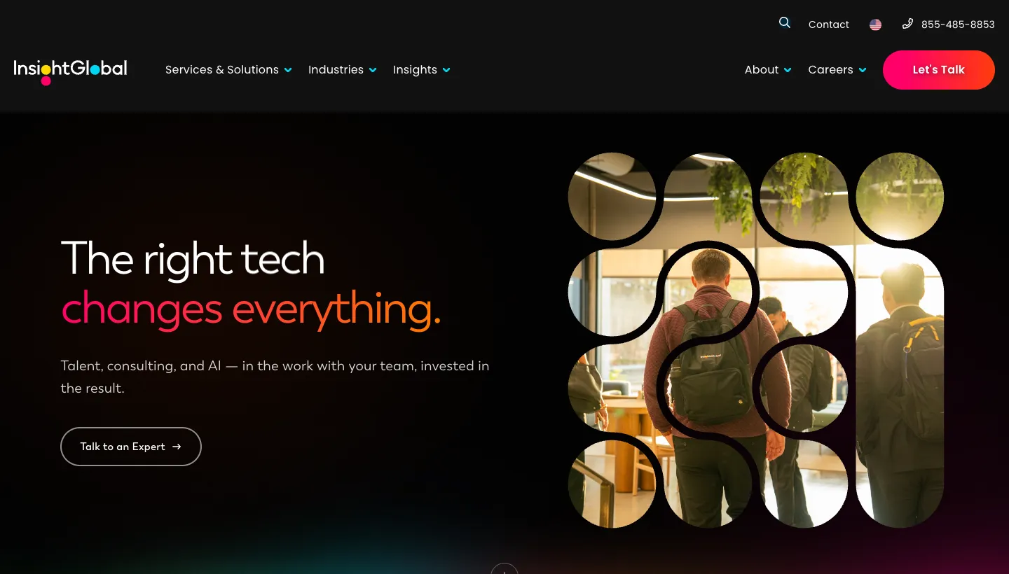
Insight Global uses a short, rotating headline ("The right ... changes everything") with a one-line promise of "talent, consulting, and AI" working alongside your team, and a single "Talk to an Expert" button. Further down, it lists the industries and functions it serves, from automotive and construction to healthcare and IT, and gives its culture its own section.
The page talks to clients first and keeps candidates one click away in the menu under Careers. For a firm that also sells consulting, that order makes sense.
Borrow this: if clients bring in the revenue, it is fine to speak to them first, as long as candidates can find the jobs quickly.
Sites that lead with expertise
5. Heidrick & Struggles: a purpose, then the practice areas
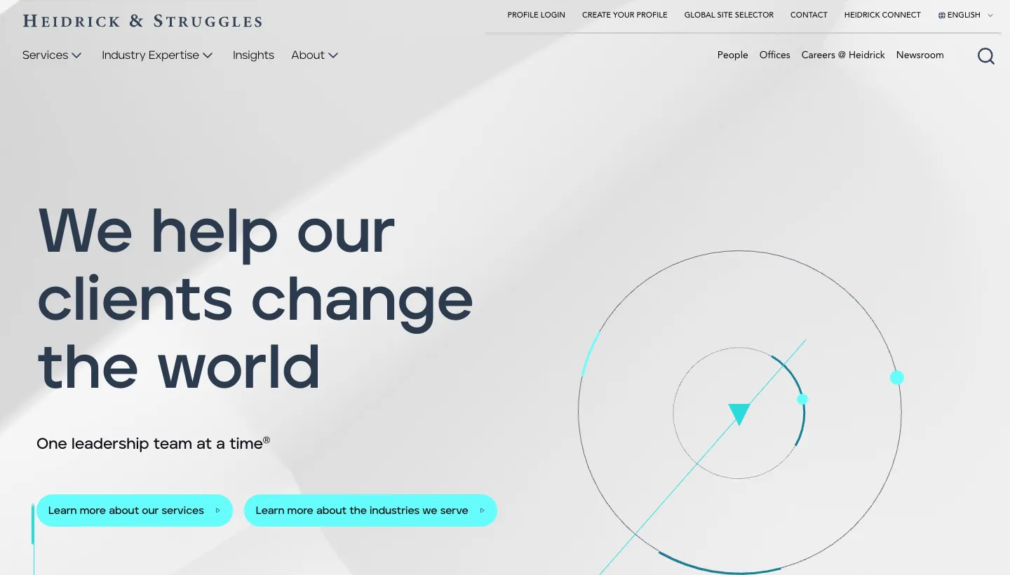
Heidrick & Struggles opens with "We help our clients change the world" and "One leadership team at a time", followed by two links: one to its services and one to the industries it serves. The menu shows how deep its practice goes, from executive search for chief executives and boards to leadership development, interim executives and board effectiveness.
Executive search clients buy judgement, not job listings, so the homepage never mentions vacancies. It sells the firm's view of leadership instead.
Borrow this: if you place senior people, list your practice areas and the roles you fill, and leave the job board out of the homepage.
6. Spencer Stuart: research as the lead
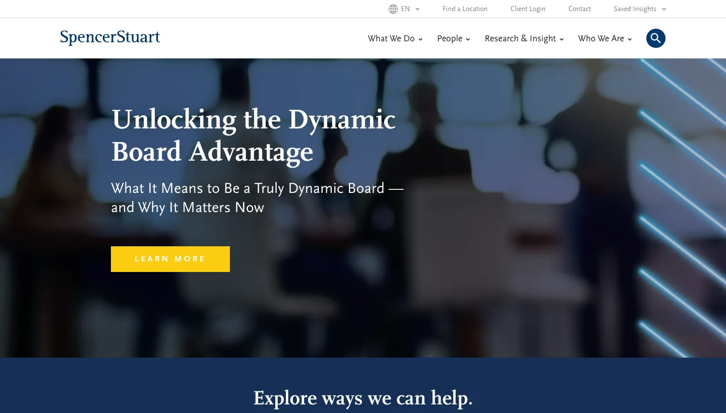
Spencer Stuart gives its first screen to a piece of research on boards, then a row of services: Board and CEO advisory, CEO succession planning, executive assessment, executive search and leadership consulting. Below that is a long list of insights, including its 2026 U.S. Spencer Stuart Board Index, each with a reading time and a save option.
The research does the selling. A board chair who reads one useful article is far more likely to call than one who reads a list of services.
Borrow this: publish one genuinely useful report a year for your market, and give it the homepage when it comes out.
7. Korn Ferry: insight on every screen

Korn Ferry leads with "Growth Starts Here" and a short line about "the people, work, and organizational decisions that drive business growth." Below, nearly everything is insight: talent trend reports, a growth readiness assessment, an early-career report and a weekly roundup of leadership articles. A small note beside the hero says its visuals are AI-generated.
The site behaves more like a publication than a recruitment agency, which suits a firm that sells consulting and assessment as well as search.
Borrow this: an interactive assessment or quiz gives clients a reason to engage before they are ready to talk.
Mistakes these sites avoid
One message for everyone
None of these sites tries to speak to candidates and clients in the same sentence. Each chooses a lead audience or splits them clearly.
Hiding the specialisms
Every site names its sectors and role types. "All industries" may be true, but it gives a client no reason to choose you.
Proof without context
The numbers they use mean something: years in a ranking, placements made, roles open today. A number without a reason to care is just decoration.
How to apply this to your agency
Decide who your homepage is for. If most of your revenue comes from clients, speak to them first and keep candidates one clear click away. If you run high-volume staffing, lead with the search box. Either way, give each audience its own landing page, name your specialisms and add one form of proof each audience trusts.
Then look at your job pages. They are often the most visited pages on a recruitment site and the least designed. Clear titles, salary ranges where you can share them, a simple application and a phone-friendly layout make a bigger difference than the homepage.
The short version
The best recruitment websites know who they are talking to. Staffing firms lead with search and job counts. Executive search firms lead with expertise and research. The strongest split candidates and clients on the first screen and give each a route built for them. Pick the model closest to your business, name your specialisms and show proof each audience trusts. Our page on website design for recruitment agencies shows how we build these sites.
FAQ
What should a recruitment agency website include?
Separate routes for candidates and clients, a job search, clear specialisms, proof such as placements or reviews, useful insight like salary guides, and simple ways to apply or request staff.
Should a recruitment homepage target candidates or clients?
It depends on your model. High-volume staffing firms often lead with job search, while executive search firms lead with expertise. Many split both audiences on the first screen.
How do recruitment agencies win clients online?
By naming their specialisms, showing proof clients trust, publishing useful market insight and making it easy to request a call or brief a role.
Do recruitment sites need a job board?
Agencies that place many candidates usually do. Executive search firms often don't list vacancies publicly and focus on expertise instead.
How can a staffing firm make job pages better?
Use clear job titles, share salary ranges where possible, keep the application short and make sure the page works well on a phone.
How much does a recruitment agency site cost?
It depends on page count, copy, and features such as job feeds or candidate portals. Our Rebuild projects start from $9,500, with the exact price agreed in writing before work starts.