Most lists of the best photography websites are really lists of the best photographers. The pictures are stunning, but that doesn't tell you much about the website. So for each site below we looked past the images at the decisions around them: how the work is organised, what the menu says, and how a visitor who likes what they see gets in touch or buys.
Everything here is visible on the live sites as of November 2026. We have grouped the photographer website examples by what they teach.
What makes a photography website work
A photographer's site has an unusual problem. The work is the main argument, so the design has to step back. But a site that only shows pictures leaves a visitor admiring and then leaving, with no idea how to hire you, what you shoot or what happens next.
The best sites solve this in three ways:
They organise the work the way a client thinks. By the kind of job, the subject or the project, not by the date it was shot.
They keep words short but present. A caption, a client name or a one-line description gives context the image can't.
They make the next step obvious. An enquiry link, a shop, a booking or a newsletter, always one click away.
Keep those in mind as you look through the list.
1. Tim Walker: captions that sell the client list
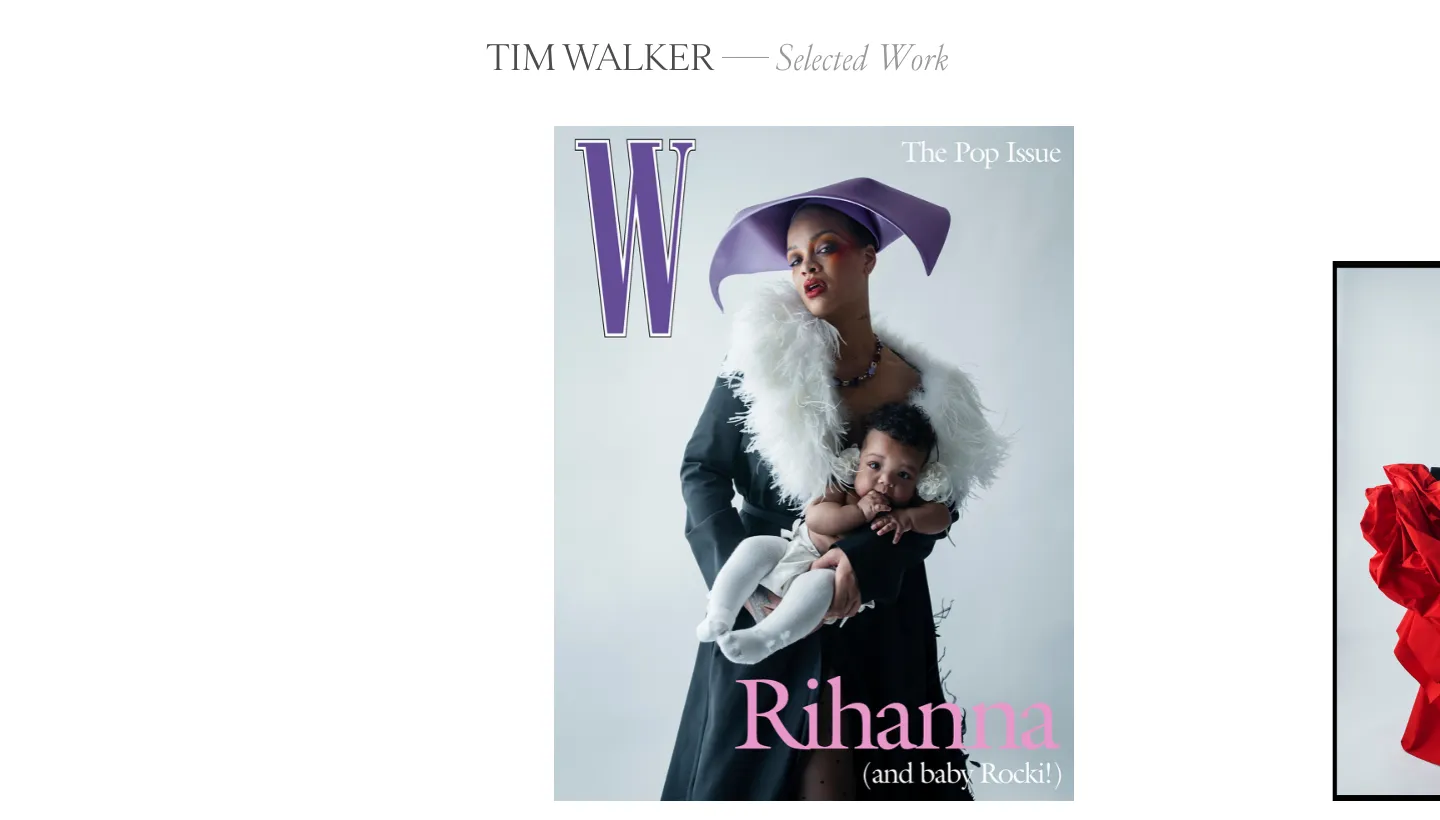
Tim Walker's site opens on selected work, and each image is captioned with the subject, the publication and the year, such as W Magazine. The menu is short: portraiture, stories, moving image, books, articles, biography and contact.
The captions do quiet but important work. A commissioning editor sees the calibre of publications without a single logo wall or testimonial.
Borrow this: caption your strongest work with the client or publication and the year. It is proof without the bragging.
2. Platon: work sorted the way clients buy
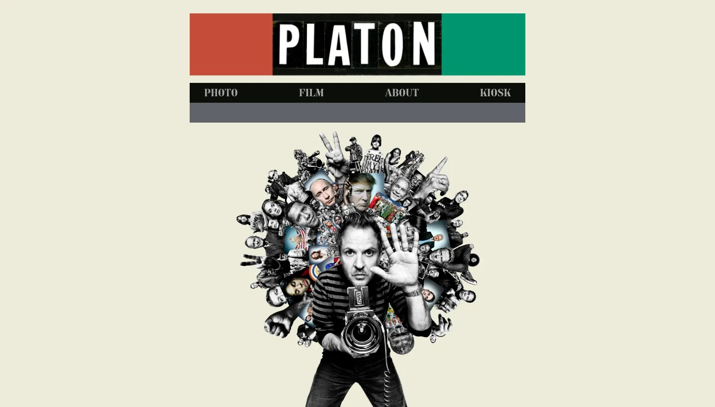
Platon's site describes him as photographer, storyteller and public speaker, and splits the photography into people, style, stories and brands. Film, biography, press and inquiries sit alongside. The studio's address and phone number are in the footer.
A brand looking for a campaign photographer goes straight to "brands". A magazine goes to "people". Nobody has to scroll through work that isn't relevant to them.
Borrow this: group your portfolio by the type of client or job, so each visitor finds their kind of work in one click.
Sites that organise a large body of work
3. Steve McCurry: themes, prints and workshops
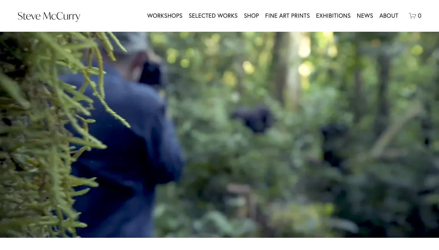
Steve McCurry's site organises decades of work by theme, such as portraits, animals, children and monsoons. The menu also leads to workshops, fine art prints, exhibitions and news, with dated posts about book signings and upcoming workshops.
With a large archive, themes make it browsable. The news section and dated events show a working photographer, not just a back catalogue.
Borrow this: if you sell prints or run workshops, give each its own place in the menu. And keep something dated on the site so it looks alive.
4. Nick Brandt: projects as chapters
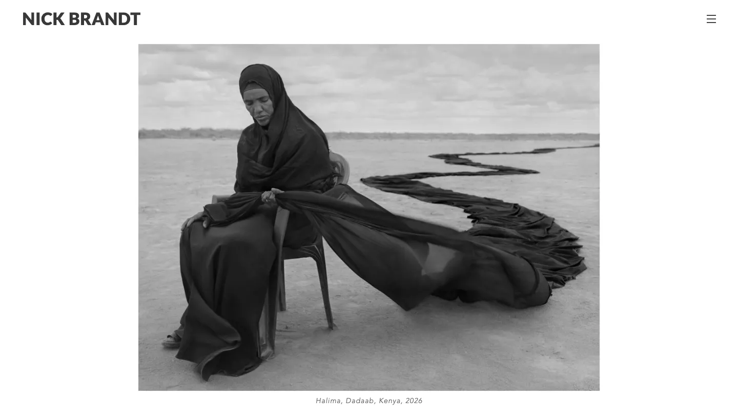
Nick Brandt's site is organised by project, each with its year, and some projects are split into chapters. Alongside the photographs are essays and a page about the NGOs connected to the work.
For a photographer whose work is long-term projects with a purpose, this structure tells the story better than any gallery grid could.
Borrow this: if your work comes in series, present each series as a project with a title, a year and a few sentences about why it exists.
5. Martin Parr: a full archive, well signposted
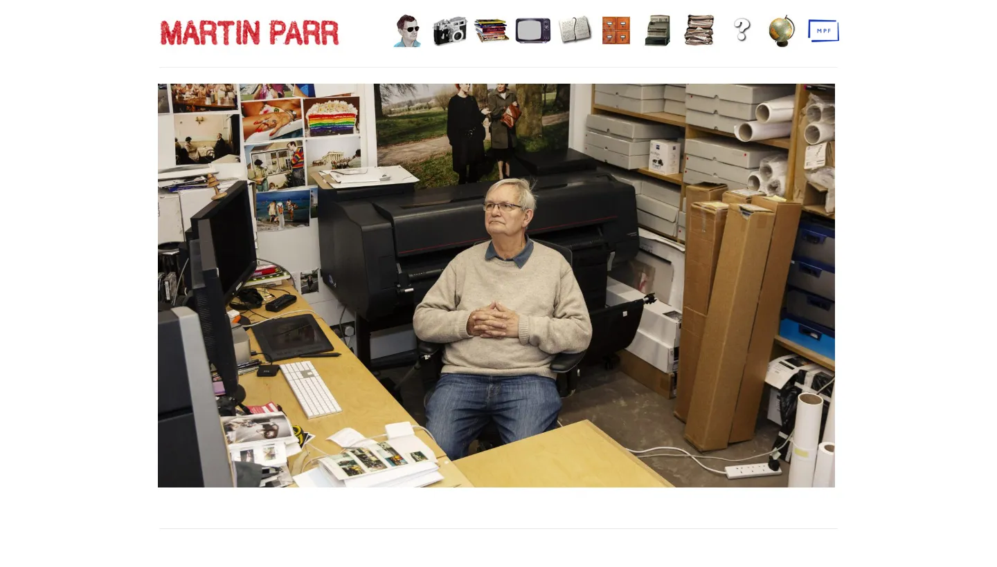
Martin Parr's site has a long but clear menu: recent work, books, TV and radio, blog, archive, shop, CV, FAQs and contact.
The FAQs page is the detail we like most. A photographer who is asked the same questions again and again can answer them once, which saves time and helps visitors who would never email to ask.
Borrow this: collect the questions clients ask before booking, such as usage rights, turnaround and travel, and answer them on one page.
Sites built for commissions and motion
6. Alex Strohl: advertising and personal work, kept apart
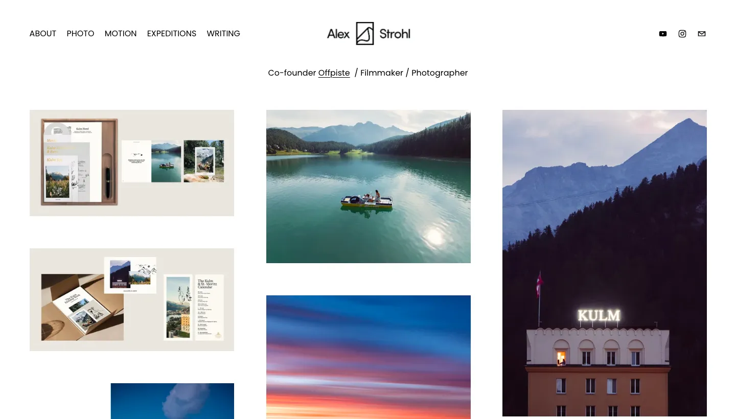
Alex Strohl's site introduces him as co-founder of Offpiste, filmmaker and photographer. The photo menu separates advertising work from personal work, alongside a journal, motion, expeditions and writing.
Separating advertising from personal work helps two audiences at once: brands see the commissions, and everyone else sees the photographer's own eye.
Borrow this: if you shoot commercially and personally, split the two. Clients want to see work like the job they are hiring for.
7. Jimmy Chin: stills and motion, side by side
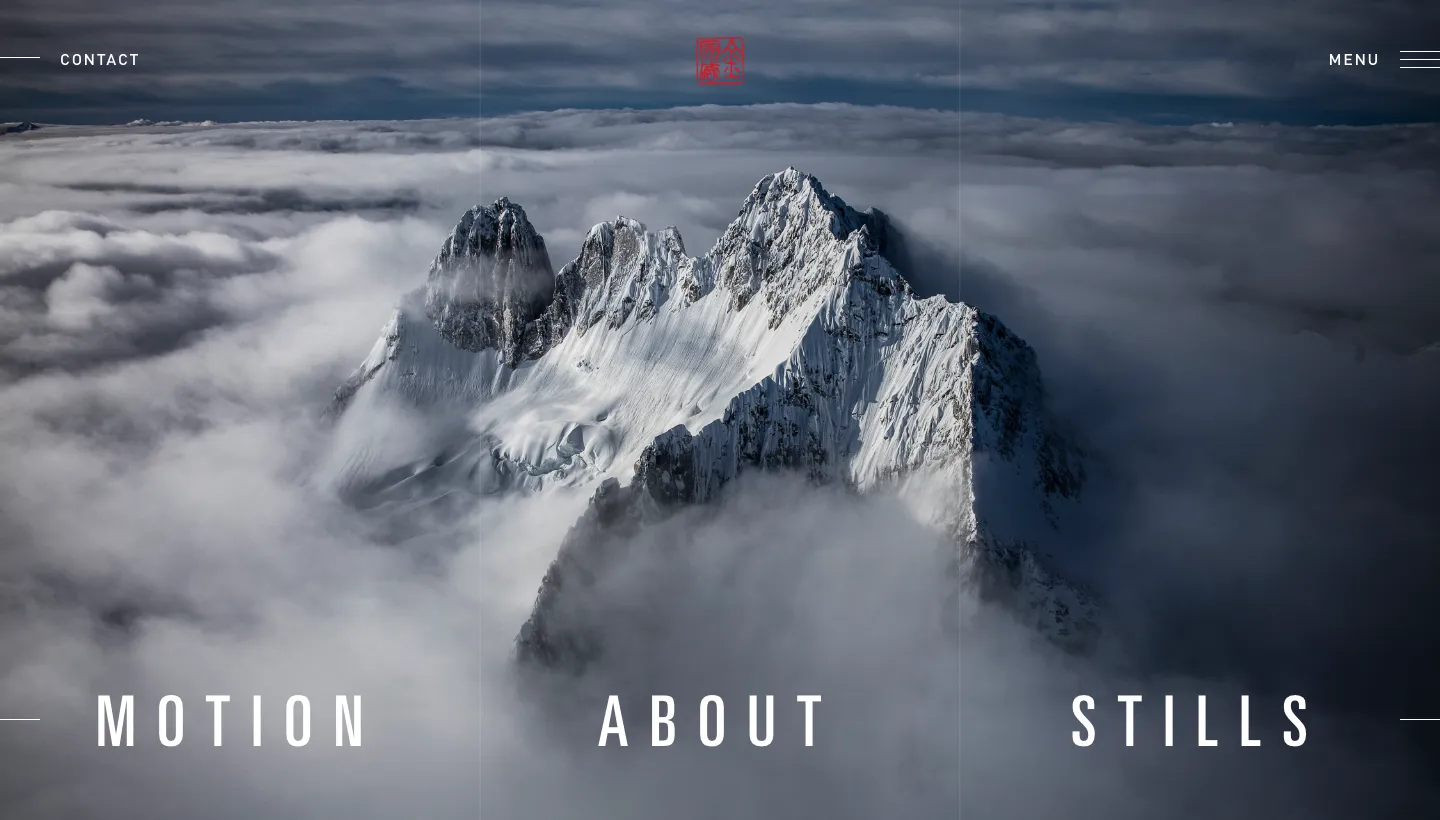
Jimmy Chin's site puts stills and motion next to each other in the menu, with books, a Substack, press, speaking and a shop.
Many photographers now shoot video as well, and a client hiring for a campaign may want both. Two clear menu items make that obvious in a second.
Borrow this: if you shoot video, give it its own section rather than mixing clips into photo galleries.
8. Elizabeth Weinberg: the job title in the page title
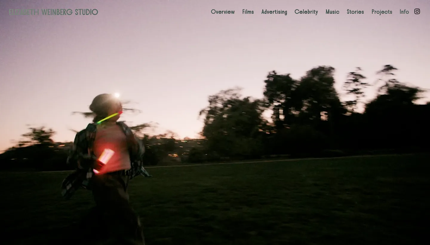
Elizabeth Weinberg's site is titled "Director & Photographer", and the work is split into films, advertising, celebrity, music, stories and projects, with an info page and a thumbnail view of everything.
The page title is what shows in search results and browser tabs. Putting both roles there tells clients and search engines what she does before they see a single image.
Borrow this: make your page title say what you do, such as "Wedding Photographer in Denver", not just your name.
Sites that sell to fans as well as clients
9. Brandon Woelfel: products for the audience
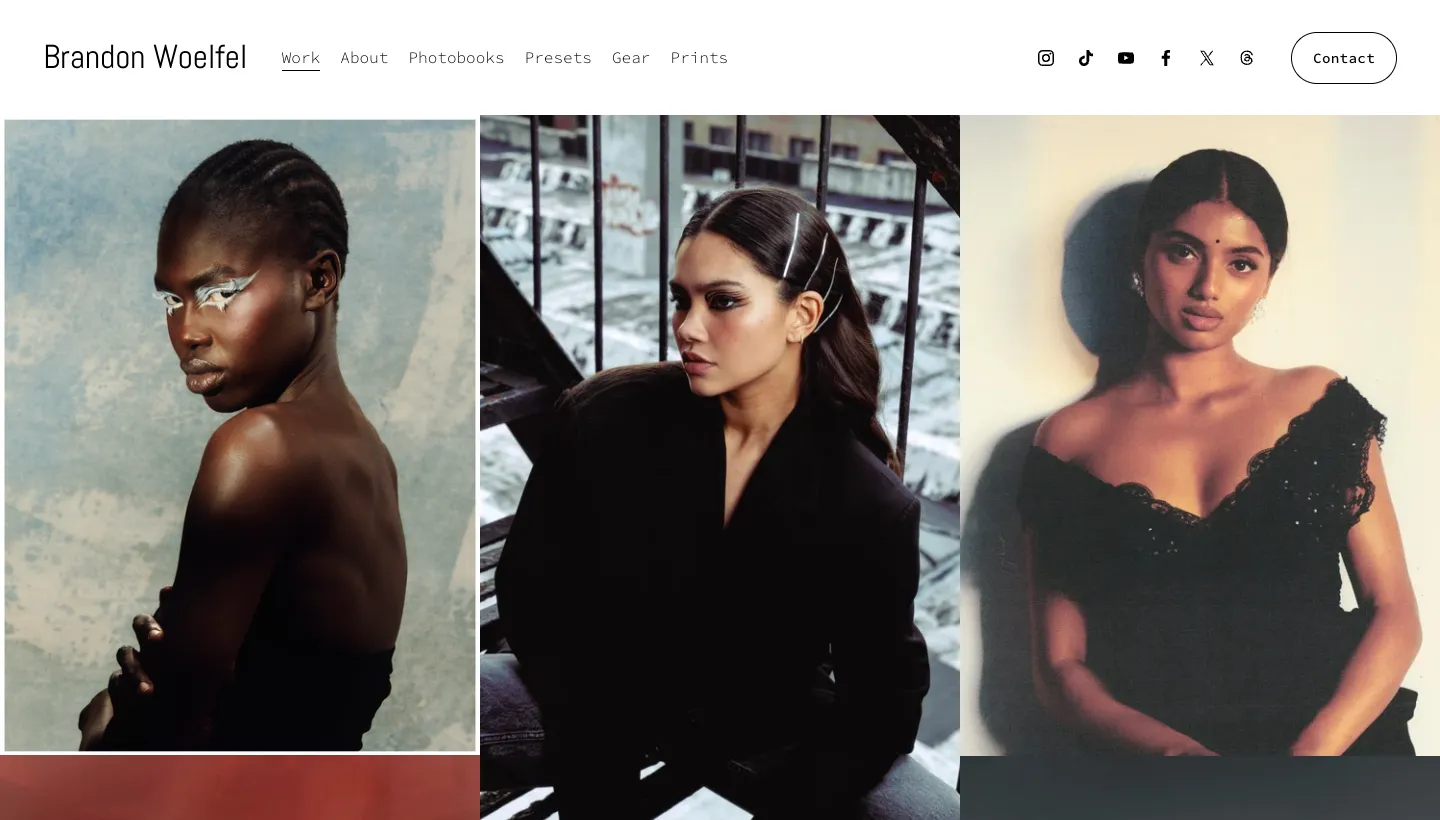
Brandon Woelfel's site has a short menu: work, about, photobooks, presets, gear, prints and contact. Alongside the portfolio, it sells to people who admire his style, through photobooks, editing presets and prints, and shares the gear he uses.
For a photographer with a following, this turns fans into customers without getting in the way of the portfolio.
Borrow this: if people regularly ask what camera you use or how you edit, a gear page or presets can answer it and earn from it.
10. Scott Henderson Photography: from admiration to enquiry
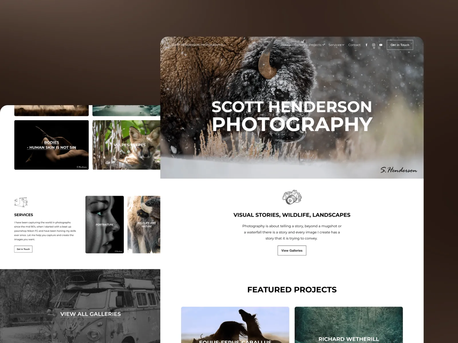
Scott Henderson Photography is a site we redesigned and rebuilt. Scott had a strong body of work and a portfolio that people admired, but it brought in almost no enquiries. Galleries, services and contact lived in separate places, so someone who liked the work had to hunt for a way to get in touch, and most didn't bother.
We modernised the design so the work sits in a frame worthy of it, then joined browsing and enquiring into one journey, with a route to contact from anywhere in the galleries. The galleries are paced deliberately rather than dumped into a grid, and the phone version was rebuilt rather than adapted, because that is where most people first find a photographer. It went live three weeks after kick-off, and Scott publishes new shoots himself. The full story is in the Scott Henderson Photography case study.
Borrow this: put a way to enquire inside the galleries, not only on the contact page. Interest fades fast.
What the best photographer websites have in common
Across all ten, a few habits repeat.
They sort work by client need
Platon by people and brands, Alex Strohl by advertising and personal, Elizabeth Weinberg by films, music and advertising. A client should find work like theirs in one click.
They use a few words well
Tim Walker's captions, Nick Brandt's project essays, Martin Parr's FAQs. Short text gives the images context and gives search engines something to read.
They show the photographer is working now
Dated news, recent work, a current project. An archive alone can look like a career that has ended.
They make the next step obvious
Inquiries, a shop, workshops, a newsletter. Every site gives the visitor something to do after admiring the work. If you take one thing from this list, take that. Our post on booking page friction for photographers goes further into the enquiry step.
The short version
The best photography sites let the work lead, but they never leave it alone. They organise it the way clients look for it, add a few well-chosen words, show that the photographer is busy now and always offer a next step.
Most photographers don't need a more striking design. They need a clearer structure and an enquiry route inside the galleries. Fix those, and keep your images fast to load (our post on image optimisation for photography websites explains how), and the work can do its job.
FAQ
What should a photography website include?
Your best work organised by the type of job, a short about page, a clear way to enquire from anywhere on the site, and enough words for clients and search engines to understand what you shoot and where. Prints, workshops or a booking page are worth adding if they are part of your business.
How many photos should be in a photography portfolio?
Fewer than most photographers think. Show your strongest work for each type of job you want more of, and leave out the rest. A tight, well-paced gallery makes a stronger impression than a long one.
Should a photographer's website show prices?
It depends on the work. Wedding and portrait photographers often show starting prices, which filters enquiries and saves time. Commercial photographers usually quote per job, so a clear enquiry form with the right questions works better.
How do I get my photography website found on Google?
Give each type of work its own page with a clear title, such as the kind of photography and the area you work in. Add short descriptions and captions, keep images fast to load, and complete your Google Business Profile if you shoot locally.
Is Squarespace good for photographers?
For most photographers, yes. Its templates are image-led and it is easy to update galleries yourself. Our guide to Squarespace for photographers covers where it works well and where a different setup might suit you better.
How long does it take to build a photography website?
It depends on the number of galleries and how much is written. Scott Henderson Photography went live three weeks after kick-off, including the full redesign.