
Website layouts that convert high ticket clients
A curated look at the structural design principles, narrative flow, and visual composition strategies used to attract and convert elevated, premium buyers.
Written by Mikkel Calmann
Dec 20, 2025

The influence of website layouts that convert on high End decision making
Website layouts that convert are never accidental—they’re architected with intention, narrative control, and aesthetic authority. High-ticket clients aren’t influenced by pressure or gimmicks; they’re influenced by clarity, sophistication, and the unmistakable impression that a brand operates at a higher level. When a website’s layout is designed with precision, it becomes more than a framework. It becomes a persuasive experience.
The problem many premium brands face is not that their website is unattractive; it’s that its structure lacks emotional direction. Without a clear narrative flow, even the most visually stunning site can feel hollow. High-ticket clients want to feel guided, understood, and inspired from the moment they land. A layout built around story and hierarchy does exactly that.
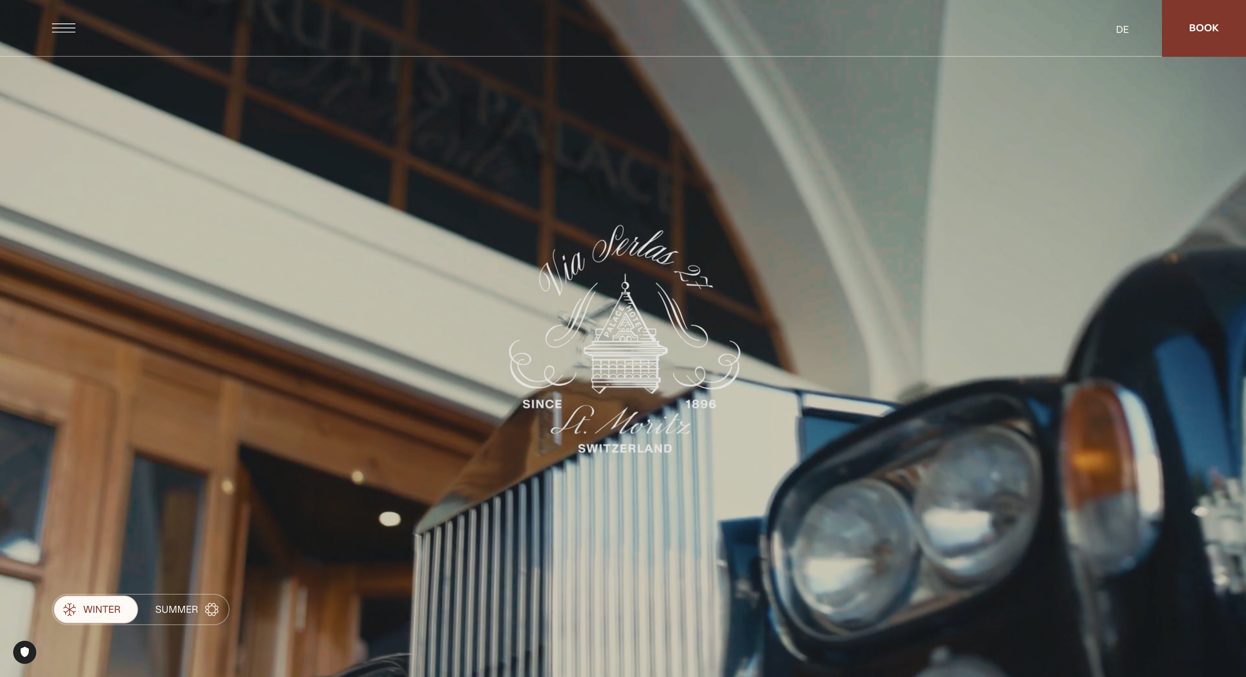
The hero layout that establishes authority instantly
A premium website begins with a hero that doesn’t just look good—it establishes authority. This type of layout uses intentional negative space, minimal copy, and strong art direction to signal that the brand operates with confidence.
For a luxury interiors firm, we crafted a hero layout built around a cinematic full-bleed image paired with a simple declarative headline. No buttons fighting for attention, no clutter pulling the eye away—just a visual statement of expertise. High-ticket clients often commented that they “felt the brand’s level” before reading a single line. That’s the power of editorial restraint.
This is how website layouts that convert begin: with clarity, poise, and emotional presence.
The story-led overview that pulls the client in
After the hero, the structure must shift from impression to narrative. A premium layout guides the user through controlled storytelling—something high-end buyers expect.
This section usually blends concise editorial copy with spacious imagery that introduces the brand’s worldview. You’re not just telling the visitor who you are; you’re aligning them with your values.
For a consulting agency, we used a slow-scroll layout with soft fades and refined serif typography. Each block revealed a new piece of the story: what they stand for, what they believe in, and why their work matters. By the time visitors reached the next section, they didn’t just understand the brand—they felt connected to it.
Layouts like these convert because they make story visible. They transform narrative into a design asset.
The signature services layout that elevates perceived value
Premium clients don’t buy services. They buy clarity, expertise, and aesthetic confidence. This is why a services layout must move beyond listing offerings—it must communicate value through structure.
A well-executed services section uses editorial spacing, modular grids, and refined visual cues to elevate the perceived worth of the work. For a private coaching brand, we created a two-column layout with generous spacing, high-contrast typography, and subtle hover motions that added tactility to the experience. Each service felt like its own luxury package.
When layouts turn offerings into curated experiences, high-ticket clients stop comparing and start envisioning.
This is how website layouts that convert move the client from interest to intent.
The portfolio layout that demonstrates taste
Taste is the true currency of premium design. High-ticket clients look at a portfolio layout and make a decision instantly: “Does this brand have the eye I want associated with mine?”
A premium portfolio layout isn’t a gallery; it’s an editorial showcase. It relies on rhythm, visual pacing, and intentional curation. Some images sit large, others small. Some appear in monochromatic tones, others in full color. The composition tells a story that mirrors the brand’s aesthetic philosophy.
For a boutique fashion label, we created a staggered layout reminiscent of a luxury magazine spread. Instead of overwhelming the screen with thumbnails, we curated a handful of key images displayed with spacious margins and elegant transitions. The brand later shared that clients referenced the website layout as a reason they reached out.
This is the power of a layout that doesn’t just show work—it shows taste.
The credibility layout that builds trust without noise
High-ticket clients expect evidence of expertise, but they don’t want cluttered badges or overwhelming testimonials. The right layout communicates credibility with restraint.
This often means incorporating:
A sparse testimonial slider with elegant typography
A minimal grid featuring high-end publication logos
Select quotes with spacious margins
For a leadership strategist, we built a credibility section using oversized pull quotes and a muted color palette. Instead of long testimonial paragraphs, we chose key lines that captured the essence of the transformation. The section felt elevated, quiet, and confident—qualities that naturally build trust at the premium level.
Website layouts that convert use credibility as design, not decoration.
The signature process layout that creates certainty
Certainty is a premium emotion. High-ticket clients don’t just want to be impressed—they want to feel secure. A structured process layout, when designed elegantly, becomes one of the most powerful conversion tools on a high-end site.
This layout typically uses a vertical or horizontal flow that breaks the process into digestible, visually refined chapters. Clean lines, subtle numbering, and editorial descriptions communicate clarity without overwhelming.
For a luxury creative studio, we designed a minimalist timeline layout with soft gradients and micro-transitions. Clients consistently praised this layout for making the decision-making feel effortless. When a process looks thoughtful, the brand appears thoughtful.
This is how structure becomes confidence.
The CTA layout that invites, not pushes
A premium call-to-action layout is never aggressive. High-ticket clients resist hard selling—they respond to invitation.
This means the CTA layout is spacious, elegant, and aligned with the visual narrative. Typography carries the tone. Imagery carries the emotion. The button is subtle yet intentional.
For a private wellness retreat, we used a soft, atmospheric background image paired with a simple line of text: “Begin your experience.” It wasn’t a push—it was a pull. Clients described the CTA as “irresistible without trying.”
Website layouts that convert high-ticket clients rely on emotional resonance, not pressure.
Layouts that signal premium positioning
Every section of a premium website layout communicates something about the brand: its taste, its values, its standards. The structure becomes an invisible form of messaging. High-ticket clients read layout the way others read copy—every spatial decision, margin width, and composition choice signals who the brand is.
This is why premium website layouts are quiet, confident, and editorially composed. They’re not designed to impress everyone. They’re designed to speak directly to those who understand and appreciate elevated design.
This is what separates high-ticket buyers from general audiences—they’re looking for signals of alignment.
The end-to-end journey that converts
When the entire layout flows with intention, the website becomes more than a touchpoint—it becomes a persuasive journey. Every section works together to create momentum, ease, and emotional clarity.
A high-ticket client should move through a site and feel:
Guided, not pushed
Inspired, not overwhelmed
Certain, not confused
Seen, not generalized
The right layout achieves this without forcing a single moment. It feels natural, inevitable, and elevated.
Website layouts that convert operate at this level of intentionality.
Conclusion
High-ticket clients don’t convert because of features or pressure—they convert because a website makes them feel aligned with the brand’s taste, clarity, and authority. A premium layout is more than structure; it’s a statement of identity.
When every section—from the hero to the CTA—is crafted with editorial refinement and emotional precision, the website stops functioning as a marketing tool and becomes an experience. An experience that confirms the client’s instinct that this brand, this service, this partnership is the right one.
This is the art of creating website layouts that convert. It’s not about louder design. It’s about smarter structure, deeper narrative, and the kind of aesthetic authority that high-ticket clients recognize instantly.
Flexible custom packages.
Three tiers scoped for where you are and where you're going. Not sure which fits? Book a call — we'll go over your project together and make sure you land on the right one.
Launch build
Look credible, fast.
$2,500starting from
A focused, conversion-aware website that gives you confidence sharing your link anywhere.
- Up to 4 structured pages
- 1 focused revision round
- Fully mobile-optimised
- SEO foundations included
- Launch-ready in 3 weeks
- 30 days email support
Best for businesses launching or replacing an outdated site.
Start your projectAuthority build — Most popular
Elevate your brand.
$4,000starting from
A refined, strategically designed website that positions your business as established and credible.
- Everything in Launch, plus:
- Up to 7 pages
- Custom styling & layouts
- 2 revision rounds
- Blog integration
- 5-week build timeline
- Training walkthrough
Best for growing businesses that want their site to reflect their expertise.
Start your projectScale build
No limits. Full depth.
$8,000starting from
A fully bespoke build with advanced functionality, custom code, and no artificial constraints.
- Everything in Authority, plus:
- Unlimited pages
- Unlimited custom code
- Unlimited revisions
- Plugin costs covered
- Priority support
- Complete SEO setup included
Best for established businesses investing in a long-term digital foundation.
Start your project
Mikkel Calmann
I’m Mikkel Calmann, a certified Squarespace designer and Circle Member. We’ve worked with businesses of all sizes, crafting strategic websites that look great and perform even better. If you’d like to discuss a project, feel free to email us at mikkel@typza.com or reach out to us here. You can also book a free 15-minute consultation here.