
Website hero section design for premium brands.
An editorial exploration of what makes website hero section design truly premium—from visual hierarchy and narrative clarity to the emotional storytelling techniques that attract luxury clients from the very first frame.
Written by Mikkel Calmann
Dec 27, 2025

The first frame decides everything
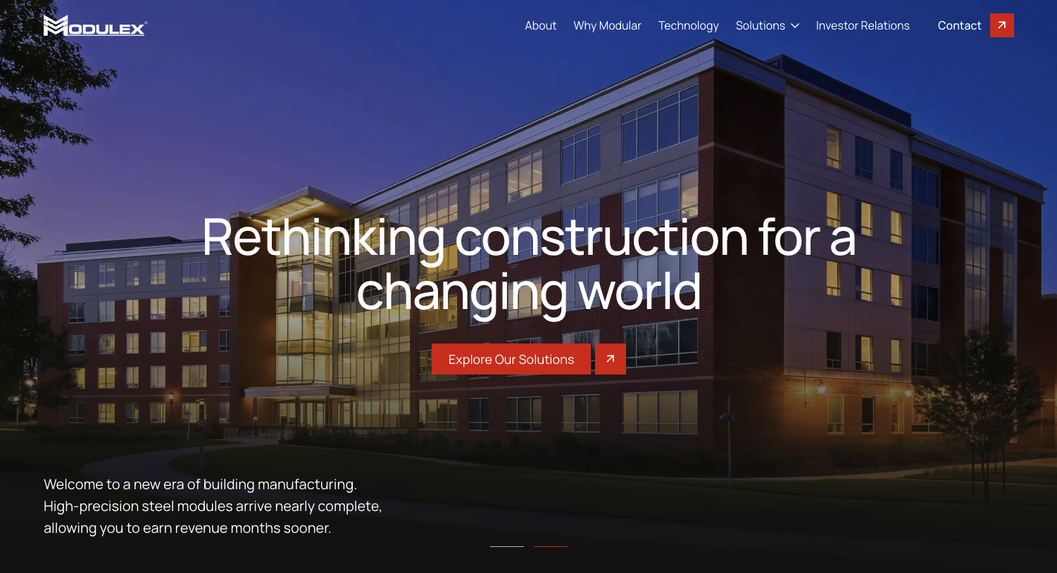
When brands approach me for a redesign, their frustrations often stem from a simple but high-stakes truth: their first frame doesn’t match the standard of their work. The hero section—the first seven seconds of the entire experience—is often visually busy, narratively unclear, or simply not communicating the level of excellence the brand operates at.
For high-end clients, the website hero section design is not a decorative introduction. It is a positioning device. It sets the tone, signals the category, and determines whether the audience perceives the brand as elevated, premium, and worth their attention. If the hero section is off tone, the brand’s entire value proposition becomes harder to believe.
Premium brands cannot afford an average first impression. The hero section is where taste, clarity, and authority converge—or fall apart.
Why premium brands need a cinematic opening
Over the past decade, one pattern has been impossible to ignore across luxury, hospitality, creative studios, boutique consultancies, and wellness brands: premium audiences respond to cinematic stillness more than digital gimmicks. They’re not impressed by motion for the sake of motion or visuals that feel like they’re trying too hard.
A strong hero section for a premium brand establishes a world. It creates atmosphere. It invites the user into a controlled sense of aesthetic presence. This is where editorial thinking replaces traditional web design. Instead of asking, “What do we put here?” I guide brands to ask, “What experience do we create in the first five seconds?”
A cinematic hero is not about animation—it’s about invitation. It is the controlled, deliberate composition of elevation.
The three elements every premium hero must nail
Every high-end website hero section design I’ve built over the years has relied on three quiet but powerful pillars: visual presence, narrative clarity, and editorial restraint.
Visual presence
Premium visuals don't shout. They glide. Whether it’s a photograph, a color field, or a text-driven layout, the visual needs to anchor the screen with confidence. Large, clean composition instantly communicates sophistication. Unnecessary textures, patterns, and busy elements dilute that effect.
Narrative clarity
Luxury audiences do not need to be convinced—they need to be oriented. This is where the headline becomes a brand’s first moment of authority. The strongest hero headlines are precise, unhurried, and intentional. They signal who the brand is without excess words.
Editorial restraint
The hero is not the place for features, long descriptions, or multiple CTAs. Premium design leans into simplicity. One primary headline, one supporting line, one clear CTA. Space becomes the luxury. Stillness becomes strategy.
How emotion shapes high-end hero design
The most premium brands understand the psychology of emotional pace. The hero section sets the interpretive mood for everything that follows. If it feels overwhelming, the brand feels insecure. If it feels sparse but intentional, the brand feels high-end. If it feels rushed, the brand feels transactional.
Premium hero sections succeed because they slow down the viewer’s nervous system. They create ease. They create trust. They create a sense of alignment before the user has even read the copy.
This emotional design is subtle. It exists in:
The width of the headline
The brightness level of imagery
The spacing around the text
The absence of aggressive colors
The generosity of margins
The confidence of a single CTA
This emotional environment is what premium brands pay for: a digital atmosphere calibrated to their audience.
Case insight: When a hero redefines a brand
A boutique fashion consultancy once approached me with a site that felt overwhelmed by color, copy, and detail. Their work was exquisite, but their hero section felt like a collage of mismatched ideas. The moment someone landed on the site, they had to work to understand the brand.
We rebuilt the hero using a single full-bleed editorial portrait with refined shadows, a short headline that captured the founder’s philosophy, and a CTA positioned at the edge of the frame to guide the eye down rather than distract from the composition.
The effect was immediate. Their audience now experienced the brand with ease, clarity, and aspiration. They didn’t have to navigate chaos—they stepped straight into a world.
Within six weeks, inquiries shifted from price-sensitive prospects to clients who referenced the site as the reason they trusted the brand immediately.
This is what the right hero section can do.
Why simplicity converts in luxury spaces
Luxury design is ultimately about curation. Premium audiences do not want to decode your message. They want to feel it. That is why simplicity is not minimalism—it is precision.
When a hero section is well-curated, it creates a sense of ease that communicates value. Every pixel feels placed; every word feels chosen. Premium audiences associate that level of precision with professionalism and expertise.
A cluttered hero signals a brand that lacks direction. A clear hero signals a brand that leads.
This difference is what turns visitors into high-caliber clients.
The art of the one-line headline
One of the lessons refined through building premium sites is that high-end clients respond to clarity more than cleverness. A poetic or vague headline might sound interesting, but premium clients prefer specificity delivered with elegance.
The strongest hero headlines are:
Direct but refined
Confident but not loud
Short but not generic
Clear but not salesy
A headline such as “Elevated brand strategy for ambitious consultants” conveys more gravity than a long paragraph explaining capabilities. This precision is the visual equivalent of luxury: there is nothing extra.
The role of typography in premium hero sections
Typography is often the silent authority of the hero section. Premium brands rarely use loud fonts. They use considered ones. The hero is where type hierarchy needs to feel both intentional and effortless.
Strong typography in a hero section:
Establishes tonal direction
Signals professionalism
Creates visual rhythm
Guides the viewer’s eye
Adds structure to the composition
Large serif headlines communicate elegance. Modern sans-serifs communicate clarity. Editorial weights and carefully spaced letters create an atmosphere instantly recognizable as premium.
Typography becomes the brand’s voice before the audience reads a single word.
Curated imagery as a conversion tool
The imagery chosen for the hero section determines whether the brand feels luxurious or low-end. In premium design, images need to feel intentional, atmospheric, and aligned with the brand’s tone.
The difference between premium and average imagery is rarely subject matter—it’s composition and depth. Premium brands use imagery that:
Has breathing room
Has intentional lighting
Has a clear point of focus
Has editorial sensibility
Has a calm visual temperature
The hero image must feel like a still from the brand’s story. Anything less weakens trust immediately.
The hero section should guide, not impress
A mistake I see in mid-tier designs is the attempt to shock or impress the viewer through spectacle—multiple animations, sliders, effects, or overly complex layouts. This may look interesting, but it often confuses the narrative hierarchy.
Premium brands don’t chase attention. They command it.
A strong hero guides the user into the experience with quiet authority. The goal is not to showcase everything—it’s to showcase direction.
Case insight: The power of a silent frame
A luxury wellness brand approached me during a full rebrand. Their existing site leaned heavily on vibrant colors and overlapping visuals. Through the discovery phase, it became clear that their actual brand was calm, almost meditative.
I redesigned the hero with a nearly monochromatic palette, a still photograph of natural textures, and a single-line headline positioned low on the screen—a technique pulled from editorial magazine layouts.
The result was a “silent frame” hero section. It invited visitors to pause, breathe, and recalibrate. The brand suddenly felt premium, spacious, and trustworthy.
The founder reported immediate feedback from clients who said the site “felt like the brand finally grew up.”
This is the shift a well-designed hero section can create.
Why the CTA should feel like an invitation, not an instruction
Premium audiences do not want to be told what to do—they want to be invited. The CTA in a hero section should feel like a natural next step, not a sales command.
Signals of a premium CTA:
Minimal wording
Clear intention
Placement with breathing room
A refined micro-interaction
A tone that feels aligned with the brand’s personality
Instead of “Book a Call Now,” a premium brand might use “Explore the Experience” or “Begin Your Enquiry.” The tone of the CTA matters more than most realize; it conveys the brand’s entire approach.
Hero layout pattern: The visual weight triangle
One technique I use consistently for premium hero section design is what I call the visual weight triangle. It’s a layout principle that creates balance and compositional harmony.
The triangle consists of:
A grounding image or visual anchor
A strong headline positioned with intention
A refined CTA placed strategically to guide movement
These three elements create a triangular flow of attention. It helps the user understand where to look first, next, and last. This makes the hero section feel elevated, stable, and intuitive.
This pattern is subtle, but it’s one of the reasons premium hero sections feel “different” without the user knowing why.
Why hero sections should not try to tell the whole story
The instinct to over-explain is the biggest mistake in hero design. Premium websites succeed because they choose what not to include. The hero section is a beginning, not a summary. It should spark curiosity without overwhelming.
The hero section is the doorway. The rest of the site is the journey.
When brands embrace that distinction, conversion improves. Users feel guided rather than sold to. The experience becomes intuitive, not demanding.
Conclusion
Website hero section design is one of the most important investments a premium brand can make. It’s the first visual handshake, the editorial tone-setter, the emotional entry point, and the primary perception shaper.
For luxury brands, the hero section is not an aesthetic decision—it’s a strategic one. It determines whether the audience sees the brand as elevated, trustworthy, and worth investing in. When built with precision, restraint, and creative direction, the hero section becomes the most powerful differentiator on the entire website.
If you’re ready for a website hero section that finally reflects your brand’s standard and elevates your positioning from the very first frame, this is the moment when your next chapter begins.
Flexible custom packages.
Three tiers scoped for where you are and where you're going. Not sure which fits? Book a call — we'll go over your project together and make sure you land on the right one.
Launch build
Look credible, fast.
$2,500starting from
A focused, conversion-aware website that gives you confidence sharing your link anywhere.
- Up to 4 structured pages
- 1 focused revision round
- Fully mobile-optimised
- SEO foundations included
- Launch-ready in 3 weeks
- 30 days email support
Best for businesses launching or replacing an outdated site.
Start your projectAuthority build — Most popular
Elevate your brand.
$4,000starting from
A refined, strategically designed website that positions your business as established and credible.
- Everything in Launch, plus:
- Up to 7 pages
- Custom styling & layouts
- 2 revision rounds
- Blog integration
- 5-week build timeline
- Training walkthrough
Best for growing businesses that want their site to reflect their expertise.
Start your projectScale build
No limits. Full depth.
$8,000starting from
A fully bespoke build with advanced functionality, custom code, and no artificial constraints.
- Everything in Authority, plus:
- Unlimited pages
- Unlimited custom code
- Unlimited revisions
- Plugin costs covered
- Priority support
- Complete SEO setup included
Best for established businesses investing in a long-term digital foundation.
Start your project
Mikkel Calmann
I’m Mikkel Calmann, a certified Squarespace designer and Circle Member. We’ve worked with businesses of all sizes, crafting strategic websites that look great and perform even better. If you’d like to discuss a project, feel free to email us at mikkel@typza.com or reach out to us here. You can also book a free 15-minute consultation here.