
How a minimalist layout increased client inquiries
This case study explores how a cluttered, visually noisy website became a calm, editorial-driven digital presence—and how that shift directly increased client inquiries for a growing premium brand. This is a story about restraint as strategy, design clarity as conversion, and why minimalism attracts the clients who are already operating at a higher level.
Written by Mikkel Calmann
Dec 25, 2025

When design noise silences opportunity
The brand in this case study—a lifestyle consultancy—had invested heavily in content, photography, and messaging. Yet despite the volume of material, the website felt visually dense and overstimulating. The founder described it as “busy in a way that didn’t feel expensive.” Traffic wasn’t the issue; relevance wasn’t the issue; reputation wasn’t the issue. The problem was perception. The website created friction where there should have been flow.
Within the first paragraph of our strategic audit, we pinpointed the core issue: the brand needed a minimalist layout to restore focus and prominence to the elements that mattered. This shift later increased client inquiries dramatically—not because the brand changed who it was, but because the redesigned layout finally reflected its value.
Premium clients move quickly. They read with intention, but they don’t tolerate clutter. They look for signs of discipline: clarity of content, confidence in styling, and comfort in the quiet moments of a layout. The original design offered none of these signals, and as a result, visitors weren’t developing trust long enough to inquire.
Minimalism would change that—but only if executed with precision, not trend-driven simplicity.
Why minimalism isn’t about having less
Minimalism is often misunderstood as emptiness, neutrality, or coldness. In premium design, minimalism is purposeful. It is an editorial decision: a deliberate choice to let hierarchy, spacing, and typography carry the narrative.
For this brand, minimalism became a strategic filter. By removing distractions, the design elevated the founder’s expertise and allowed the brand story to unfold with clarity. Simplicity didn’t dilute the offering—it amplified it.
Minimalism works in high-end environments because it communicates confidence. Brands that resist over-explaining are assumed to be secure in their value. Brands that present one message at a time appear focused. Brands that embrace space signal maturity.
In short: minimalism doesn’t create less impact. It creates more room for impact.
Understanding where the original site failed
Before building anything new, we needed to understand precisely where the original site created friction. Three patterns emerged:
The first was density—too many visual elements competing for attention. The homepage had multiple hero images, several button styles, and inconsistent typography. Users were scanning rather than absorbing. No section carried enough weight to anchor the experience.
The second issue was hierarchy. There was no clear path through the content. Primary messages and secondary messages looked visually identical; calls to action blended into paragraphs; the founder’s strongest differentiators were tucked away in sidebars.
The third issue was emotional tone. The brand’s real personality—calm, refined, and deeply experienced—was missing. Instead of feeling editorial, the site felt promotional. Instead of feeling premium, it felt crowded.
These weren’t content problems. They were problems of delivery. And that is precisely where a minimalist layout excels.
Designing the new minimalist layout
The redesigned layout was built around a single goal: clarity that converts. Every decision—spacing, alignment, type scale, interaction—was crafted to reinforce authority and calm.
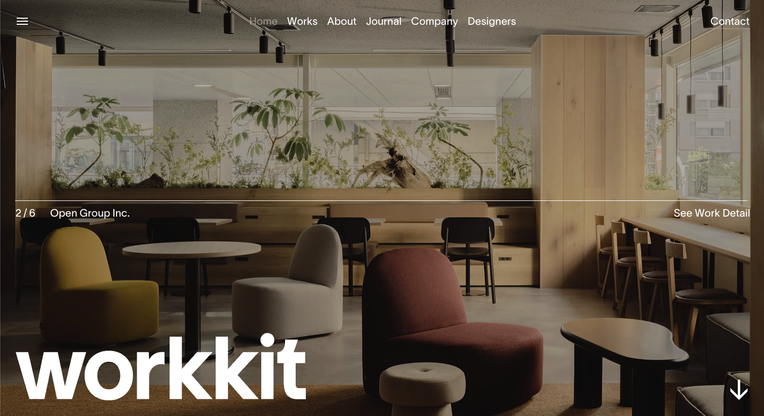
We rebuilt the homepage like an editorial spread. The hero section became stripped down, with a single confident message and one refined call to action. Instead of rotating images or heavy animations, we used one strong, full-bleed photograph to set tone and pace.
Spacing became the most powerful design tool. Generous margins allowed each message to breathe, creating visual rest between content blocks. These quiet moments are where premium clients form trust; minimalism depends on them.
Typography shifted to a structured, understated system. A large serif headline established immediate presence, while a clean, contemporary sans-serif supported clarity. This contrast grounded the page and created a natural hierarchy that didn’t need decoration.
The layout avoided unnecessary elements. No shadows, no borders, no decorative lines. The visual system relied instead on balance, rhythm, and intention.
The result: the brand finally felt like the brand.
How minimalism elevated the brand story
A minimalist layout doesn’t just tidy up a website; it reframes the entire story.
For this project, removing clutter revealed narrative clarity. The founder’s process became easier to understand. Their positioning became more distinct. Their expertise became more apparent.
With the new layout, we transformed the brand’s story from scattered fragments into a cohesive, linear experience. Each section flowed into the next with continuity: who they are, why they matter, how they work, and what makes them different.
Minimalism gave the story dignity. It made the content feel curated rather than compiled. And for premium brands, curation is everything.
Visual rhythm and the pace of discovery
One of the most overlooked aspects of minimalism is rhythm—the pace at which information is presented. Premium clients don’t want to be bombarded. They want to be guided.
The minimalist layout achieved this by controlling the tempo of the experience:
Longer vertical spacing before key statements signaled importance.
Shorter spacing after paragraphs kept reading momentum.
Thoughtful image placement created visual pauses.
Section transitions felt smooth rather than abrupt.
This deliberate pacing elevated the brand from a service provider to an editorial experience. Visitors didn’t skim; they followed.
When rhythm is right, the user feels the design before they consciously understand it. This feeling builds trust.
Case study insight: The metrics behind the minimalism
After the redesign launched, the results were as immediate as they were measurable.
Within the first 60 days, inquiry volume rose significantly. The brand saw increased client inquiries across both the primary consultation page and the general contact form. But beyond volume, the quality of inquiries shifted too. Fewer transactional leads, more aligned ones. More long-term project requests. More clients ready to invest.
We also saw improvements in engagement metrics:
Visitors stayed longer.
They scrolled further.
They read more deeply into the brand’s differentiators.
This is typical of premium audiences—they reward clarity with attention. The minimalist layout didn’t simply make the site look better; it made the brand easier to say yes to.
The emotional impact that data cannot measure
Metrics tell part of the story. But with premium audiences, emotion drives conversion just as much as logic.
The minimalist layout created a new emotional atmosphere around the brand. Visitors now described the site as “calm,” “professional,” “understated,” and “luxurious.” These words are signals of trust—signals that the brand is operating at a higher level.
Clients reported that they felt more confident reaching out. They understood the founder’s process more clearly. They perceived the brand as more established.
Minimalism creates this emotional depth by removing anything that dilutes the message. What remains feels intentional, curated, and elevated.
Why the minimalist approach pre-qualifies premium clients
Premium clients make purchasing decisions differently. They don’t respond to urgency tactics or cluttered feature lists. They respond to clarity, control, and composure.
Minimalism communicates these qualities effortlessly.
A minimalist layout:
Signals that the brand is confident enough not to over-explain
Creates a sense of spaciousness associated with luxury environments
Demonstrates discipline and taste
Encourages only the most aligned clients to reach out
This design philosophy does more than improve conversions—it filters. It attracts clients who appreciate intentional design and who value expertise over discounts.
In other words, minimalism isn’t just aesthetic. It’s strategic positioning.
The storytelling power of restraint
A minimalist layout uses storytelling differently. Instead of presenting everything at once, it reveals information in a curated sequence. That sequence becomes a narrative arc—one that feels thoughtful and sophisticated.
In this project, we used restraint as a storytelling device. Each section carried only what was essential. Each image served a purpose. Each statement had weight.
This level of curation becomes a reflection of the brand’s own process. It signals that they, too, operate with intention. That they understand nuance. That they value clarity.
Minimalism makes the visitor feel guided rather than sold to. And premium clients respond to guidance.
The reason this strategy worked
The minimalist layout succeeded not because minimalism is trendy, but because it aligned with the brand’s identity. The founder’s actual client experience was calm, structured, and expert-led—but the old design didn’t communicate that.
When design and identity finally matched, everything felt cohesive.
The brand’s confidence became visible. The founder’s expertise became legible. The value became undeniable. And increased client inquiries were a natural outcome of that alignment.
Minimalism didn’t change the brand. It revealed it.
Conclusion
This case study isn’t a story about trends or aesthetics. It’s a story about clarity, identity, and the power of restraint in digital environments.
A minimalist layout increased client inquiries not because it looked cleaner, but because it created an emotional and operational shift in how the brand was experienced. It allowed the audience to breathe. It allowed the message to land. It allowed the founder’s expertise to take center stage without competition.
Minimalism is a premium strategy—one that filters the right clients, elevates the brand narrative, and builds trust through intention rather than excess.
In a digital world obsessed with more, the brands that learn to master less win.
Flexible custom packages.
Three tiers scoped for where you are and where you're going. Not sure which fits? Book a call — we'll go over your project together and make sure you land on the right one.
Launch build
Look credible, fast.
$2,500starting from
A focused, conversion-aware website that gives you confidence sharing your link anywhere.
- Up to 4 structured pages
- 1 focused revision round
- Fully mobile-optimised
- SEO foundations included
- Launch-ready in 3 weeks
- 30 days email support
Best for businesses launching or replacing an outdated site.
Start your projectAuthority build — Most popular
Elevate your brand.
$4,000starting from
A refined, strategically designed website that positions your business as established and credible.
- Everything in Launch, plus:
- Up to 7 pages
- Custom styling & layouts
- 2 revision rounds
- Blog integration
- 5-week build timeline
- Training walkthrough
Best for growing businesses that want their site to reflect their expertise.
Start your projectScale build
No limits. Full depth.
$8,000starting from
A fully bespoke build with advanced functionality, custom code, and no artificial constraints.
- Everything in Authority, plus:
- Unlimited pages
- Unlimited custom code
- Unlimited revisions
- Plugin costs covered
- Priority support
- Complete SEO setup included
Best for established businesses investing in a long-term digital foundation.
Start your project
Mikkel Calmann
I’m Mikkel Calmann, a certified Squarespace designer and Circle Member. We’ve worked with businesses of all sizes, crafting strategic websites that look great and perform even better. If you’d like to discuss a project, feel free to email us at mikkel@typza.com or reach out to us here. You can also book a free 15-minute consultation here.