





Its own layout, not a shrunk one
We design the phone version separately, so the order, sizes and spacing suit a small screen instead of being whatever the desktop columns stack into.
Most of your visitors arrive on a phone, often in a spare minute, and a desktop design squeezed onto a small screen loses them. We design a separate layout for phones, with the content in the order a mobile visitor needs it, buttons that are easy to tap and pages that load fast, at a fixed price agreed before we start.
See how your current site scores
Scores for speed, search, accessibility and trust in about a minute.
Responsive used to mean the columns stack and the text gets smaller. But a phone visitor is in a different situation: one thumb, less time, a patchy connection. If the first screen is a large image and the button is three swipes down, they leave before they ever see what you offer. So we design the phone layout as its own thing, not as the leftovers of the desktop one.
Each part below is designed and checked on a phone, because that is where most first visits happen.
We design the phone version separately, so the order, sizes and spacing suit a small screen instead of being whatever the desktop columns stack into.
Images sized for each screen and nothing loaded that isn't used, so pages open quickly on mobile data, not just on office wifi.
Buttons and links large enough for a thumb and spaced apart, so nobody taps the wrong thing or has to zoom in.
A short, clear menu with the next step always in reach, so a visitor can find a page or get in touch without hunting.
Only the fields you need, the right keyboard for each one and a clear confirmation, because a form that is painful on a phone loses the enquiry.
Every page checked on small phones, large phones, tablets and desktops before launch, so nothing breaks at a size nobody looked at.
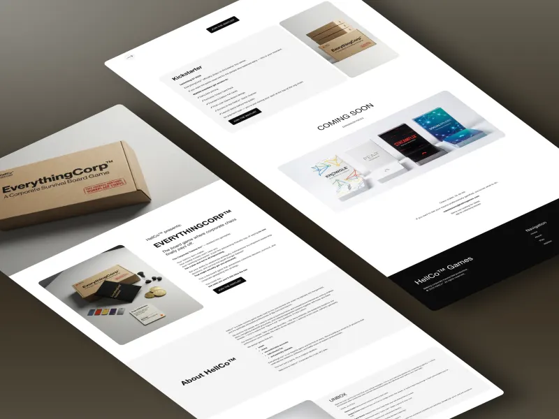
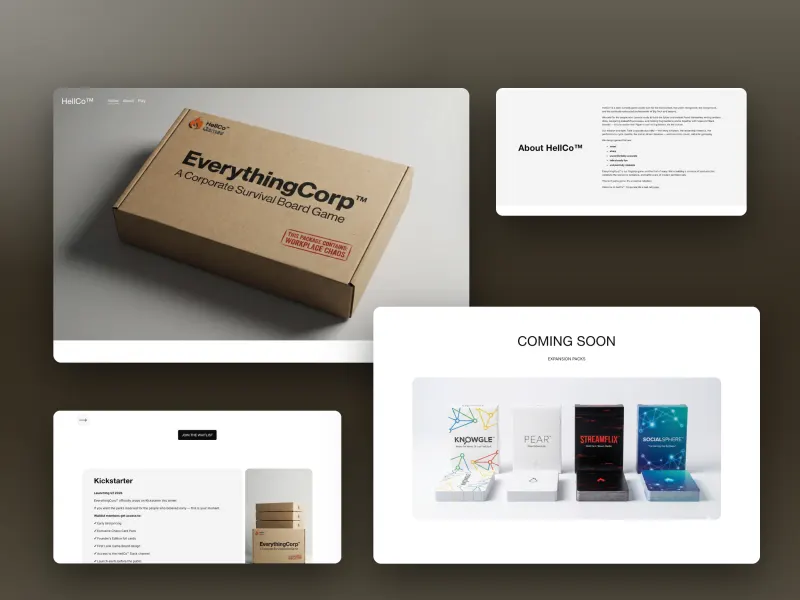
A dark-comedy game studio launching their flagship tabletop game, EverythingCorp™. The site had to stop being a brochure and start being a lead-generation funnel before the Kickstarter went live.
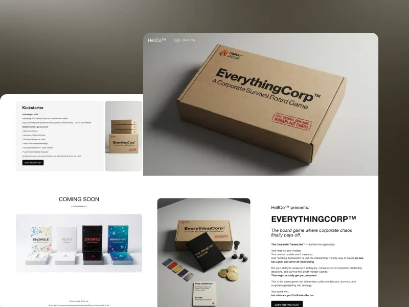
A Kickstarter succeeds or fails on the email list you built before the campaign opened. HellCo had an existing site, a launch date, and a default sign-up form that captured addresses without segmenting them, which means the launch email goes to everyone identically and converts like a newsletter.
The second constraint was sequencing. Final hero renders were roughly two weeks out, and waiting for them would have burned the entire runway before launch. The technical work could not sit idle waiting on artwork.

Split delivery into two phases so nothing waited unnecessarily. Phase one built the conversion funnel and technical foundation: a dedicated Mailchimp VIP sign-up replacing the default form, triggered by the Pre-Order CTA and tagging subscribers as VIP Launch Backers for segmented campaigns.
Phase two integrated the final renders once delivered, finished the product pages, added the coming-soon pages and ran full cross-browser QA, three days from asset handover to launch-ready.
“Working with Mikkel was an absolute pleasure from start to finish. He was prompt, highly responsive, and executed exactly what we needed with precision and thoughtfulness. Every revision was handled quickly and efficiently, and he consistently translated feedback into strong, polished design solutions without friction. Beyond the quality of the work itself, Mikkel is simply easy to work with, providing clear communication, great judgment, and a true sense of ownership over the project. The final result exceeded expectations, and the process felt smooth and collaborative the entire way. I would absolutely work with Mikkel again and highly recommend him to anyone looking for a reliable, talented designer who delivers.”
 Mya.HellCo Games
How does your current site score on a phone? Start with a free audit.
See what the audit checksTwo fixed-price projects to build the site right on every screen and two monthly partnerships to keep it working. Most clients start with one project.
We rethink what the site says and how a phone visitor moves through it, then write, design and build it for every screen.
From$9,500
We build your site from settled design and content, with a separate phone layout, and move everything across without losing rankings.
From$5,000
Each month we add pages for the searches your best clients make, designed for phones from the start.
From$2,000/mo
Send us changes and new pages and we add them within 48 hours, checked on phone and desktop every time.
From$1,500/mo
Grow and Maintain can run together after any project, with 10% off the combined fee. Not sure which you need?
Four stages, in the same order every time. How long each takes depends on the size of the site, and you get the timeline in writing before anything starts.
One call and a short form. Who your visitors are, what they come to do, and how many of them arrive on a phone today.
We write your homepage copy first and show it on a mockup, then every other page. On a phone every word counts, so this is where the order is decided.
Designed custom from a blank canvas, with the phone layout designed separately from the desktop one, then built and checked on real devices.
Every page tested at every size, every URL redirected so rankings hold, then training, 30 days of support and full ownership in your name.
3 to 4 hours That is all the time it takes from you: a discovery call, a copy review and a site review, which you can do on your own phone.
Real reviews from real clients, with their names and their websites attached.
Read all reviews“He’s a businessman himself who made it a point to understand my business. If you can articulate it, he can make it. He is perhaps the clearest communicator of any web designer I have ever worked with.”
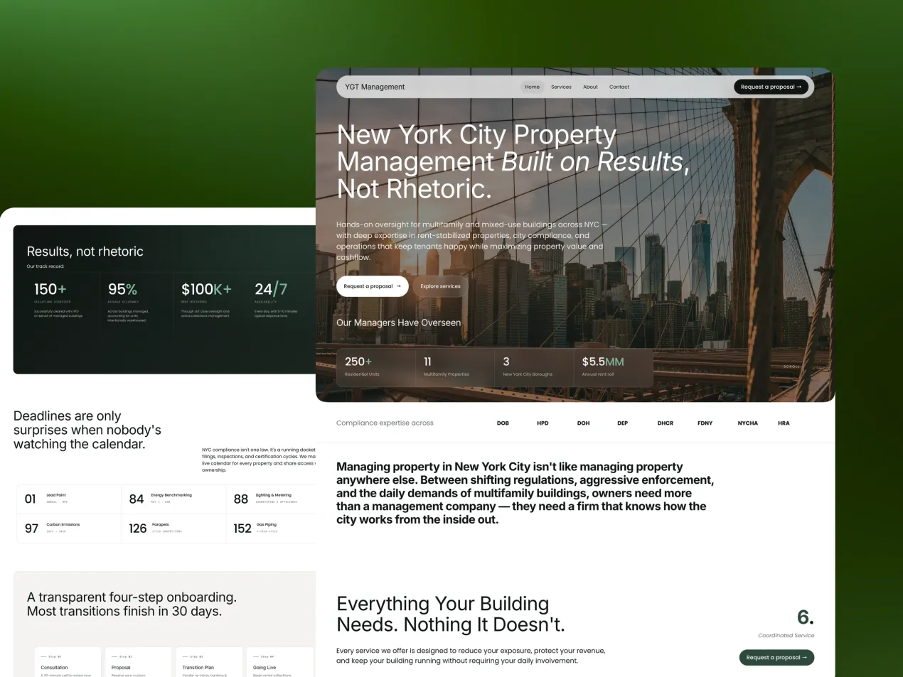
 Reed B.YGT Management
“He has a rare combination of design artistry, technical depth, and human intuition that makes a brand feel alive.”
 Brett L.Ajarro
“He listened carefully, asked the right questions, and consistently delivered work that captured exactly what I was hoping for.”
 Duncan M.Not Just Another Shark
“He offered clarity and a path forward at a time of uncertainty, and he turned my website into something that truly represents my vision.”
 Charli T.EduVentura
“Mikkel truly went above and beyond in creating a great website for me. Will definitely recommend to others in the future.”
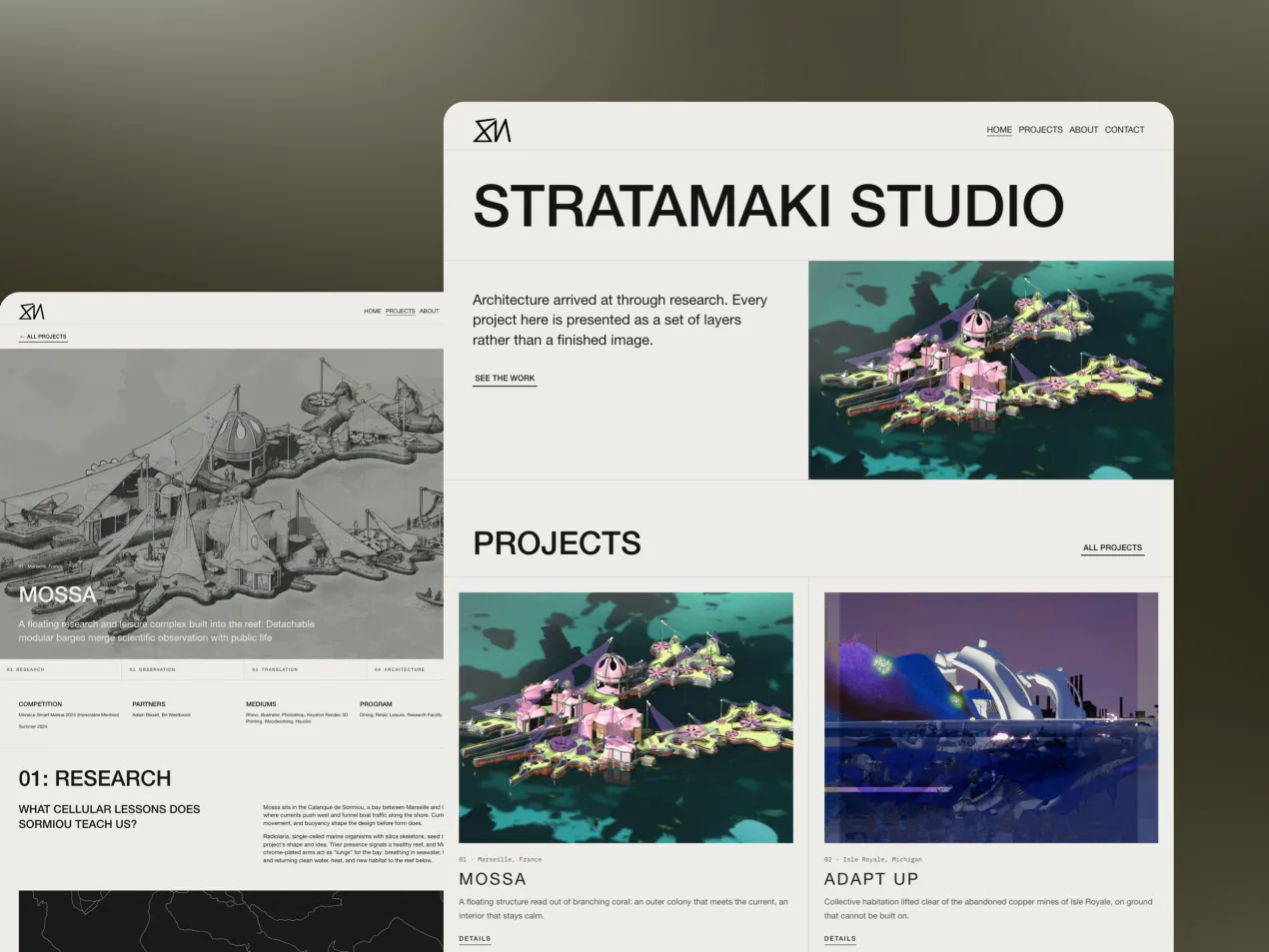
 Michael K.Stratamaki Studio
Have a question about your site on mobile first?
Every URL is mapped and 301-redirected before launch, and rankings are measured either side so anything bringing in enquiries keeps working.
Pages and content are editable in-house, and the phone layout keeps working when you add to them, with a recorded walkthrough of your own site.
The domain, the website account and every piece of content are in your name from day one, with no agency lock-in.
Straight answers before you book anything.
Still have a question?Ask us directly, or talk it through with us on a free 15-minute call.
A website that adapts to the screen it is viewed on, from a small phone to a large desktop. The basic version just stacks columns and shrinks things. We go further and design a separate layout for phones, so the order and sizes suit how people actually use a small screen.
Not quite. Responsive means the site works at every size; mobile-first means the phone experience is designed deliberately rather than left to whatever the desktop layout turns into. We do both. Our guide to mobile-first design explains the difference.
Squarespace, on Launch and Rebuild. We build only on Squarespace, so we know it inside out: the design is custom, the site ships in weeks, and your team can change text and add pages without paying a developer. Hosting and security are handled.
Yes. Google looks at the mobile version of your site first when it decides how to rank it, so a slow or awkward phone layout holds back the whole site, not just its phone visitors.
No. Every URL is mapped and 301-redirected before launch, and rankings are measured either side so anything bringing in enquiries keeps working. Some movement in the first two weeks is normal while Google recrawls the site.
Our projects build a new site on Squarespace, designed for every screen from the start. If the current site's design and content are settled, Launch rebuilds it properly for phones while keeping the words. A free audit shows how the current site scores on mobile first.
Three to four hours: a discovery call, a copy review and a site review. Reviews are scheduled around your busiest periods, and you can do them on your own phone.
Launch starts from $5,000 and Rebuild from $9,500, with the exact figure set by page count, functionality and how much content is written rather than moved across. You get a fixed number in writing before anything begins. The domain, the website account and every piece of content are in your name from day one. Full detail on the pricing page.
Enter your address and get scores for speed, search, accessibility and trust in about a minute.